

the image gallery The widget allows you to easily add and design complex and beautiful images galleries on your page.
Content
Configurations
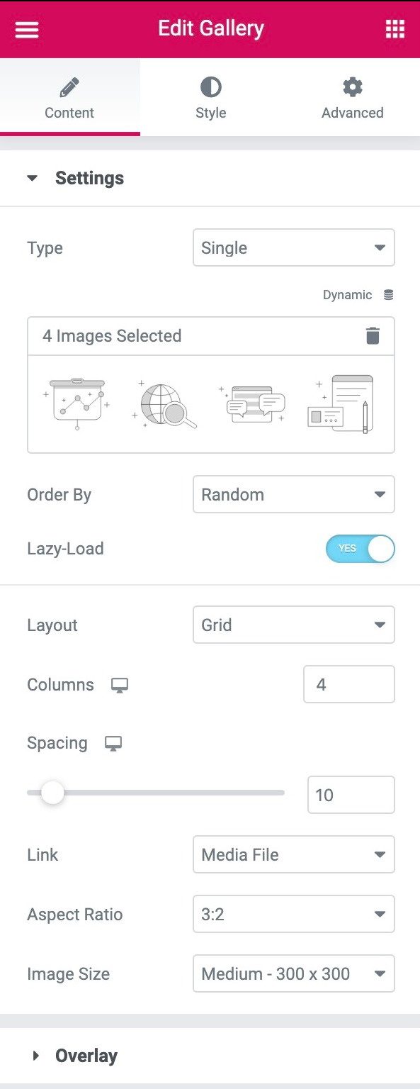
- Type: Select the type of gallery, choosing between Single or Multiple. Multiple allows you to have a filterable portfolio style image gallery.
- Add images: Choose multiple images from the media library to insert into your gallery and write a Title for the gallery.
- Sort by: Choose default or random order
- Slow loading: Set Yes to use Lazy Load to improve loading speed.
- Design: Select from Grid, Justifiedor Brickwork.The Grid it is based on an aspect ratio of your choice. Justified allows you to set the height of each row and adjusts to different widths per image. Brickwork maintains the same image width and adjusts to different heights.
- Columns: Sets how many columns will be displayed per row, from 1 to 24. Not available if Justified The design is chosen.
- Row height: Sets the height of each row, in pixels. Only available if Justified The design is chosen.
- Spacing: Controls the amount of space between each image in a row.
- Link: Set the link for the images to None, Media file or Custom URL
- Aspect ratio: Choose the aspect ratio, selecting from 1: 1, 3: 2, 4: 3, 9:16, 16: 9 and 21: 9. Only available for grid layout.
- Image size: Set the image size, from thumbnail to full, or enter a custom size.
If Type: Multiple is chosen, the following additional options from the Filter Bar will be available:
Filter bar (only available if multiple type is chosen)
- Filter «All»: Select Yes to include the filter "All" or No to exclude it.
- Filter label «All»: If set to Yes, enter the desired label. "All" is the default.
- Pointer: Select the pointer used when hovering over each filter label. Choose from None, Underline, Overline, Double Line, Framed, Background, or Text.
- Animation: Sets the animation style of the pointer. Choose from Fade, Slide, Grow, Drop, Drop, or None.
Cover
- Background: Select Yes to have an overlay appear when you hover over each image, or No to have no overlay.
- Title: Choose which meta attribute to display as the title of the overlay. Select from Image Title, Caption, Alt, Description, or None.
- Description: Choose which meta attribute will be displayed as Description of the overlay. Select from Image Title, Caption, Alt, Description, or None.
Style
Image
- Border color: Choose the border color of the image, for Normal and Hover states
- Border width: Choose the border thickness only for the Normal state.
- Edge radius: Controls the roundness of the corner of the edge of the image, for Normal and Hover states.
- CSS filters: Set CSS filters, selecting from Blur, Brightness, Contrast, and Saturation for Normal and Hover states.
- Scrolling animation: Choose hover image animation, selecting from None, Zoom In, Zoom Out, Move Left, Move Right, Move Up, or Move Down, for Normal and Hover states.
- Animation duration (ms): Sets the amount of time the animation takes, in milliseconds.
Cover
- Cover: Select the type of overlay (Classic or Gradient) for Normal and Hover states of images.
- Colour: Set the overlay color or gradient colors for Normal and Hover states of images.
- Blend mode: Select from various layer effects, including Normal, Multiply, Screen, Overlay, and more. See blending mode demo
- Scrolling animation: Choose the overlay entry or exit animation when hovering. Select from Swipe Right, Swipe Left, Swipe Up, Swipe Down, Zoom In, Zoom Out, and Fade. If input animation is chosen, images are displayed with full opacity in Normal state, with the overlay covering the image when hovering over the mouse. If Exit Animation is chosen, the overlay covers the image in the Normal state and is removed on mouse over.
- Animation duration (ms): Sets the amount of time the animation takes, in milliseconds.
Content
- Alignment: Aligns content to the left, right, or center
- Vertical position: Align content to the top, middle, or bottom
- Filling: Adjusts the content padding
Title
- Colour: Choose the title color
- Typography: Sets the font options for the title
- Spacing: Sets the amount of space between the title and description
Description
- Colour: Choose color from description
- Typography: Sets the font options for the Description
- Scrolling animation: Choose the input, reaction or output animation of the content when hovering the mouse. For the input animation, select from Swipe Right, Swipe Left, Swipe Up, Swipe Down, Zoom In, Zoom Out, and Fade. For the reaction animation, select from Zoom In, Zoom Out, Move Left, Move Right, Move Up, or Move Down. To exit the animation, select from Swipe right, Swipe left, Swipe up, Swipe down, Zoom in, Zoom out, and Disappear.
- Animation duration: Sets the amount of time the animation takes, in milliseconds.
- Sequenced animation: Set Yes so that the title and description are animated in sequence. Set to No so that the Title and Description are animated at the same time.
Filter bar
These additional filter bar options are available only if Type: Multiple was chosen.
- Text color: Choose the color of the filter bar text for Normal, Hover and Active states.
- Typography: Set the typography options for the filter bar text.
- Pointer color: Choose the color of the filter bar pointer. Only available in Hover or Active states.
- Pointer width: Select the thickness of the pointer.
- Space between: Controls the amount of space between text elements in the filter.
- Gap: Control the amount of space between filter text and gallery images.
Advanced
Set the advanced options that are applicable to this widget


