

the Media carousel widget allows you to create a slider of videos and images.
The widget includes 3 skins:
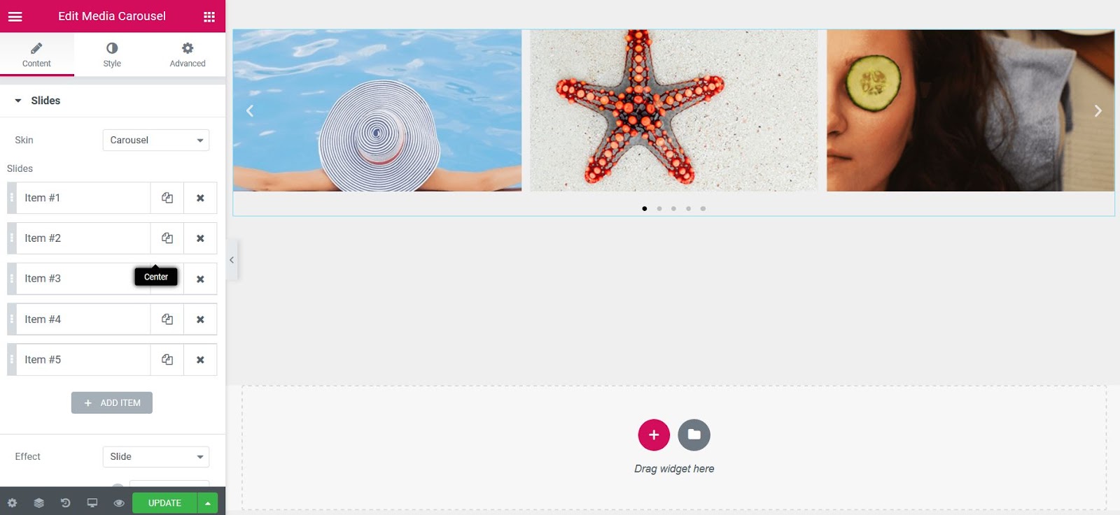
- Carousel is the standard rotating carousel skin that displays a custom number of image or video slides per view.
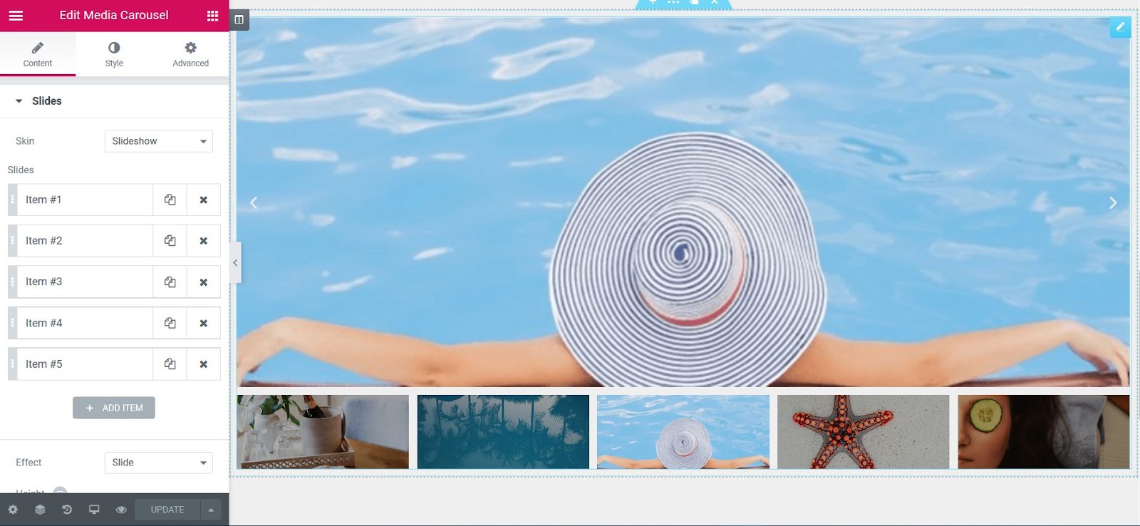
- Slideshow is a slider mask showing a main slide and small image thumbnails below.
- Current flow It is a slider skin that shows a center slide on the front and two side sliders on the back.
Within each slide, you can add the image or video and have it link to your media file or an external link. The carousel can display a combination of images and videos at the same time.
If you have Lightbox enabled, this will also be available for this widget.
The Media Carousel widget also has options for optimal viewing on mobile devices.
Carousel skin
Content
Slideshow
- Skin: Carousel
- Slideshow: Choose image or video to display and set URL to link
- Effect: Choose how each slide changes, whether it is Slide, Fade, or Cube
- Slides per view: Sets the number of slides to view at a time, maximum 10
- Slides to get around: Sets the number of slides to scroll per slide, maximum of 10
- Height: Sets the height of the carousel
- Width: Sets the width of the carousel
Additional options
- Arrows: Choose to show or hide the navigation arrows
- Pagination: Select None, Points, Fraction or Progress
- Duration of transition: Set the time it takes for each slide to appear. This time is in milliseconds, so 1000 ms is equal to 1 second.
- Self-reproduction: Show or hide
- Auto play speed: Sets the time between each slide. This time is in milliseconds, so 1000 ms is equal to 1 second.
- Infinite loop: Displays the carousel in a continuous loop, infinitely. Yes or no
- Pause in interaction: Select whether or not to pause autoplay when a user interacts with the carousel. Yes or no
- Cover: Select the type of overlay, when the user hovers the cursor over a slide. None, text or icon
- Image size: Select the image size, from Thumbnail to Full or Custom
- Image adjustment: Select how the image fits into its container, either Cover, Contain, or Automatic
Slideshow skin
Content
- Skin: Slideshow
- Slideshow: Choose image or video to display and set URL to link
- Effect: Choose how each slide changes, whether it is Slide, Fade, or Cube
- Height: Sets the height of the carousel
- Miniatures:
Slideshow By sight: Number of slides, per view, maximum 10
Proportion: Select from 1: 1, 4: 3, 16: 9 or 21: 9
Additional options
- Arrows: Choose to show or hide the navigation arrows
- Duration of transition: Set the time it takes for each slide to appear. This time is in milliseconds, so 1000 ms is equal to 1 second.
- Self-reproduction: Show or hide
- Auto play speed: Sets the time between each slide. This time is in milliseconds, so 1000 ms is equal to 1 second.
- Infinite loop: Displays the carousel in a continuous loop, infinitely. Yes or no
- Pause in interaction: Select whether or not to pause autoplay when a user interacts with the carousel. Yes or no
- Image size: Select the image size, from Thumbnail to Full or Custom
- Image adjustment: Select how the image fits into its container, either Cover, Contain, or Automatic
Coverflow skin

Content
- Skin: Current flow
- Slideshow: Choose image or video to display and set URL to link
- Slides per view: Sets the number of slides to view at a time, maximum 10
- Slides to get around: Set the number of slides to scroll per slide, maximum of 10
- Height: Sets the height of the carousel
- Width: Sets the width of the carousel
Additional options
- Arrows: Choose to show or hide the navigation arrows
- Pagination: Select None, Points, Fraction or Progress
- Duration of transition: Set the time it takes for each slide to appear. This time is in milliseconds, so 1000 ms is equal to 1 second.
- Self-reproduction: Show or hide
- Auto play speed: Sets the time between each slide. This time is in milliseconds, so 1000 ms is equal to 1 second.
- Infinite loop: Displays the carousel in a continuous loop, infinitely. Yes or no
- Pause in interaction: Select whether or not to pause autoplay when a user interacts with the carousel. Yes or no
- Cover: None, Text or Icon
- Yes Text is chosen:
Subtitle: Choose the text to be displayed as the title: title, title or description
Animation: Choose from Fade, Swipe Up, Swipe Down, Swipe Right, Swipe Left, Zoom In - Yes Icon is chosen:
Icon: Choose from a search icon, plus icon, eye icon, or link icon - Animation: Choose from Fade, Swipe Up, Swipe Down, Swipe Right, Swipe Left, Zoom In
- Image size: Select the image size, from Thumbnail to Full or Custom
- Image adjustment: Select how the image fits into its container, either Cover, Contain, or Automatic
Style
Slideshow
- Space between: Sets the space between slides
- Background color: Choose a background color for the carousel
- Border size: Controls the thickness of the border
- Border color: Choose a border color
- Filling: Sets the padding
- Edge radius: Sets the radius of the border to control the roundness of the corners
Navigation
Arrows
- Size: Scales the size of the arrow up or down
- Colour: Choose the color of the arrows
Pagination (not available in slide show type)
- Position: Place pagination outside or inside slides
- Size: Scales the pagination size up or down
- Colour: Sets the pagination color
Playback icon (you must have videos on your slides to view it)
- Colour: Sets the color of the video playback icon
- Size: Sets the size of the video playback icon
- Text shadow: Sets the text shadow of the video play icon
Overlay (not available in slide show type)
If Text was chosen for the overlay:
- Background color: Choose a background color for the overlay
- Text color: Choose the color of the overlay text
- Typography: Change the typography options for the overlay text
If the icon was chosen for overlay:
- Background color: Choose a background color for the overlay
- Text color: Choose the color of the overlay icon
- Icon size: Scales the size of the overlay icon up or down
Light box
- Colour: Choose the background color of the light box
- User interface color: Choose the color of the user interface. This affects the arrow and dot navigation of the lightbox and the close X icon.
- UI Scroll Color: Choose the scrolling color of the user interface. This affects the navigation of arrows and points in the lightbox and the close icon of the X when the user hovers over each one.
- Video width: Sets the width of the video
Note: Autoplay is affected by Google autoplay policy in Chrome browsers.
Note: Using Elementor template shortcodes within the widget can sometimes work, but it is not a supported feature.
Advanced
Set the advanced options that are applicable to this widget


