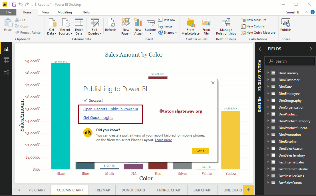
En este artículo, le mostramos el enfoque paso a paso para publicar informes de escritorio de Power BI en el servicio Power BI con un ejemplo práctico. Antes de comenzar…
En este artículo, le mostramos el enfoque paso a paso para publicar informes de escritorio de Power BI en el servicio Power BI con un ejemplo práctico. Antes de comenzar…
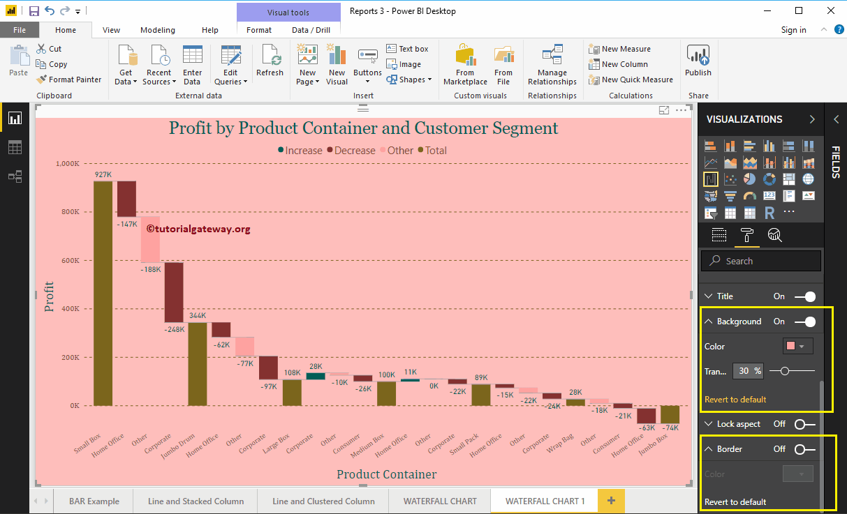
How to format Power BI waterfall chart with example? Formatting the waterfall chart includes changing the colors of the bars, the title text…
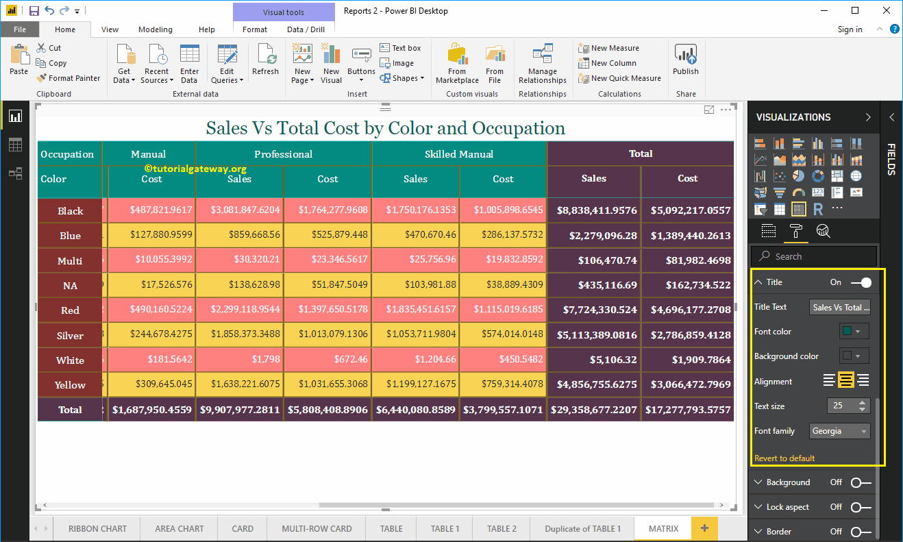
How to format Power BI Matrix report with example? The Power BI Format Matrix includes changing the colors of the matrix grid, the formatting…
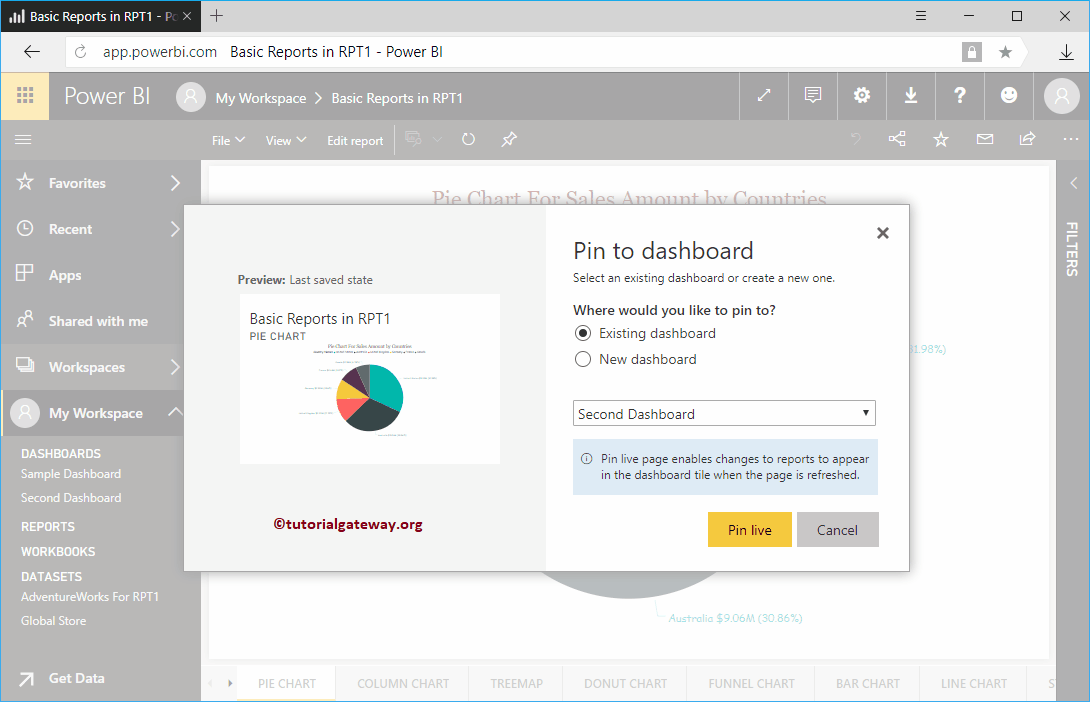
How to add reports to Power BI dashboard with a practical example? Before moving on to the actual example of Adding reports to the Power BI dashboard, let me show you the dashboards…
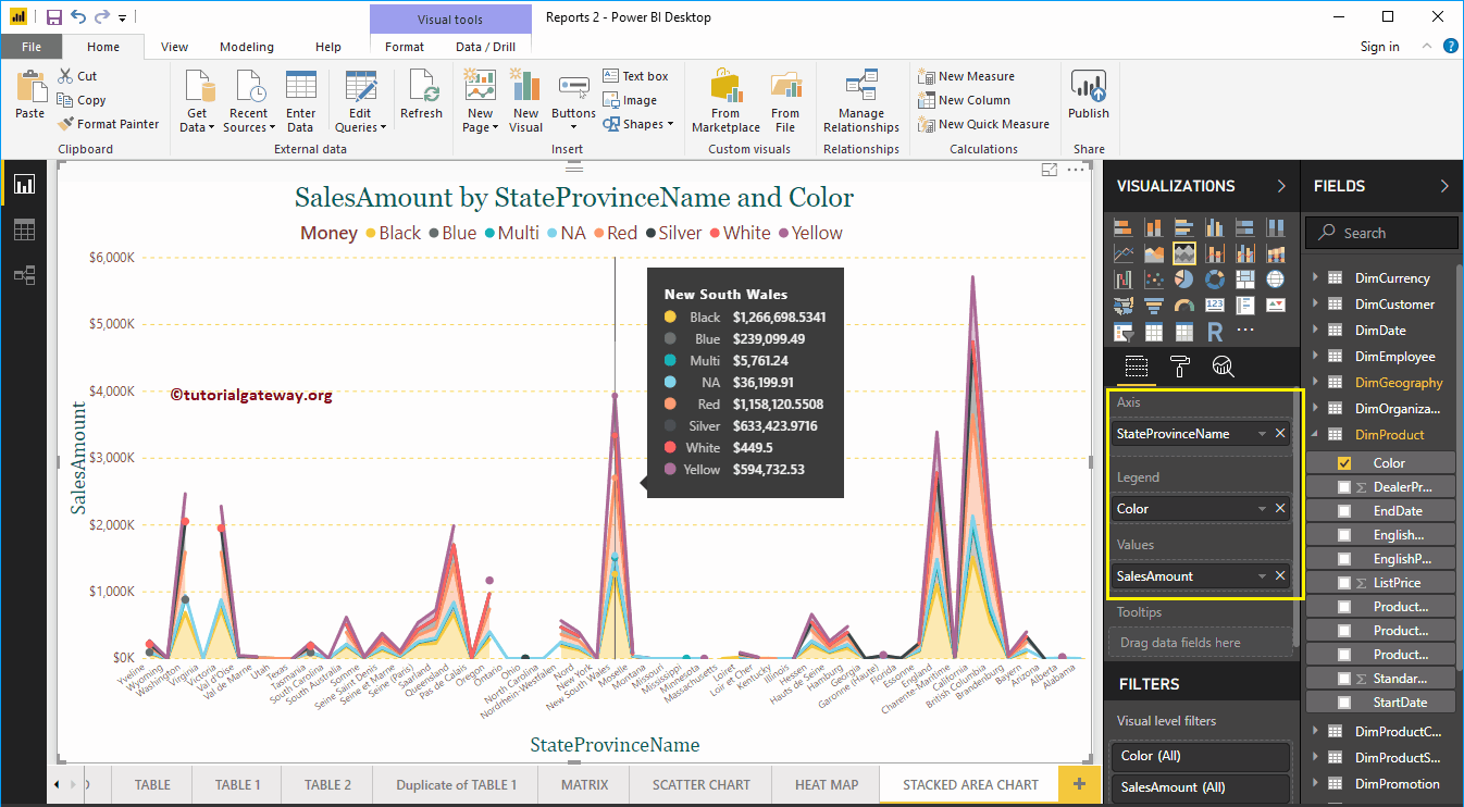
How to create a stacked area chart in Power BI with an example? For this Power BI stacked area chart demo, we will use the SQL data source…
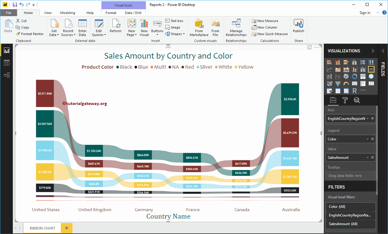
The Power BI ribbon chart is useful for quickly identifying which categorical data has the highest rank (large values). Let me show you how to create a tape chart…
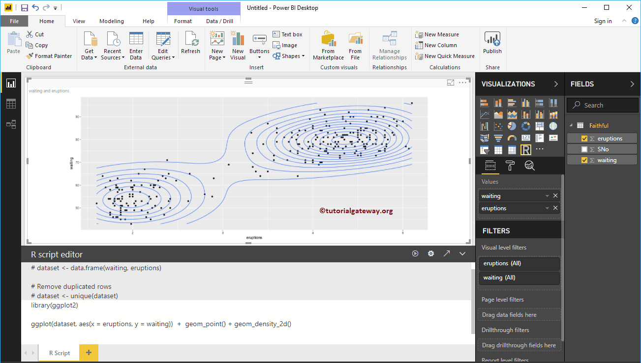
Power BI R Script allows you to use R visuals or R charts within your Power BI dashboard. Using an R script within Power BI is…
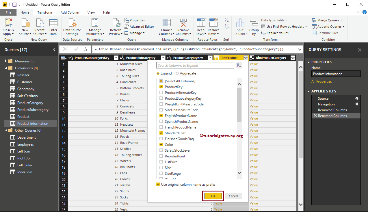
Merge multiple tables in Power BI: In real time, your data is in a normalized format, but in some situations, you may need the denormalized data. In this situation,…
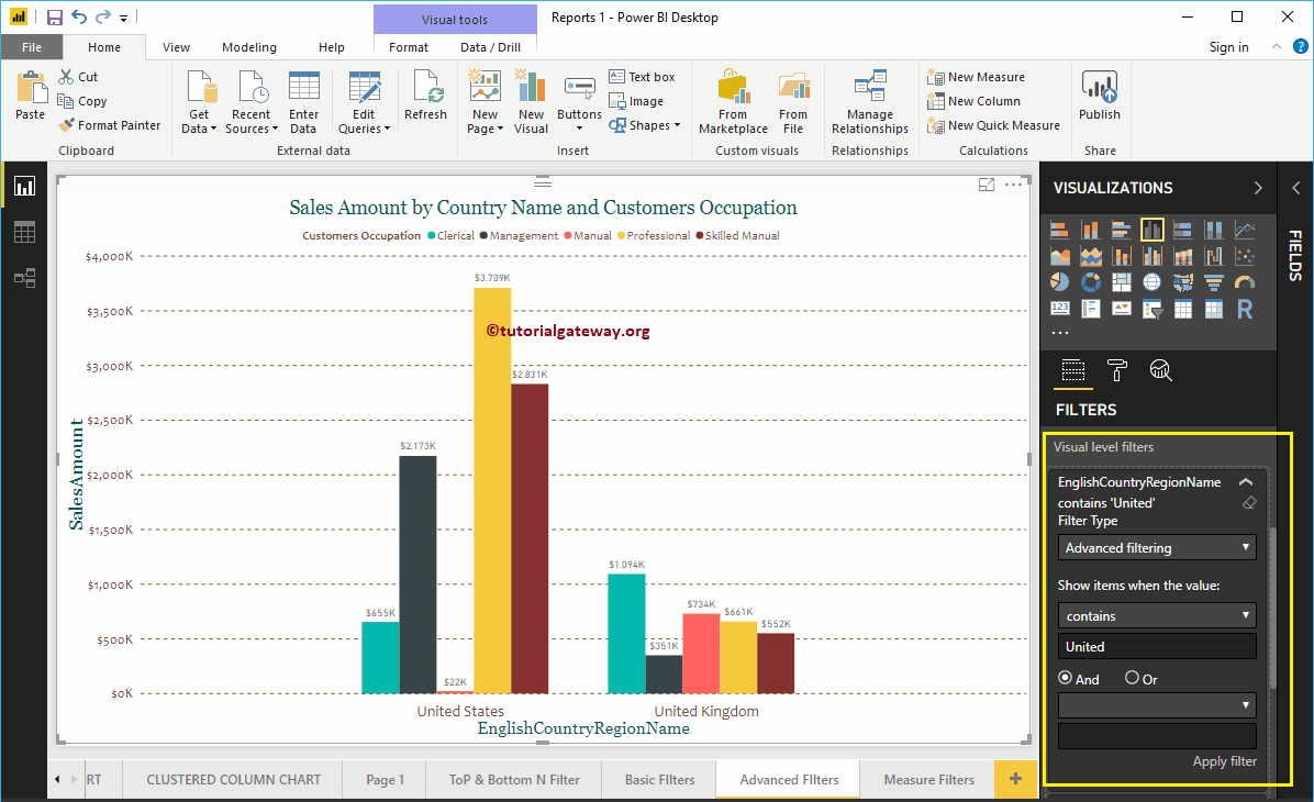
How to create advanced Power BI filters with an example?. Power BI advanced filters use wildcards to restrict report data based on requirements. For example,…
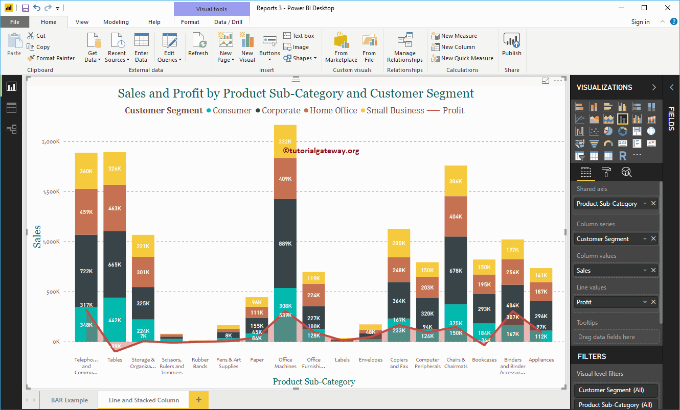
The Power BI stacked column and line chart helps you visualize multiple dimensions and measures. Let me show you how to create a stacked line and column chart in…


© 2024 R Digital Marketing.