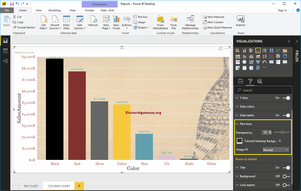
How to format Power BI column chart with example? Formatting Power BI column chart includes changing the color of the bar, the…
How to format Power BI column chart with example? Formatting Power BI column chart includes changing the color of the bar, the…
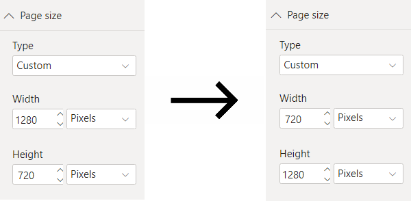
Reading time: 4 minutes The default Power BI report layout uses a landscape orientation. While it's not common to see report pages that use the...
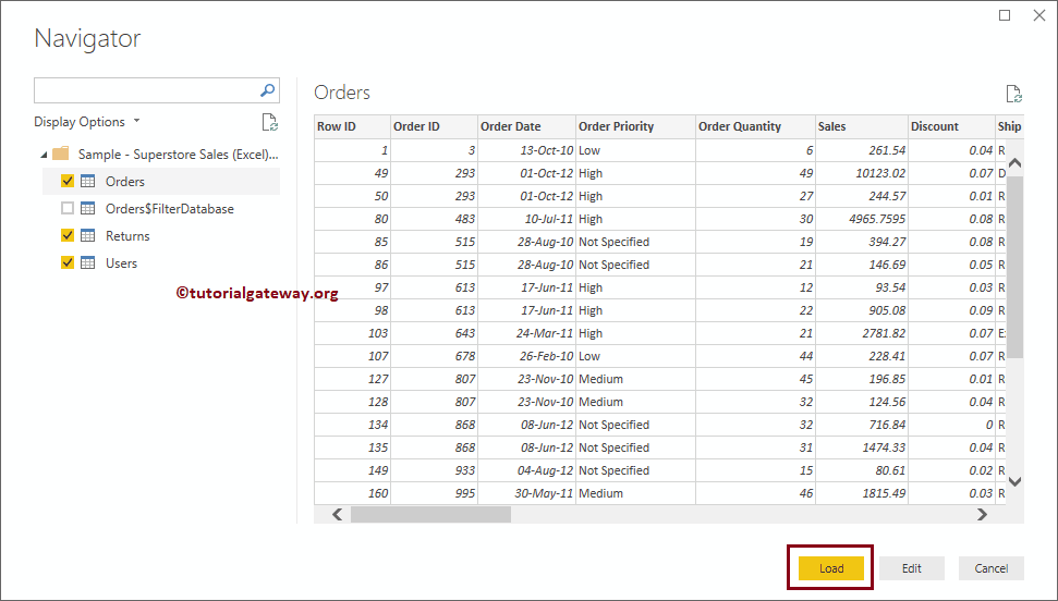
In this article, we show you how to connect Power BI to multiple Excel sheets and how to use the data present in those Excel sheets. To demonstrate the connection of…
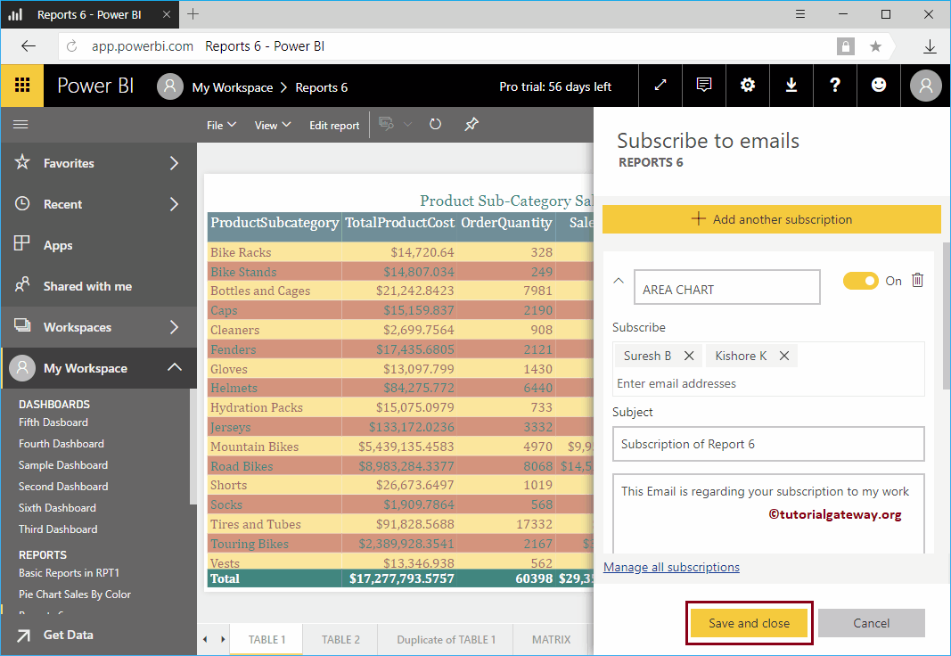
Let me show you the procedure to subscribe Power BI report with a practical example. Before you begin the Power BI report email subscription process,…
En Power BI, puede crear una tabla personalizada o una tabla calculada a partir de la tabla existente. En este artículo, le mostramos cómo crear tablas calculadas en Power BI…
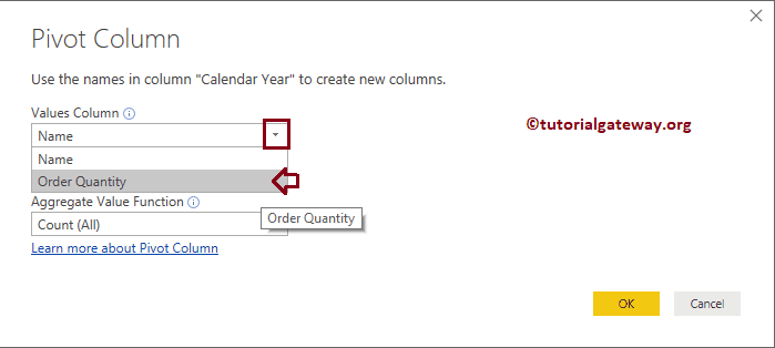
The Power BI PivotTable option converts selected rows to columns. Let me show you how to create a pivot table or how to convert the non-pivot table to a…
Power BI Slicer is commonly used to add filters to the canvas or to display filters on the report canvas. Let me show you how to create a Slicer in Power BI with…
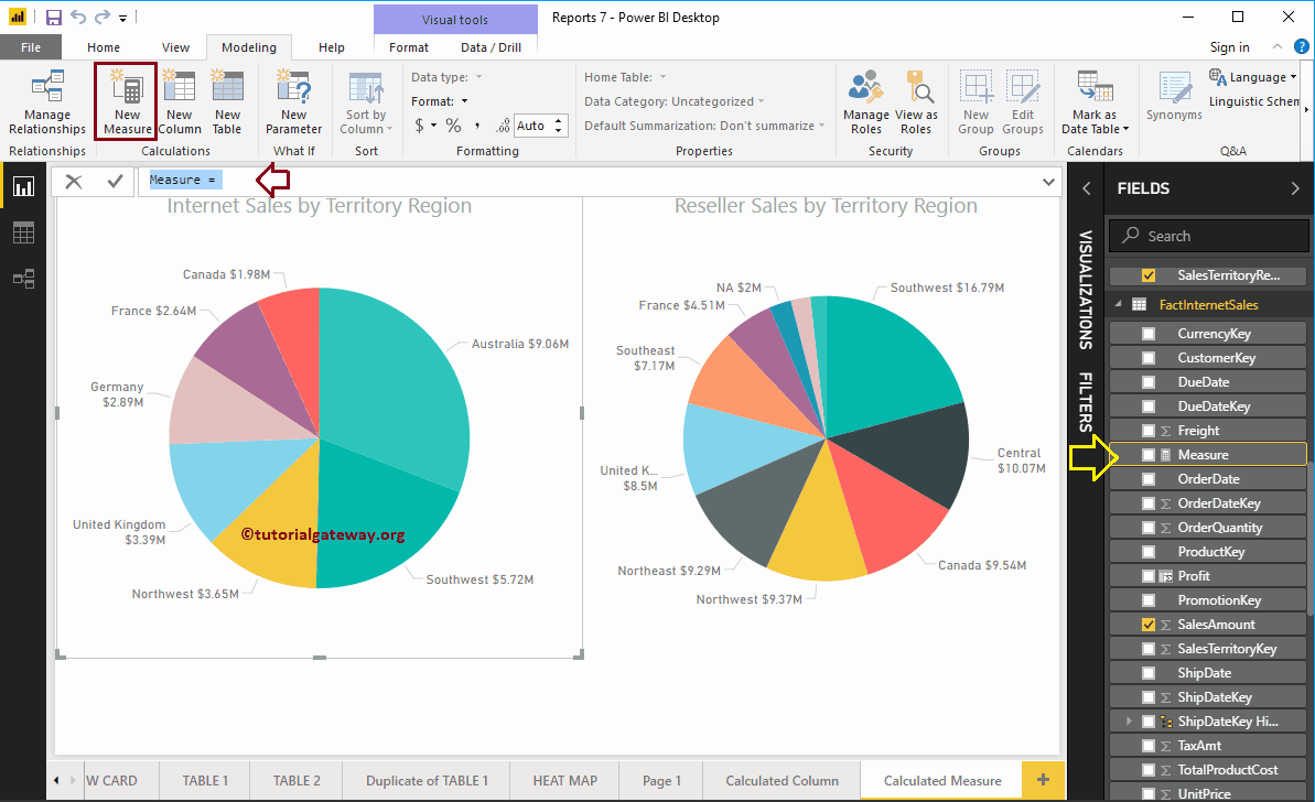
En Microsoft Power BI, puede crear una medida calculada personalizada (o cálculo agregado numérico) a partir de columnas existentes. En este artículo, le mostramos cómo crear medidas calculadas en Power…
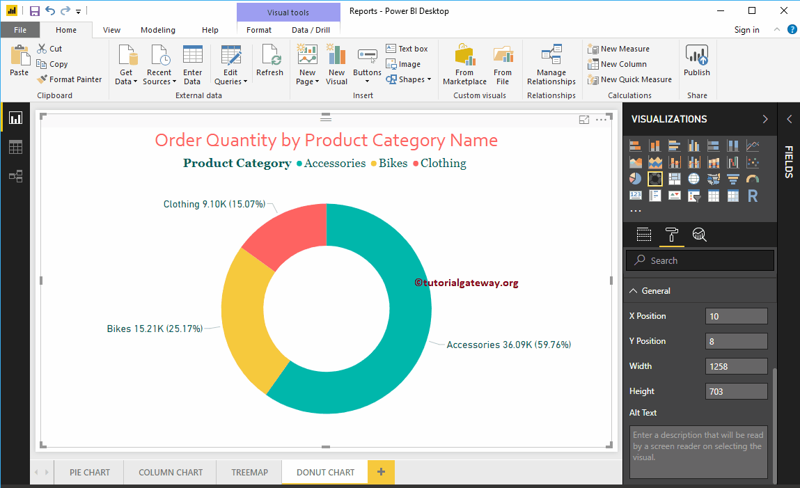
Power BI Donut Chart es similar al gráfico circular, que es útil para visualizar los datos de nivel superior. En este artículo, le mostramos cómo crear un gráfico de anillos…
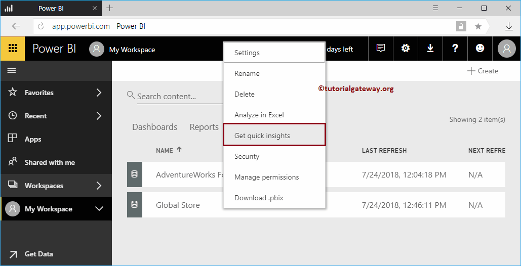
Let me show you how to get insights into the Power BI workspace with a practical example. Before we begin to search for or obtain information about the data of…


© 2024 R Digital Marketing.