Power BI R Script allows you to use R visuals or R charts within your Power BI dashboard. Using an R script within Power BI is very helpful for data scientists to put their work in one place.
In this section, we show you how to create a chart using Power BI R Script by example. For this Power BI R Script demo, we will use the Faithful CSV file created by R studio.
I suggest you check out R programming to understand the code we use in this Power BI article.
Create a Power BI R script visual
In Power BI, you can use this R Script Visual to create R charts within a Power Bi dashboard.
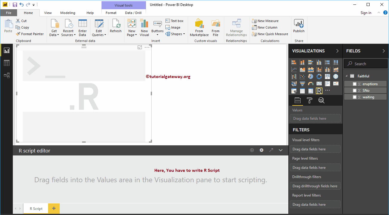
First, click on R Script Visual under the Display section. Automatically create an R chart with an R script editor, as shown in the following screenshot.
You must use this window of the R script editor to write an R script.
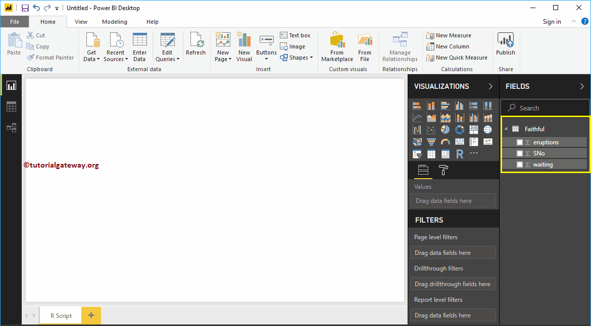
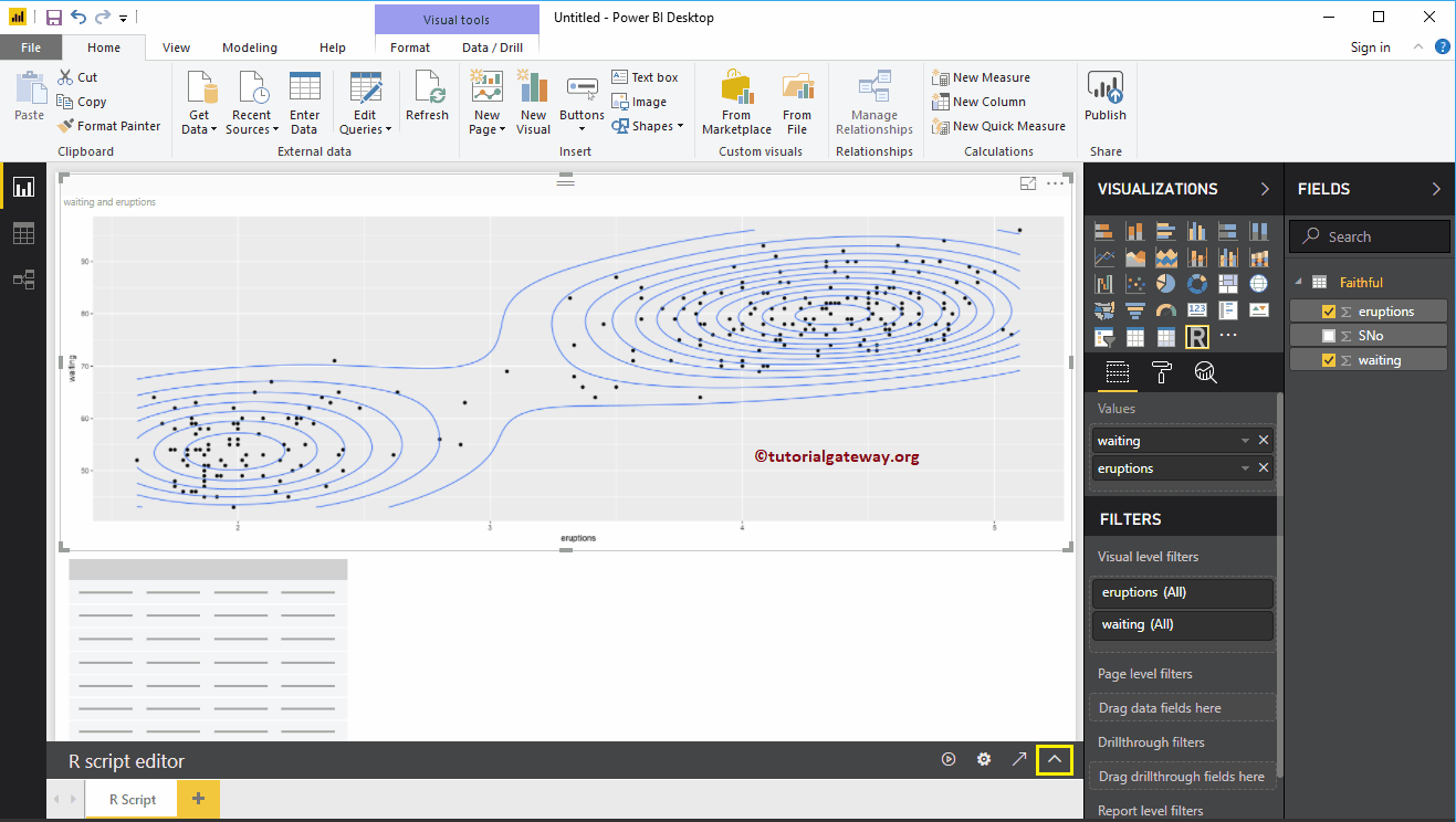
Before you start writing R code, you must create a dataset. You can do this by dragging the required fields to the Values section. For this demo, let me drag eruptions and wait columns into the Values section.
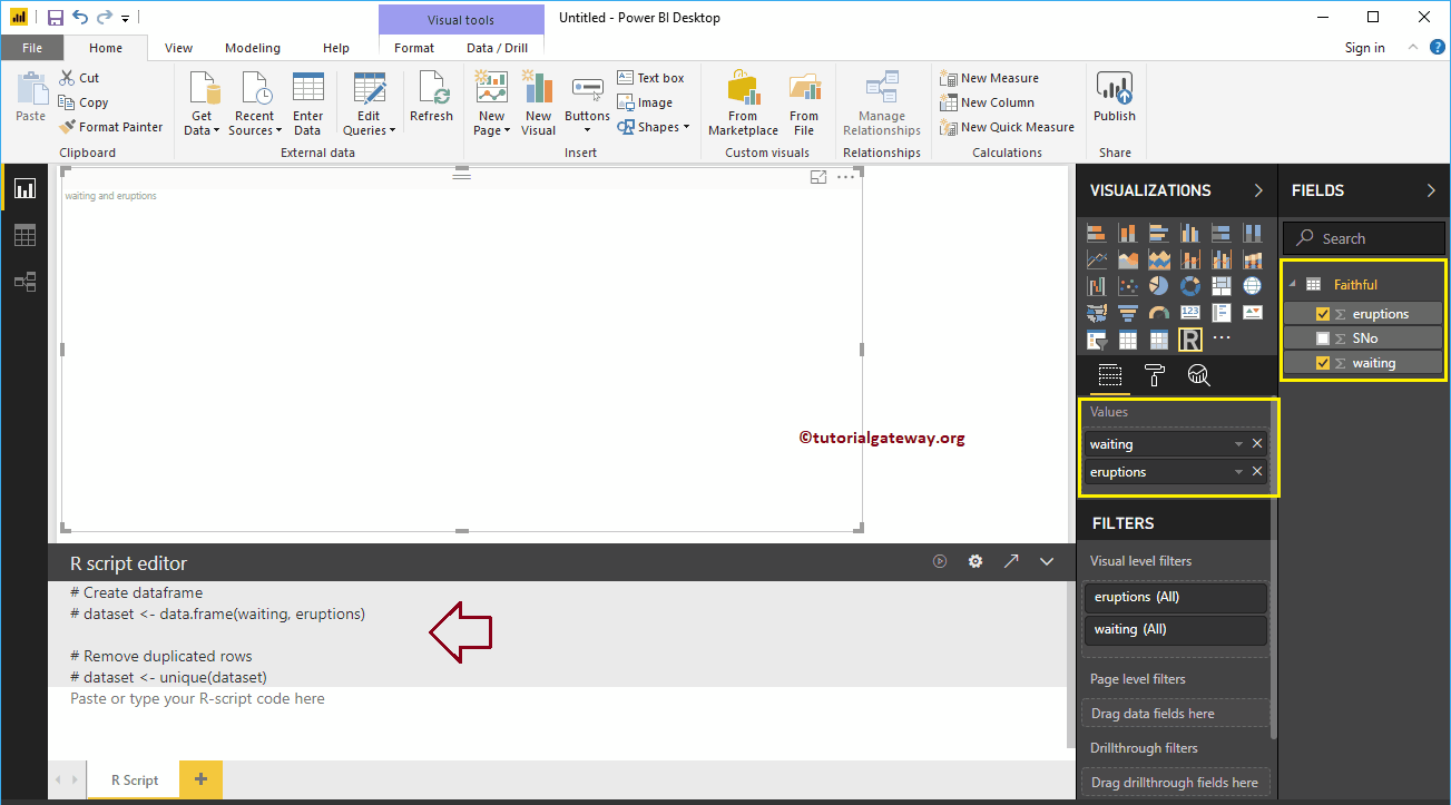
As you can see in the screenshot above, Power BI has automatically generated a dataset for you. Now, you need to use this dataset to create your R visual.
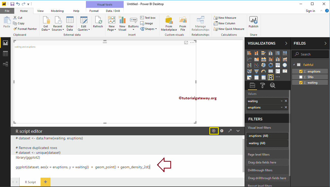
Here, we use ggplot2 to create a 2D scatterplot. I suggest you refer to the Create a Scatter Plot article to understand this code.
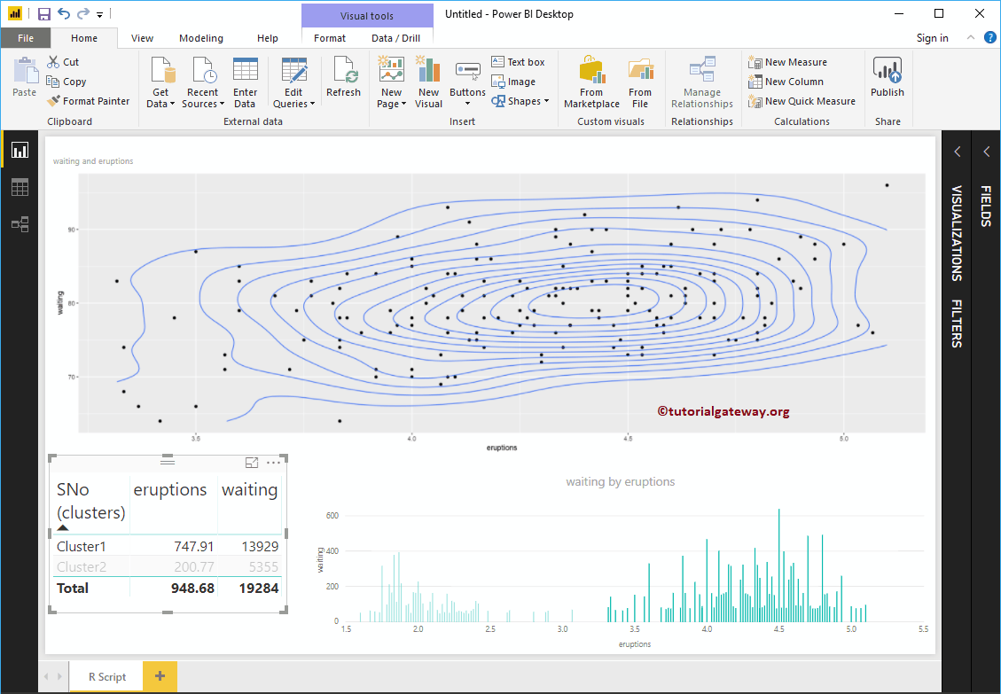
library (ggplot2) ggplot (dataset, aes (x = eruptions, y = waiting)) + geom_point () + geom_density_2d ()
Once you have finished writing your script, click the Run button
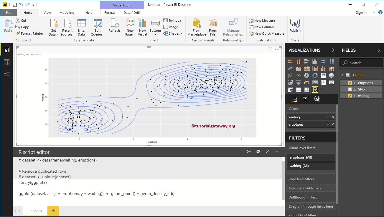
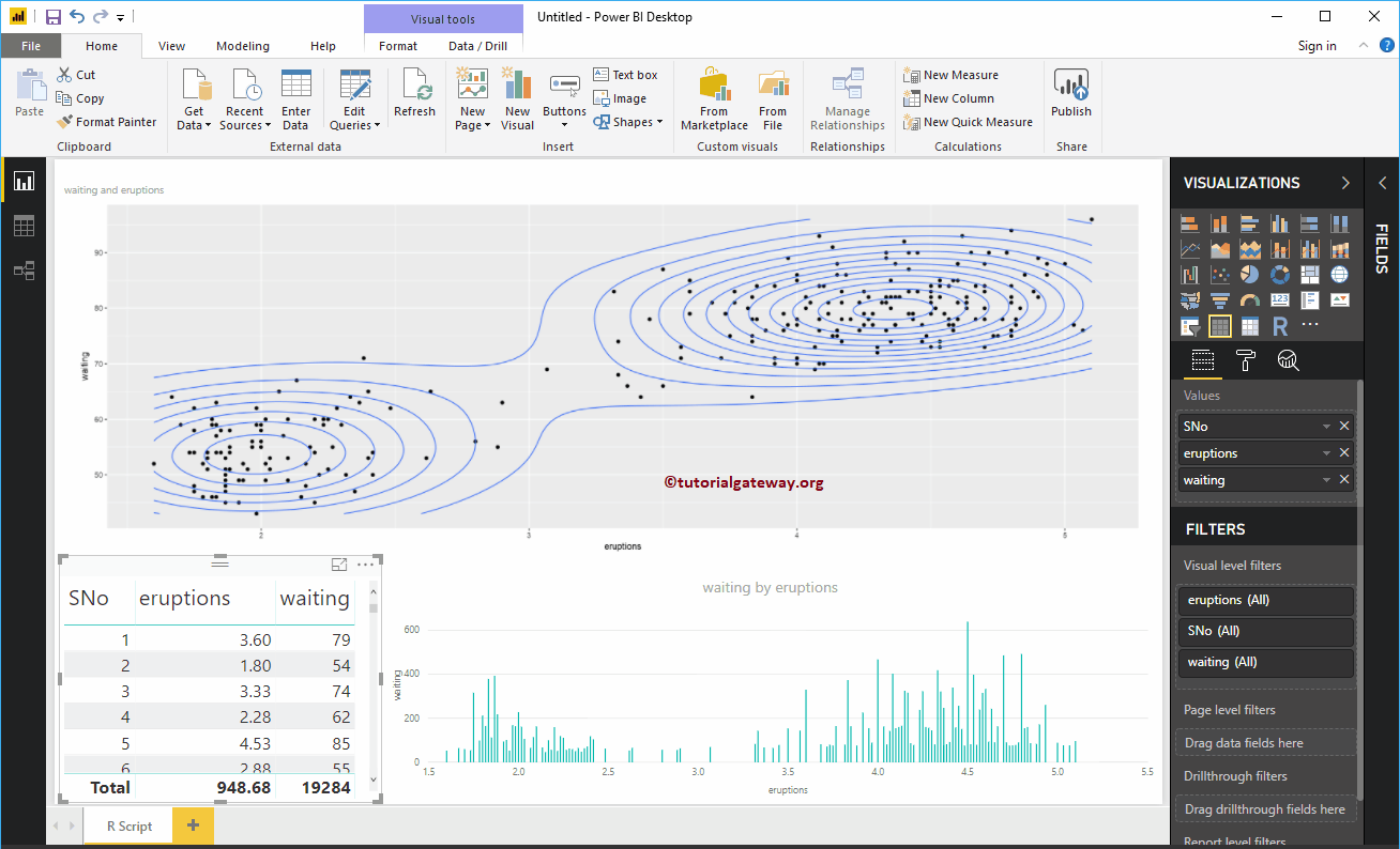
In the screenshot below, you can see the R chart.
Like any other chart in Power BI, you can also apply filters on the R chart. To demonstrate Power BI R script filters, first let me create a table.
We also create a column chart.
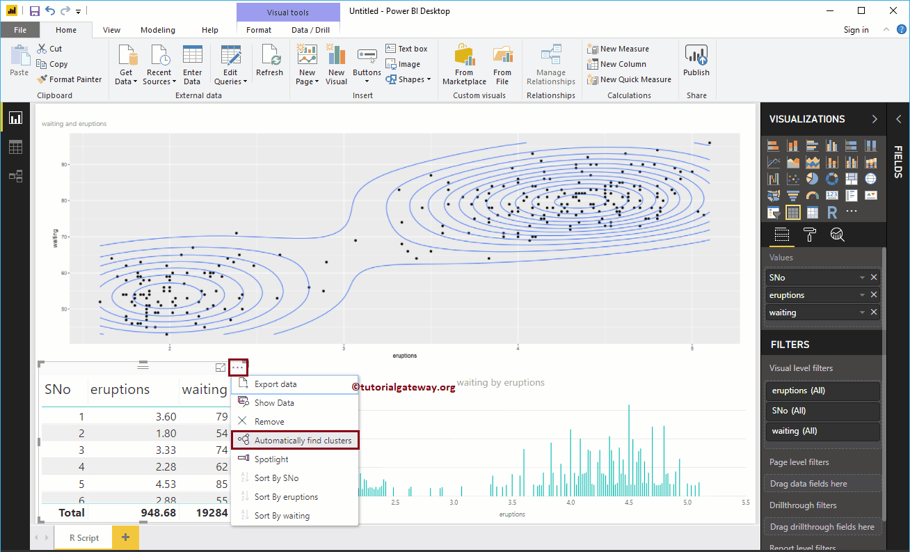
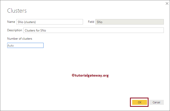
I think there is too much data in the table to apply filters. So, let me create a cluster.
We leave the default settings
As you can see, you have created two groups. Next, we replace the Sno with the Cluster column in a table
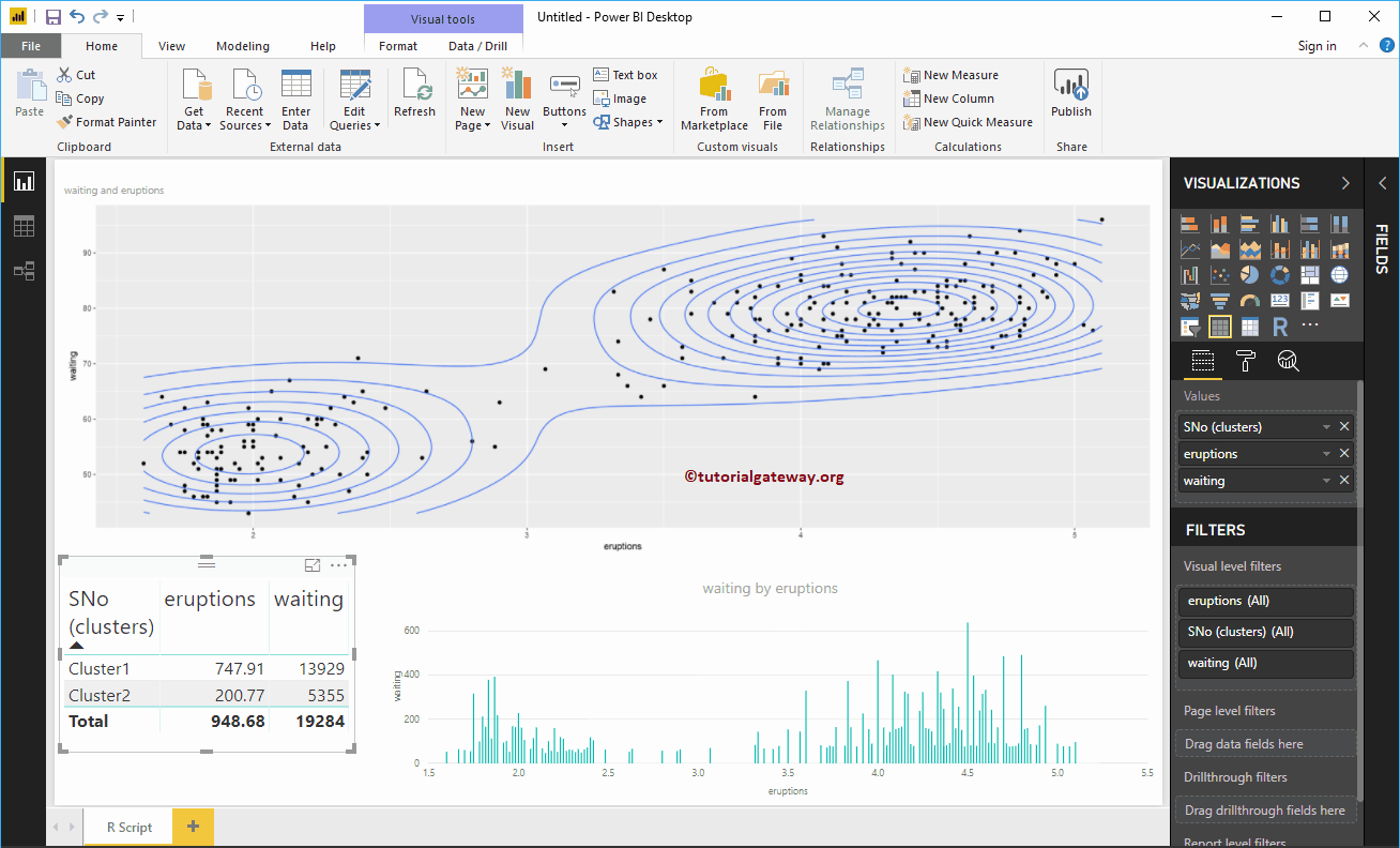
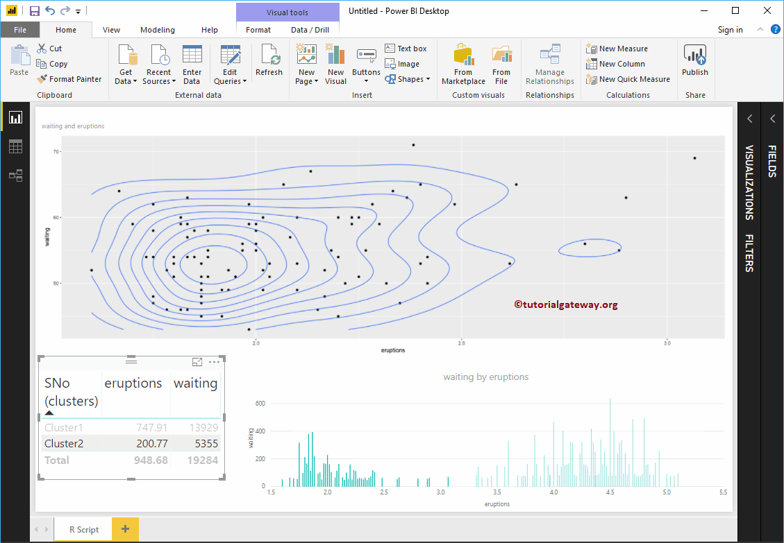
Let me select Cluster 1. In the screenshot below, you can see that the R visual is filtering.

Also try the other group

Create a Power BI R Visual 2 script
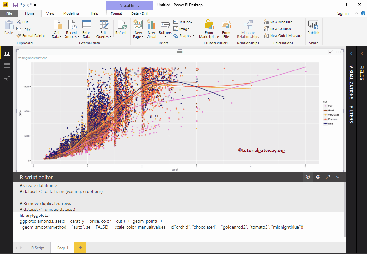
In Power BI, you can also create a visual R object with default datasets available in R. To demonstrate the same, we are using the Diamonds dataset.
library (ggplot2) ggplot (diamonds, aes (x = carat, y = price, color = cut)) + geom_point () + geom_smooth (method = "auto", se = FALSE) + scale_color_manual (values = c ("orchid" , "chocolate4", "goldenrod2", "tomato2", "midnightblue"))
In the screenshot below, you can see the R Script in the report.