How to format Power BI scatter chart with an example? Formatting the scatter chart includes changing the scatters (pie shapes), colors, scatter chart title text, title position, X and Y axis details, data colors, and image images. background, etc.
To demonstrate these scatter chart formatting options, we'll use the scatter chart we created earlier. See the article Scatter chart in Power BI to understand the steps required to create a Power BI scatter chart.
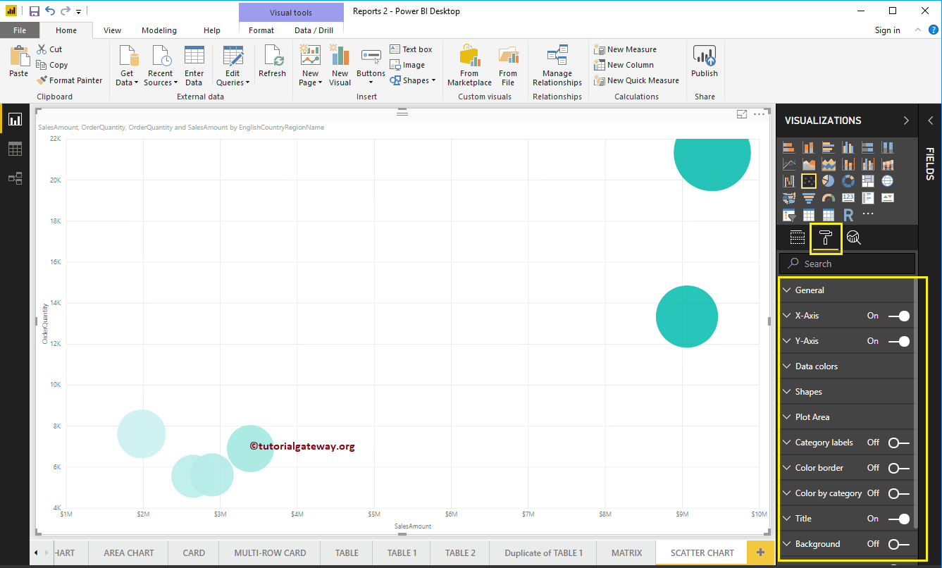
How to Format the Power BI Scatter Chart
Click on the Format to see the list of formatting options that are available for this scatter plot.
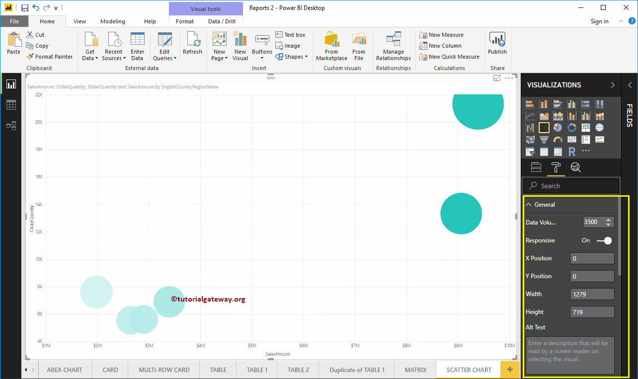
Format general Power BI scatter chart settings
Use this general section to change the data volume, chart responsiveness, X, Y position, width, and height of a scatter chart.
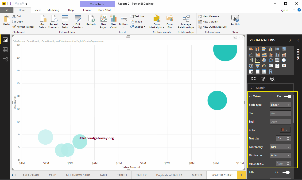
Format the X-axis of a scatter chart in Power BI
Below is the list of options that are available to format the horizontal axis or the X axis. Here, you can mention the start and end value.
As you can see in the screenshot below, we changed the color to brown, the text size to 19, and the font family to DIN.
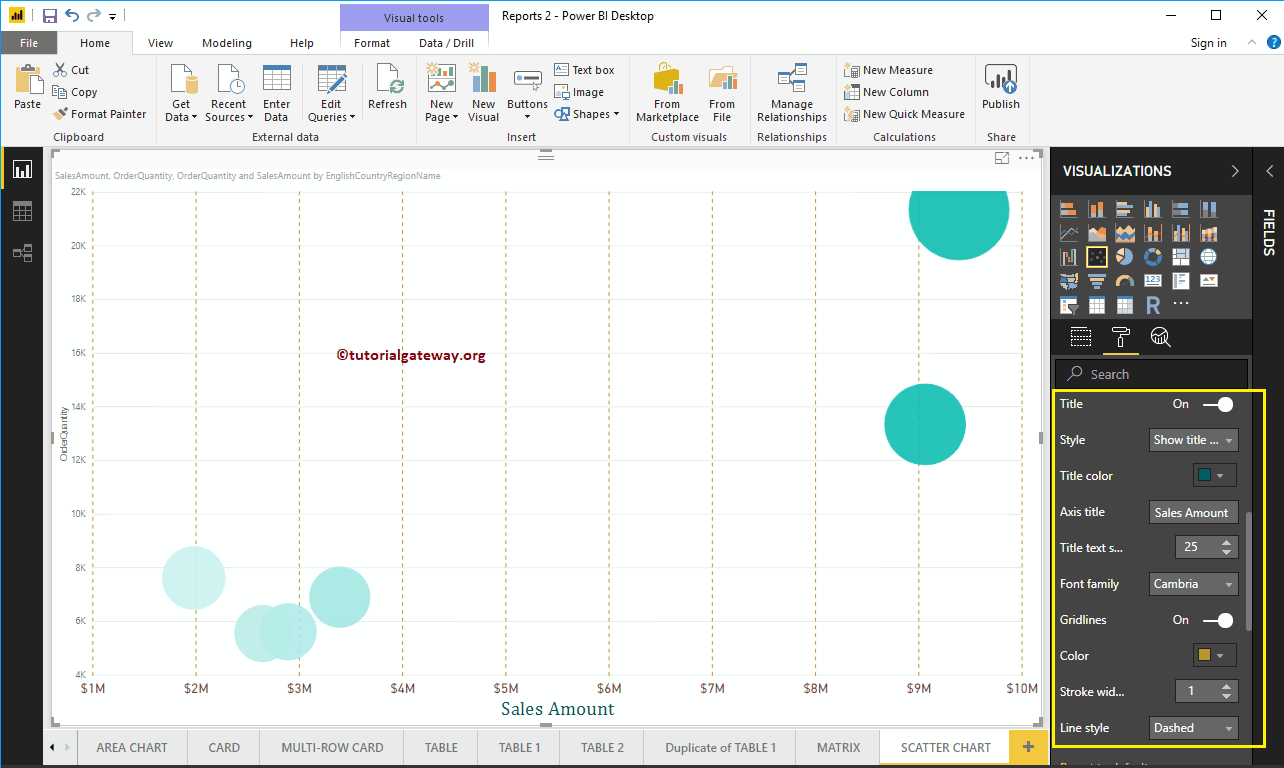
Let me change the Axis Title from SalesAmount to Sales Amount, Title Color to Green, Font Style to Cambria, and Font Size to 25.
By toggling the scatter plot Grid lines option from On to Off, you can disable the grid lines.
- Colour: You can change the color of the grid.
- Stroke width: Use this to change the width of the grid.
- Line Style: Choose the line style as Solid, Dotted, and Dashed.
Here, we change the color to gold and the line style to dashed.
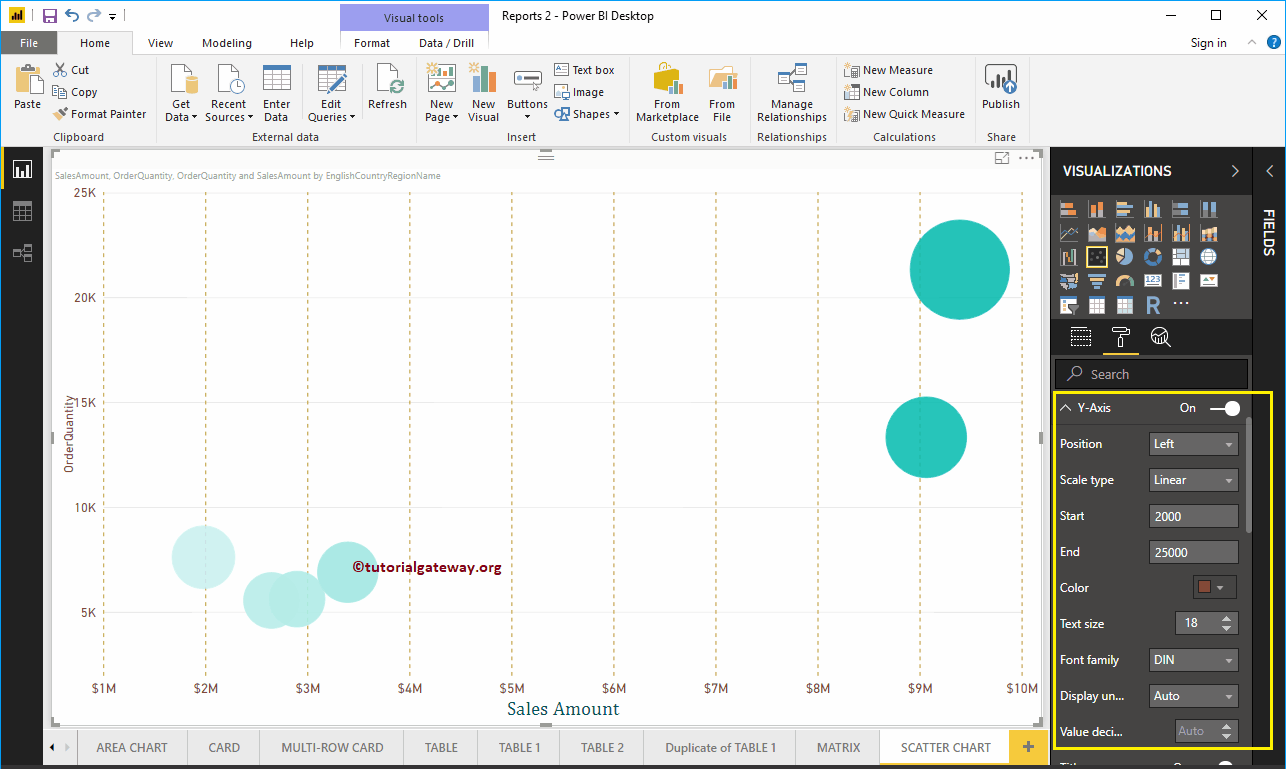
Format the Y-axis of a Power BI scatter chart
As you can see, we change the initial Y-axis value to 2000 and the final value to 25000, the Color labels to brown, and the text size to 18.
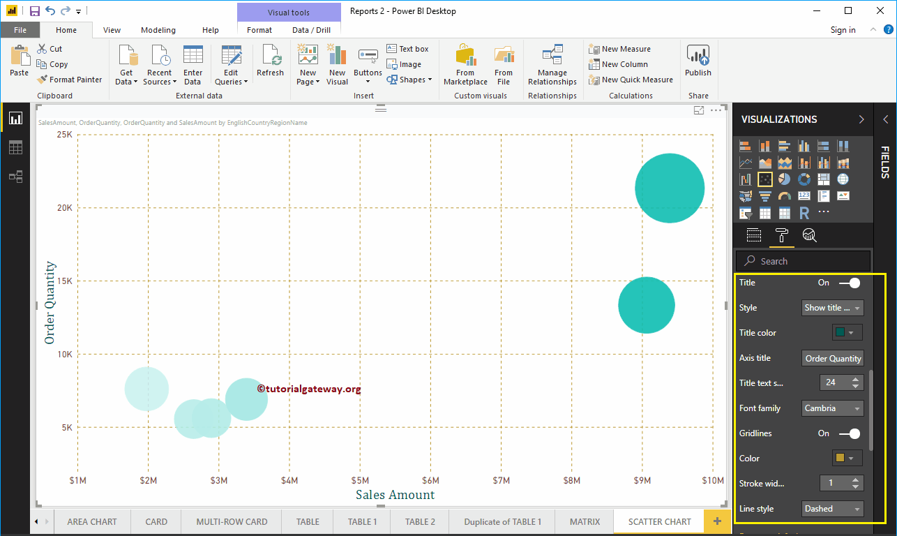
Let me change the Y-axis title from Order Quantity to Order Quantity, Title Color to Green, Text Size to 24, and Font Family to Cambria. Here, here, we also change the color of the grid lines to gold and the line style to dashed.
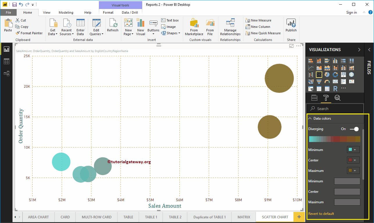
Format Power BI Scatter Chart Data Colors
While creating this scatter chart, we add the Sales Amount as Color Saturation, and that is why we see the Divergent option under Data Colors. Change the Minimum, Center and Maximum colors according to your requirements.
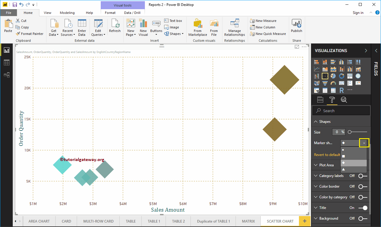
Format the scatterplot in Power BI shapes
Use this section to change the default scatter plot circles.
As you can see in the screenshot below, we changed the Marker Shape to Diamond for demonstration purposes.
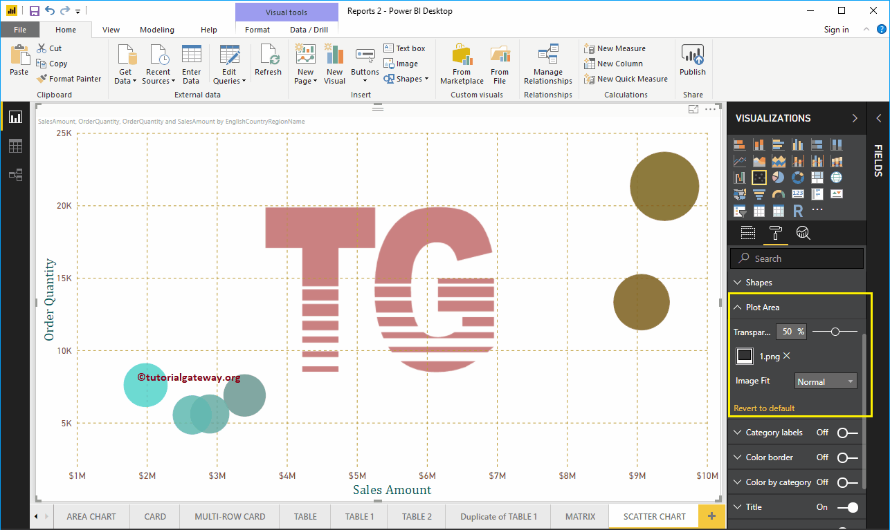
Format the scatter chart in the Power BI plot area
With this plot area property, you can add custom images as the background of the scatter plot. For demonstration purposes, we added an image as the background of the plot area.
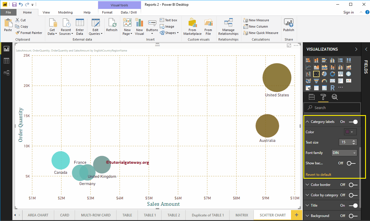
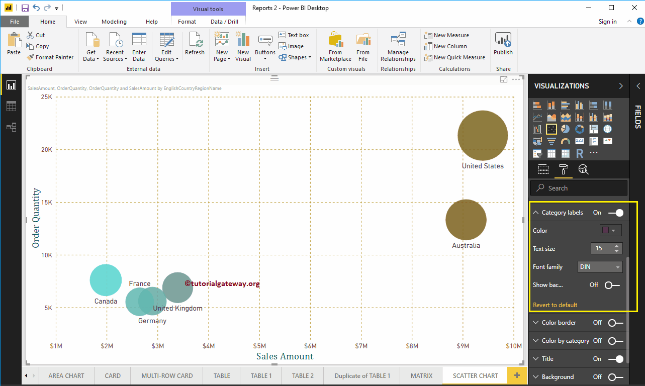
Format Power BI Scatter Chart Category Labels
Category labels mean names that represent each circle. By toggling the Category Tags option from Off to In, you can enable these tags.
In the screenshot below, you can see that we changed the color to purple, the text size to 15, the font family to DIN. If you want, you can also add the background color.
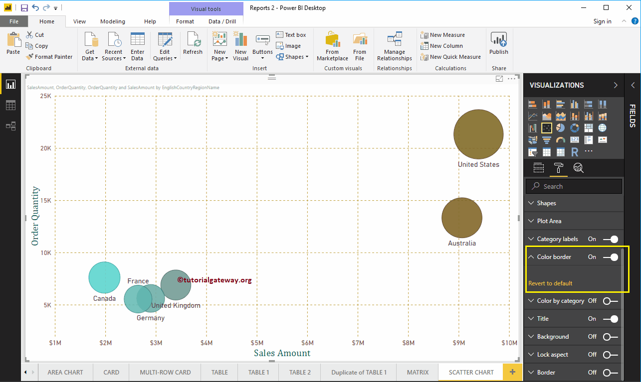
Format Power BI Scatter Chart Border Color
By toggling the Color Border option Off to In, You can enable the borders of the circle (or whatever shape you have selected).

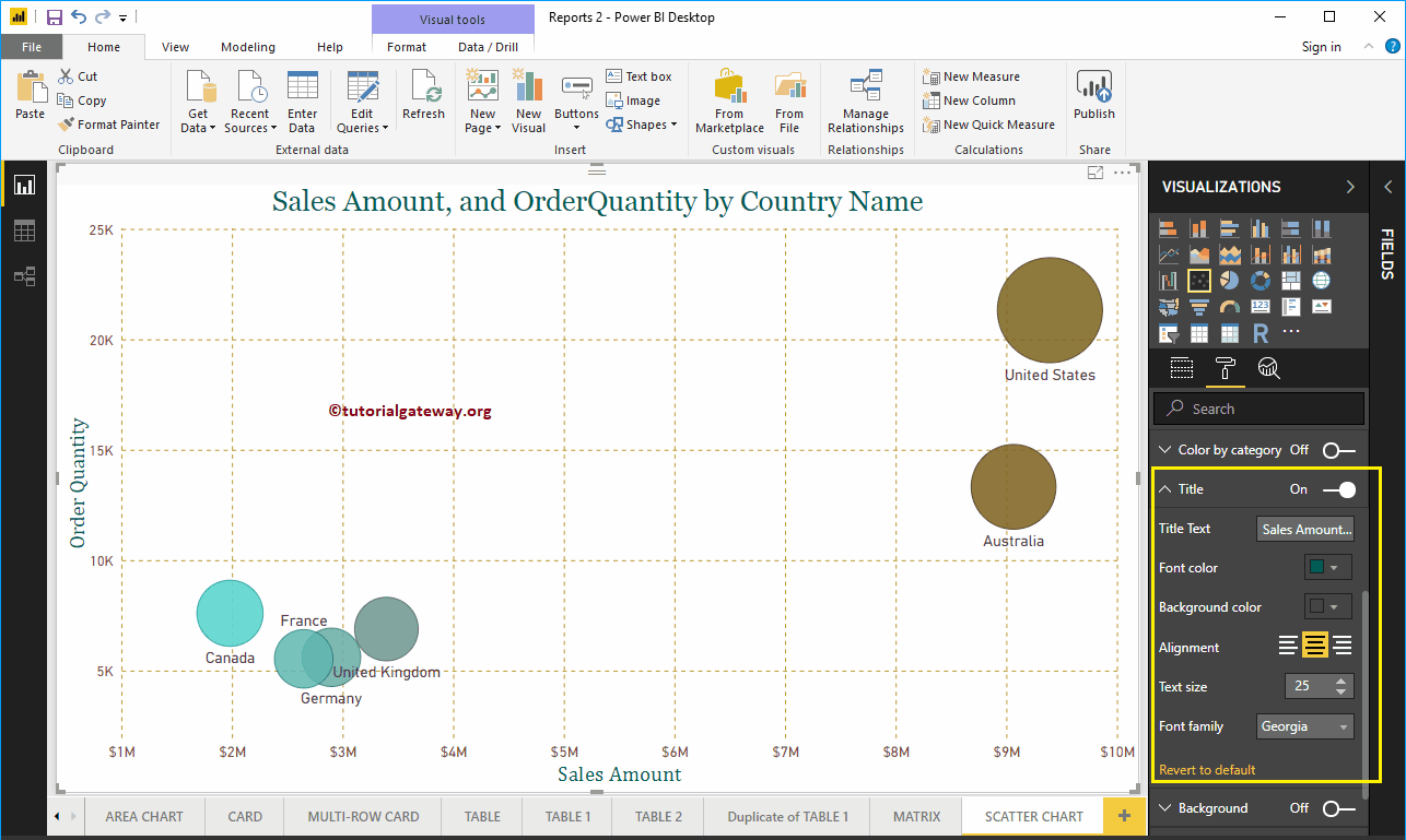
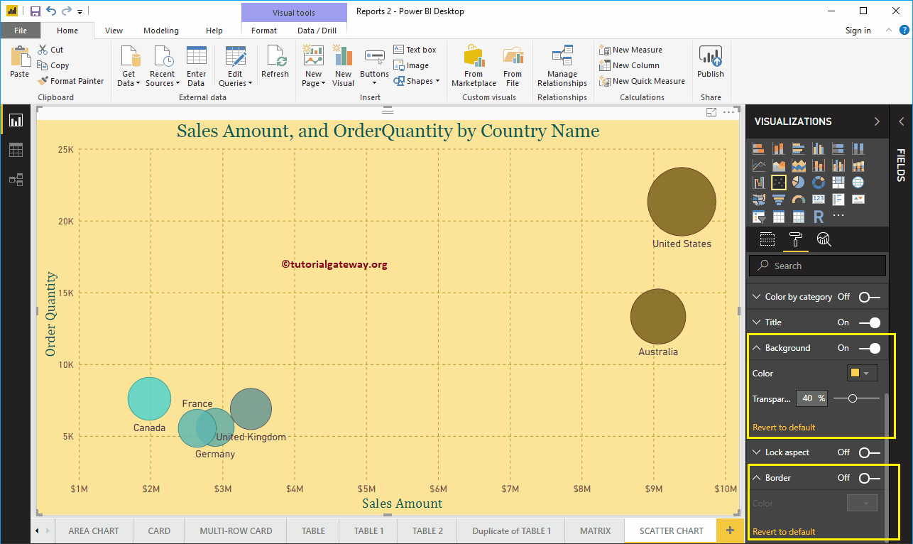
Format the Power BI scatter chart title
By toggling the Title of In to Off, you can turn off the Scatter Chart title.
In the following screenshot, you can see that we changed the title text to Sales Amount and Order Quantity by Country Name. Then Font Color to Green, Text Size to 25, Font Family to Georgia, and Title Alignment to Center. If you want, you can also add the background color to the title.

Format the background color and borders of the Power BI scatter chart
You can add a background color to a scatter plot by toggling Background option a In. For demonstration purposes, we added yellow color with a transparency 40%.
Similarly, you can add edges to a scatter plot by toggling the Border option of Off to In.
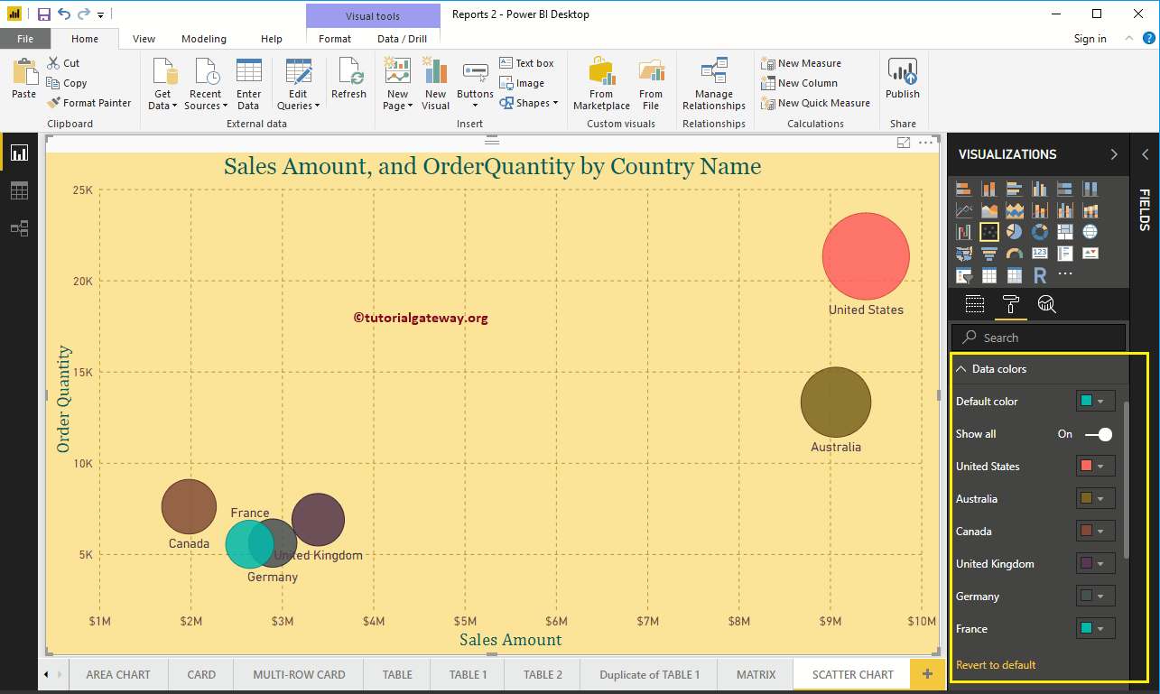
Format Power BI Scatter Chart Data Colors - Part 2
If you designed the scatter plot without placing any measured value in the Color Saturation section, the Data Colors section shows you the following options. By default, it selects some random colors, but you can change them according to your requirements.