How to format the line chart in Power BI with an example? Formatting the Power BI line chart includes changing line colors, title text, title position, axis details, data labels, and background images, and more.
To demonstrate these Power BI line chart formatting options, we used the line chart we created earlier. See the Power BI line chart article.
How to format the line chart in Power BI
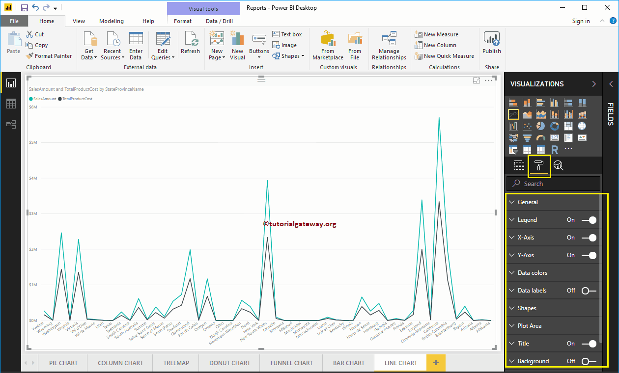
Click on the Format to see the list of formatting options that are available for this line chart.
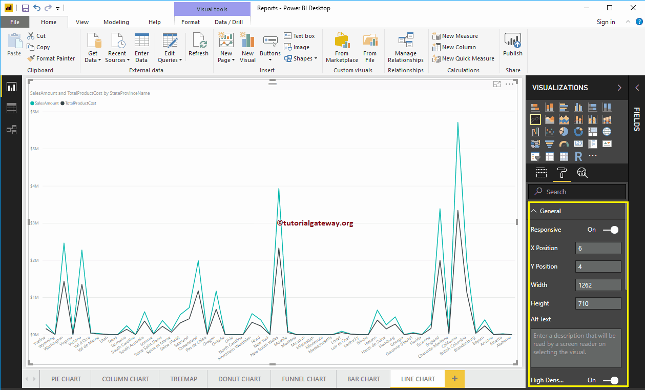
Format line chart general settings
Use this general section to change the X, Y position, width and height of a line chart
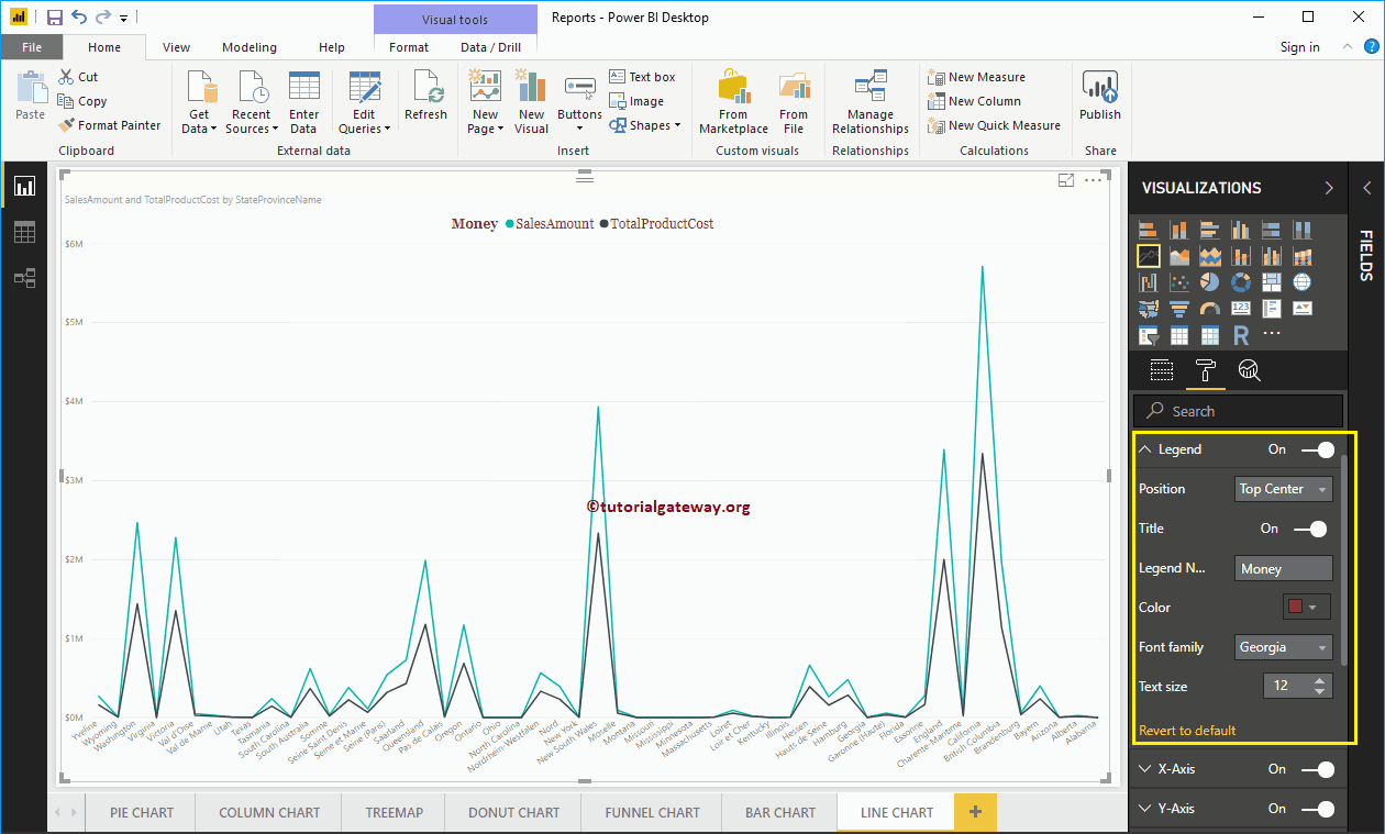
Format a line chart legend in Power BI
To display or enable the Legend, select the Power BI Legend region and change the option to Off to In. Use the Position drop-down box to change the position of the legend.
As you can see, we add Legend Title as Money, Legend Position as Top Center. And we also changed the color to brick red, the font family to Georgia, and the text size to 20.
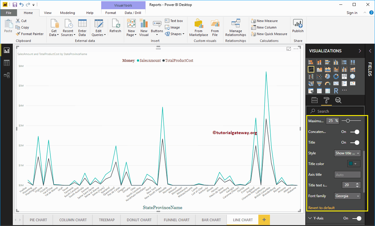
Format the X-axis of a line chart in Power BI
Below is the list of options that are available to format the horizontal axis or the X axis. As you can see in the screenshot below, we changed the color to dark gray, the font style to Candara, the size of the text to 12.
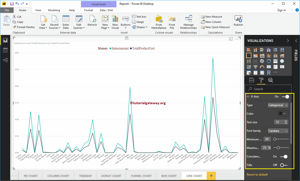
By default, the X-axis title is disabled, but you can enable it by changing Title to In. Let me change the title color to green, the font style to Georgia, and the font size to 20.
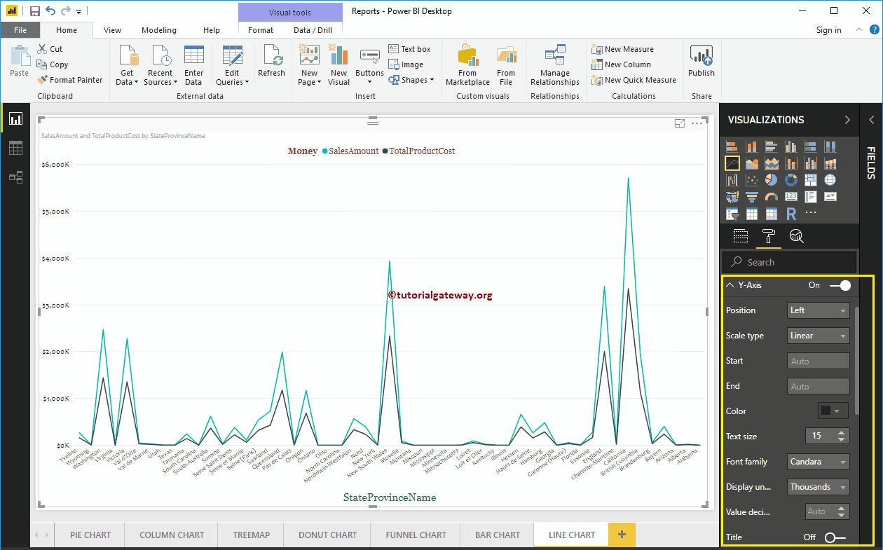
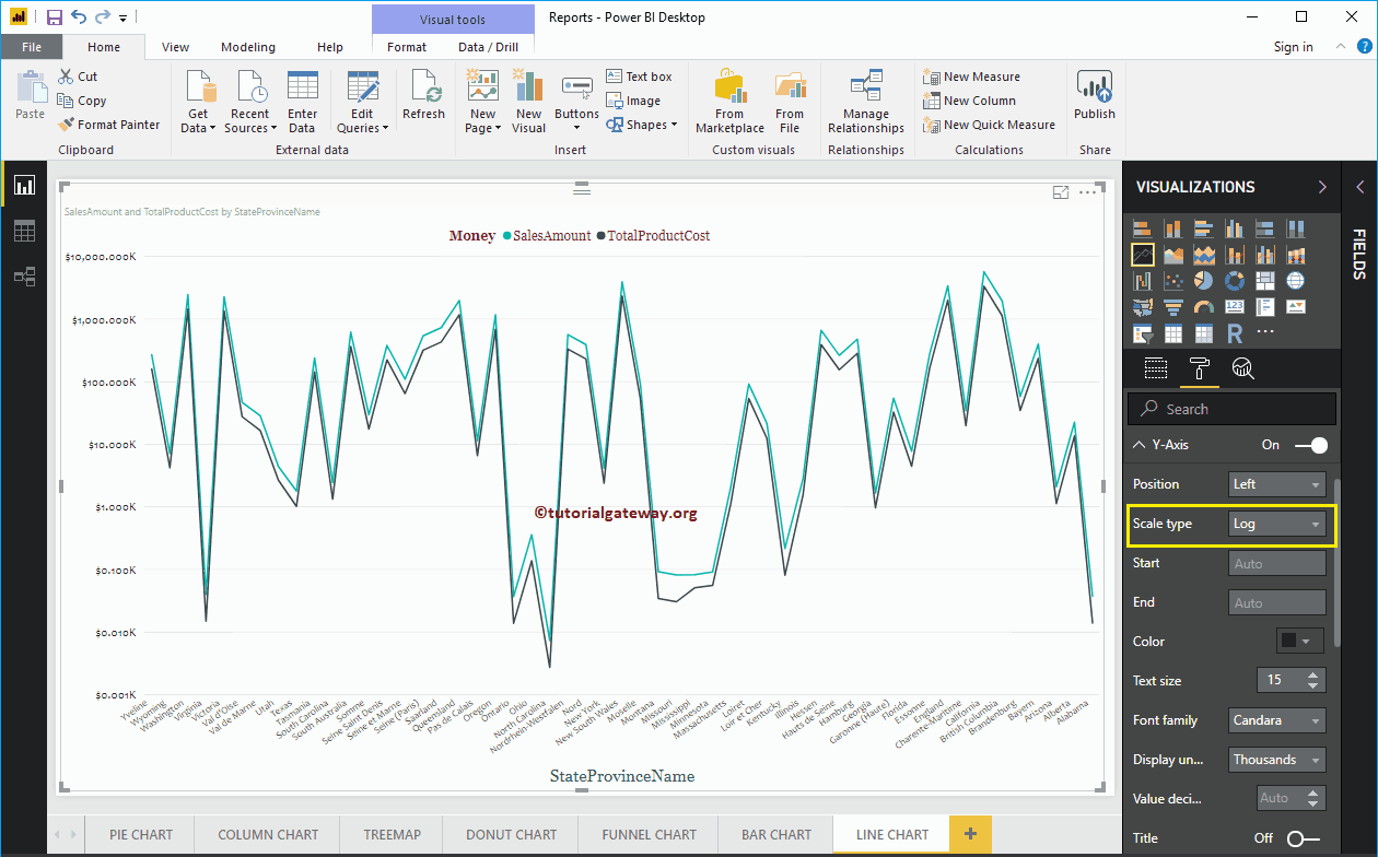
Format the Y-axis of a Power BI line chart
Below is the list of options that are available to format the vertical axis or the Y axis. In the screenshot below, you can see that we changed the color of the Y axis labels to dark gray, the size of the text to 15, the font style to Candara.
Let me change the scale type to Log. In the following screenshot, you can see that it shows the Log scale.
By default, the Y-axis title is disabled, but you can enable it by toggling Title in the Y-axis section to In. Let me change the Title Color to Green, the Title Text Size to 20, and the font family bracket.
By toggling the Grid lines option from Enabled to Disabled, you can disable the grid lines of the line chart.
- Colour: You can change the color of the grid.
- Stroke width: Use this to change the width of the grid. Here, we change the width from 1 to 2 default strokes.
- Line Style: Choose the line style as Solid, Dotted, and Dashed.

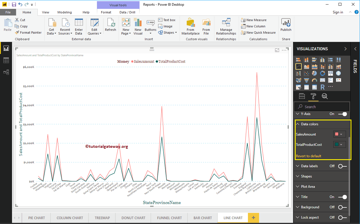
Format Power BI line chart data colors
By default, the line chart will be displayed in the default colors. Let me change the color of the sales amount line to brick red and the color of the total product cost to green.

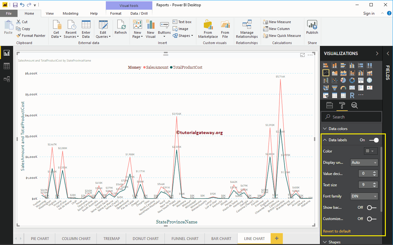
Format line chart data labels in Power BI
Data labels show metric or value information (sales amount at each point) on the line. I don't think you need data labels for trends, but you have a choice.
As you can see in the following screenshot, we enable it to show the properties.
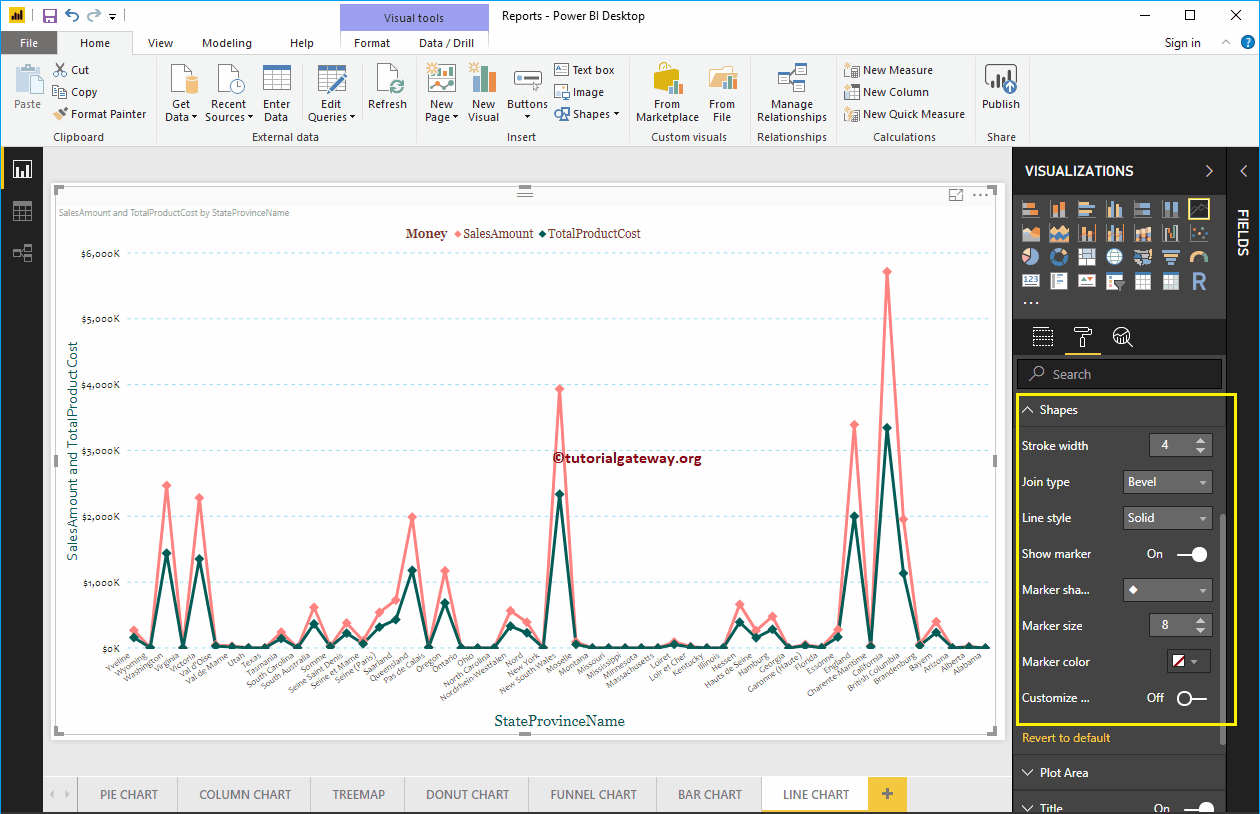
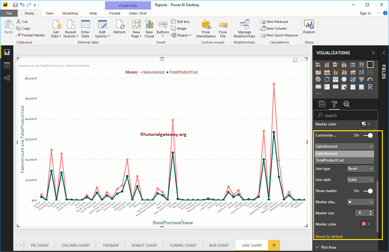
Format line chart in Power BI shapes
Use this section to change the line strokes or the join.
As you can see below, we change the stroke width (line width) to 4, the marker shape (shape at the junction point) to diamond, and the marker size to 8.

Whatever changes you make in the previous step, they will be reflected in both Lines. But you have an option called Custom Serial, and if you enable this option, you can customize Individual Line.
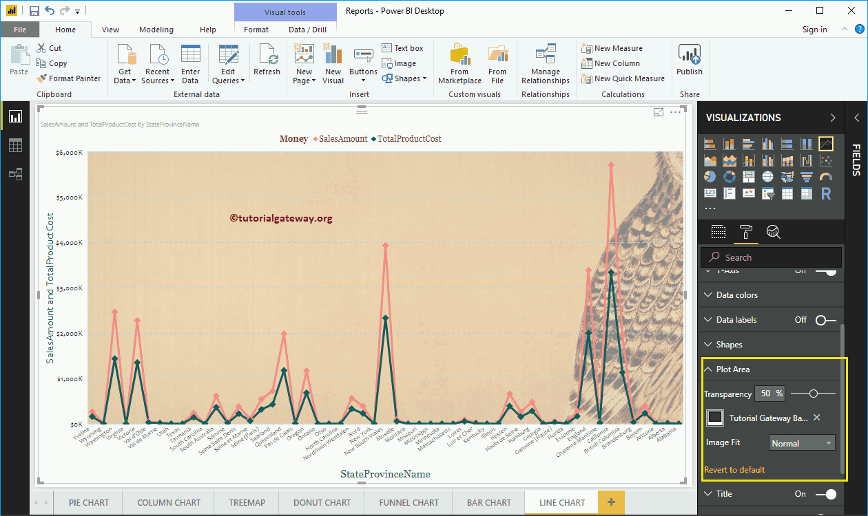
Format the plot area of the line chart
You can add images as the background of a line chart using this section of the plot area. For demonstration purposes, we added an image as the background of the plot area.

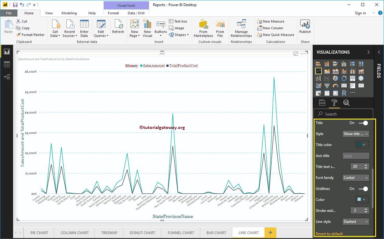
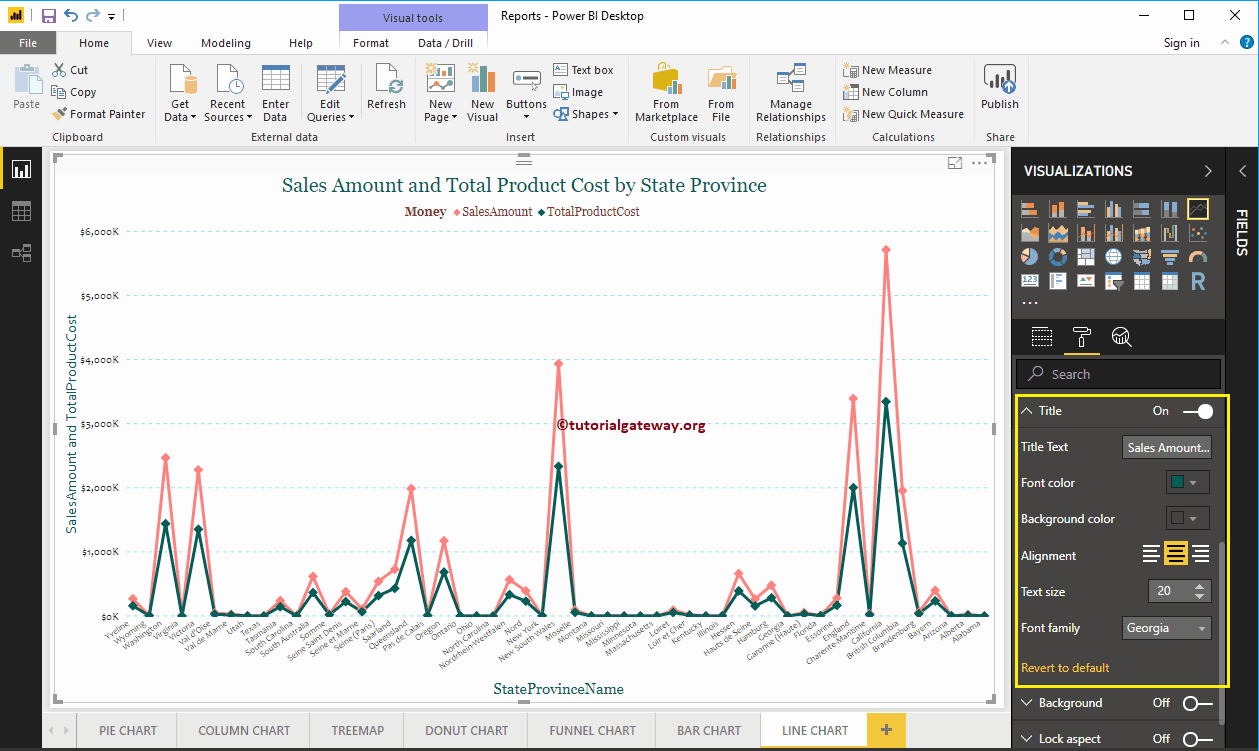
Format the Power BI line chart title
By toggling the Title of In to Off, you can turn off the title of a line chart.
As you can see in the following screenshot, we changed the Title Text to Sales Amount and Total Product Cost by State Province Name. Next, we also change the font color to green, the font family to Georgia, the font size to 20, and the title to center alignment. If you want, you can also add the background color to the title.


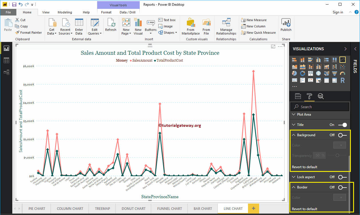
Format the background color and border of a line chart
You can add the background color to a line chart by toggling Background option a In. And you can add borders to a line chart by toggling the Border option of Off to In.