How to format Power BI column and line chart with an example? Formatting the Power BI stacked column and line chart includes changing line strokes, stacked column colors, title position, axis details, and more.
To demonstrate the formatting options for the Power BI stacked column and line chart, we will use the stacked column and line chart that we created earlier.
Check out the article Stacked column and line chart in Power BI to understand the steps to create it.
How to format the Power BI line and stacked column chart
Click on the Format to see the list of formatting options that are available for this stacked column and line chart.
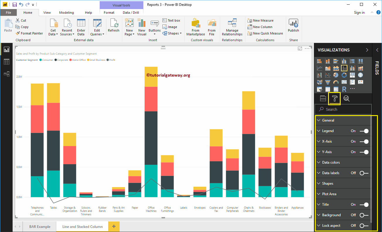
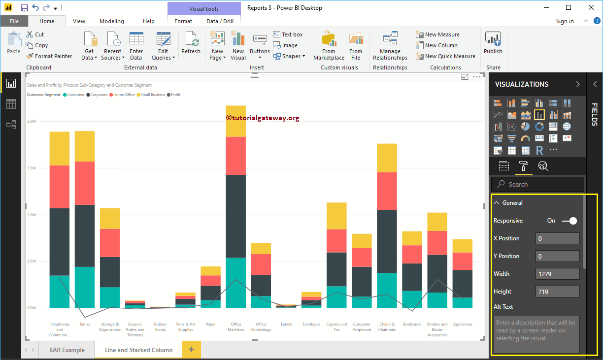
General settings for the Power BI stacked column and line chart
Use this overview section of Power BI to change the X, Y position, width, and height of a stacked column and line chart.
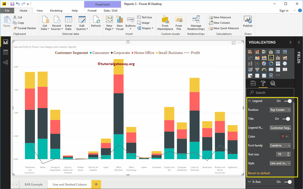
Format the legend for a stacked column and line chart in Power BI
First, we use the Position drop-down box to change the legend position to Top Center. Next, we change the color to brick red, the font family to Cambria, and the text size to 16.
The X axis of a Stacked column and line chart in Power BI
The following is the list of options that are available to format the X axis. Here, we change the color to brown, the font family to Candara, and the text size to 14.
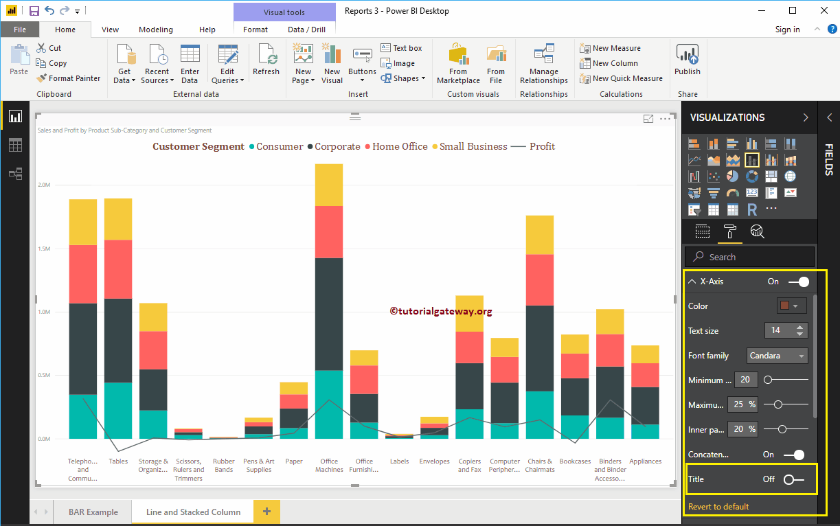
As you can see in the above screenshot, by default the X-axis title is off for the stacked column and line chart. But you can enable it by toggling Title to In. Let me change the title color to green, the font style to Georgia, and the font size to 20.
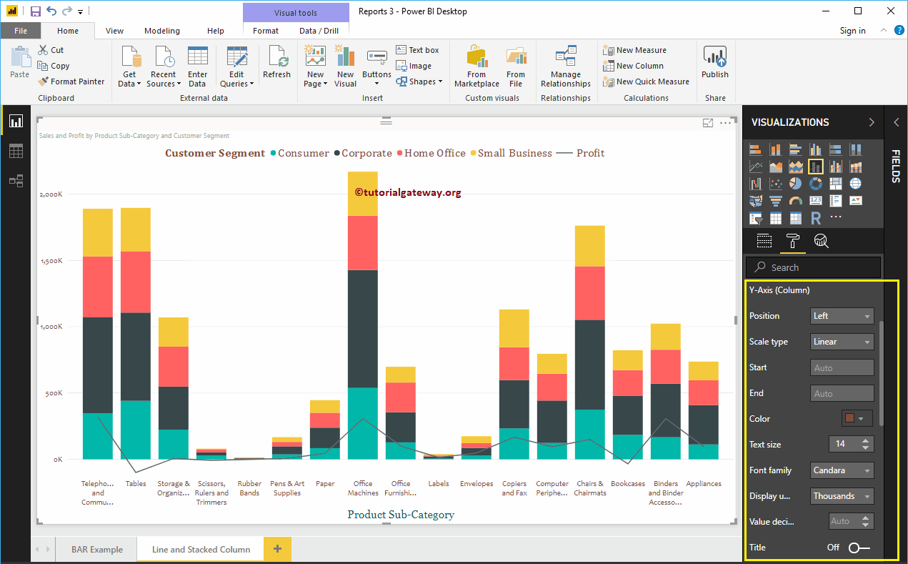
Format the Y-axis of a Power BI line and a stacked column chart
As you can see, we changed the Y axis label color to brown, the font style to Candara, the text size to 14, and the display units to thousands.
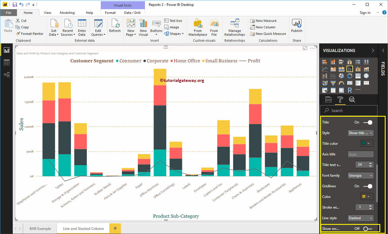
By default, the Y-axis caption for the stacked column and line chart is disabled, but you can enable it by toggling Caption on In. Let me change the title color to green, the text size to 24, and the Georgia font family.
By toggling the Grid lines From On to Off, you can turn off the stacked column and line chart grid lines.
- Colour: You can change the color of the grid.
- Stroke width: Use this to change the width of the grid.
- Line Style: Choose the line style as Solid, Dotted, and Dashed.
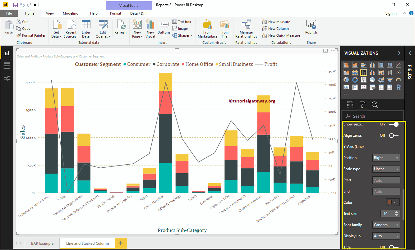
As you can see from the screenshot above, there is an option called show secondary axis below Y axis. By enabling this, you can also show secondary Y axis.
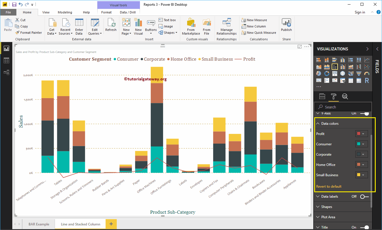
Format the colors of Power BI stacked column and line chart data
By default, the stacked column and line chart uses the default colors to fill the stacked columns and lines. Let me change them for demonstration purposes.
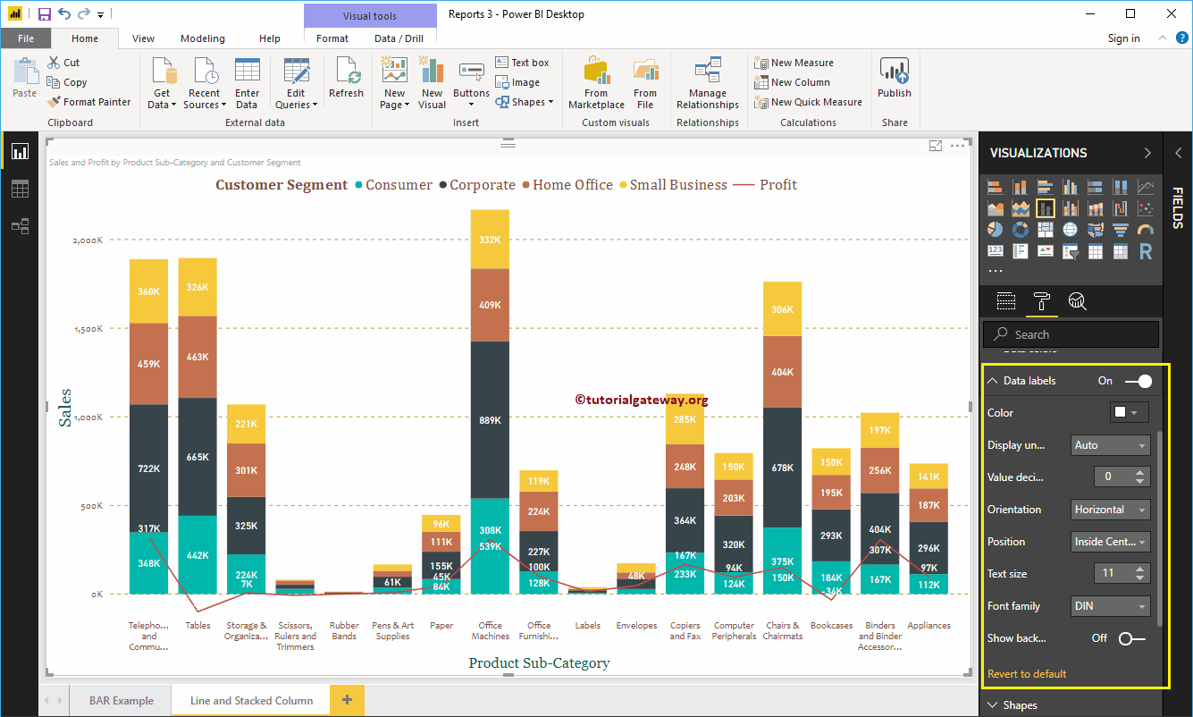
Format data labels in a stacked column and line chart
The data labels show the metric values (group sales amount and profit at each point). As you can see in the following screenshot, we enabled data labels and changed the color to white.
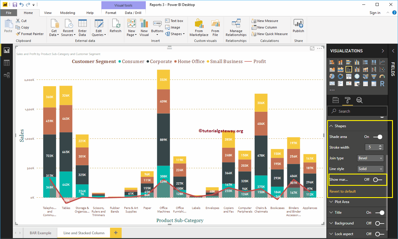
Format stacked column and line chart in Power BI shapes
You can use this section to change line strokes or mark shapes.
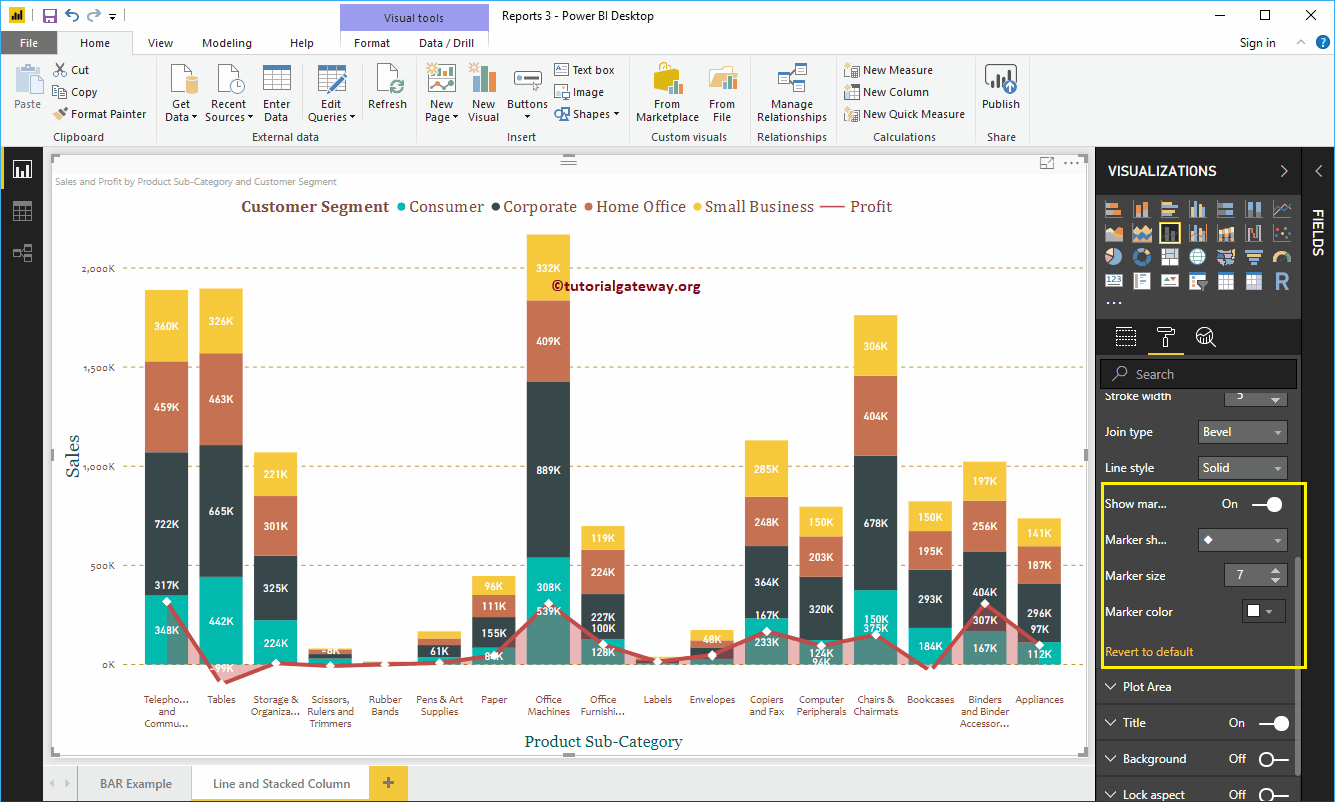
As you can see in the following screenshot, we changed the Stroke Width (line width) to 4, the join type to bevel, and the line style to solid.

By enabling the Show Markers property, you can display the markers at each point.
First, we change the marker shape (bond point shape) as diamond, marker size as 7, and marker color as white.

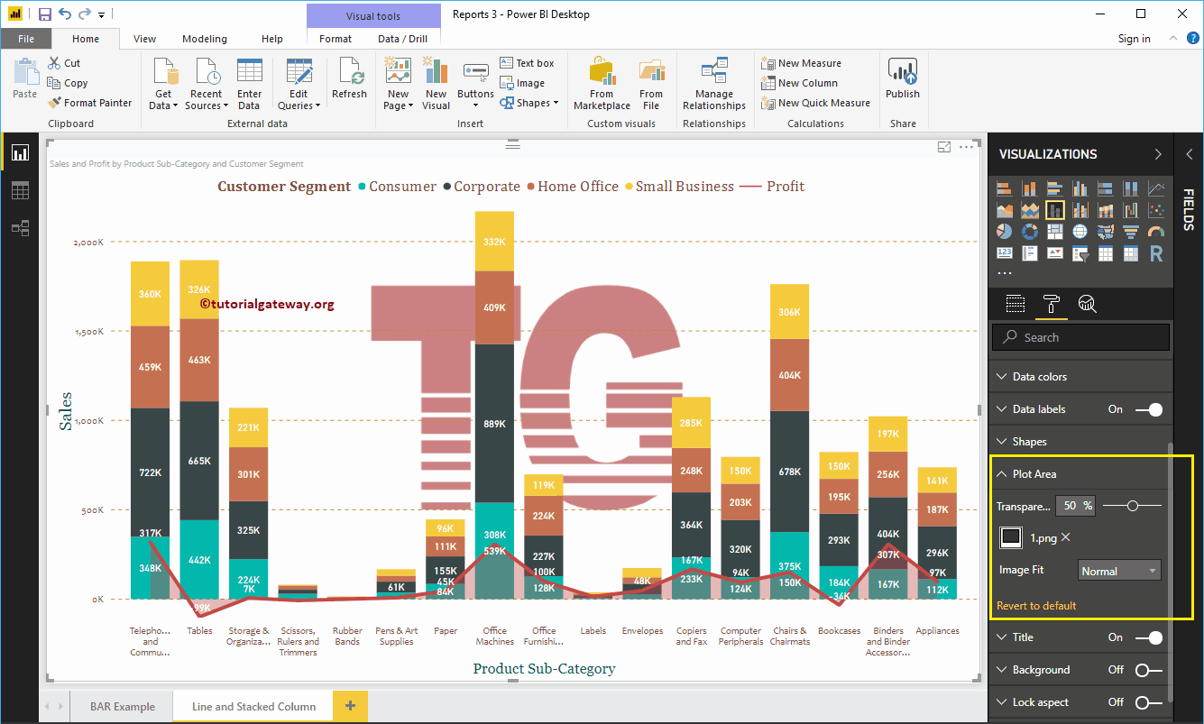
Stacked column and line chart in Power BI plot area
With this plot area property, you can add custom images as the background of the line and stacked column chart. For demonstration purposes, we added an image as the background of the plot area.

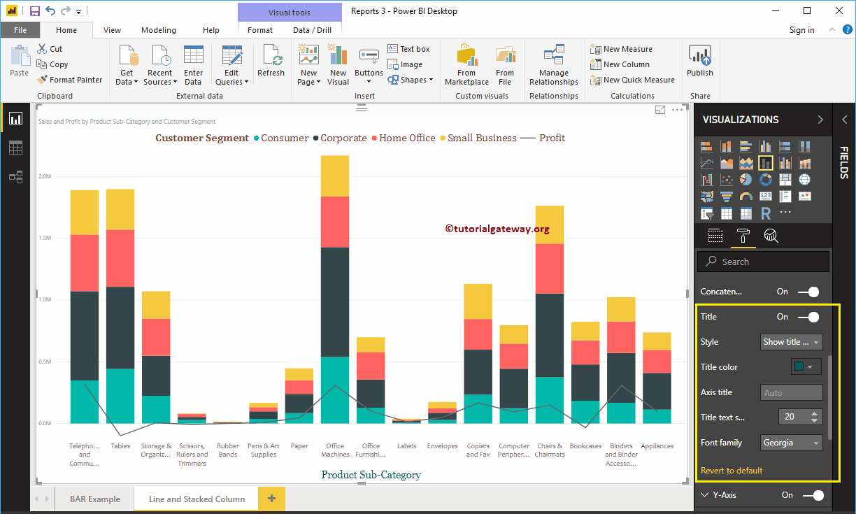
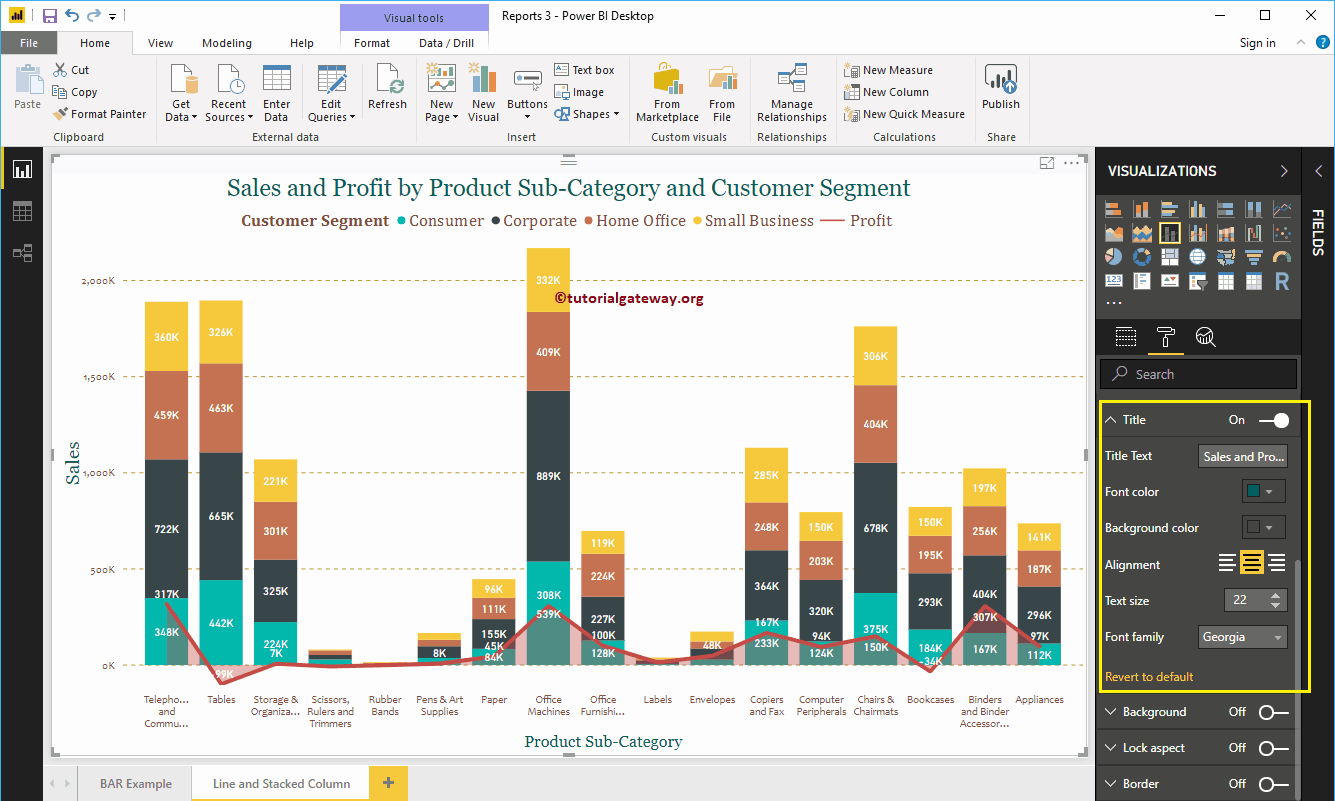
Format the Power BI stacked column and line chart title
As you can see, we changed the font color to green, the font family to Georgia, the text size to 22, and the title alignment to center. If you want, you can also add the background color to the title.
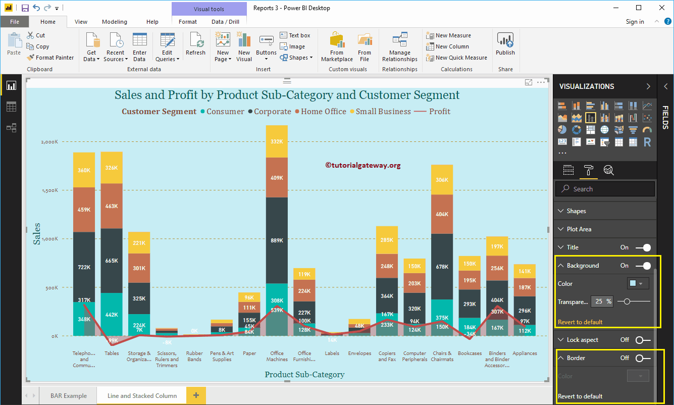
Format the background color and borders of the stacked column and line chart
You can add the background color to a stacked column and line chart by alternating Background option a In. For demo purpose, we added sky blue with a 25% of transparency.
Similarly, you can add borders to a stacked column and line chart by toggling the Border option of Off to In.