The Power BI area chart is the same as the line chart, where the area between the X-axis and the lines is filled with a color. Let me show you how to create an area chart in Power BI with an example.
For this demonstration of the Power BI area chart, we will use the SQL data source that we created in our previous article.
See the article Connect Power BI to SQL Server to understand the data source in Power BI. And also see the article Line Chart.
How to create an area chart in Power BI
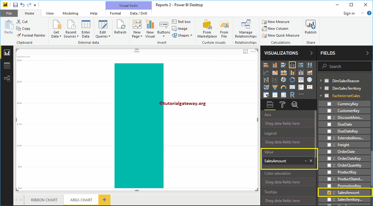
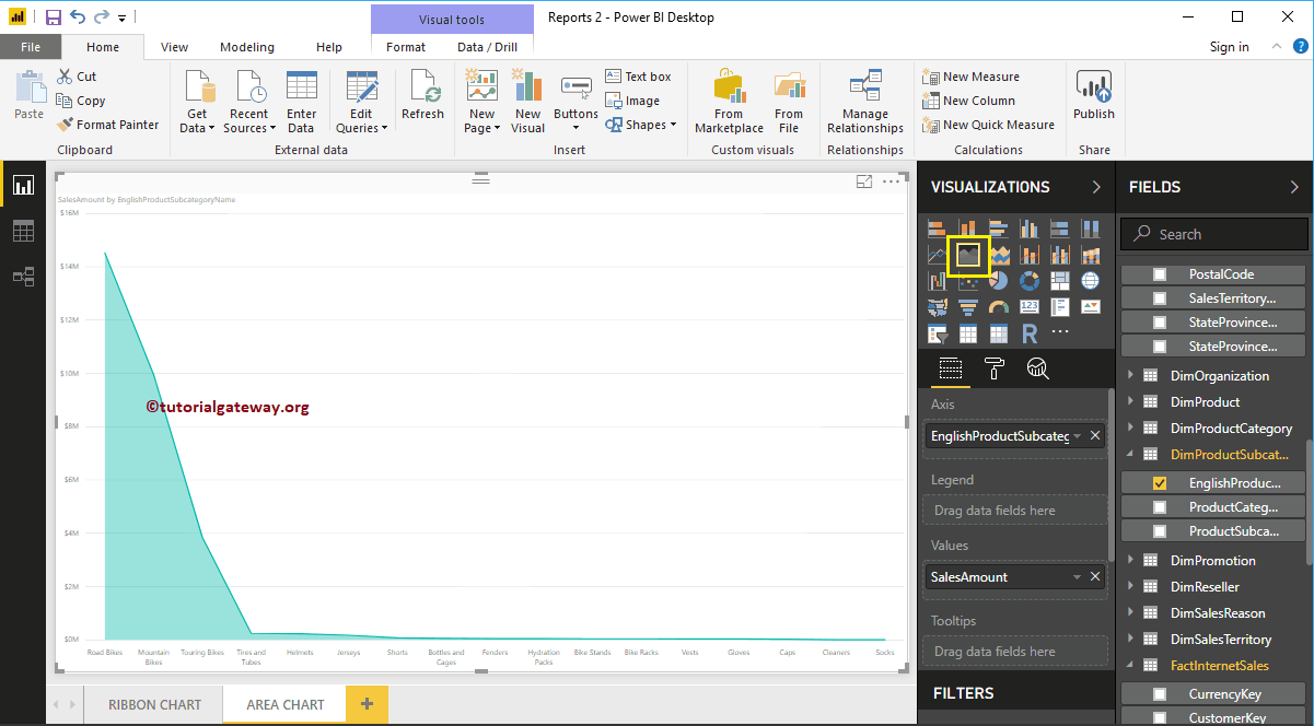
To create an area chart in Power BI, first drag and drop the Sales Amount section of the fields to the region of the canvas. Automatically create a column chart, as shown in the following screenshot.
Next, let me add the name of the English product subcategory to the Axis section.
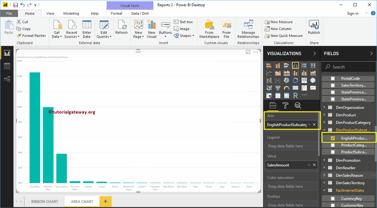
Click on the area chart below the Display section. It will convert the column chart to an area chart. In the screenshot below, you can see the area chart showing the sales by product sub-category.
Create an area chart in Power BI focus 2
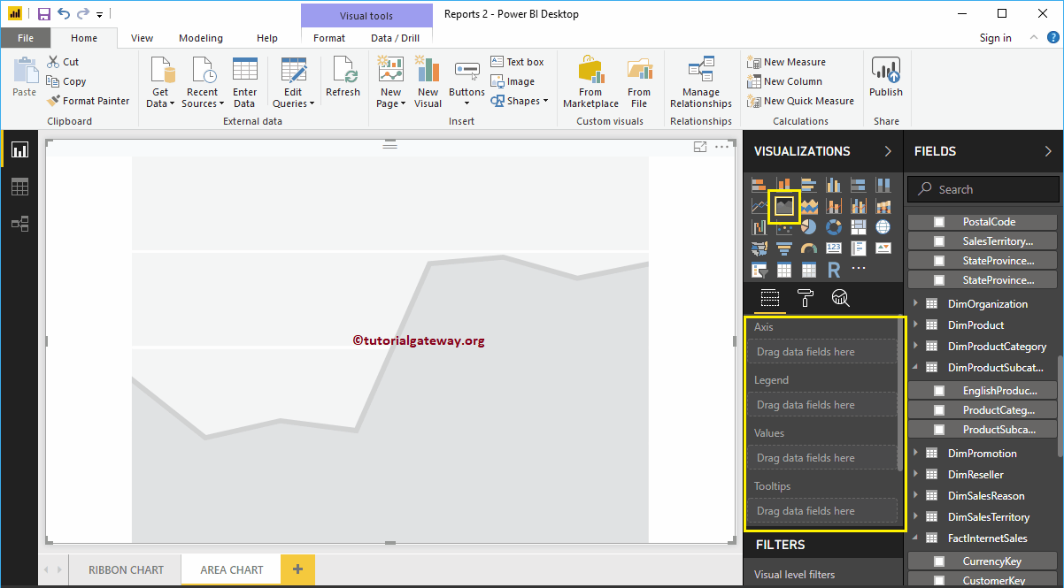
First, click on the area chart below the Display section. You will create an area chart with fictitious data, as shown in the following screenshot.
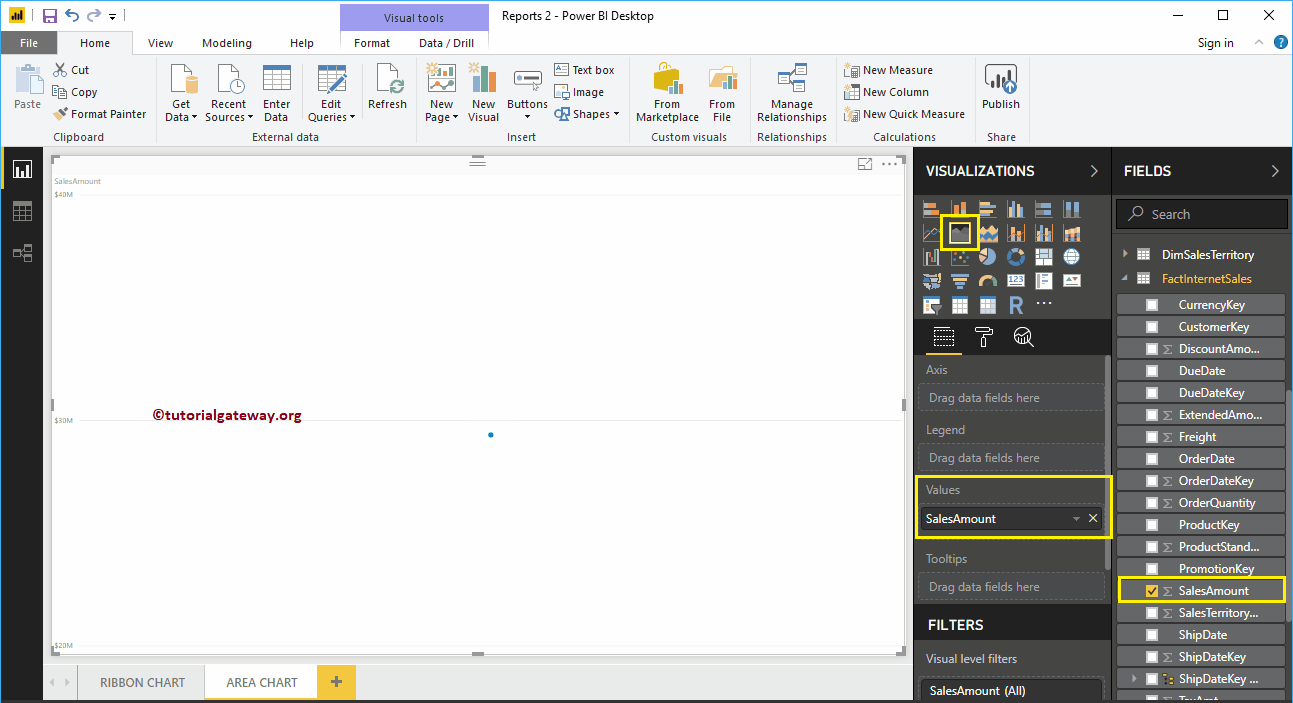
To add data to the Power BI area chart, we have to add the required fields:
- Axis: Specify the name of the column that represents the area.
- Values: Any numerical value such as sales amount, total sales, etc.
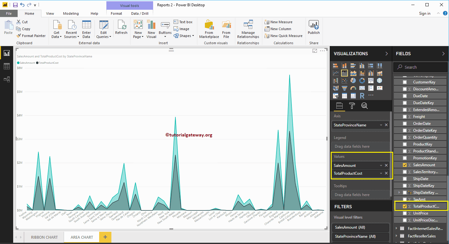
Let me drag the sales amount from the Fields section to the Values field.
Next, let me add the name of the state province to the Axis section. You can do this by dragging State Province to the Axis section, or just check the State Province column.
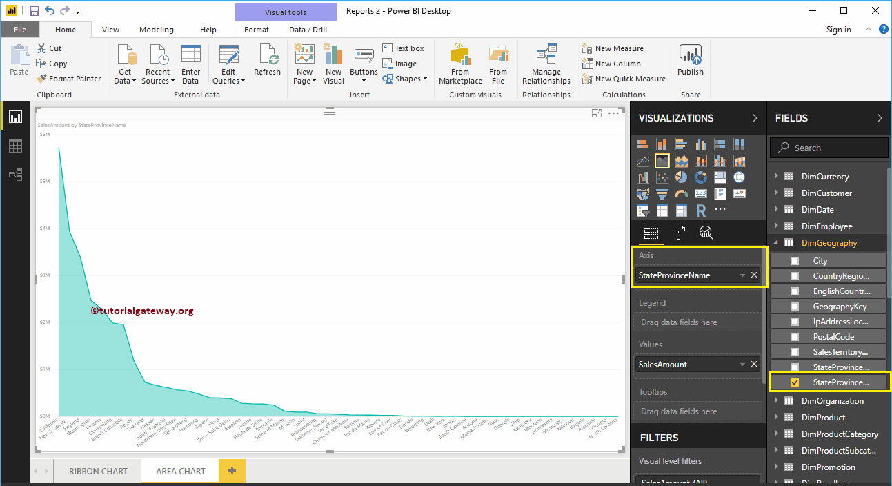
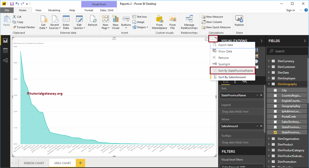
Let me sort the data by state province name (by default it's sorted by sales amount). To do this, click on the … (3 dots) in the upper right corner and select the Sort by stateProvinceName option as we show below.
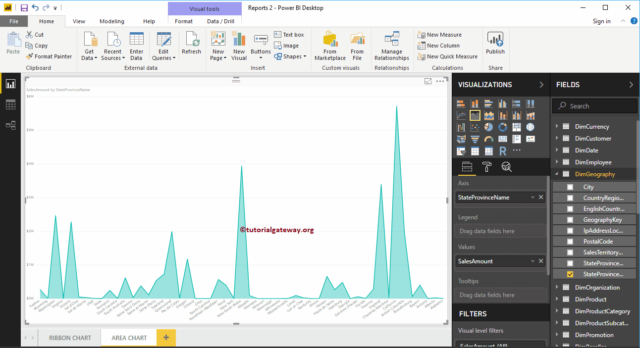
You can now see a more meaningful area chart
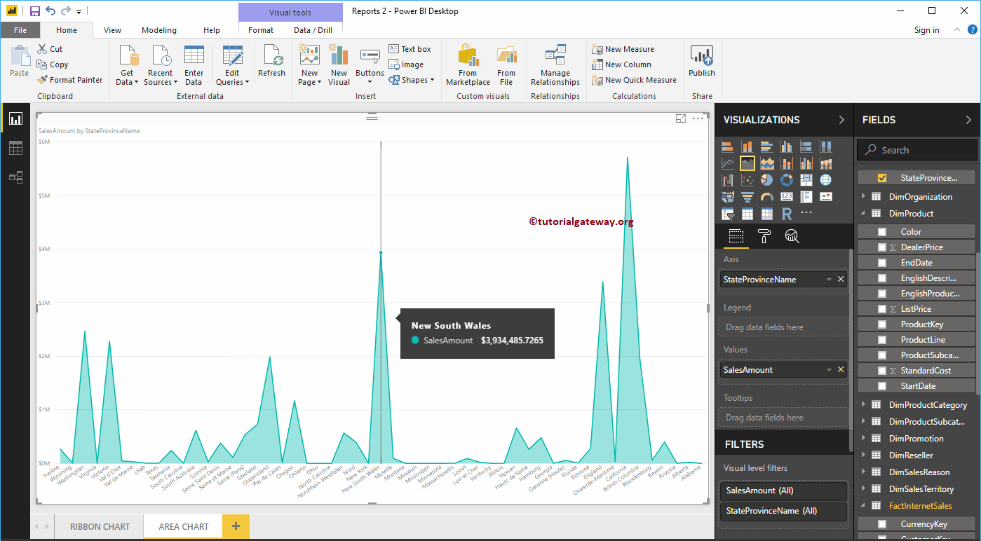
Hover over any position to display the Sales Amount and State Province Name tooltip

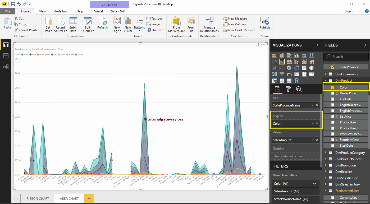
Adding Product Color to the Legend section will convert the Power BI Area chart to the Stacked Area chart.

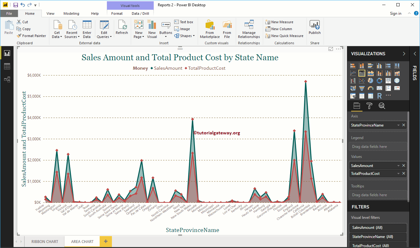
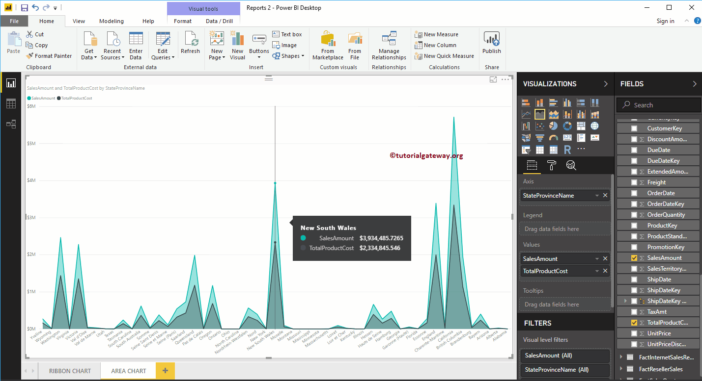
Let me remove the Color field from the Legend section and add one more field i.e Total Product Cost to Values section. Compare the amount of the sales area with the total cost of the product.

Hover over any position to display the Sales Amount and Total Product Cost tooltip
Let me quick format this Power BI area chart
NOTE: I suggest you refer to the article Formatting the area chart to understand the steps required to format the area chart title, chart area, line color, etc.