

All elements of web pages are defined within a rectangular box. However, that doesn't mean we have to make everything look like a box. You can use the CSS clip-path property to crop parts of an image or other element, to create interesting effects.
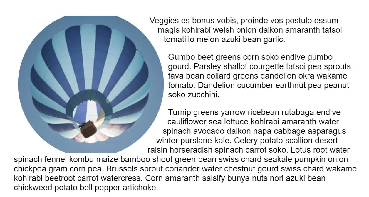
In the example above, the balloon image is square (source). Using clip-path and the basic form value of circle ()
the extra sky around the globe is cut out leaving a circular image on the page.
As the picture is a link, you can see some more about it clip-path property. Only the visible area of the image can be clicked, as events are not fired in hidden parts of the image.
Clipping can be applied to any HTML element, not just images. There are a few different ways to create a clip-path, in this post we will see them.
Browser compatibility
Apart from the values in the table as explained later in the post, the various values of clip-path proven to have excellent browser support. For legacy browsers, an alternative may be to allow the browser to ignore the clip-path property and display the image without cropping. If this is a problem, you can try it clip-path in a function query and offer an alternative layout for unsupported browsers.
@supports(clip-path: circle(45%) {
}
Basic shapes
the clip-path The property can take several values. The value used in the initial example was circle (). This is one of the basic shape values, which are defined in the
CSS shape specification. This means that you can crop an area and also use the same value for shape-outside to make the text conform to that shape.
Note that CSS shapes can only be applied to floating elements. the clip-path The property does not require the element to be floating.
The full list of basic shapes is:
inset ()
the inset () value inserts the clipped area from the edge of the element and values can be passed for the top, right, bottom, and left edges. A border-radius It can also be added to curve the corners of the cropped area, using the round keyword.
In my example I have two boxes both with a class of .box. The first frame has no clipping, the second one is trimmed using inset () values.
circle ()
As you have seen, the circle () The value creates a circular cropped area. The first value is a length or a percentage and is the radius of the circle. A second optional value allows you to set the center of the circle. In the example below, I am using keyword values to set my cropped circle at the top right. You can also use lengths or percentages.
Watch out for flat edges!
Note that with all these values the shape will be clipped by the element's margin box. If you create a circle in an image and that shape will extend outside the natural size of the image, you will get a flat edge.
circle (50%) applied. Since the image is not square, we press the margin box at the top and bottom and the circle is cropped.ellipse ()
An ellipse is essentially a squashed circle, so it acts very similar to circle () but it accepts a radius for x and a radius for y, plus the value of the center of the ellipse.
polygon ()
the polygon () value can help you create quite complex shapes, defining as many points as you need, setting the coordinates of each point.
To help you create polygons and see what is possible, see Clippy, a clip-path generator, then copy and paste the code into your own project.
Shapes from cash values
Also defined in CSS Forms are forms of cash values. These relate to the CSS box model: the content box, the fill box, the border box, and the margin box with keyword values of content-box, border-box, padding-boxand margin-box.
These values can be used alone or in conjunction with a basic shape to define the reference frame used by the shape. For example, the following would clip the shape to the edge of the content.
.box {
clip-path: content-box;
}
In this example, the circle would use the content-box as a reference chart instead of margin-box (which is the default).
.box {
clip-path: circle(45%) content-box;
}
Currently, browsers do not support the use of box values for clip-path property. Are compatible with shape-outside Nevertheless.
Using an SVG element
To have more control over the cropped area than is possible with basic shapes, use an SVG clipPath element. Then reference that ID, using url () as the value of clip-path.
Animating the cropped area
CSS transitions and animations can be applied to the clip-path to create some cool effects. In the example below, I am animating a circle by hovering over the transition between two circles with a different radius value.
There are many creative ways that animation can be used with clipping.
Animating with clip-path on CSS Tricks goes through some ideas.
Photo by Matthew henry in Burst.


