A heuristic evaluation It is a method to check the usability of a website or user interface. Fixed criteria (heuristics) are normally used for verification. A heuristic evaluation can be part of user experience (UX) design and provides an alternative to a usability test.
Background
For a long time, developers assumed that it required a lot of effort to investigate the usability of a product, website or software. Consequently, alternatives were sought to minimize the time required and financial expenses. A viable alternative to traditional usability testing was heuristic evaluation, which was introduced in 1990 by the two usability experts Jakob Nielsen and Rolf Molich. As part of their work, the two scientists developed 10 aspects that are part of conducting a heuristic evaluation.
Ingredients
As part of a usability inspection, a heuristic evaluation is a method of examining the usability of a project with the help of three to five experts. The number of experts is justified by the fact that an expert can only discover about 35 percent of the existing problems by himself. The more experts participate in the evaluation, the higher the percentage of errors detected.
The following 10 heuristics were established by Nielsen and Molich:
- System status is visible: Each system must provide its users with useful information about its current state in a limited period of time.
- Correspondence between the system and the real world: the system under study should not communicate with the user using technical terms, but should be generally understandable and use a logical order in the ideal case.
- User control: A user should always have the option of reverting to a system precondition, such as with the "Undo" function.
- Consistency / standards: To be optimally targeted, actions and terms must be standardized.
- Error prevention: The design used should help avoid errors.
- Accreditation: The user should be able to use the functions in the most intuitive way feasible without having to remember the previous steps.
- Flexibility and efficiency: Programs and websites must be designed in such a way that advanced users can quickly access content and functions.
- Minimalist design: To attract the attention of the user, the dialogs must not contain irrelevant information.
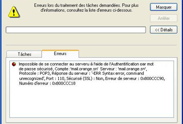
- Help in solving problems or accrediting errors and diagnoses: If an error occurs, the system should report it without technical expressions or cryptic error codes.
- Help and documentation: Help functions or software documentation should be tailored to the task required and contain the necessary steps for troubleshooting. [1]
After the evaluation has been carried out by three to five experts, the results are summarized in a report. Contains a list of existing usability issues that are flagged based on severity. From this list you can create priority lists for optimization.