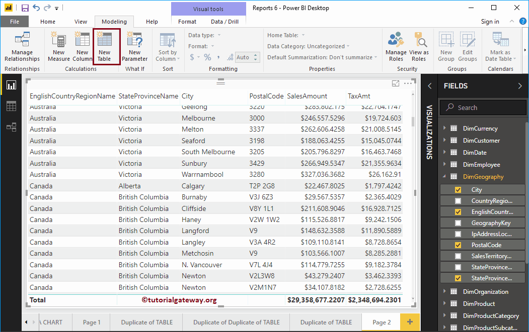
In Power BI, you can create a custom table or a calculated table from the existing table. In this article, we show you how to create calculated tables in Power BI ...
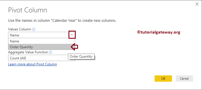
The pivot table option in Power BI converts selected rows to columns. Let me show you how to create a pivot table or how to convert the non-pivot table to a ...
Power BI Slicer is commonly used to add filters to the canvas or to display filters on the report canvas. Let me show you how to create a Slicer in Power BI with ...
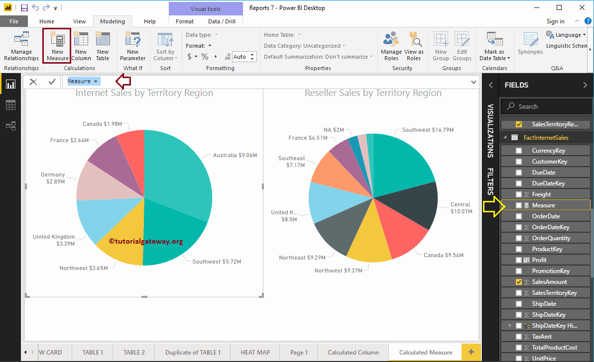
In Microsoft Power BI, you can create a custom calculated measure (or numerical aggregate calculation) from existing columns. In this article, we show you how to create calculated measures in Power ...
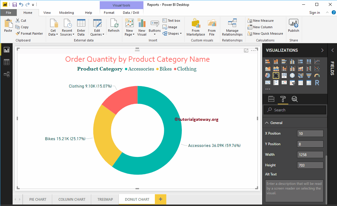
Power BI Donut Chart is similar to the pie chart, which is useful for visualizing top-level data. In this article, we show you how to create a donut chart ...
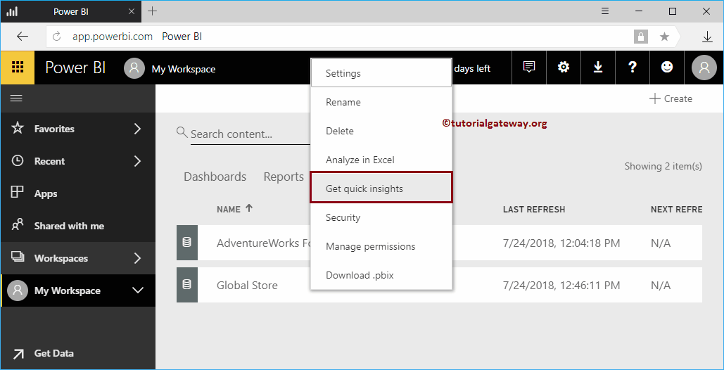
Let me show you how to get insight into the Power BI workspace with a practical example. Before we begin to search or obtain information about the data of ...
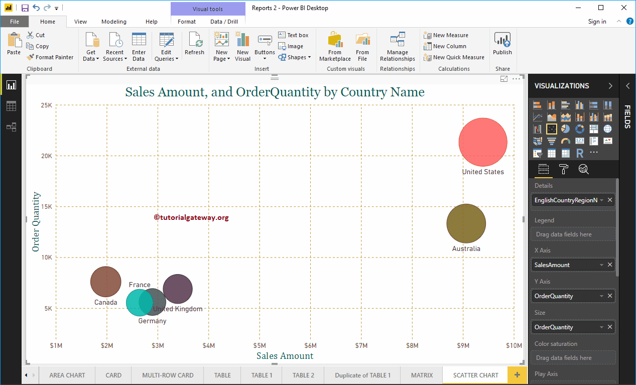
Power BI scatter chart or scatter chart is very useful for visualizing the relationship between two sets of data. Let me show you how to create a chart ...
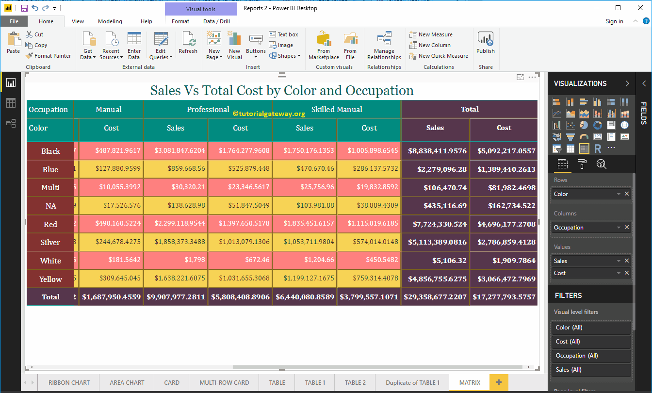
Power BI Matrix, also called a crosstab, is useful for showing the relationships between two or more than two groups. Let me show you how to create a matrix in Power BI with ...