En Power BI, puede crear una tabla personalizada o una tabla calculada a partir de la tabla existente. En este artículo, le mostramos cómo crear tablas calculadas en Power BI…
En Power BI, puede crear una tabla personalizada o una tabla calculada a partir de la tabla existente. En este artículo, le mostramos cómo crear tablas calculadas en Power BI…
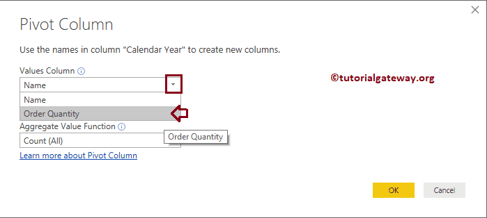
The Power BI PivotTable option converts selected rows to columns. Let me show you how to create a pivot table or how to convert the non-pivot table to a…
Power BI Slicer is commonly used to add filters to the canvas or to display filters on the report canvas. Let me show you how to create a Slicer in Power BI with…
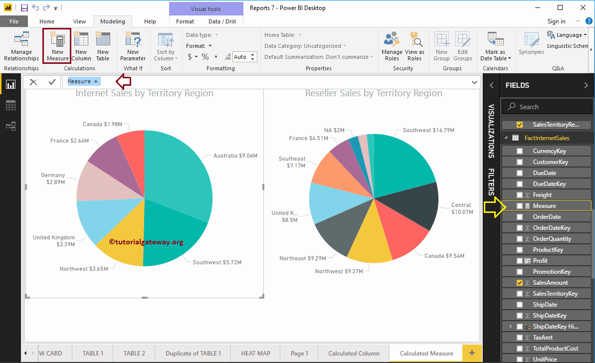
En Microsoft Power BI, puede crear una medida calculada personalizada (o cálculo agregado numérico) a partir de columnas existentes. En este artículo, le mostramos cómo crear medidas calculadas en Power…
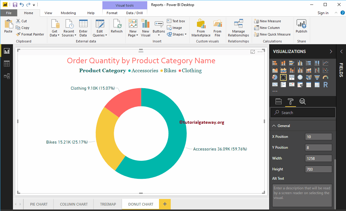
Power BI Donut Chart es similar al gráfico circular, que es útil para visualizar los datos de nivel superior. En este artículo, le mostramos cómo crear un gráfico de anillos…
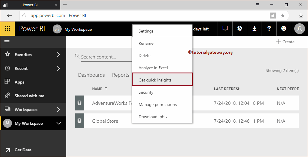
Let me show you how to get insights into the Power BI workspace with a practical example. Before we begin to search for or obtain information about the data of…
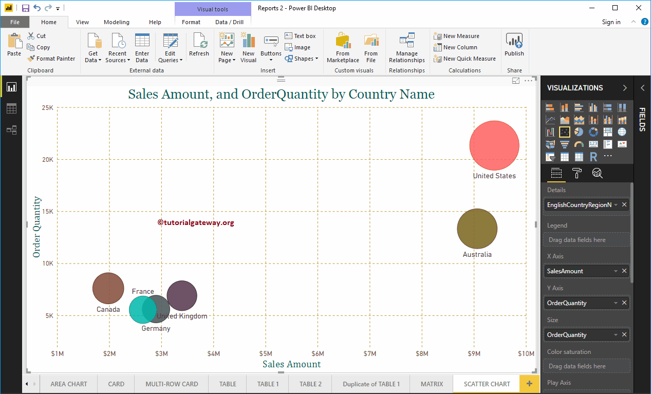
Power BI scatter chart or scatter chart is very useful for visualizing the relationship between two sets of data. Let me show you how to create a chart…
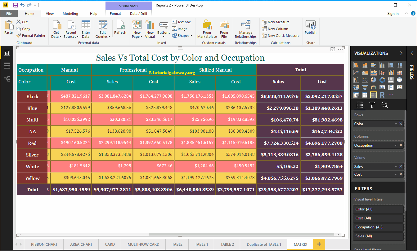
Power BI Matrix, also called a crosstab, is useful for showing the relationships between two or more than two groups. Let me show you how to create a matrix in Power BI with…
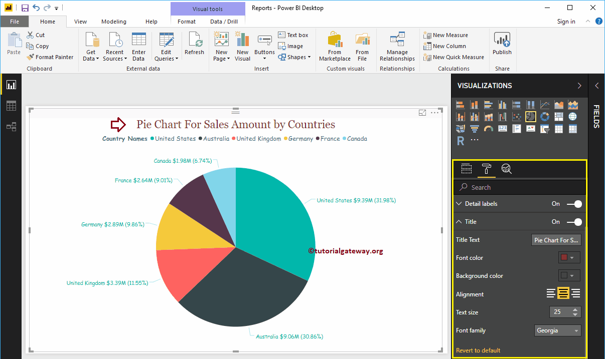
How to format Power BI pie chart with examples? Power BI pie chart formatting includes changing the position of the legend and title,...
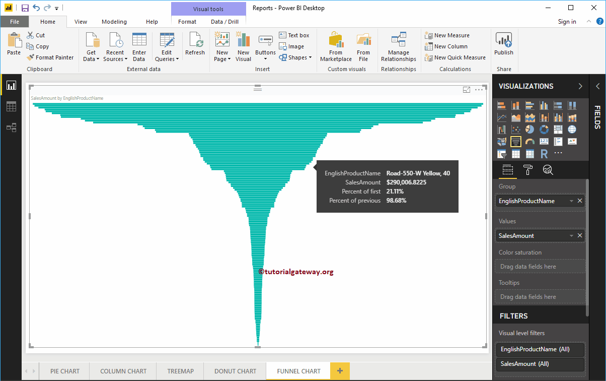
The Power BI funnel chart is very useful for displaying your data in stages. For example, we can use this Power BI funnel chart to visualize in ...


© 2024 R Digital Marketing.