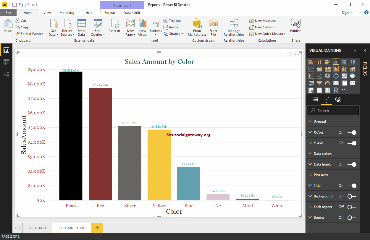
The Power BI column chart is very useful for visually comparing categorical data. For example, if we want to compare Sales by product group or Color, we can use…
The Power BI column chart is very useful for visually comparing categorical data. For example, if we want to compare Sales by product group or Color, we can use…
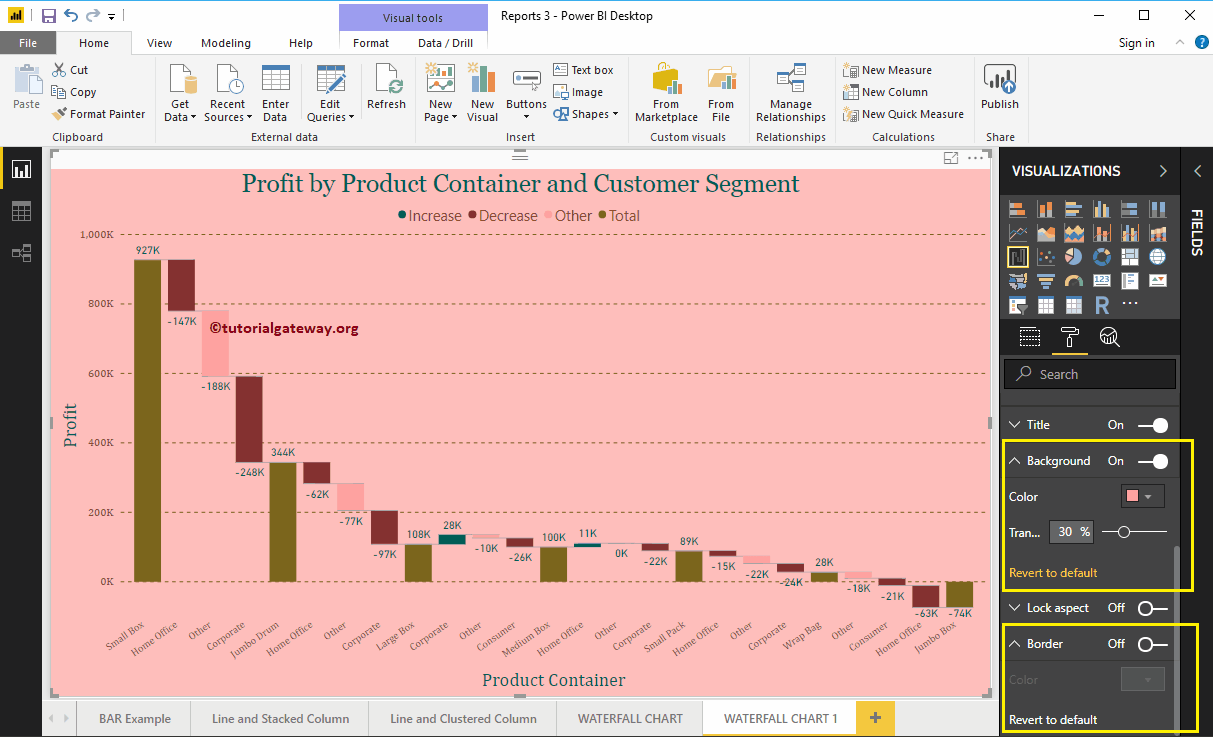
How to format Power BI waterfall chart with example? Formatting the waterfall chart includes changing the colors of the bars, the title text…
Let me show you how to add alternate row colors to Power BI table report with a practical example. For this demo of adding alternate row colors to the…
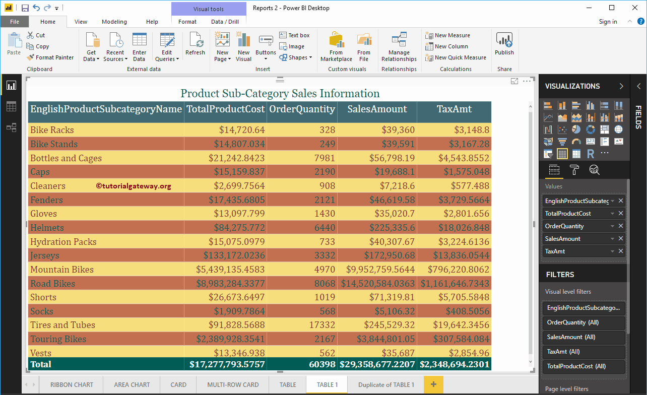
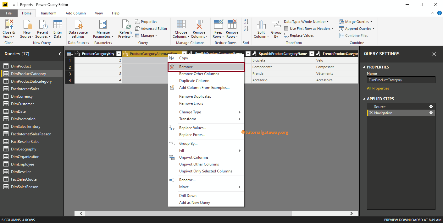
What are the steps required to remove columns from tables in Power BI using an example? In general, the data we load from the source may have some columns that…
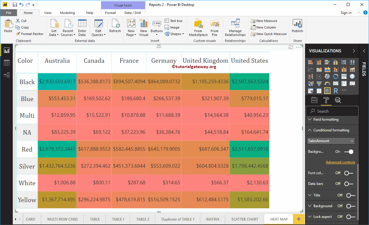
Power BI Heat Map is useful for displaying data along with colors. Seeing the color, one can easily understand the winnings. Let me show you how to create a map…
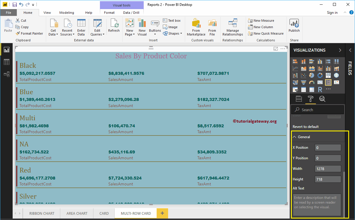
How to format Power BI multi-row card with example? The Power BI multi-row card layout includes data labels, color of…
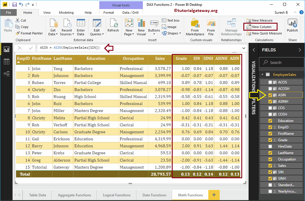
How to use Power BI DAX trigonometric functions with examples? Microsoft Power BI DAX provides several trigonometric functions such as EXP, COS, SIN, TAN, COSH, ACOS, ACOSH, ASIN, SINH, ASINH,…
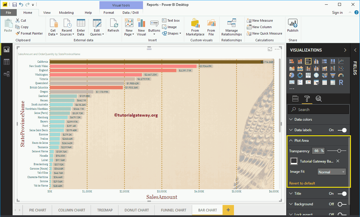
How to format bar chart in Power BI with an example? Formatting the Power BI bar chart includes changing the colors of the horizontal bar,…
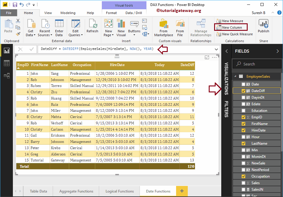
How to use Power BI DAX date functions with examples? Microsoft Power BI DAX provides various date functions such as year, month, day, calendar, date, time, dateiff, now,…
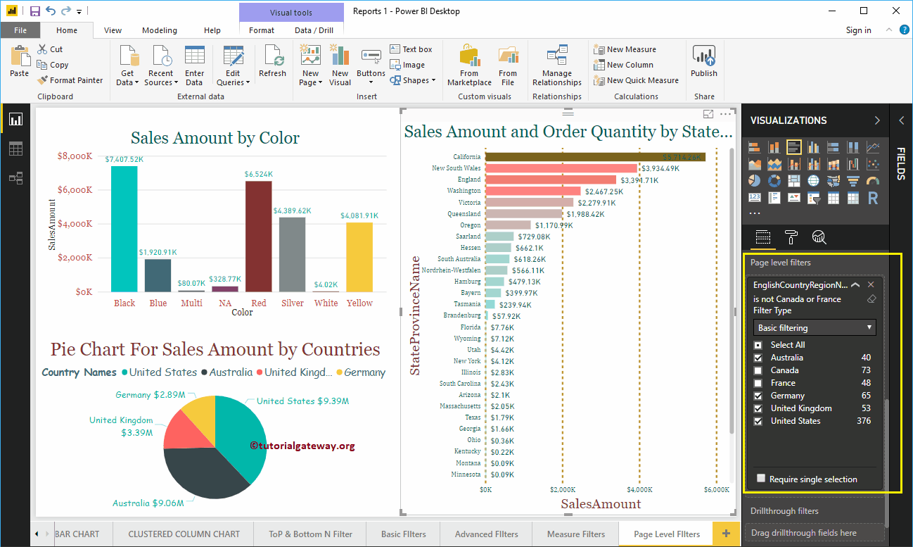
How to create page level filters in Power BI with an example? Power BI page level filters are useful for filtering charts (or elements…


© 2024 R Digital Marketing.