How to format the Power BI waterfall chart with an example? Formatting the waterfall chart includes changing the colors of the bars, the title text of the waterfall chart, the position of the title, the Y-axis and X-axis details, the data labels and background images, and so on.
To demonstrate these waterfall chart format options, we'll use the waterfall chart we created earlier. See the article Waterfall chart in Power BI to understand the steps required to create a Power BI waterfall chart.
How to format the Power BI waterfall chart in Power BI
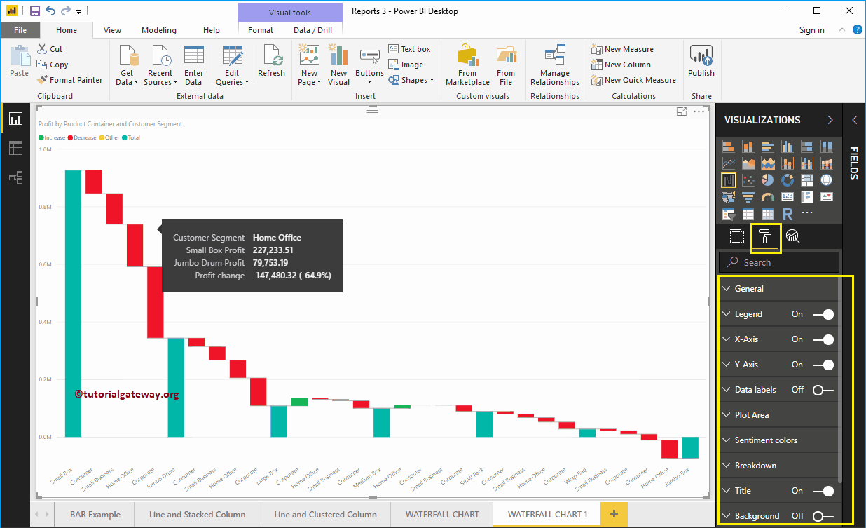
Click on the Format to see the list of formatting options that are available for this waterfall chart. As you can see in the following screenshot, hovering over any bar shows the difference in profit between the product containers
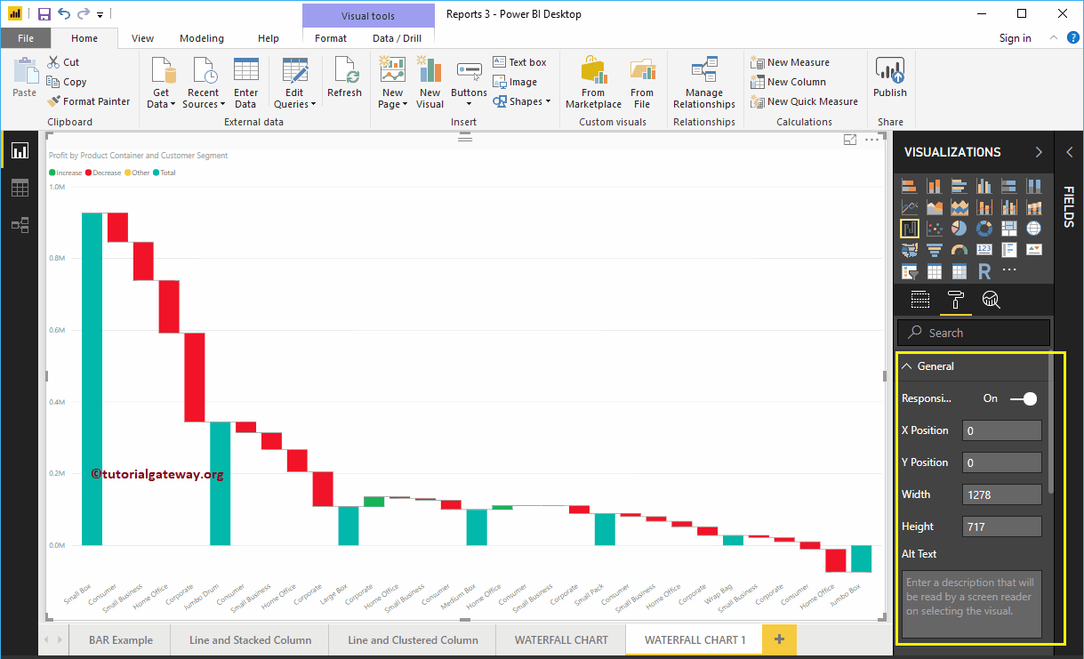
Format Power BI Waterfall Chart General Settings
Use this general section to change chart responsiveness, X, Y position, width, and height of a waterfall chart
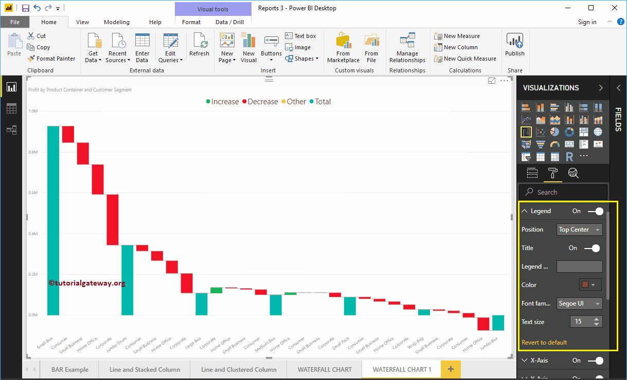
Format the legend for a waterfall chart in Power BI
Select the legend region and change the option from Off to In to enable Legend.
As you can see in the screenshot below, we used the Position drop-down box to change the legend position to Top Center. Next, we change the Color legend to Brown and the text size to 15.
Format the X-axis of a waterfall chart in Power BI
Below is the list of options that are available to format the horizontal axis or the X axis. As you can see in the screenshot below, we changed the color to brown, the text size to 14, and the font family to Cambria.
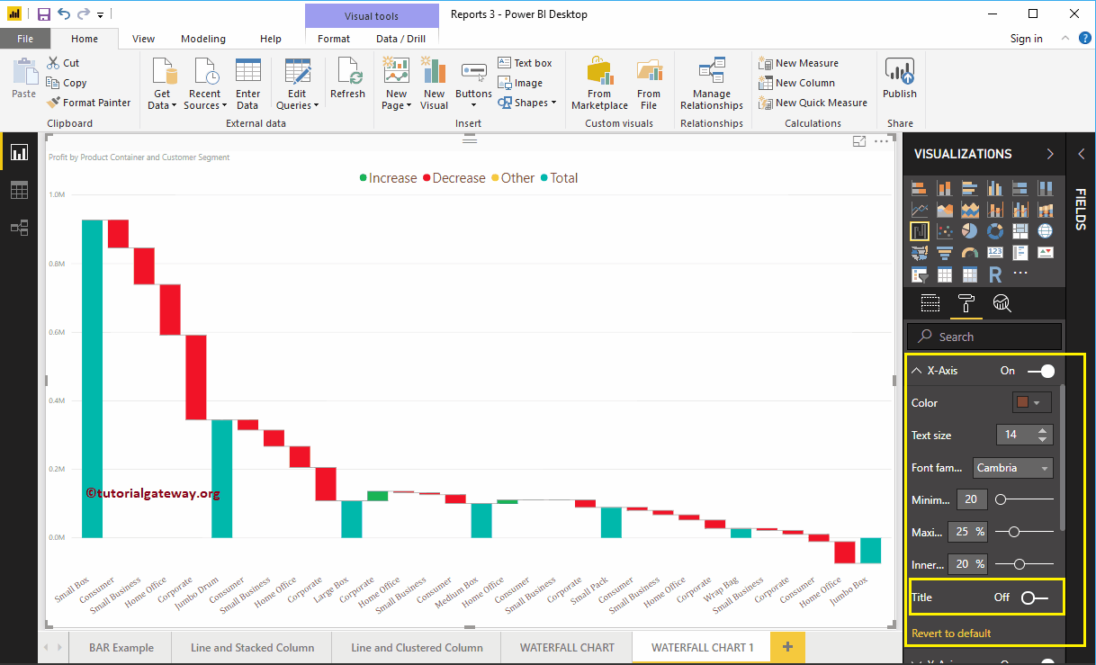
By default, the X-axis title is off. Let me change the option from Off to On. Then change the Title Color to Green, the Font Style to Cambria, and the Font Size to 25.

Format the Y-axis of a Power BI waterfall chart
Below is the list of options available to format the vertical axis. Here, you can change the default start and end values of the Y axis
As you can see, we changed the Y-axis font color to brown, the font family to Cambria, the display units to thousands, and the text size to 15.
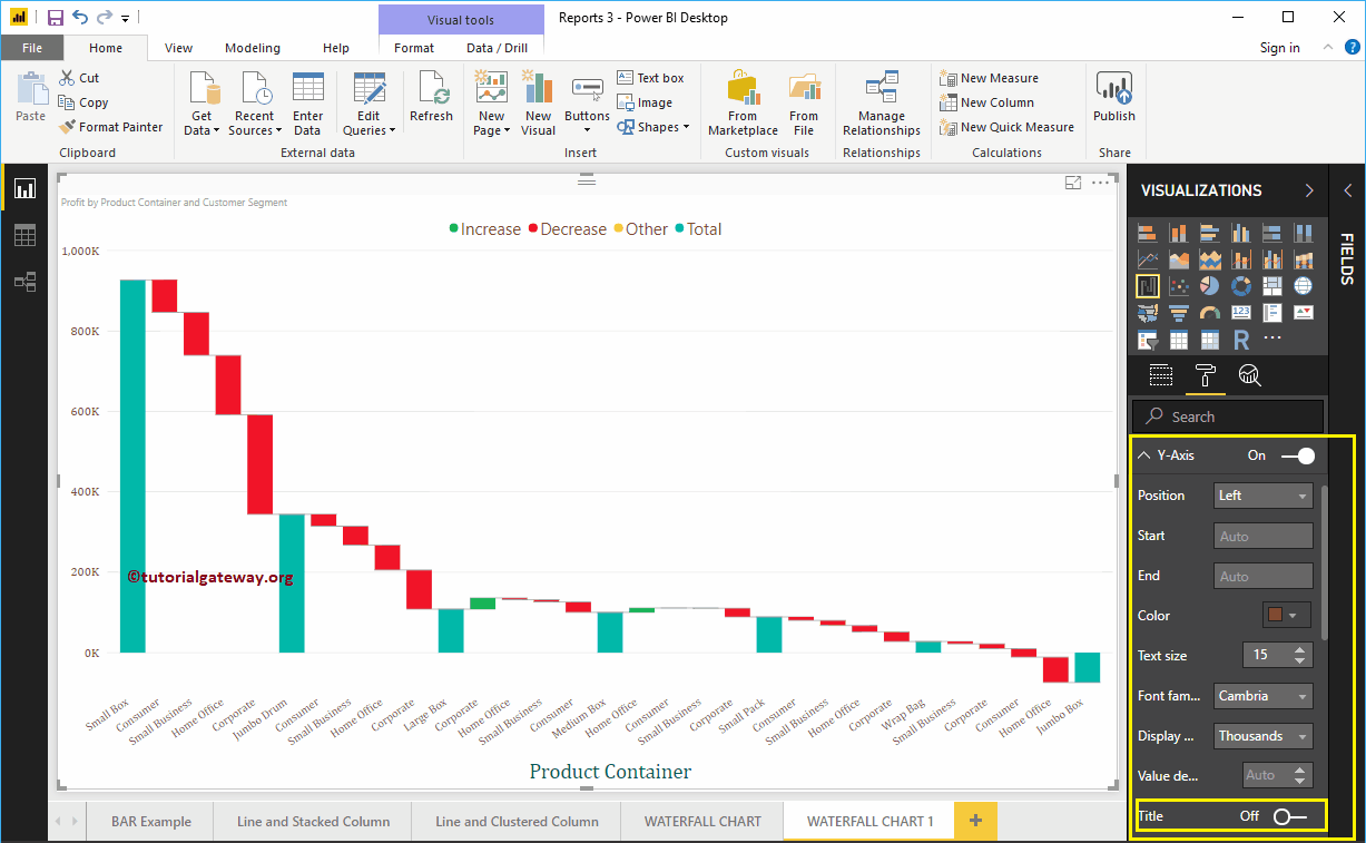
By default, the X-axis title is off. Let me change the option from Off to On. Next, we change the Y-axis title color to green, the text size to 25, and the font family to Cambria.
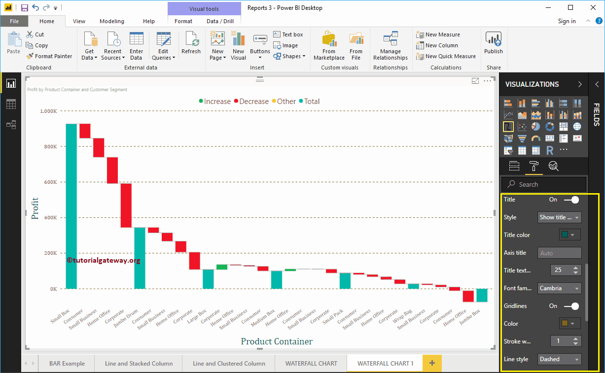
By toggling the Grid lines option from On to Off, you can disable the grid lines.
- Colour: You can change the color of the grid.
- Stroke width: Use this to change the width of the grid.
- Line Style: Choose the line style as Solid, Dotted, and Dashed.
Here, we change the color to gold and the line style to dashed.
Format data labels in a waterfall chart in Power BI
The data labels show the values (sales or earnings at all times). As you can see in the screenshot below, we enabled data labels and changed the color to green.

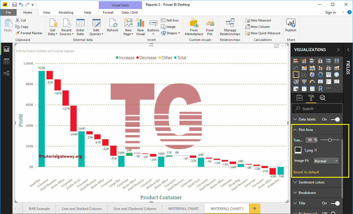
Format the waterfall chart in the Power BI plot area
With this Plot Area property, you can add custom images as Waterfall Chart Background. For demonstration purposes, we added an image as the background of the plot area.

Format Power BI Waterfall Chart Data Colors
Change these colors according to your requirements.

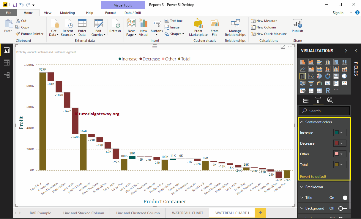
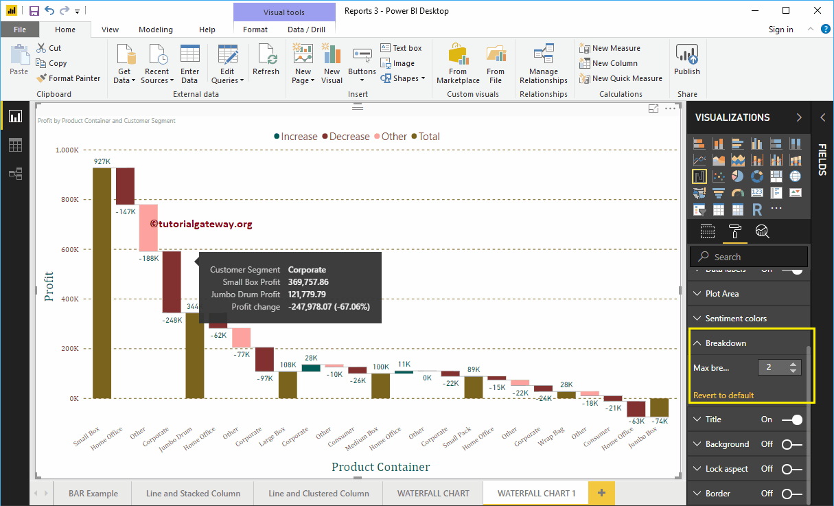
Power BI Waterfall Chart Breakdown Format
This option restricts the number of breakdown waterfall charts allowed. While creating this waterfall chart, we added the Customer Segment as the Breakdown property.
Our data has 4 records in the customer segment, and that is why the breakdown shows those 4 records.
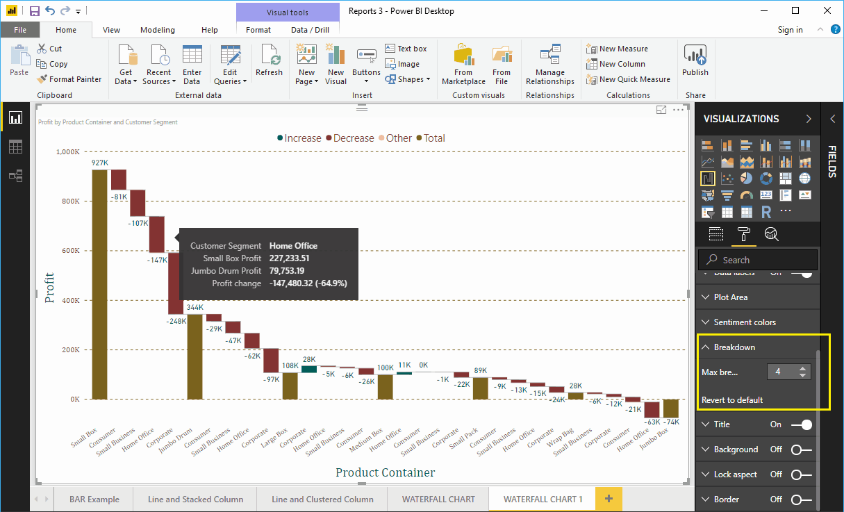

Let me change the value to 2. It means that the cascade allows a maximum of two breakdowns between each product container.

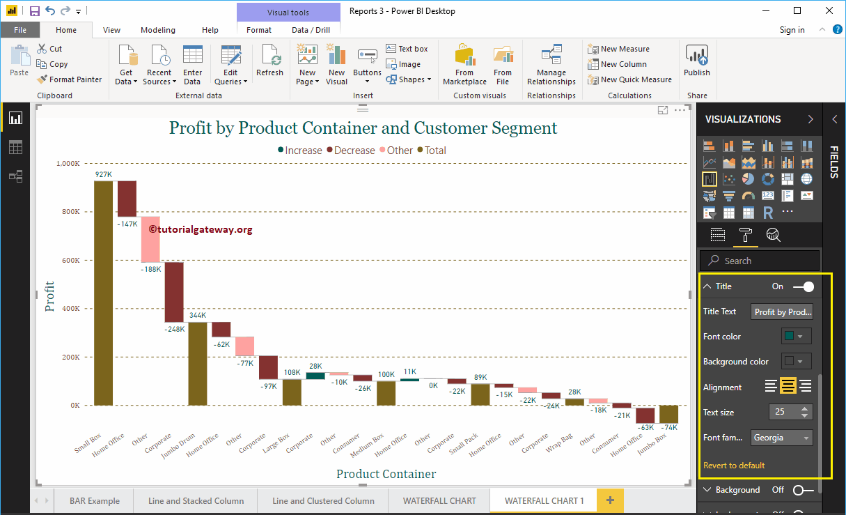
Format the title of the Power BI waterfall chart
By toggling the Title of In to Off, you can turn off the heading Waterfall Chart.
In the screenshot below, you can see that we changed the font color to green, the title alignment to center, the text size to 25, and the font family to Georgia. If you want, you can also add the background color to the title.

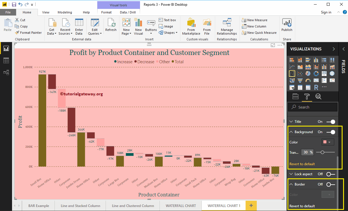
Format the background color and borders of the Power BI waterfall chart
You can add the background color to a waterfall chart by toggling Background option a In. For demonstration purposes, we added a random yellow color with a 30% of transparency.
Similarly, you can add borders to a waterfall chart by toggling the Border option of Off to In.