Power BI filled maps fill the map with colors based on the geological data you provide. Let me show you how to create a filled map in Power BI with an example.
For this Power BI Filled Map demo, we will use the world population data that we downloaded from the database (in Excel format).
See Connect to the Excel article to understand the Power BI steps required to work with Excel.
How to create a filled map in Power BI
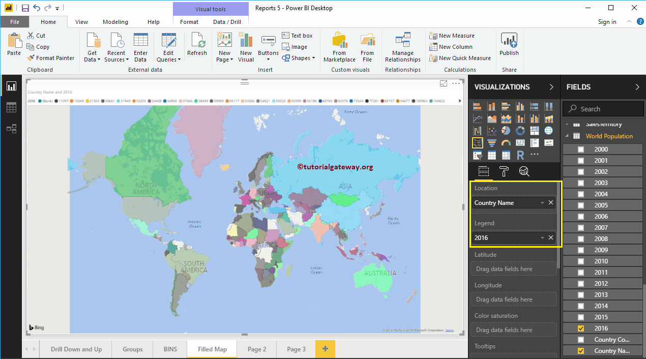
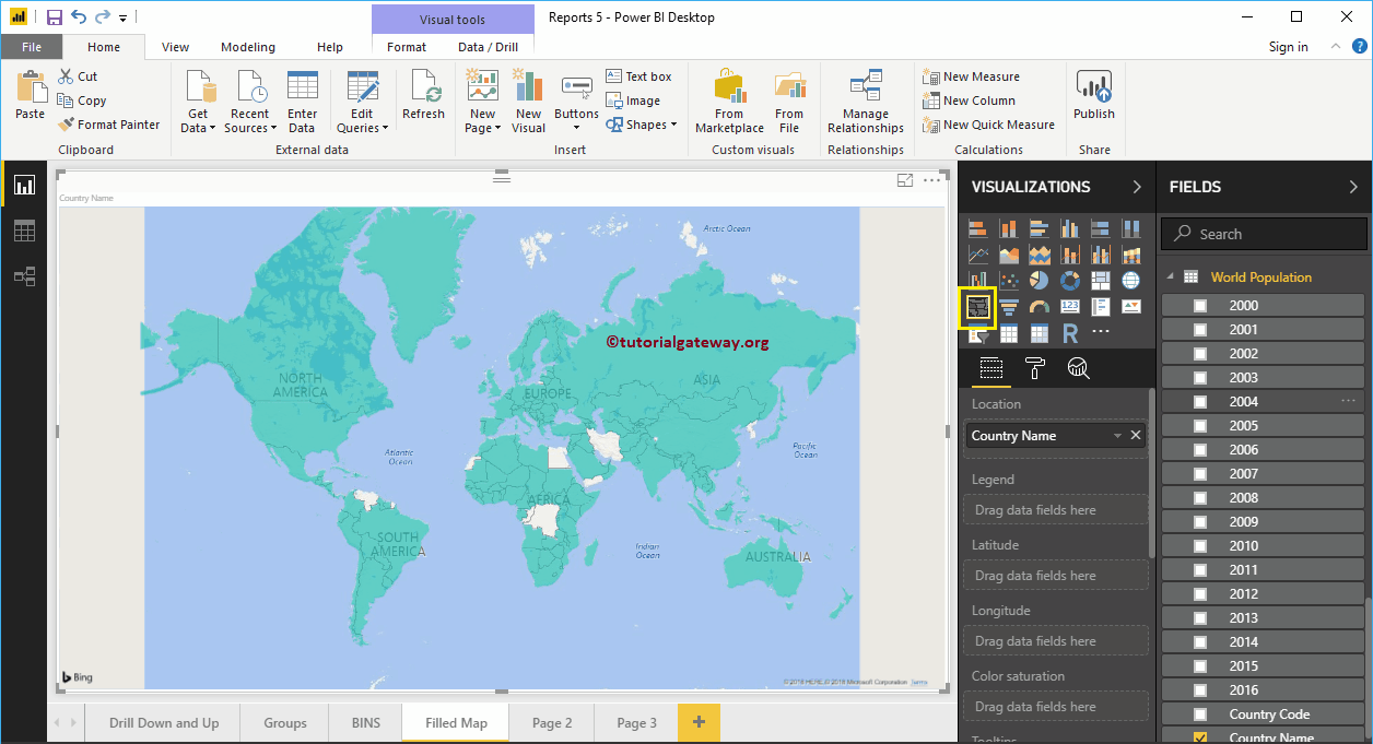
Dragging any geographic data into the Canvas region will automatically create a map. First, let me drag the Country Names from the world population table onto the canvas.
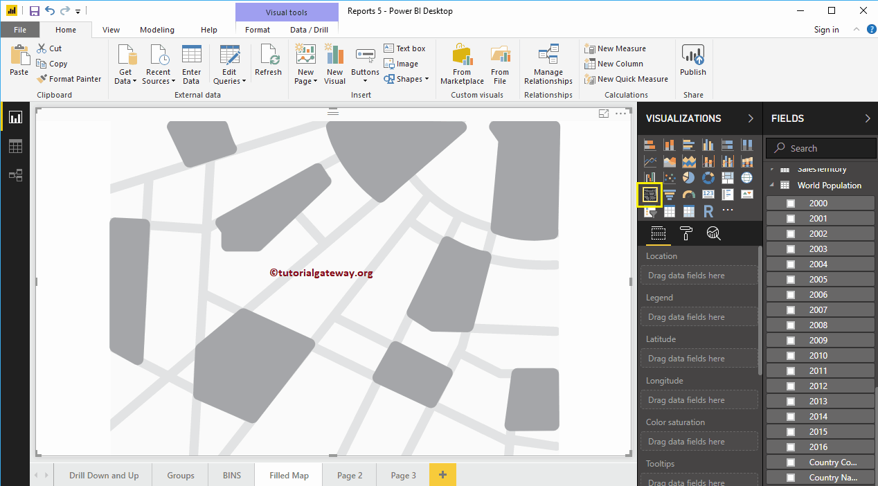
Click on the filled map below the Display section. Converts a map to a filled map.
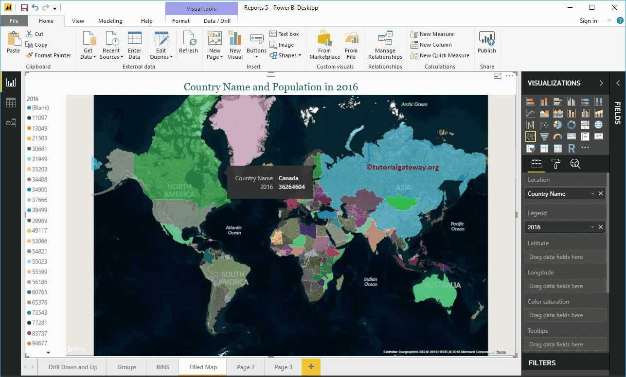
Then drag and drop the 2016 Population section of the fields to the Legend region.

In the above screenshot you can see the full map representing the population by country in the year 2016
Create a filled map in Power BI focus 2
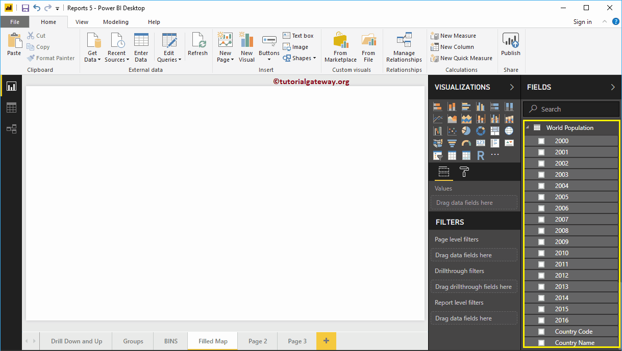
First, click on the filled Map below the Display section. Automatically create a map filled with dummy data, as shown in the screenshot below.
To add data to a full Power BI map, we have to add the required fields:
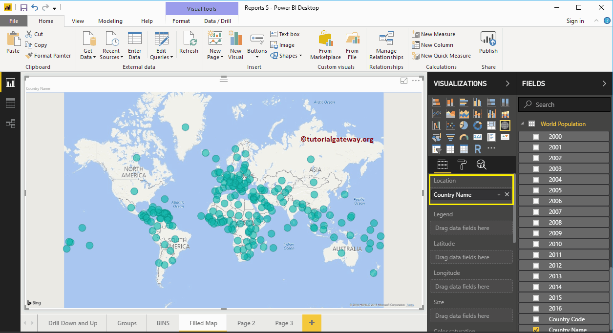
- Location: Specify the geologic column that represents the bubbles.
- Legend: Specify the column that subdivides the location data. Something like Territory, Country, Region or Continent
- Latitude and longitude: If your data has latitude and longitude information, you can use it to get the exact location.
- Size: Specify the column that represents the size of the bubbles.
- Color saturation: Any numerical value that decides the color of the bubble.
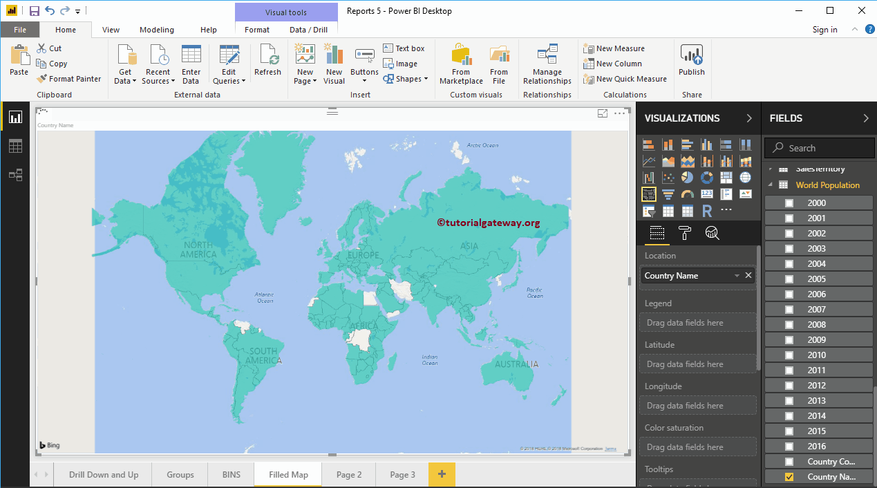
Let me drag the country name from the Fields section to the Location section. You can do this by dragging the country name to the Location section, or just check the country name column.
Next, let me add the 2016 population to the legend section. Now you see the map full

Let me apply a quick format to this map filled with Power BI
NOTE: I suggest you check out the Full Map Format article to understand the formatting options.
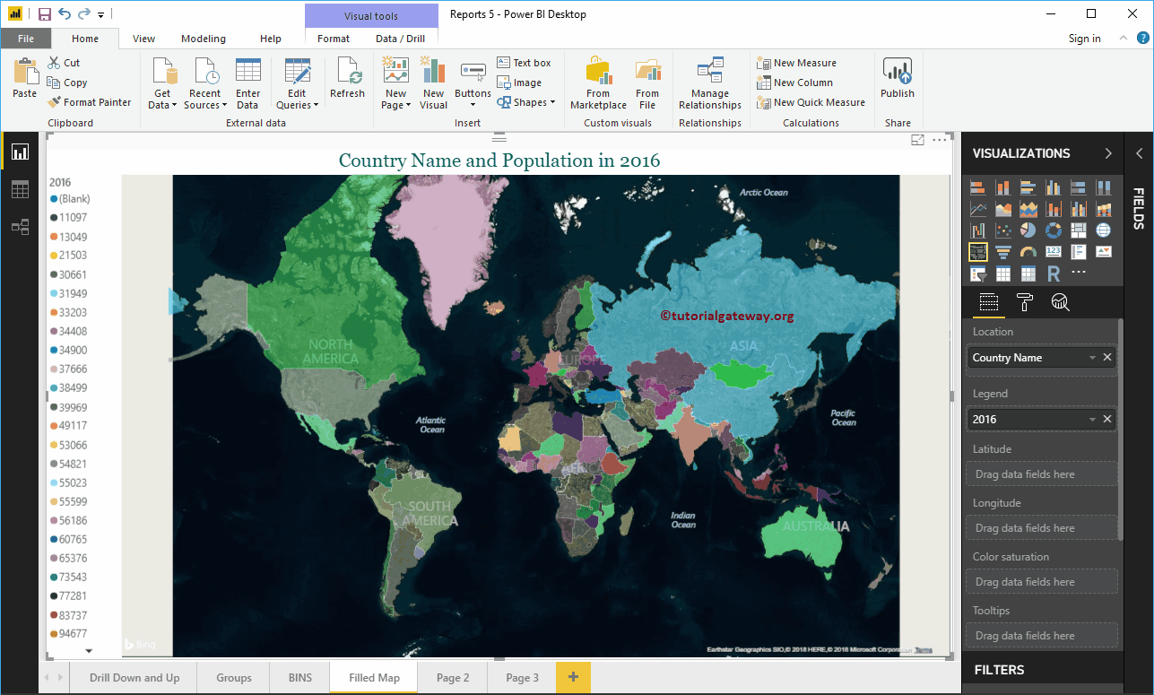
Hover over any region to see the name of the country and the population of the country.