How to format donut chart in Power BI with an example? Donut chart format includes enabling legend, positioning legend, title position, slice colors and background colors, etc.
To demonstrate these formatting options, we will use the donut chart we created earlier. See the Power BI Donut Chart article to understand the steps required to create a Power BI donut chart.
How to format donut chart in Power BI
Click on the Format to see the list of formatting options available for this donut chart.
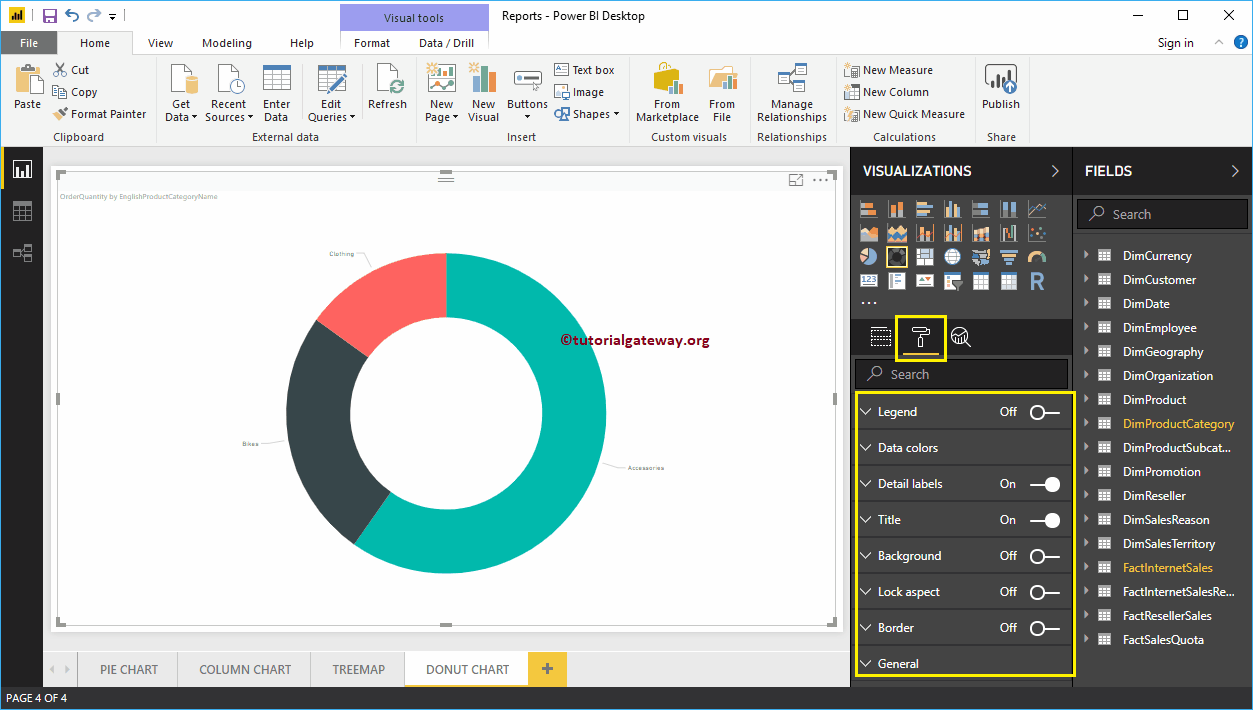
Format a donut chart legend in Power BI
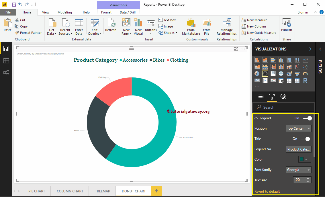
To display or enable the legend, select the legend region and change the option from Off to In. In the following screenshot, you can see the list of properties available for the legend.
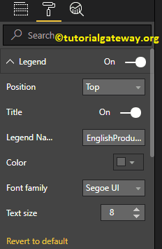
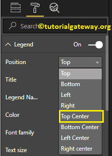
Position: Use the drop down box to reposition the donut chart legend according to your requirements. For now, we are selecting the Superior Center.
As you can see in the screenshot below, we changed the caption title to product category, the color to green, the font family to Georgia, and the text size to 20.
Format the data colors of a donut chart in Power BI
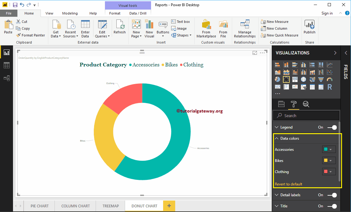
Data colors are useful for changing the colors of sectors. Use this section to change the default trim colors to those required.
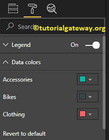
For demonstration purposes, we changed the color of the bikes to yellow.
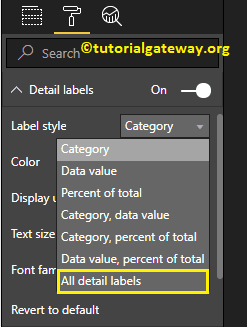
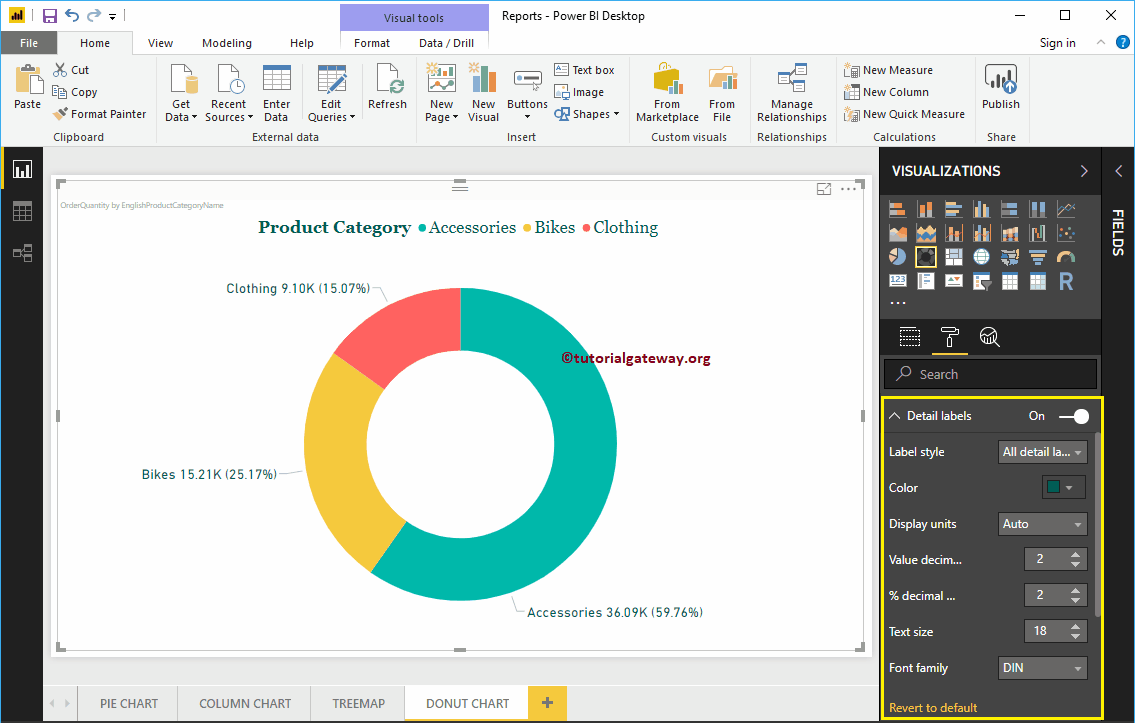
Format the detail labels of a Power BI donut chart
The detail labels show the information about each sector. By default, it displays the category name as a label. Let me change the label style to All Details. It means that each sector shows the information about the category name, the order quantity and the percentage of the total.
As you can see in the following screenshot, we also changed the color of a label to green and the font size to 18. You can also change the Display units from Automatic to Millions or Trillions.
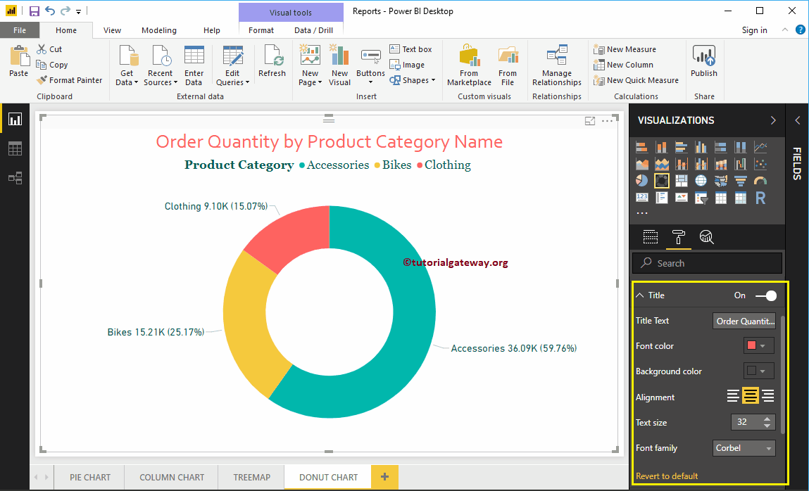
Format donut chart in Power BI title
To display the title of the pie chart, select the title and change the option to Off to In. The following is the list of options that are available to format the donut chart title.
As you can see in the screenshot below, we changed the title text to Order Quantity by Product Category Name. Then Font Color to Brick Red, Font Style to Corbel, Font Size to 32, and Title Alignment to Center.
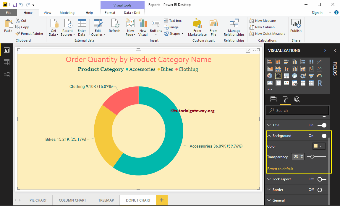
Add background color to donut chart in Power BI
You can add a background color to the donut chart by toggling the Background option from Off to In. For demonstration purposes, we are adding a background color. Here you can also change the transparency percentage.
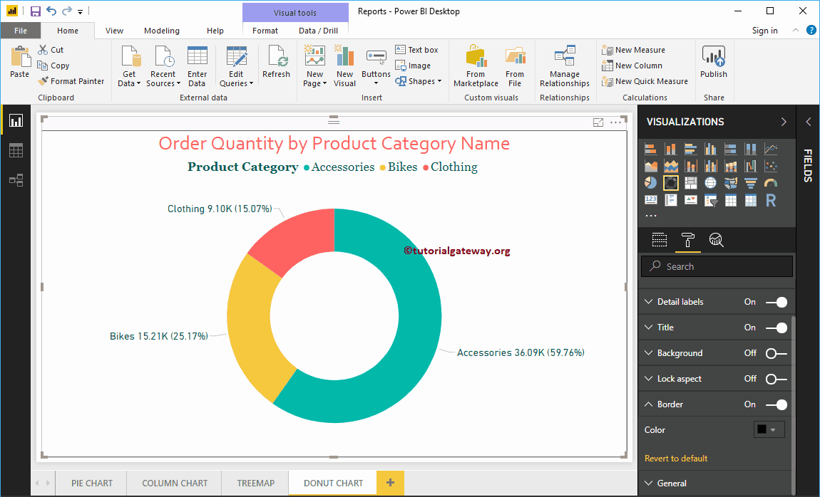
Add border colors to the donut chart in Power BI
Alternate Border option from Off to In allows you to add borders to the donut chart. For demonstration purposes, we enabled it and added black as the border color.

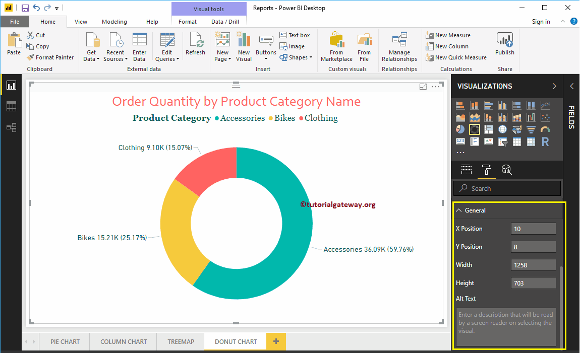
You can use this general section to change the X, Y position, width and height of a donut chart