Power BI bar chart or horizontal bar chart are useful for data comparison. For example, you can compare sales by color, region, or product group, and so on. Let me show you how to create a bar chart in Power BI with an example.
For this Power BI bar chart demo, we used the SQL data source that we created in our previous article. Therefore, see the article Connect Power BI to SQL Server to understand the Power BI data source.
How to create a bar chart in Power BI
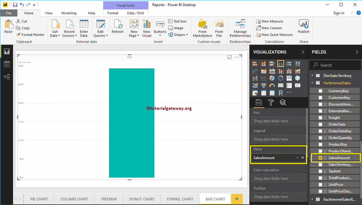
To create a bar chart, first drag and drop the sales amount from the Fields section to the region of the canvas. Automatically create a column chart.
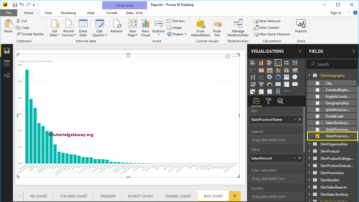
Next, let me add the name of the state province to the Axis section to create a column chart showing the sales amount by state province.
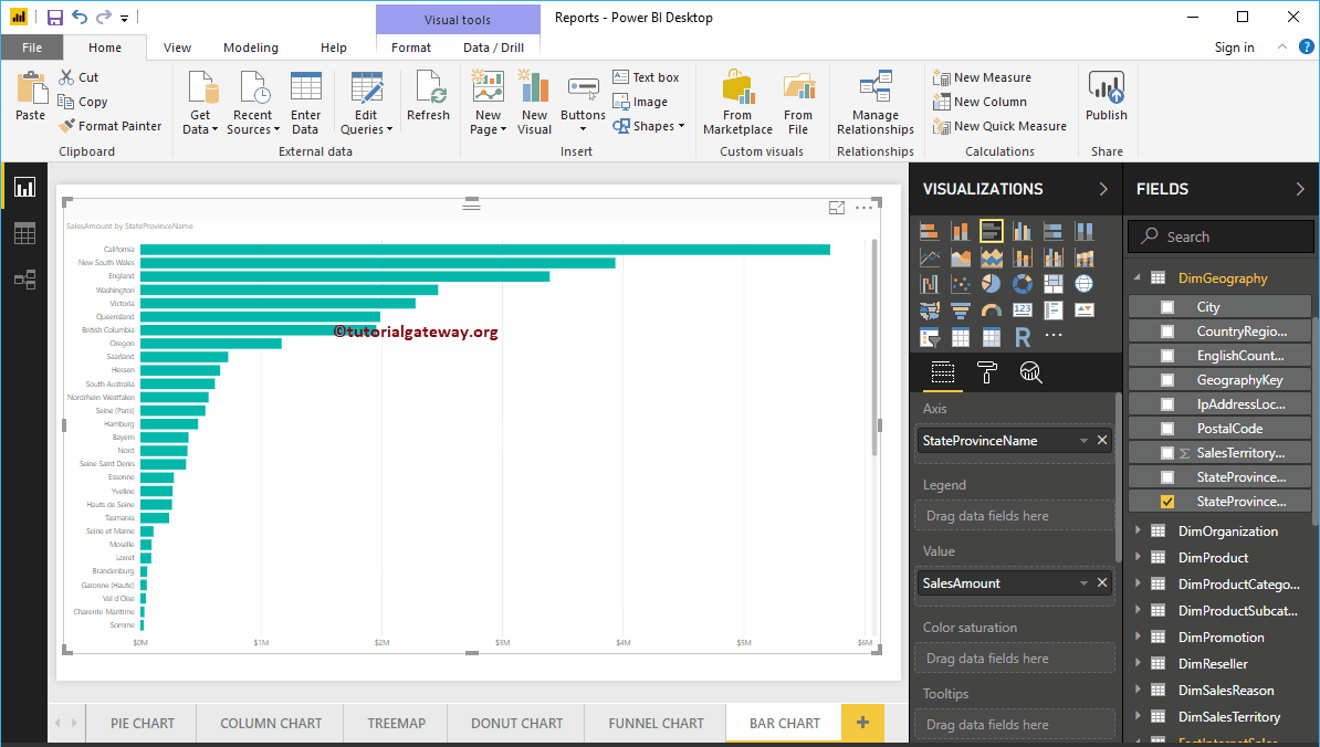
By clicking on the bar graph below the Display section, it will convert column chart to bar chart
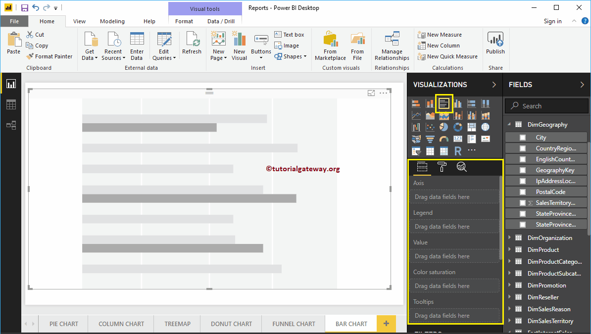
Create a bar chart in Power BI: approach 2
First, click on the clustered bar chart below the Display section. Automatically create a bar chart with fictitious data.
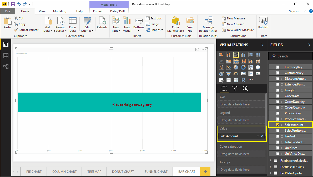
To add data to the Power BI bar chart, we have to add the required fields:
- Axis: Specify the column that represents the horizontal bars.
- Values: Any numerical value such as sales amount, total sales, etc.
Let me drag the sales amount from the Fields section to the Values field.
Then add the name of the state province from the DimGeography table to the Axis section. You can do this by dragging State Province to the Axis section, or just check the State Province column
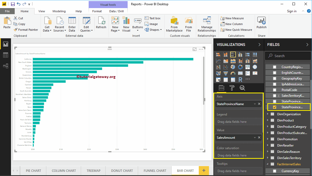
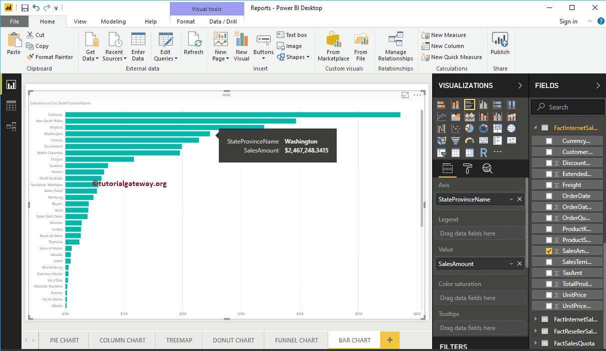
You can now see a bar chart that represents sales by state province. Mouse over any bar to display the state province name tooltip and its sales amount
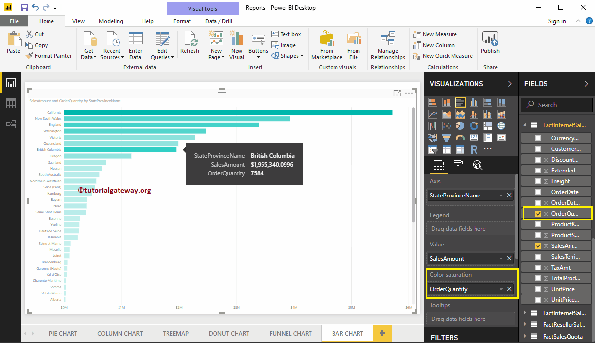
The Power BI bar chart has one more property called Color Saturation. Add colors to individual bars based on the value of the color saturation field. Let me add the order quantity to saturate the color from light to dark.
In the screenshot below, you can see that the colors of the bars have changed based on your order quantity.

Let me apply a quick format to this bar chart
NOTE: I suggest that you refer to the Formatting the Bar Chart article to understand the steps required to format the bar chart title, bar colors, data color, background color, axis fonts, and colors.