Your website is the channel through which your online business customers will find you and hopefully spend enough time to get a click on the "Complete Purchase" button. You have the compelling title, keyword-rich domain, and even great content. But the concept of "content is king" is not the end of everything. After all, what good is content if your site navigation is difficult? Your visitors will leave as soon as they arrive.
Many studies have been done on the psychological effect of certain website designs. Small details that you rarely think about, such as the size of page titles, the placement of text on the page, and the color theme, are essential for a site to be successful or not. It's time to create a design that is not only visually appealing, but smart enough to attract visitors. Once they are there and see the type of content, products and / or services you are offering, I will be back again and again.
Here are some things to consider when trying to create a solid WordPress layout.
See what other people are doing

One of the best ways to start deciding on the right design for your site is to take a look at what other website owners have done with their sites.
Check out sites that offer similar products or services and have content equivalent to yours, then determine what you like or don't like about them. Browse a site for a bit and then get away from the computer. While you're not staring at a screen, try to think of that website that stood out, if at all.
As you explore several different websites, you will begin to notice the type of patterns used, the size of the titles, the location of the text on the page, and the colors used for the backgrounds and content. The goal of any design is to grab the visitor's attention and draw them to a certain area of the page.
The layout should be pretty much the same on every page of your site to keep things clean and create the best site flow. Everything should match up a bit, without mixing all sorts of different looks into one big hodgepodge. Nothing will send your visitors faster than a confusing web design.
Don't go crazy with complex designs
Graphics and ads are great and all, but a lot of them can confuse the visitor and distract them from the actual items you want them to notice. Placing some ads on your site to monetize it is fine, but overloading your pages in hopes of getting more clicks will only make your site look like spam, which is a surefire way to send your visitors in the other direction.
Less is more, especially when it comes to ads and graphics. Too much will overstimulate your visitor. In fact, tests have been done in the past on the number of ads placed on web pages: the fewer ads there are on a site, the higher the click-through rate and the higher cost per click you get. When designing your WordPress site layout, be sure to continually tweak it until you find the right balance. Such a site will be much more pleasant to navigate, which translates into higher profits.
Don't leave out the fundamentals
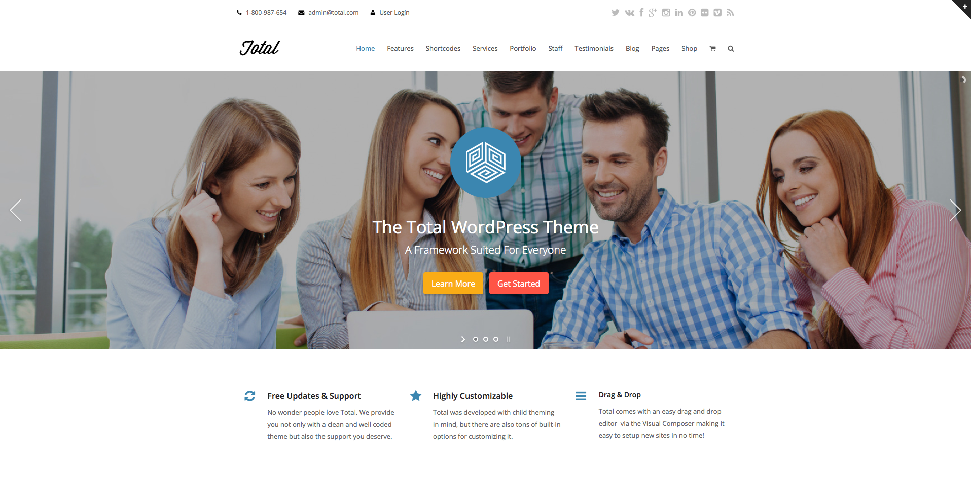
One of the best things about WordPress is that there are thousands and hundreds of themes that are highly customizable (like the Total WordPress theme). Regardless of which theme you decide to use, make sure you don't forget about the basics, including:
- A navigation bar at the top to give your visitors easy access to different pages.
- Separate sections so visitors know exactly where navigation ends and content begins.
- A search bar
- A link to the home page at each page
Almost all WordPress themes have these features, but if you come across one that doesn't, avoid it like the plague. Visitors need a site that is easy to navigate, or else they will go like the wind.
Use «The Fold» to your advantage
The phrase "above the fold" originated in the kingdom of newspapers, and it basically meant that the key stories of the day had to be placed in the top half of the newspaper so that they could attract as much attention as possible when the paper was folded in half.
These days, we've brought that phrase into the world of website design. If there is a particular item that you want your visitors to see as soon as they enter your site, you need to make sure it is placed "in the top half of the page." In other words, it is placed before the point where the user needs to scroll down to read anything else on that page.
Make sure all your important items are on every page
Just as keeping important items in the top half of the fold is crucial for visitors to notice, so is placing important items on every page of your website. Luckily, WordPress makes this kind of task easy thanks to the use of page templates, plugins, and sidebars.
Do you need a sidebar?
Speaking of sidebars, for years these website items were almost a given when it came to layouts. While they serve a good purpose for many, the sidebars seem to be disappearing.
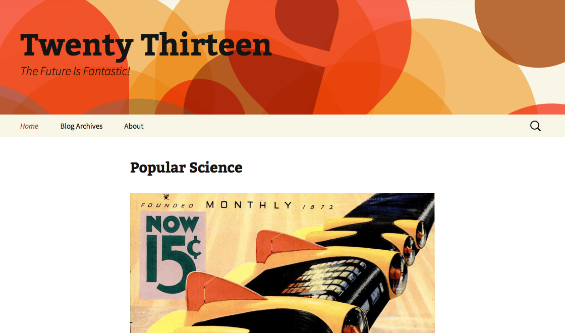
With WordPress themes like Two thousand and thirteen Out there without a sidebar, more and more website owners and bloggers are forgoing the once-static website component. The question to ask yourself is, will you sacrifice the usability of your website without a sidebar? Or can you have a well-oiled machine without it?
You must decide whether certain items that have traditionally been placed on the sidebar can survive elsewhere. Things like a search bar, ads, recent posts, links to subscribe to your blog, and email subscription forms are generally placed in the sidebars, but more and more bloggers and web store owners have found that their sites they work just as well without side bars. Many sites have been very successful without the perceived clutter of overcrowded sidebars. And that's noteworthy!
Fixed width or liquid web pages?
You will need to decide whether you want to go for a fixed-width website or a liquid-width format. Fixed width layouts will work the same on all systems, but visitors will need to scroll horizontally across the page. Liquid width formats, apart from this, can expand or contract to help fill the space.
In these cases, they are always adjusting to the specific screen the visitor uses. The main drawback of liquid formats is that they will turn into really wide columns at some point, which will likely cause the user to have to resize their browser window. The images at the same time can change, so that is something to keep in mind.
When trying to create a great design for your website, do a little homework and keep an eye out for new trends in themes and designs. Keep an eye on what other people in your industry are doing and develop a sense of what works and what doesn't. I know, it's a bit easier said than done, but it will be worth the effort when your site design is optimized, effective, and completely cool.
How did you decide on the design of your WordPress site? Did you keep any of the above tips in mind or did you just trust your gut? I would love to hear your thoughts.