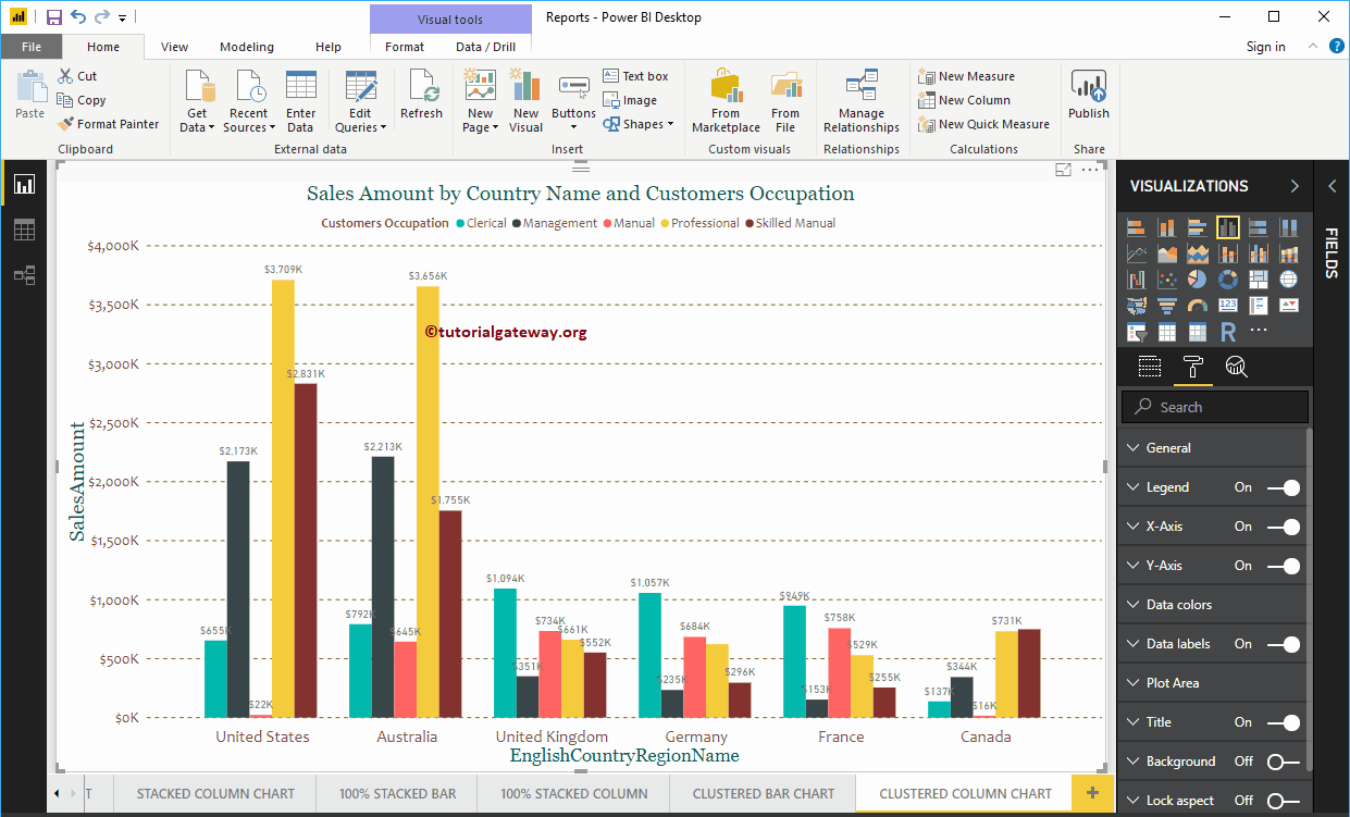
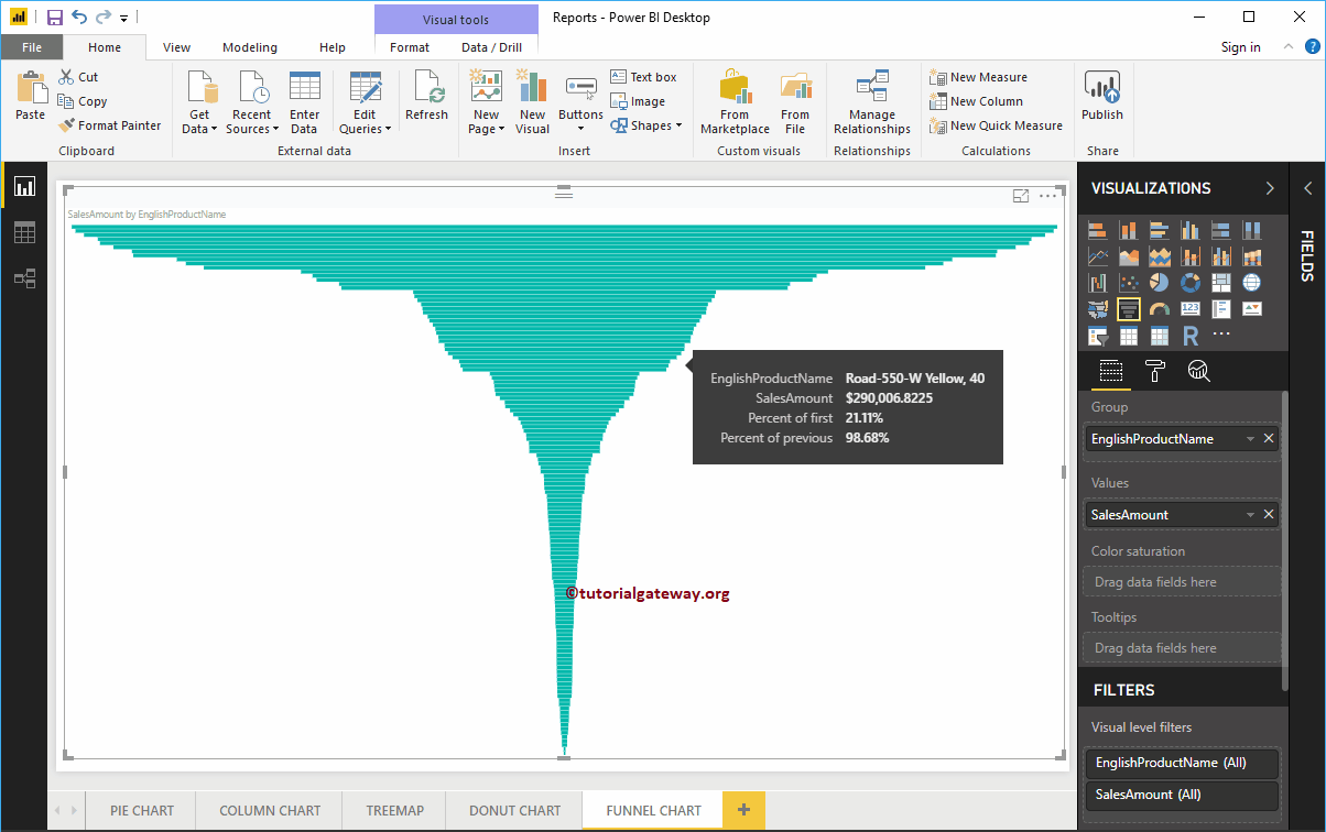
The clustered column chart in Power BI is used to display vertical bars from multiple data regions (measures) in a single metric. Let me show you how to create a chart ...
The clustered column chart in Power BI is used to display vertical bars from multiple data regions (measures) in a single metric. Let me show you how to create a chart ...
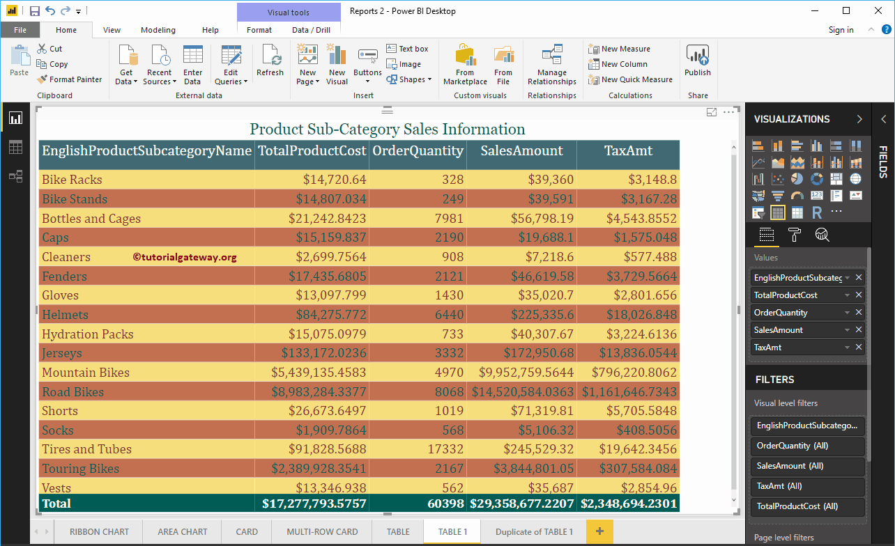
Let me show you how to add alternate row colors to Power BI table report with a practical example. For this demo of adding alternate row colors to the ...
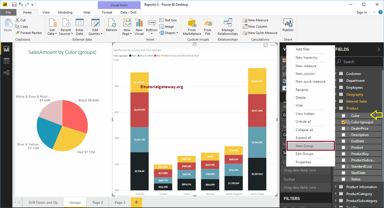
Power BI grouping is the process of combining or merging two or more values for more detailed analysis. For example, when we see a report of products by ...
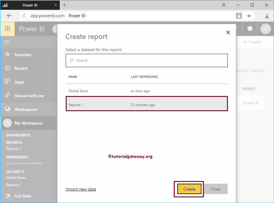
How to create a report in Power BI Workspace with a practical example ?. Before starting to create a report, let me show you the existing reports in my workspace ...
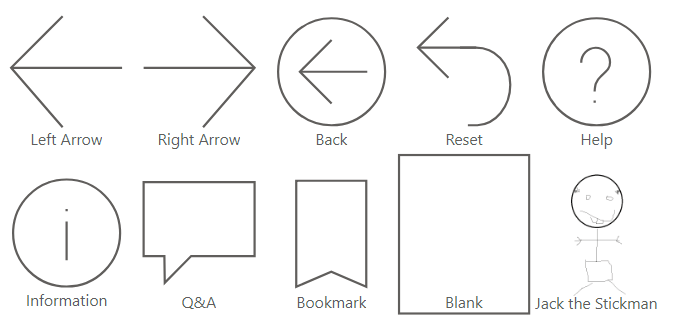
Time to read: 4 minutes Power BI buttons provide more interactivity in the reports and the different states allow a unique format when users interact with a button. Which…
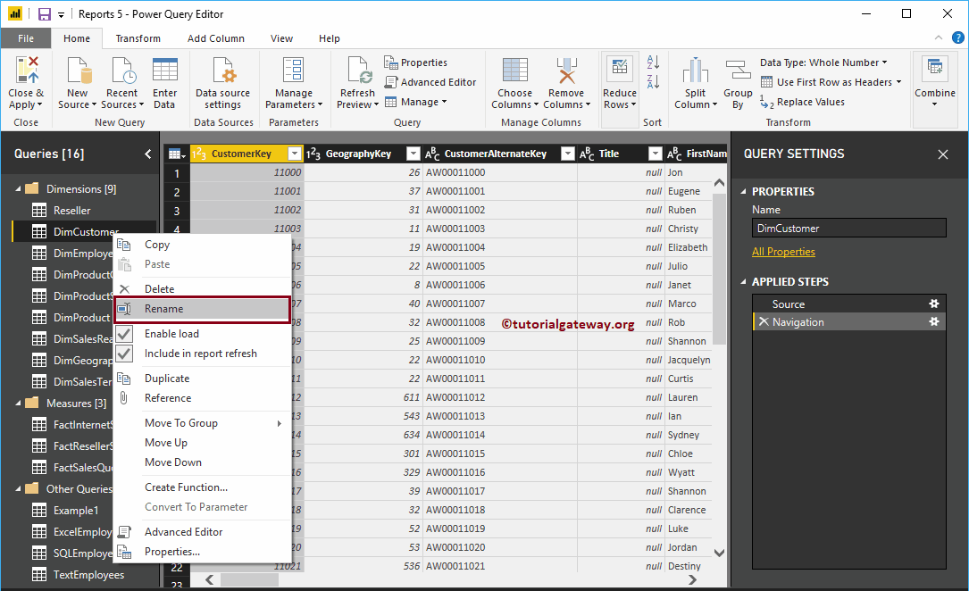
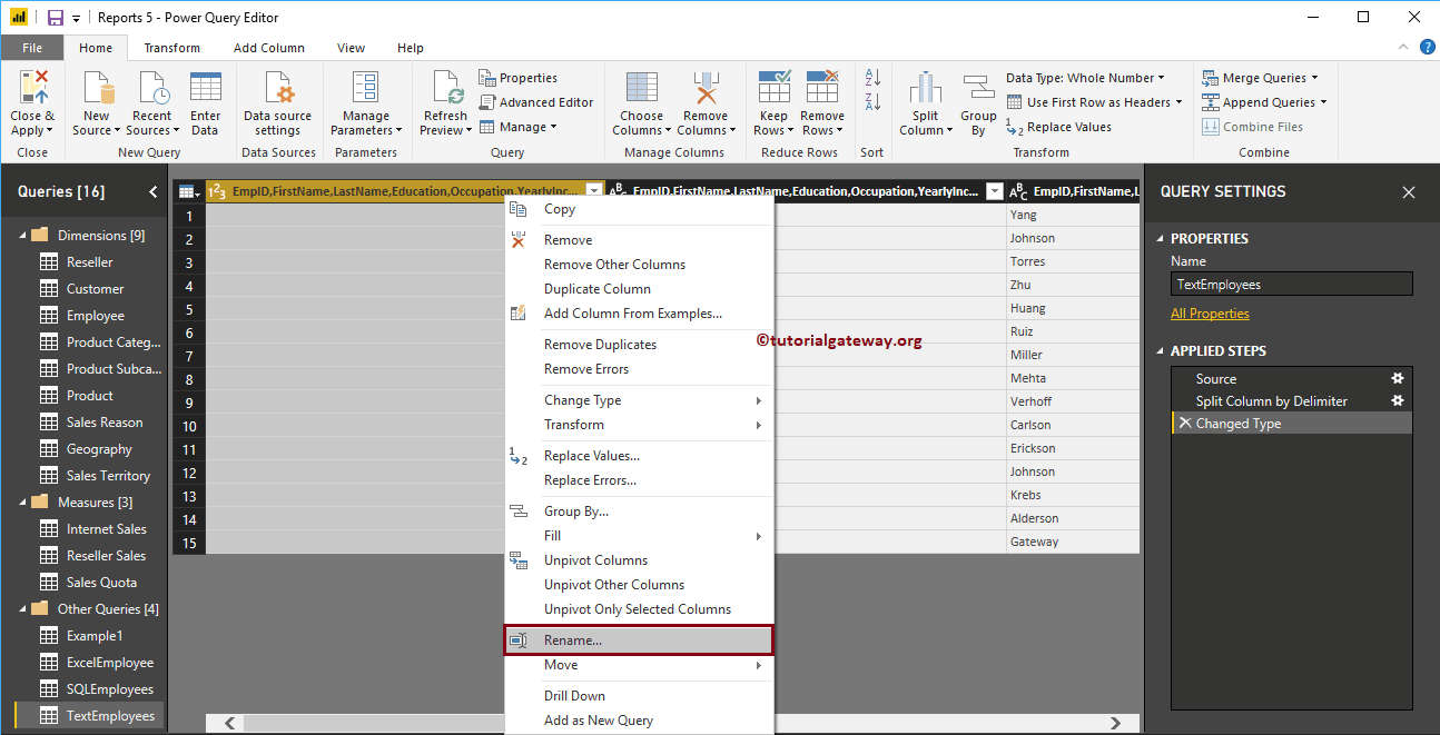
Let's see how to rename columns in Power BI Desktop with an example. Generally, when you load the data from a data source, you get the column names ...
Let's take a step-by-step approach to connecting Power BI to SQL Server database. In addition to this Connect Power BI to SQL Server, how to use queries ...