How to create a stacked area chart in Power BI with an example? For this demonstration of the Power BI stacked area chart, we will use the SQL data source that we created earlier.
See the article Connect Power BI to SQL Server to understand the Power BI data source.
How to create a stacked area chart in Power BI
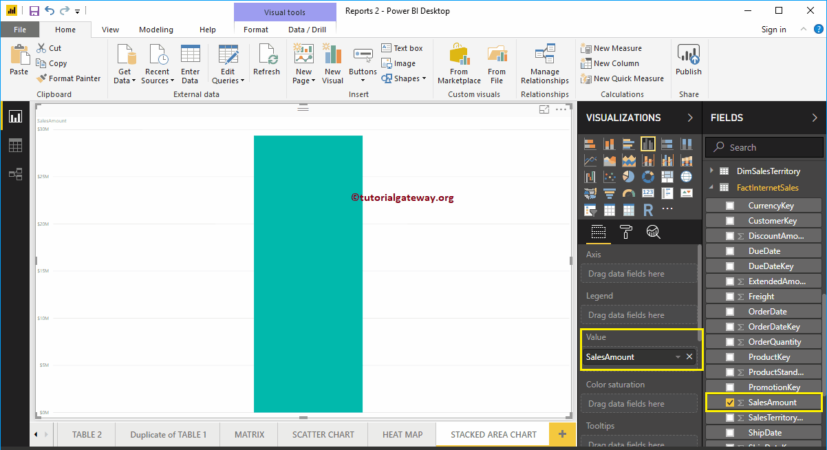
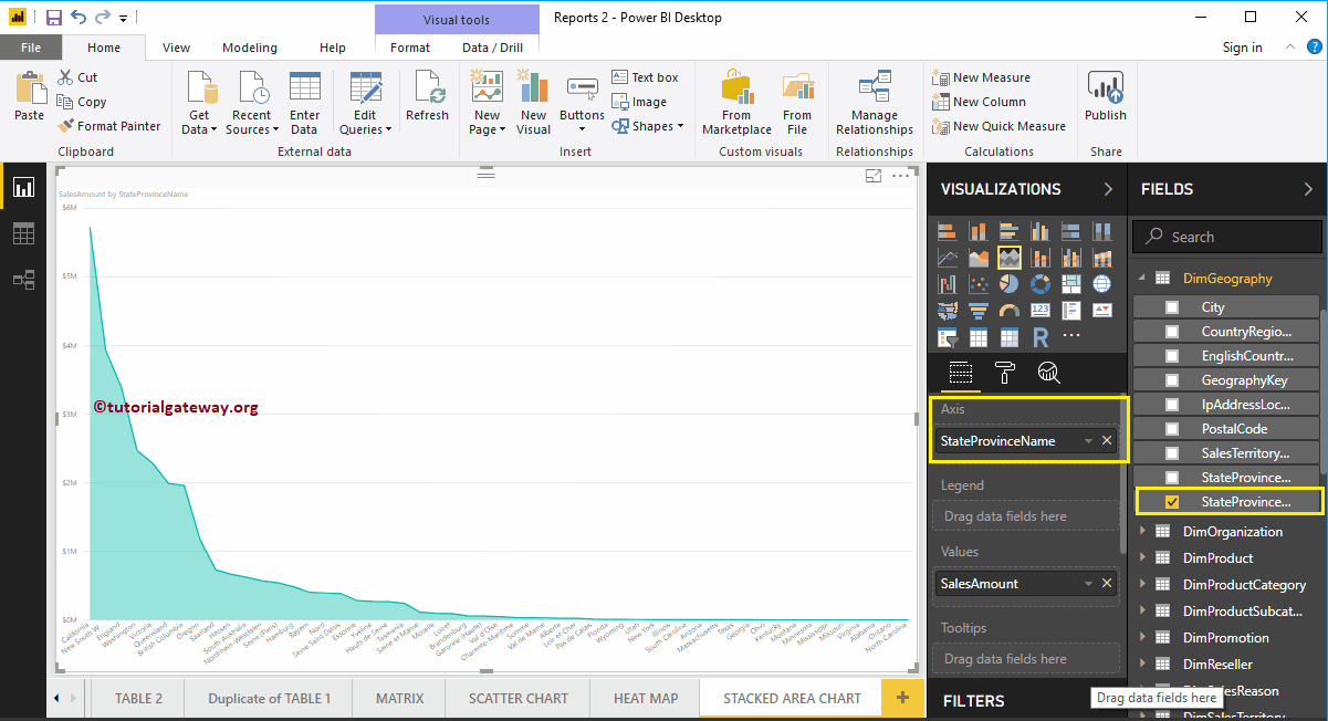
To create a stacked area chart in Power BI, first drag and drop the Sales Amount section of the fields onto the region of the canvas. Automatically create a Column Chart, as shown below.
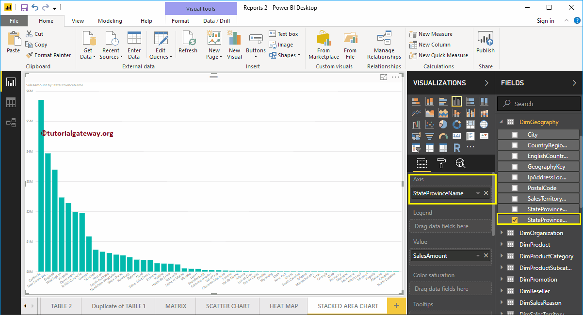
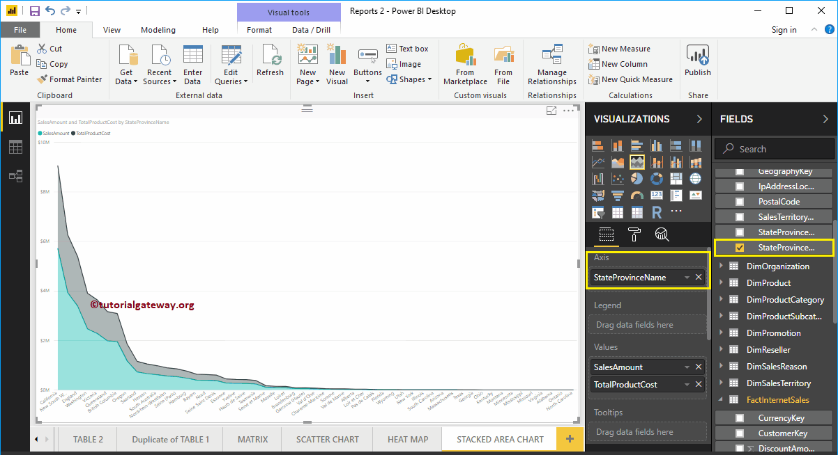
Next, let me add the name of the state province to the Axis section.
Click on the stacked area chart below the Display section. Automatically converts the column chart to a stacked area chart. In the screenshot below, you can see the stacked area chart showing the sales amount by state province name.
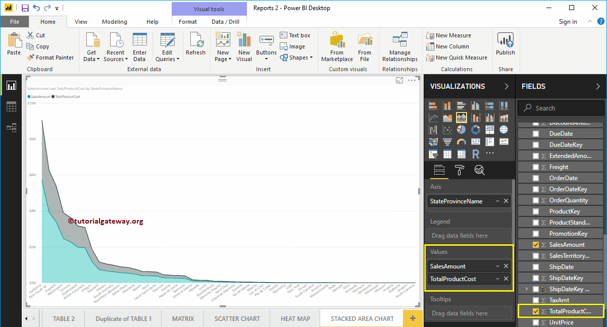
Let me add the total cost of the product to the values as well. This way, you can compare sales versus product cost by state province name.
Create a stacked area chart in Power BI: approach 2
First, click on the stacked area chart below the Display section. Automatically create a Power BI stacked area chart with dummy data, as shown in the following screenshot.
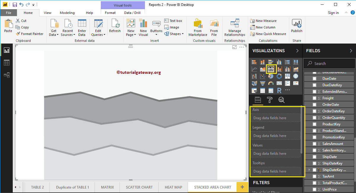
To add data to the stacked area chart, we have to add the required fields:
- Axis: Specify the name of the column that represents the stacked area.
- Legend: Column that further splits the values
- Values: Any numerical value such as sales amount, order quantity, total sales, etc.
Let me drag the Sales Amount and Total Product Cost section from Fields to the Values field.
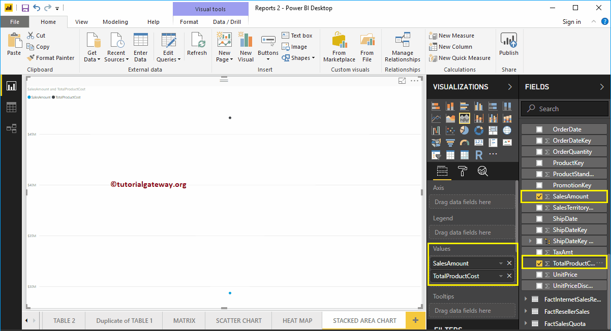
Next, let me add the name of the state province to the Axis section. You can do this by dragging State Province to the Axis section, or just check the State Province column.
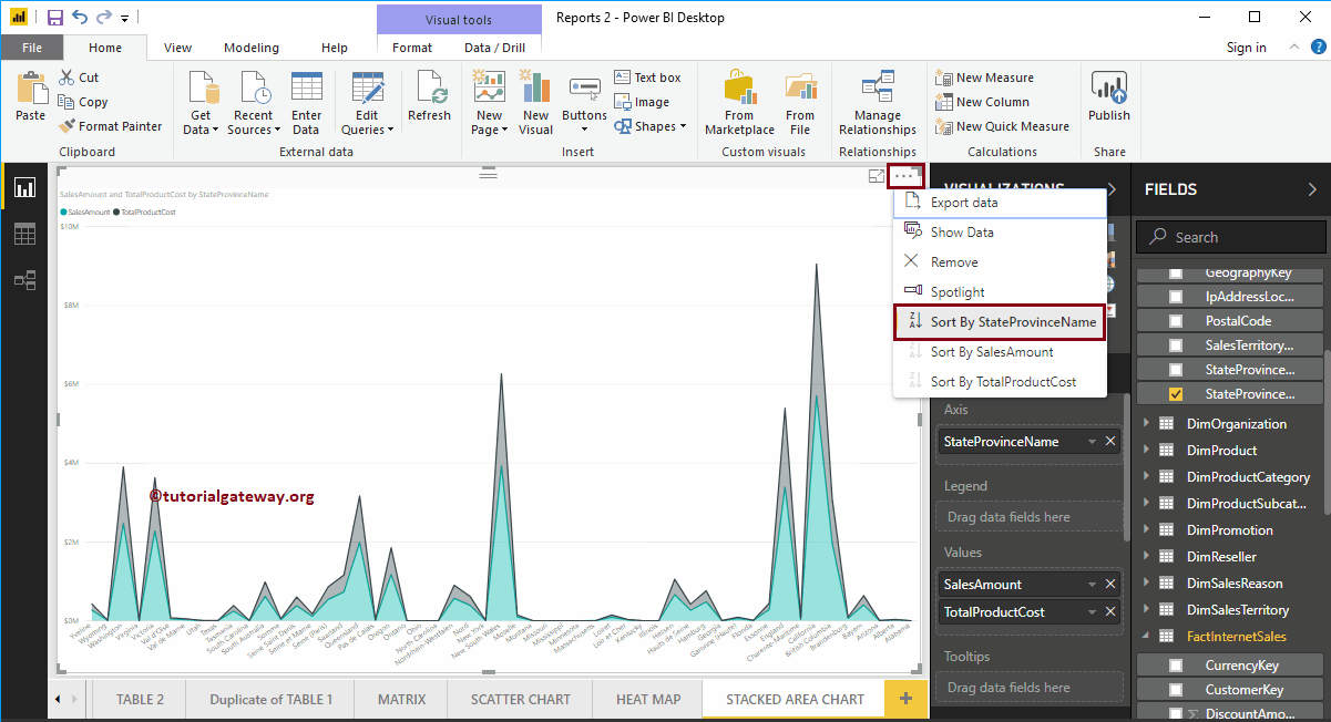
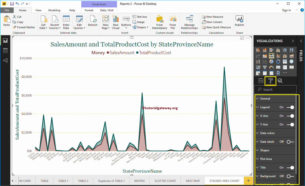
In the above screenshot, you can see that the stacked area chart is sorted by Sales Amount in descending order. So let me sort the data by the name of the state province. To do this, click on the … (3 dots) in the upper right corner and select the Sort by state province name option as we show below.

Let me apply a quick format to this Power BI stacked area chart.
NOTE: The formatting options for the area chart and stacked area charts are the same. Therefore, I suggest that you refer to the article Format Area Chart to understand the steps required to format this Stacked Area Chart.
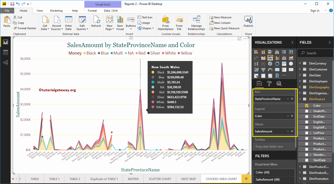
Let me add Product Color to Legend section to show multiple dimensions.