Power BI Donut Chart is similar to the pie chart, which is useful for visualizing top-level data. In this article, we show you how to create a donut chart in Power BI with an example.
For this Donut Chart demo in Power BI, we will use the SQL data source that we created in our previous article.
See the article Connect Power BI to SQL Server to understand the Power BI data source.
How to create a donut chart in Power BI
Clicking on the donut chart below the Display section, automatically creates a donut chart with dummy data.
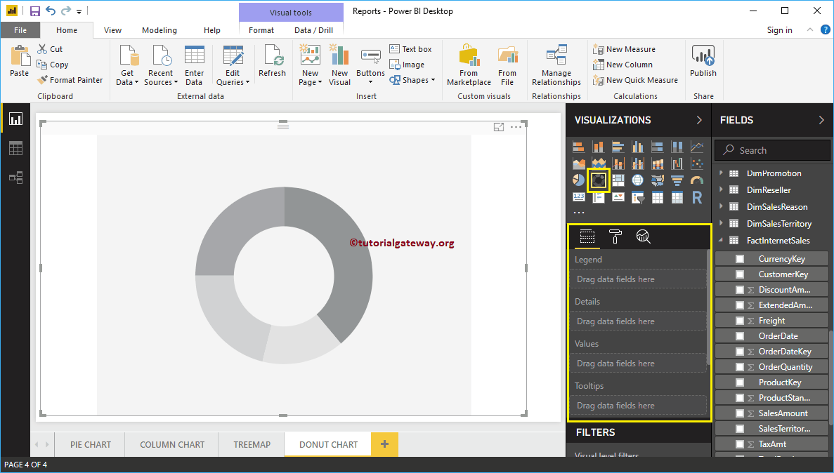 <>
<>To add data to the Power BI donut chart, we have to add the required fields:
- Legend: Drag and drop the column you want to display as a legend.
- Details: Drag and drop the column into which you want to split your donut chart.
- Values: Any numerical value like orders, sales amount, total sales, customer count, etc.
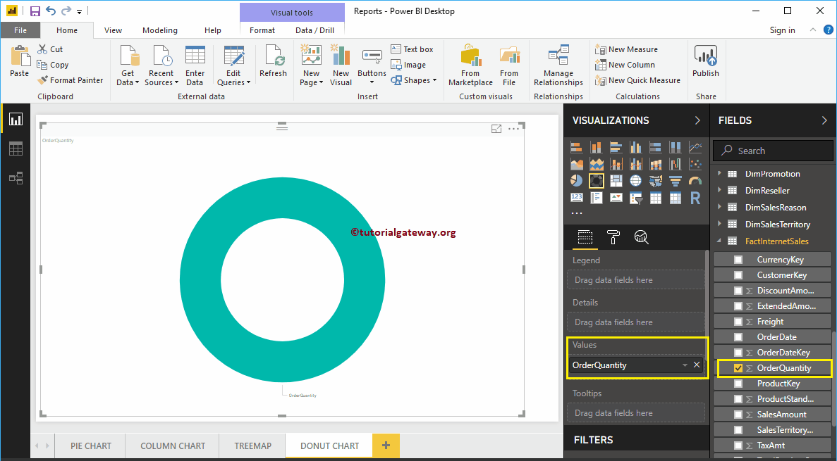
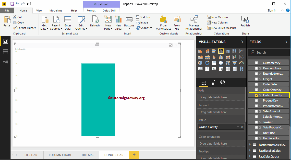
Let me drag and drop the Order Quantity section of the fields to the Values field.
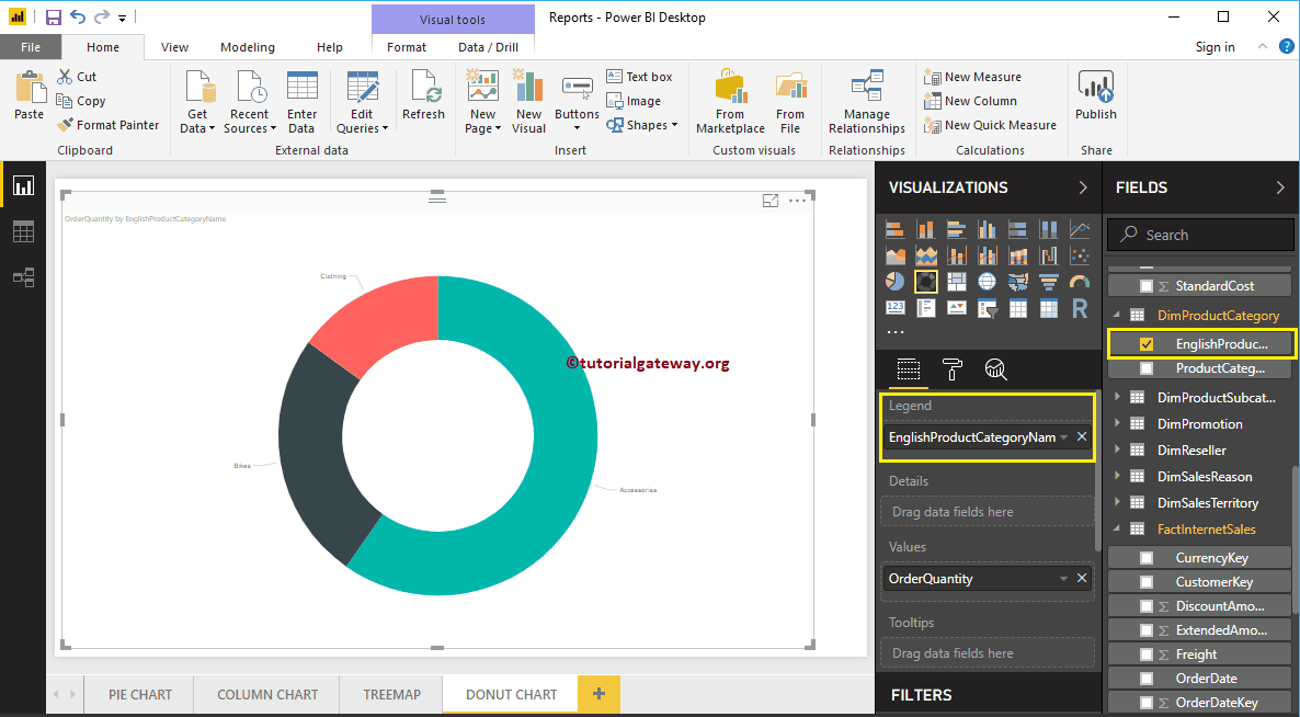
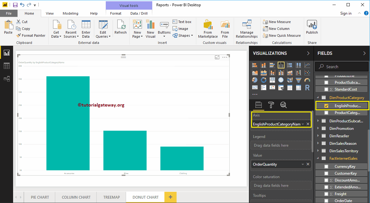
Next, let me add the English product category name from the DimProductCategory table to the Axis section. You can do this by dragging Category to Axis or by checking the category column.
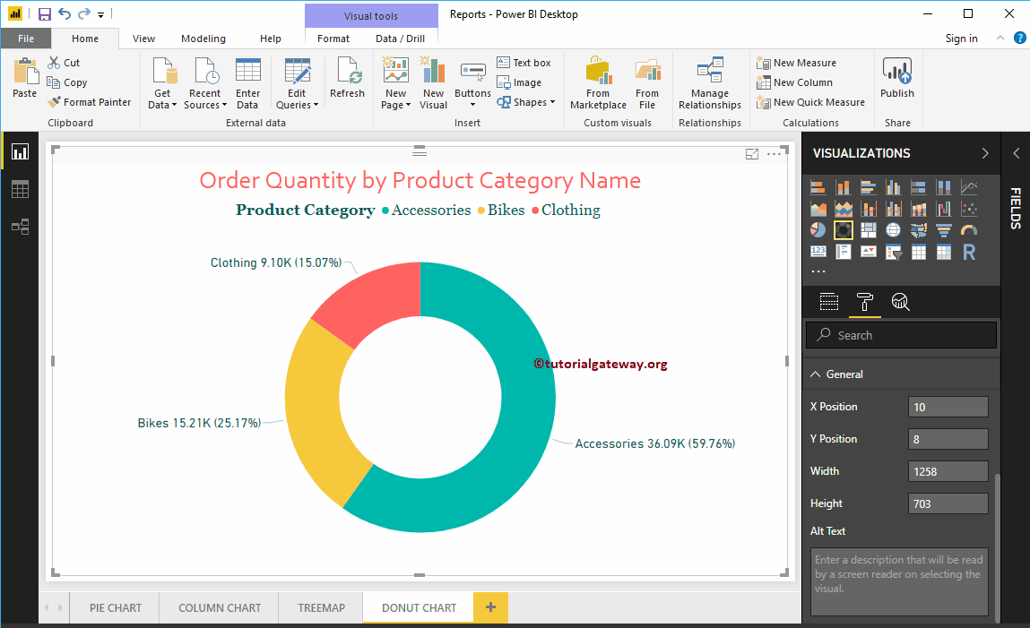
In the screenshot above, you can see the order quantity donut chart that is divided by product category.
Create a donut chart in Power BI: approach 2
First, drag and drop the Order Quantity section from the fields onto the canvas. Automatically create a Power BI column chart.
Next, let me add the English product category name from the DimProductCategory table to the Axis section. For this, drag and drop Category to Axis, or check the category column.
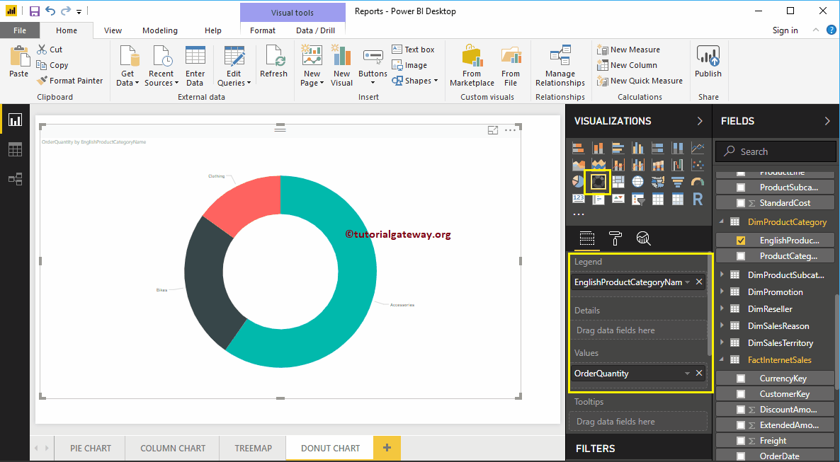
By clicking on the Donut Chart under the Display section automatically converts column chart to donut chart
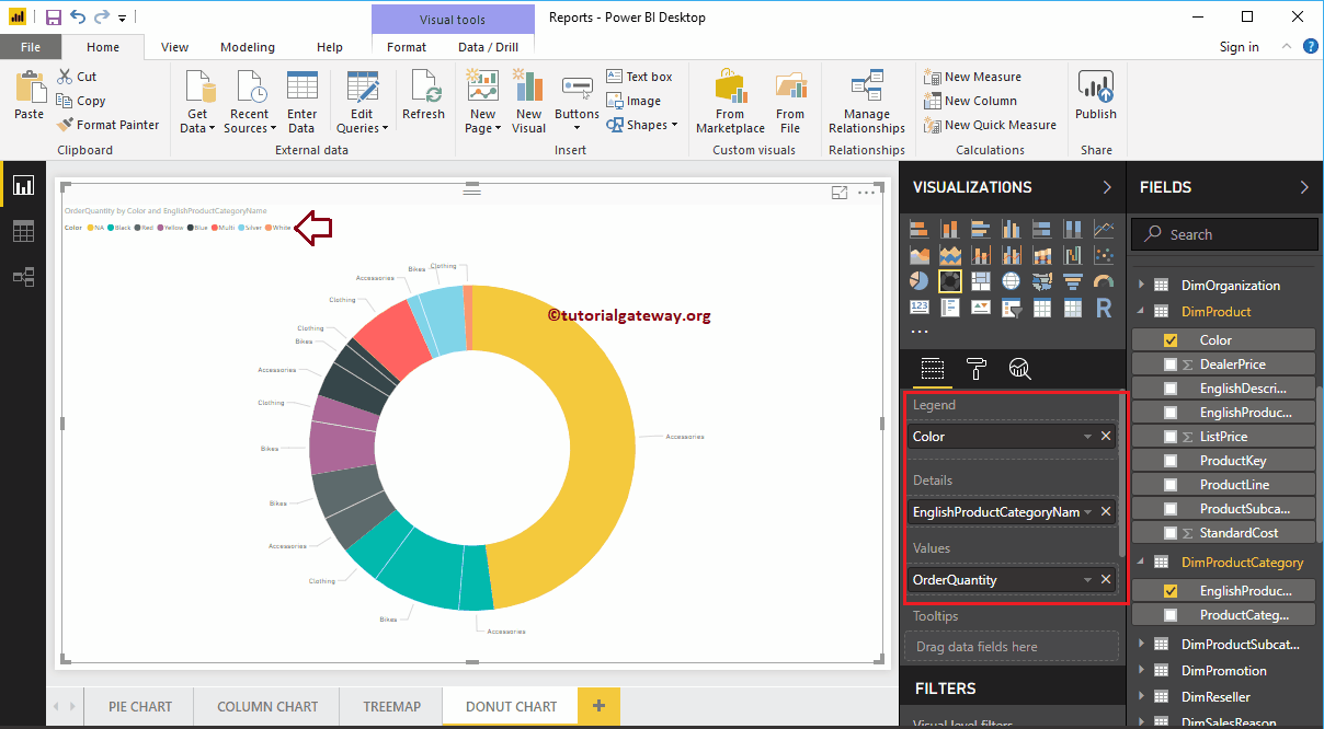
By adding another field to the Details section, further break up the Power BI donut chart.
Let me apply a quick format to the donut chart
NOTE: I suggest you refer to the Donut Chart Formatting article to understand the steps required to format the title font, title alignment, data labels, legend titles, slice color, and background colors. .