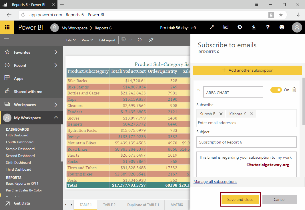
Let me show you the procedure to subscribe the Power BI report with a practical example. Before you begin the Power BI email report subscription process,…
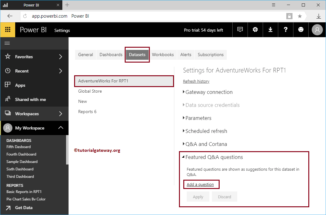
By default, Power BI Q&A suggests a few questions about your data. However, you can customize them according to your requirements. I mean, you can ask your own set of questions based on your ...
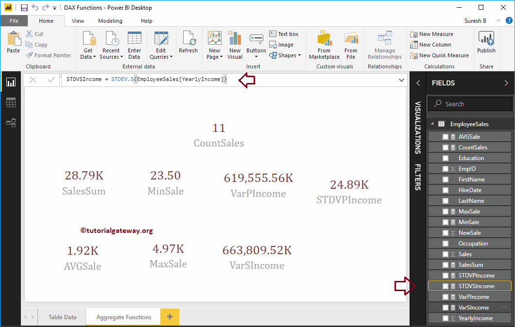
How to use DAX aggregate functions in Power BI with examples? Microsoft Power BI DAX provides various aggregate functions, which allows us to perform aggregations such as calculating sum, average, ...
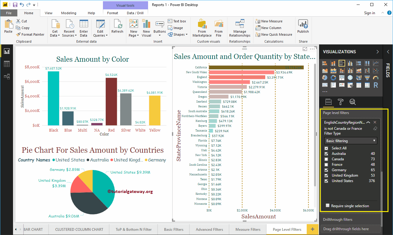
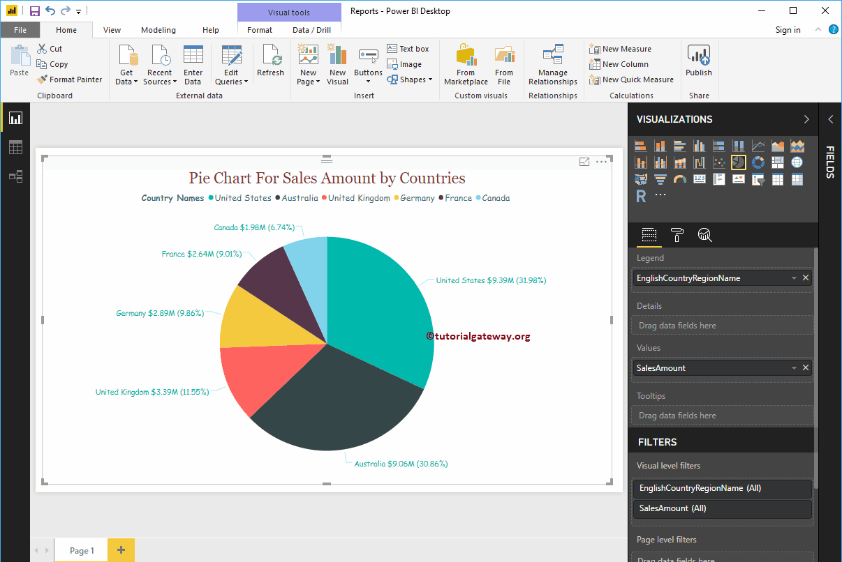
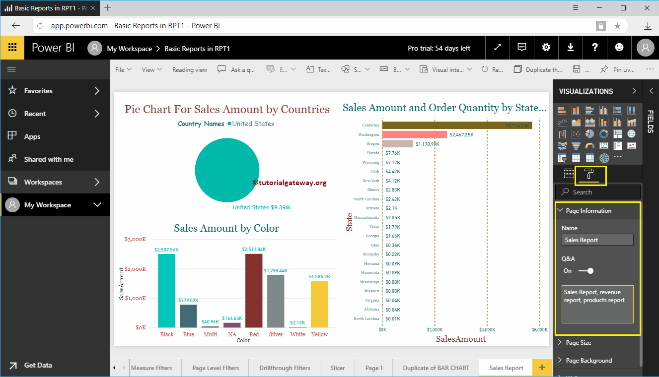
Pie charts in Power BI are very useful for visualizing high-level data. For example, Sales by continent or region, Orders by country, Customers by region or ...
In Power BI, you can use the full report as a question and answer suggestion. I mean, you can display a full report with filters in the question suggestion list ...
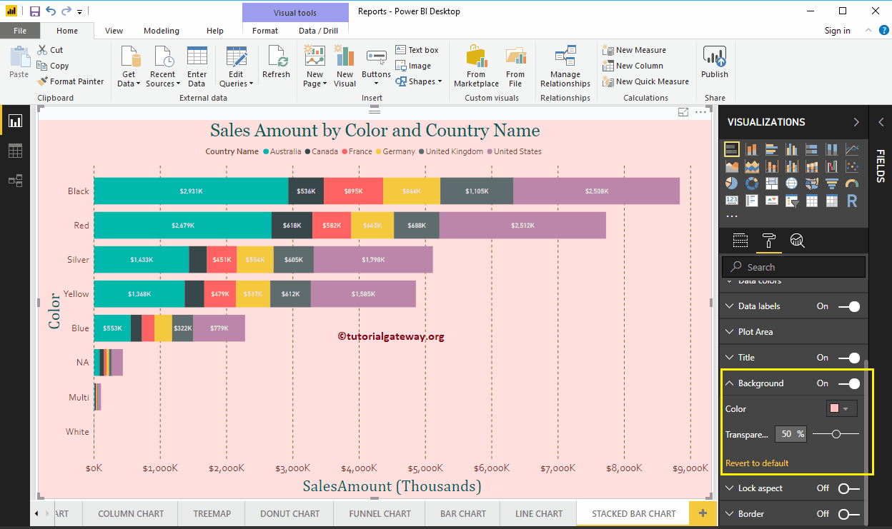
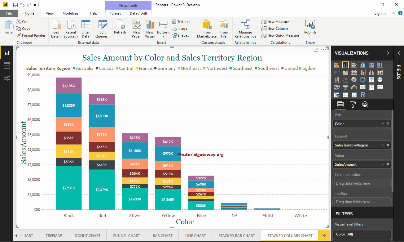
The stacked column chart in Power BI is useful for visualizing multiple dimensions in a single measure. Let me show you how to create a stacked column chart in Power BI ...
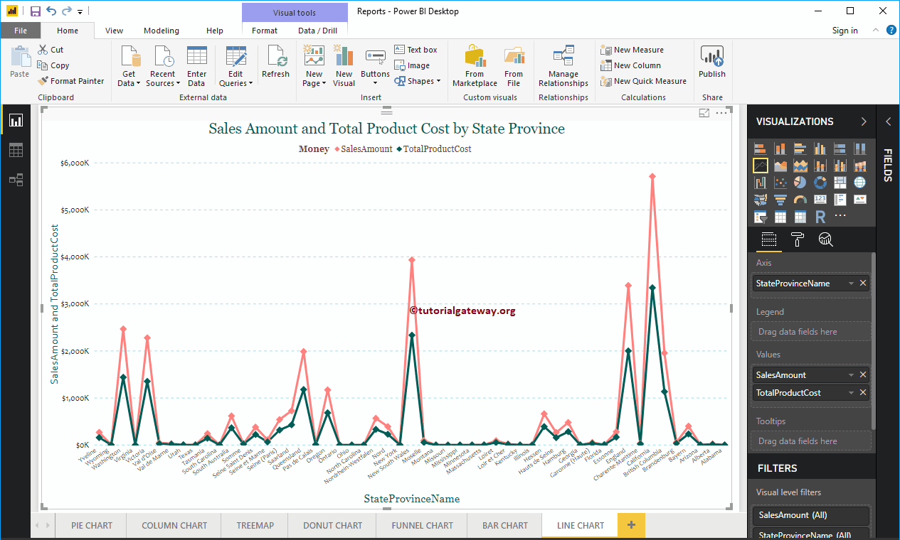
The Power BI line chart is useful for visualizing trends. For example, you can use this to create a sales trend, a temperate trend, etc. Let me show you ...