¿Cómo dar formato a un gráfico de bars apiladas en Power BI con un ejemplo? Dar formato al gráfico de barras apiladas de Power BI incluye cambiar los colores de las barras apiladas, el texto del título, la posición, las etiquetas de datos, las fuentes del eje y los colores de fondo, etc.
To demonstrate the formatting options for the Power BI stacked bar chart, we'll use the stacked bar chart that we created earlier. See the Power BI Stacked Bar Chart article.
How to format the stacked bar chart in Power BI
Click on the Format to see the list of available formatting options for this stacked bar chart.
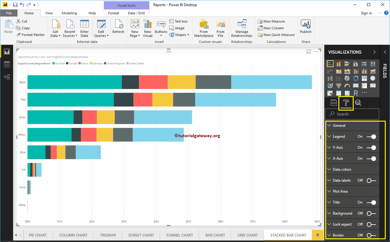 <>
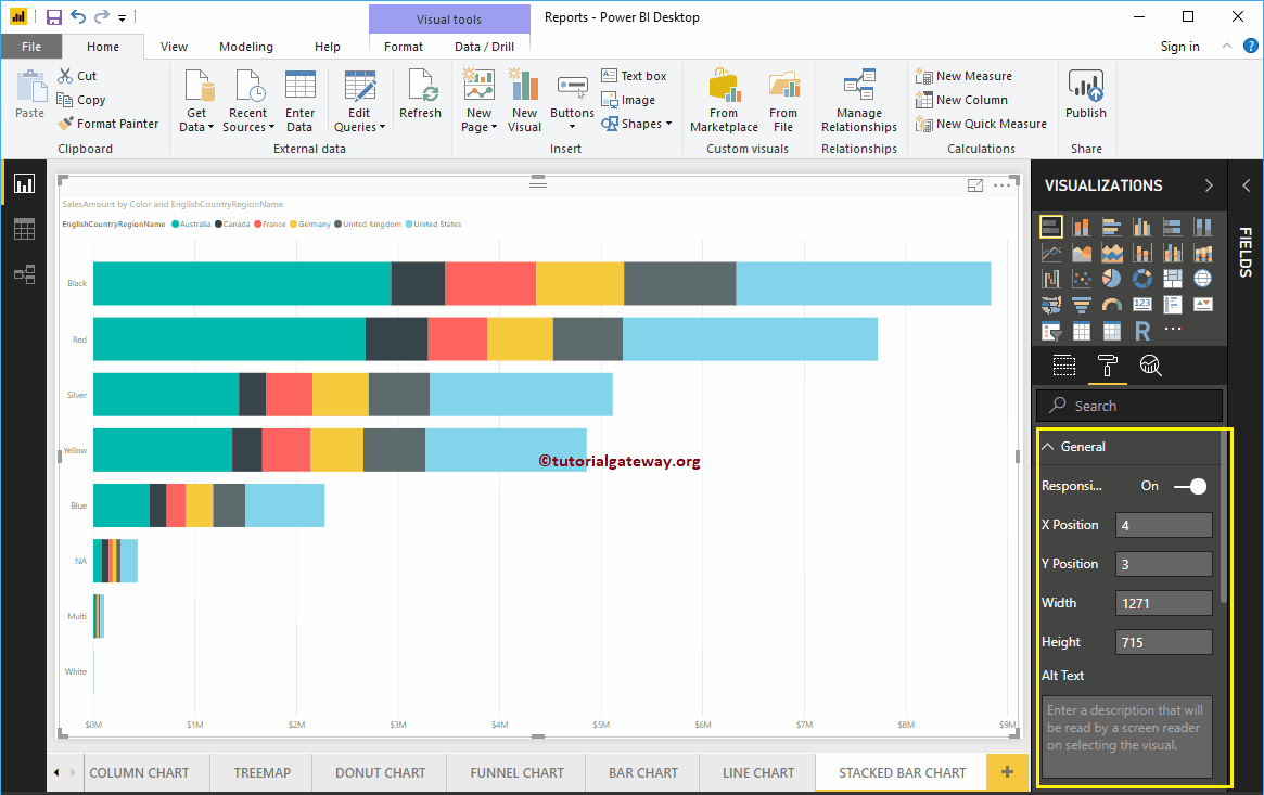
<>Format the general section of the stacked bar chart
Use this general section to change the X position, Y position, width and height of a stacked bar chart
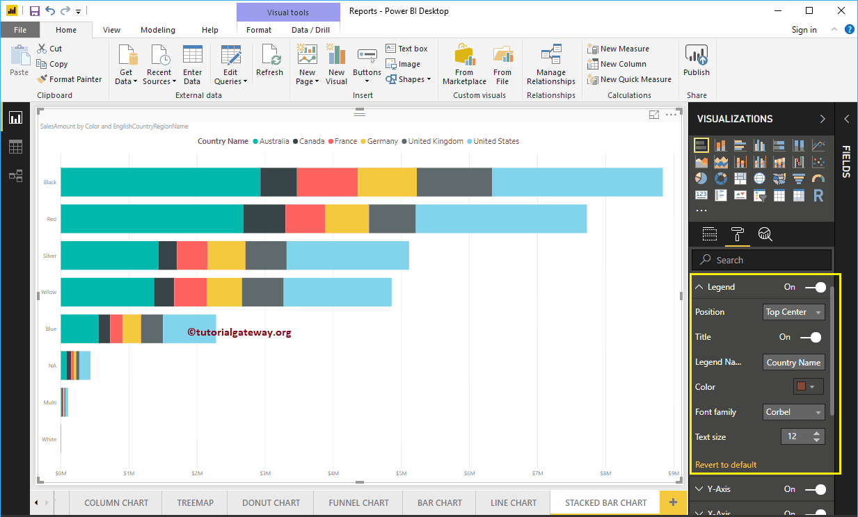
Format the legend of a stacked bar chart in Power BI
To display or enable the Legend, select the Power BI Legend region and change the option to Off to In. You can use the Position drop-down box to change the position of the legend.
As you can see in the screenshot below, we added Legend Title as Country Name, Legend Position as Top Center. Next, we also change the Color to brown, font family to corbel and text size to 12.
The Y axis of a Power BI stacked bar chart
As you can see in the screenshot below, we changed the Y-axis Labels Color to Brown, Text Size to 18, Font Style to Corbel. You can use the Minimum Category Width, Maximum Size, and Inner Padding options to change the width of the bar
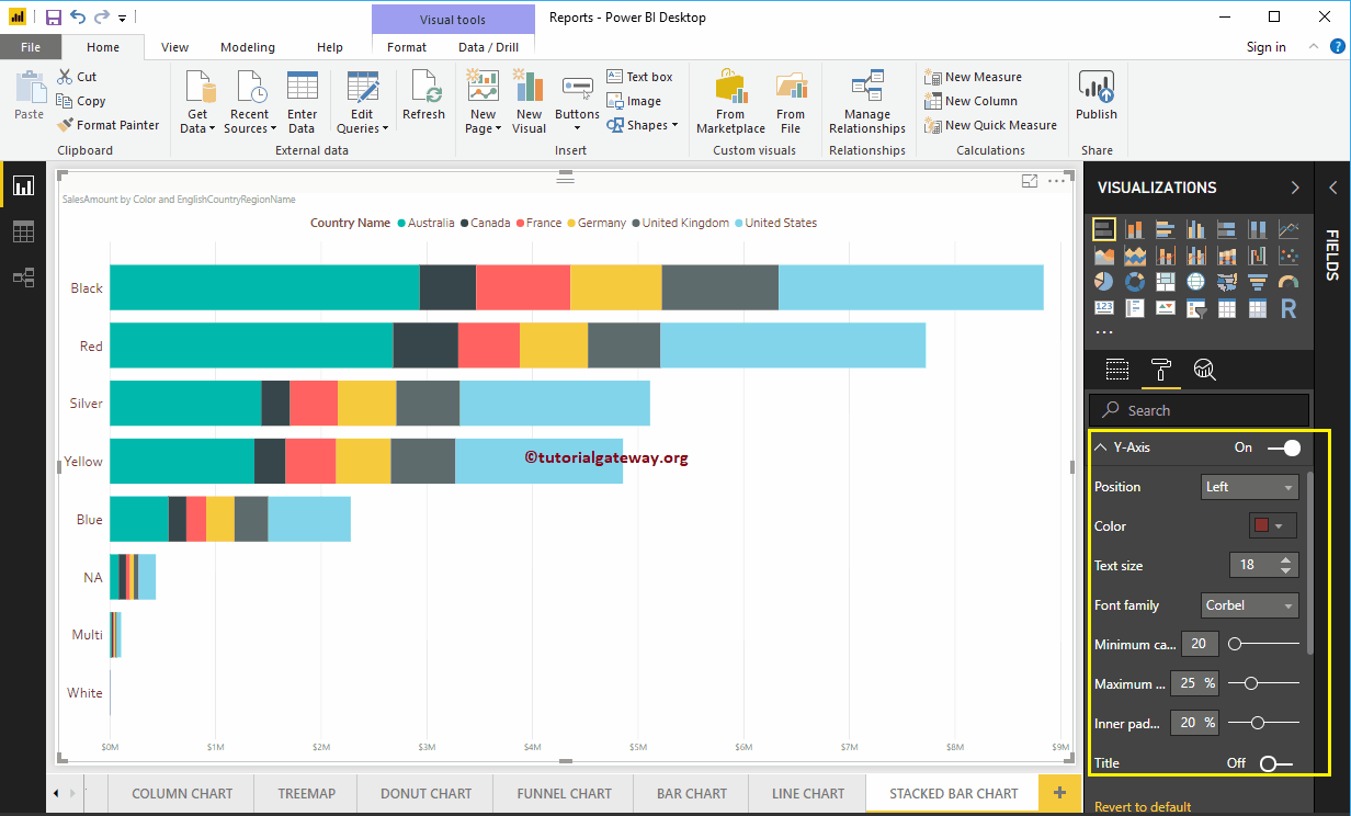
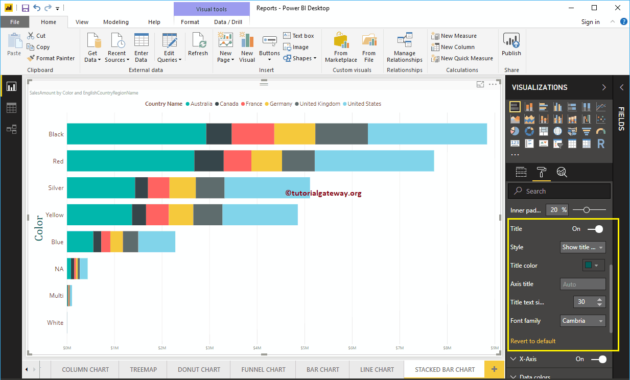
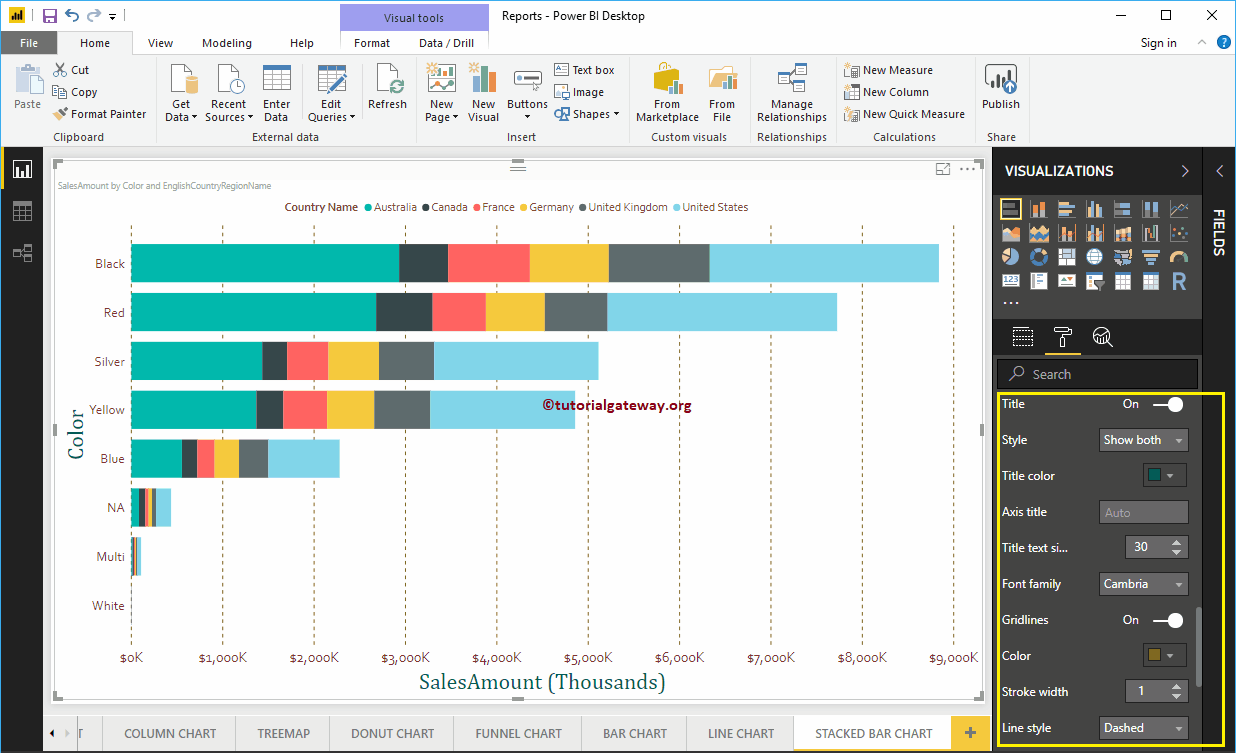
By default, the Y-axis title is disabled, but you can enable it by toggling Title in the Y-axis section to In. Let me change the title color to green, the title text size to 30, and the font style to Cambria.
Format the X-axis of a stacked bar chart in Power BI
As you can see in the following screenshot, we changed the color to brown, the font style to corbel, the text size to 20, the display units to thousands (the default is automatic).
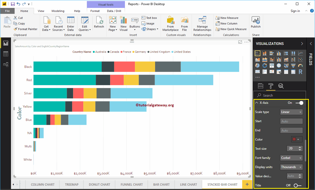
By default, the X-axis title is disabled, but you can enable it by changing Title to In. Let me change the title color to green, the font style to Cambria, and the font size to 30.
By toggling the Grid lines option from On to Off, you can turn off the stacked bar graph grid lines.
- Colour: You can change the color of the grid.
- Stroke width: Use this to change the width of the grid.
- Line Style: Choose the line style as Solid, Dotted, and Dashed.
Format Power BI Stacked Bar Chart Data Colors
By default, Power BI assigns some default colors to each bar. Let me change the color of the United States to pink.

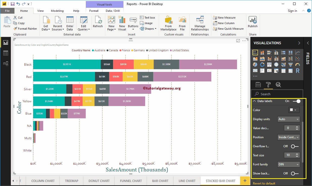
Enable data labels for the Power BI stacked bar chart
Stacked bar chart data labels display information about each individual group on a horizontal bar. In this case, it shows the sales amount for each country. To enable data labels, toggle Data labels option a In.
Let me change the color to white, the font family to DIN, and the text size to 10
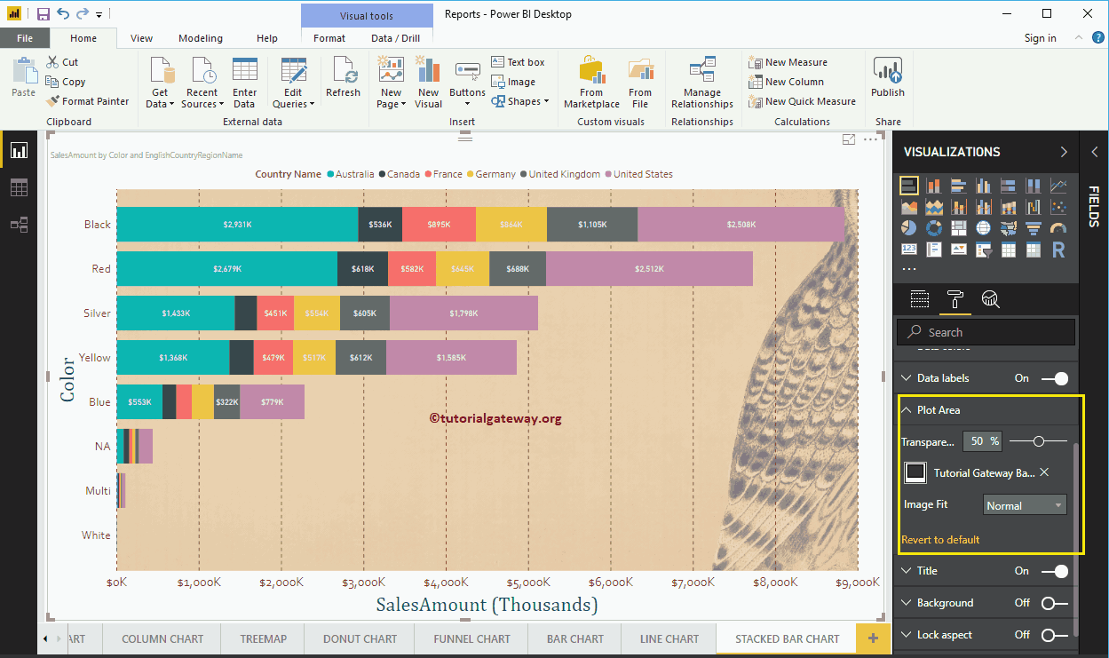
Format the stacked bar chart in the Power BI plot area
You can add images as the background of a stacked bar chart using this section of the plot area. For demonstration purposes, we added an image as the background of the plot area.
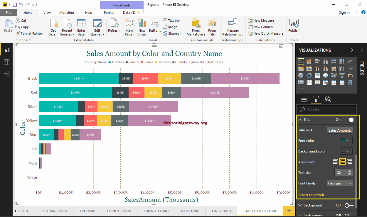
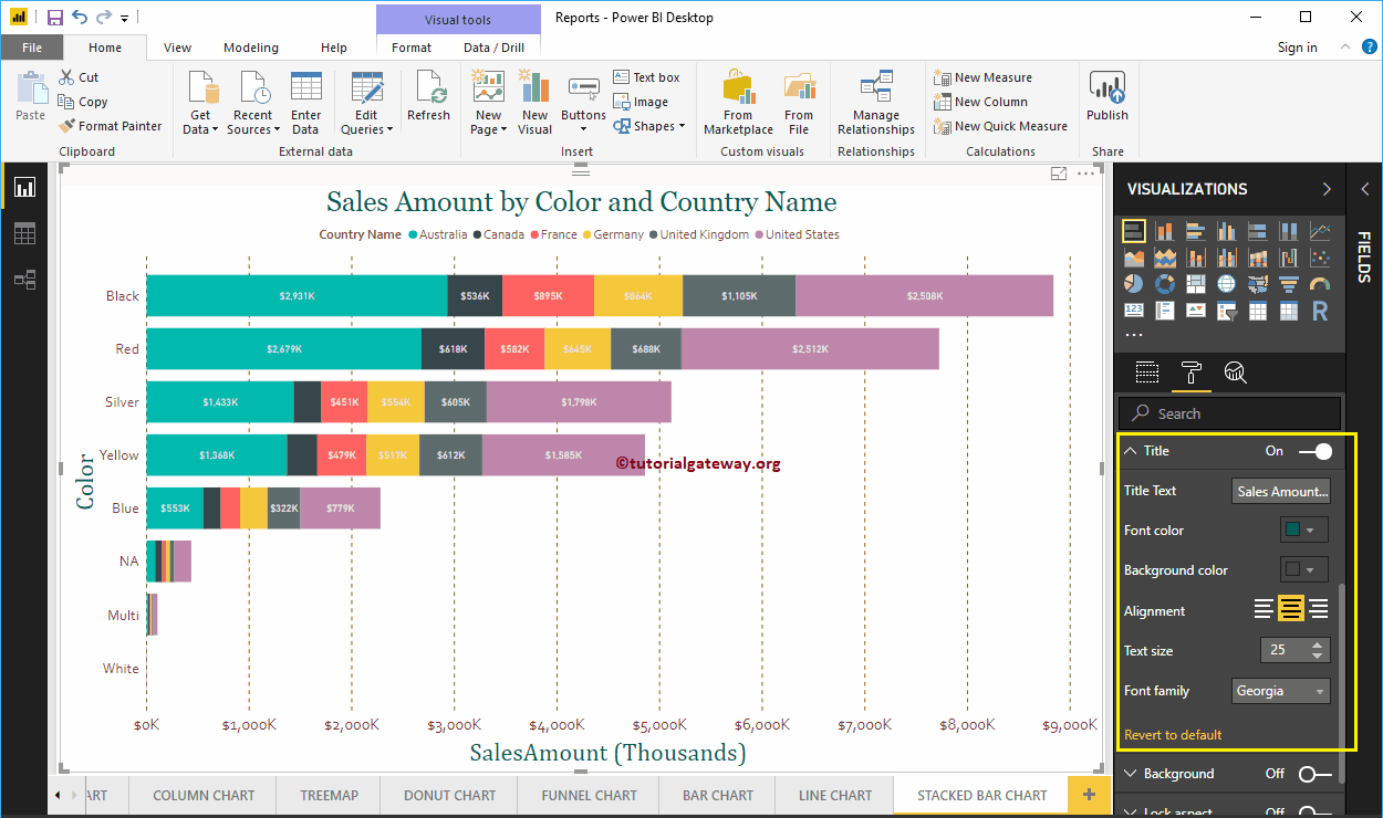
Format the stacked bar chart in Power BI title
By toggling the Title of In to Off, you can turn off the Bar Chart title.
As you can see in the screenshot below, we changed the title text to Sales Amount by Color and Country Name. And we also changed the font color to green, the font family to Georgia, the font size to 25, and the heading to center alignment. If you want, you can also add the background color to the title.
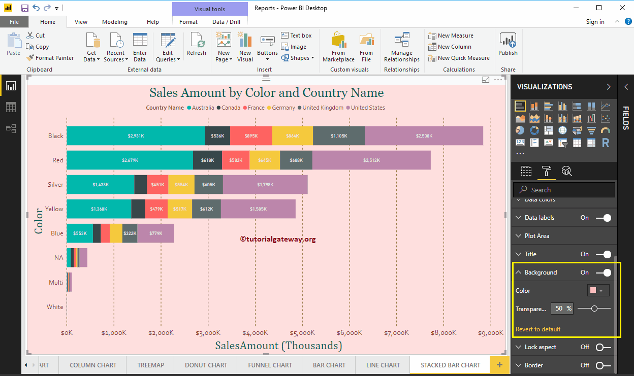
Format the background color of a stacked bar chart in Power BI
You can add the background color to a bar chart by toggling Background option a In. For demonstration purposes, we add the background color.
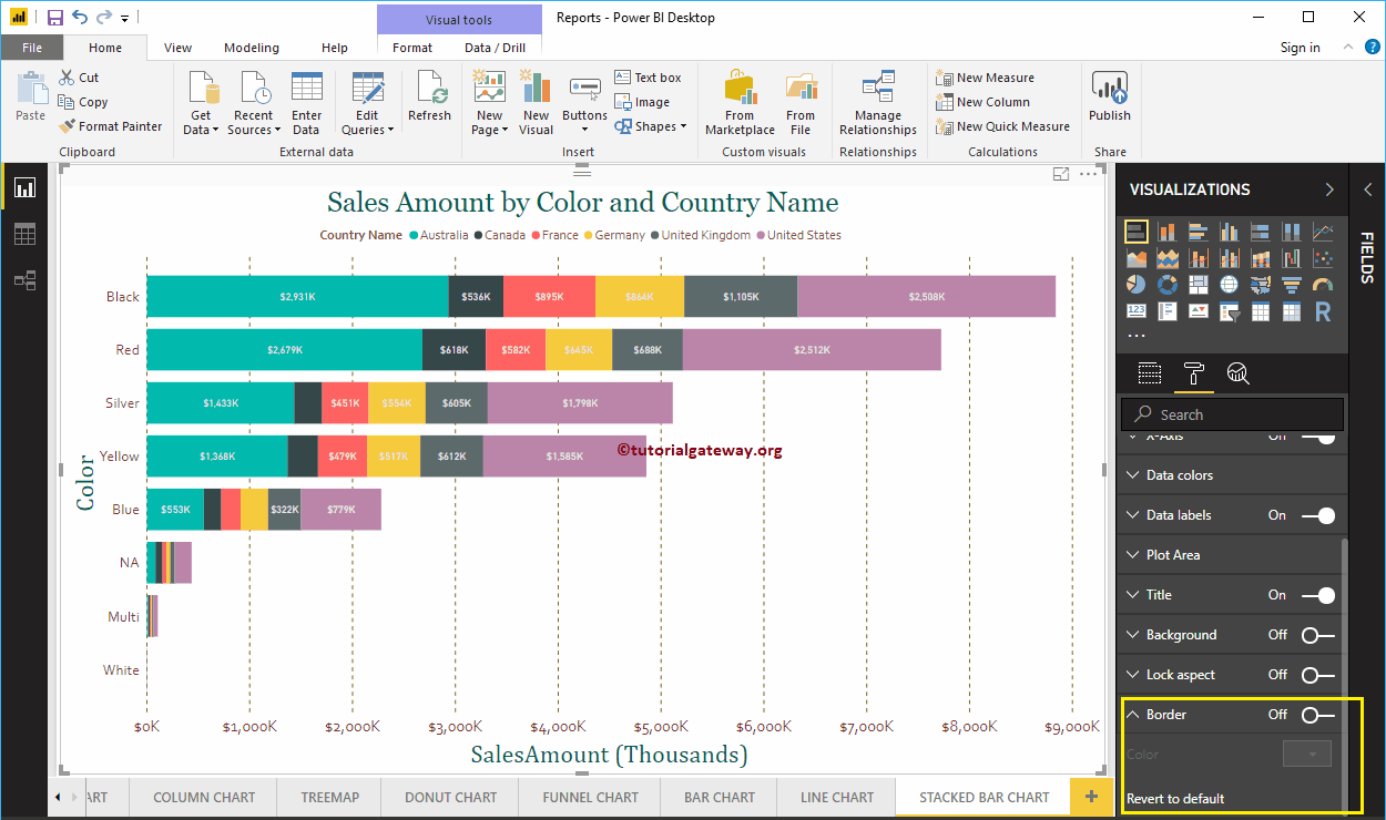
Format the edge of a stacked bar chart
You can add borders to a line chart by toggling the Border option of Off to In.