Pie charts in Power BI are very useful for visualizing high-level data. For example, Sales by Continent or Region, Orders by Country, Customers by Region, or Sales by Major Product Group, etc. Let's see how to create a pie chart in Power BI with an example.
For this example of a pie chart in power bi, we are going to use the SQL data source that we created in our previous article.
See the article Connect Power BI to SQL Server to understand the Power BI data source.
How to create a pie chart in Power BI
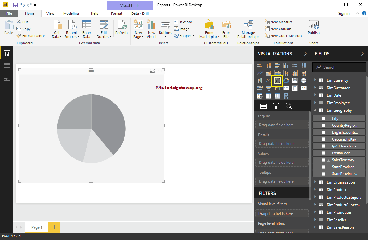
By clicking on the pie chart below the Display section, automatically create a pie chart, as shown in the following screenshot.
 <noscriptNoScript es un complemento del navegador para Mozilla Firefox, que impide que se cargue en las páginas web contenido como JavaScript, Flash o iFrames. Su objetivo es incrementar la seguridad durante la navegación y quitar la promoción comercial más molesta al cargar sitios web. El términoNoScript tiene un significado distinto en la programación HTML. Cuando JavaScript está desactivado, la etiqueta <noscript> o </noscript> asegura que el usuario pueda ver el plus>
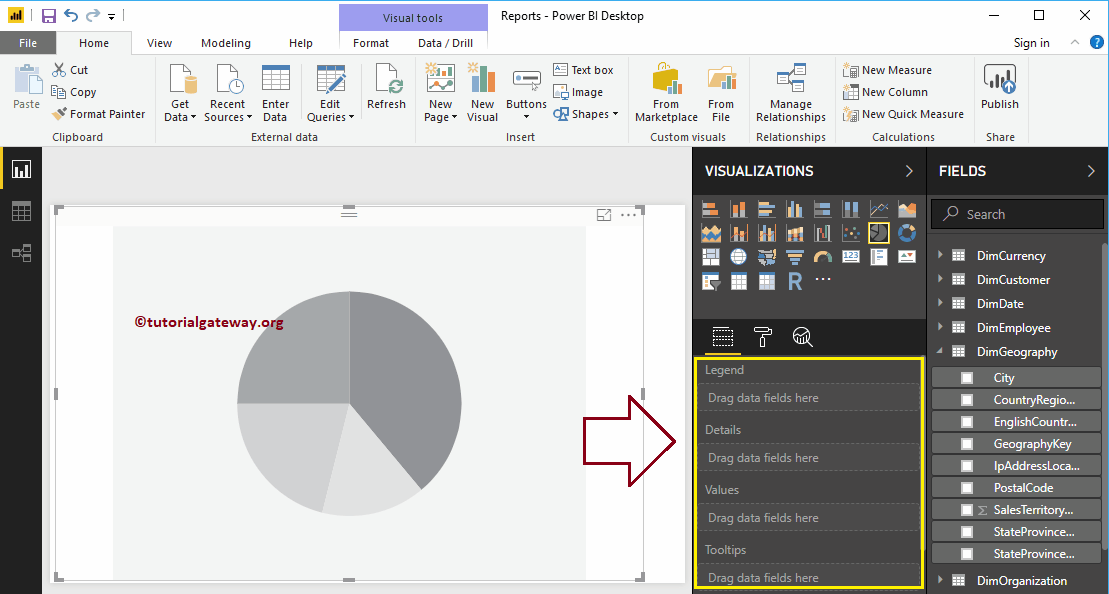
To add data to Power Bi Pie Chart, we have to add the required fields:
- Legend: Drag the column that you want to display as a legend.
- Details: Specify the name of the column into which you want to divide your pie chart. The values are divided according to this field.
- Values: Any numerical value, such as sales amount, total sales, customer count, etc.
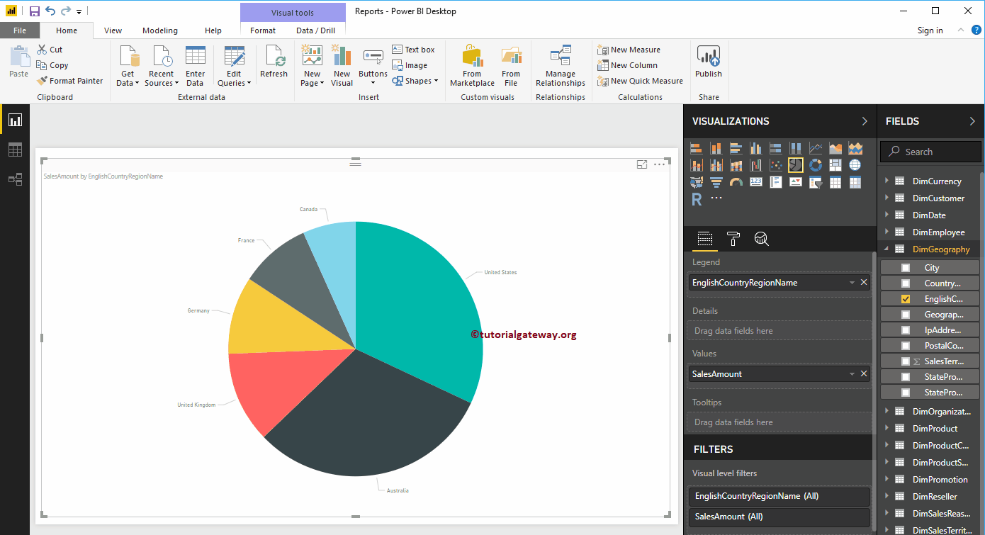
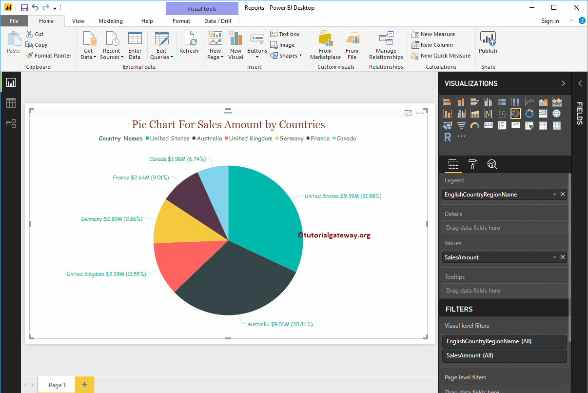
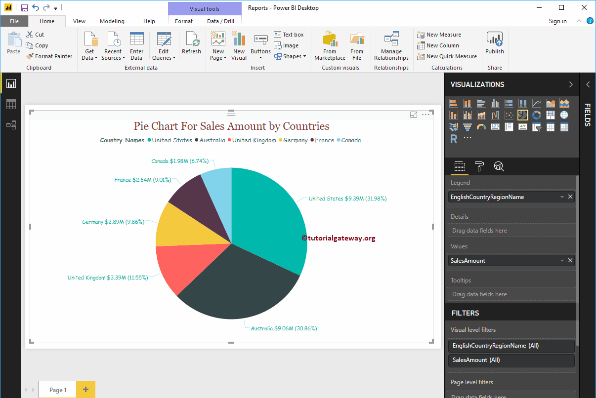
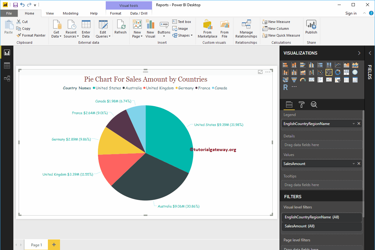
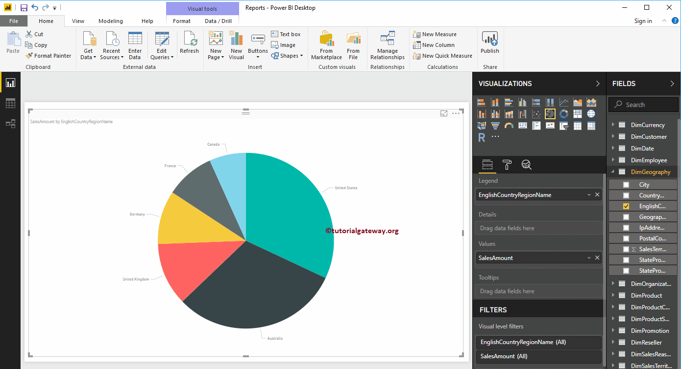
In this example, we create a pie chart for the sales amount by country names. Therefore, drag the Sales Amount column to the Values field.
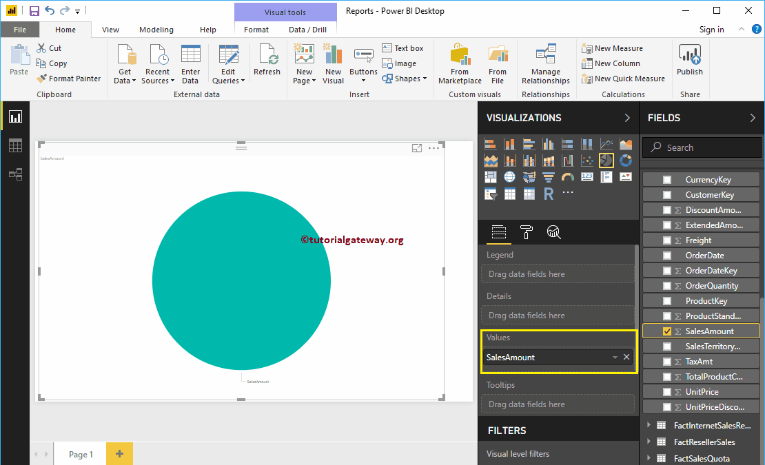
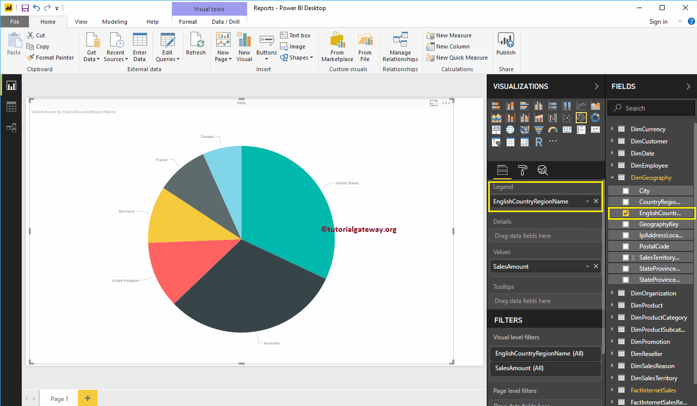
Then mark the country region name in English or drag and drop it onto the Legend region to automatically create a pie chart.
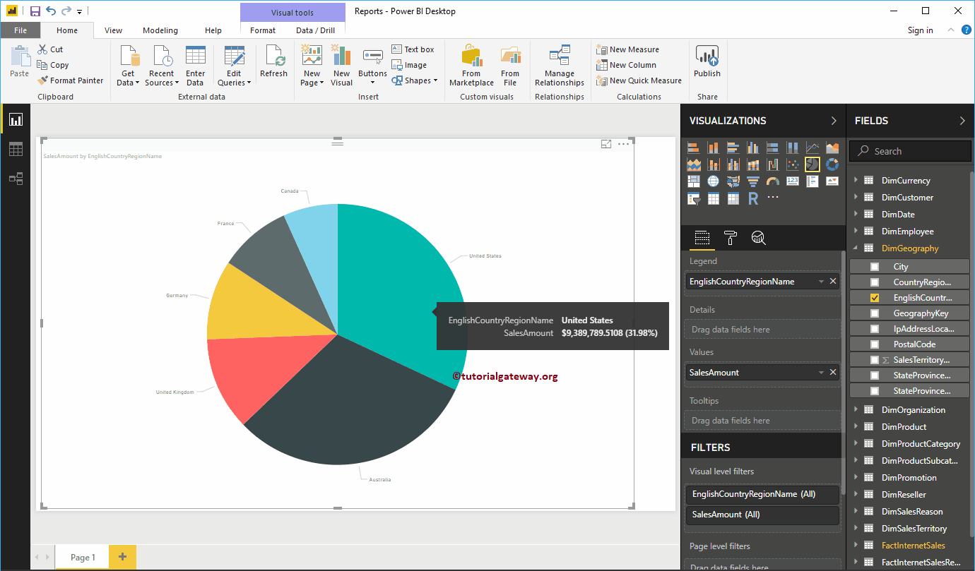
Hover over any sector to display the tooltip for the country name and its sales amount
Second approach to creating a pie chart in Power BI
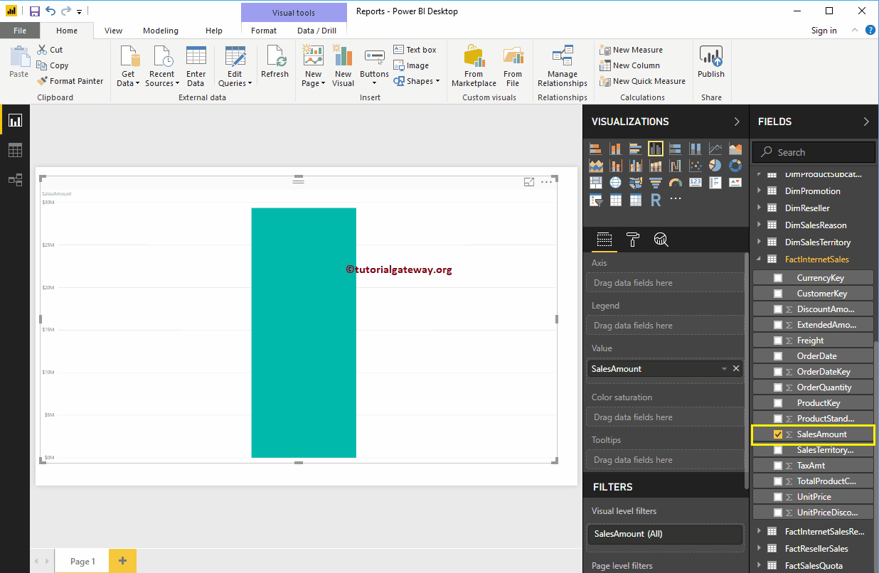
Arrastre y suelte la sección Importe de ventas de los campos al lienzo para crear automáticamente un gráfico de barsLas trailing slashes son las barras que aparecen al final de una URL ( "https://es.ryte.com/" ) y representan un directorio. Si la URL no finaliza con una barra representa un archivo. No obstante, esto son solo guías, no un requerimiento. No obstante, usar una barra como representación de un directorio ha sido aceptado como estándar con el tiempo. Uso de las barras "https://es.ryte.com/" y SEO A pesar de que dichas plus, como se muestra en la siguiente captura de pantalla.
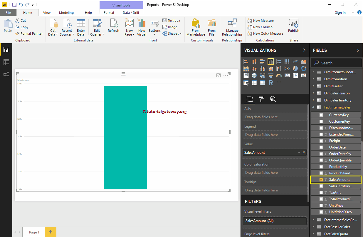
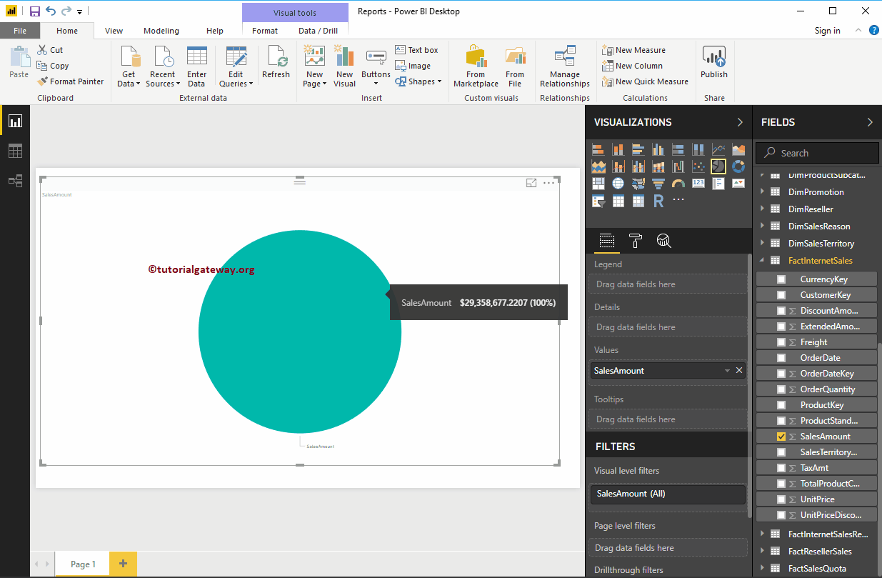
By clicking the pie chart in the Display, converts the bar chart to a pie chart.
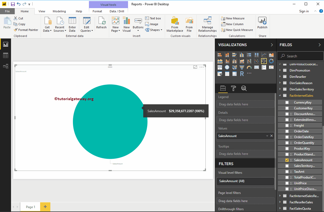
Add the name of the country to the legend. Remember, we haven't added anything to the Details section. Therefore, consider the English country region name (legend) as Details.
If I add the state vendor name to the details (explicitly), the Power BI pie chart shows sales by state province name and the legend shows the country name.
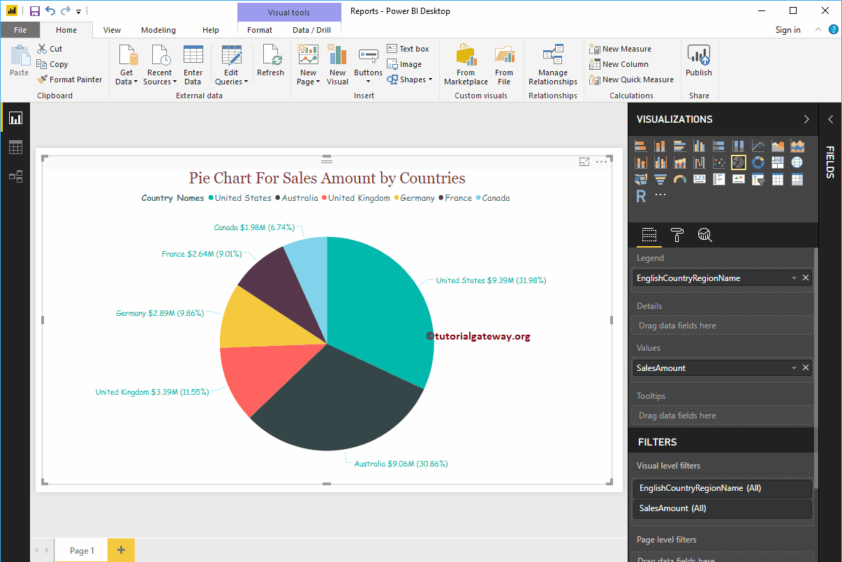
Let me quick format this pie chart
NOTE: I suggest you check out the Pie Chart Format article to understand the steps required to format the Legend, Data Color, Background Color, Title, and Pie Colors.