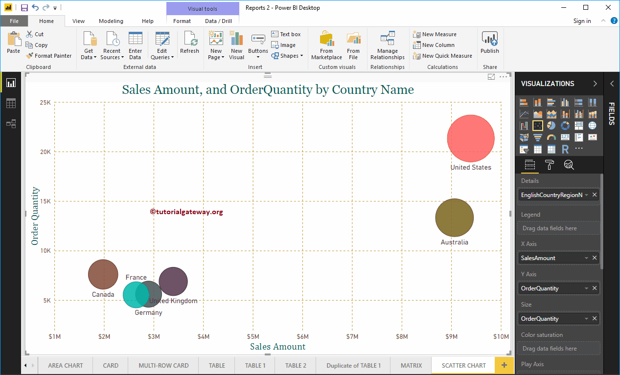
Power BI scatter chart or scatter chart is very useful for visualizing the relationship between two sets of data. Let me show you how to create a chart ...
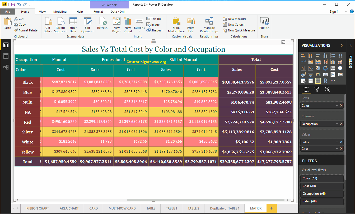
Power BI Matrix, also called a crosstab, is useful for showing the relationships between two or more than two groups. Let me show you how to create a matrix in Power BI with ...
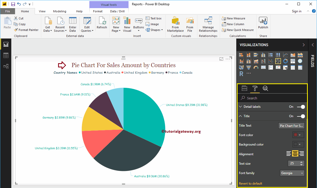
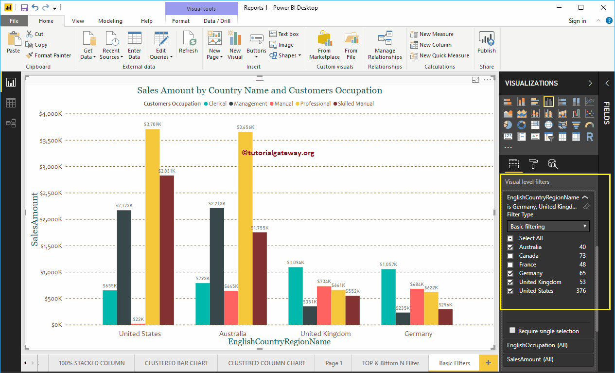
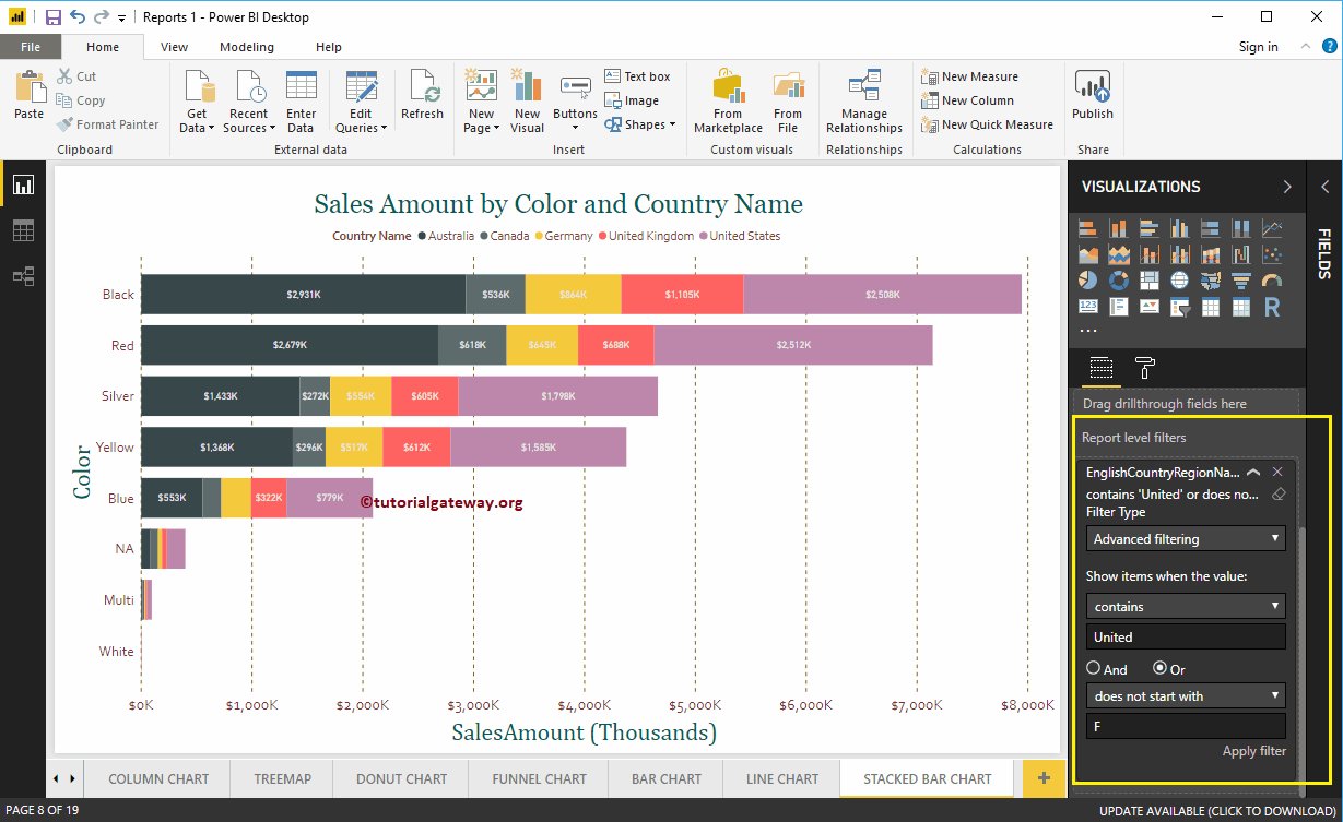
Power BI filters are useful for narrowing down your data based on requirements. For example, when using basic Power BI filters, we can exclude a product from the screen ...
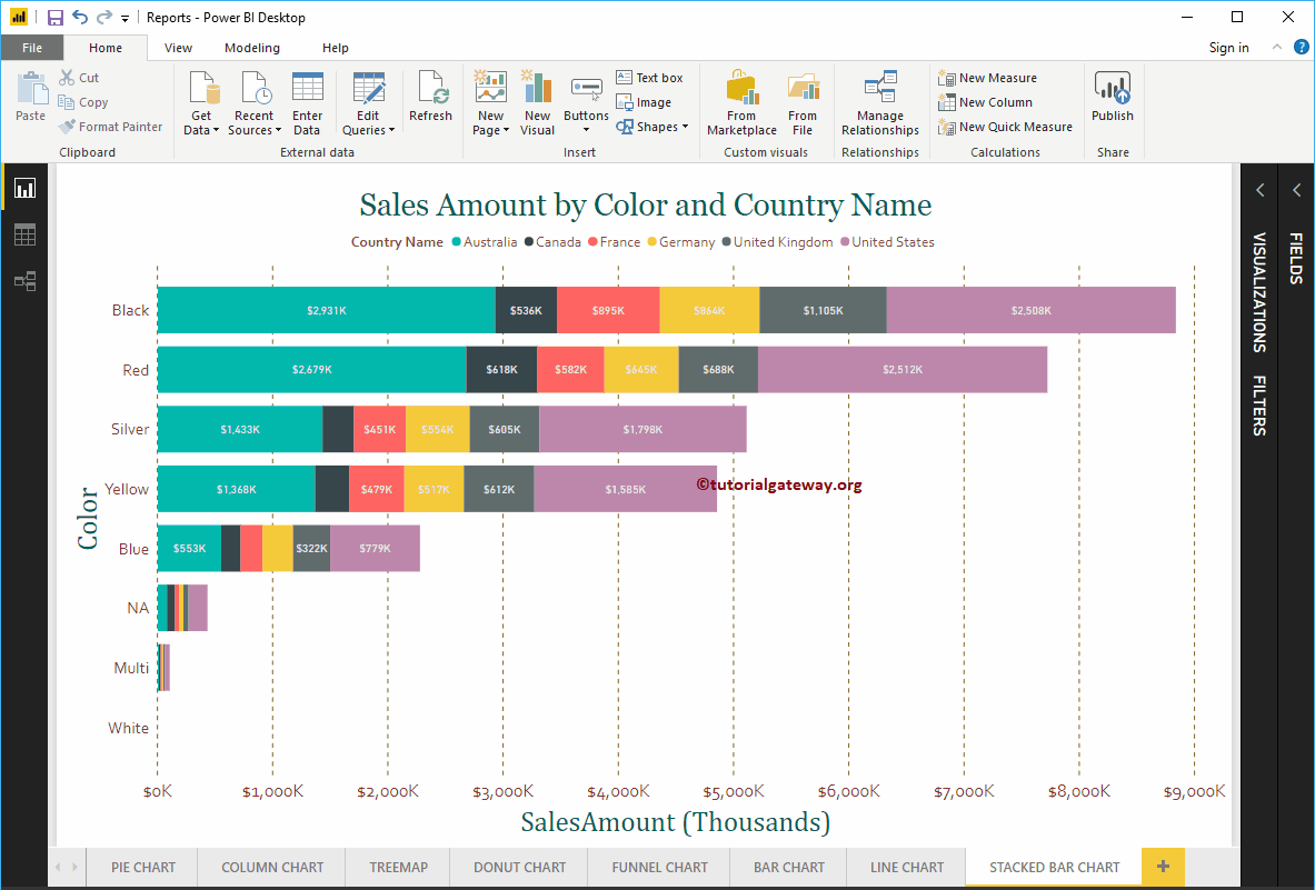
Power BI Stacked Bar Chart The bar chart is useful for comparing multiple dimensions with a single measure. Let me show you how to create a stacked bar chart ...
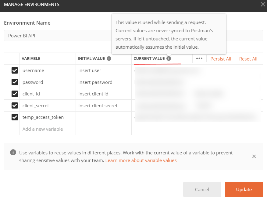
Time to read: 4 minutes Postman is a valuable tool for working with APIs, especially when testing and ad hoc requests outside of an automated production solution. In…
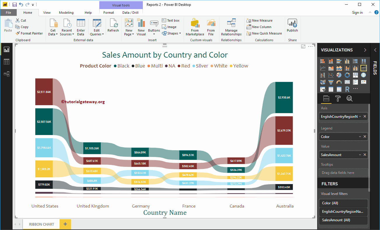
The Power BI ribbon chart is useful for quickly identifying which categorical data has the highest rank (large values). Let me show you how to create a tape chart ...