Los filtros de nivel de informe de Power BI sirven para filtrar los elementos visuales (o gráficos) presentes en todas las páginas de un informe. Por ejemplo, si su informe contiene 10 páginas, puede utilizar este filtro de nivel de informe para filtrar esas 10 páginas a la vez. Permítame mostrarle cómo crear filtros de nivel de informe en Power BI con un ejemplo.
Para crear este informe (la combinación de páginas) para la demostración de filtros de nivel de informe de Power BI, usamos la fuente de datos SQL que creamos en nuestro artículo anterior.
Consulte el artículo Conectar Power BI a SQL Server para comprender la fuente de datos.
Cómo crear filtros de nivel de informe de Power BI
Para demostrar los filtros de nivel de informe en Power BI, usaremos el informe 1 que creamos en nuestras publicaciones anteriores. Este informe de Power BI tiene 19 páginas: gráfico de columnas, gráfico circular, mapa de árbol, gráfico de anillos, gráfico de barras, etc.
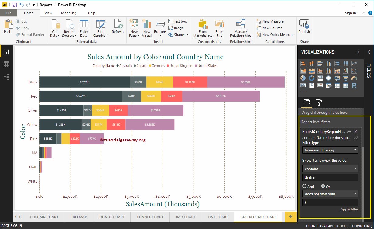
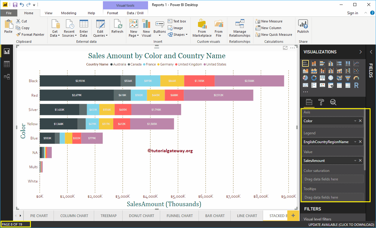
En este ejemplo, creamos un filtro de nivel de informe en el gráfico de barras apiladas. Recuerde, esta es la octava página de un total de 19 páginas.
Como puede ver en la captura de pantalla a continuación, usamos el campo Color como el eje, el campo Nombre del país como leyenda y el monto de las ventas como el campo Valor.
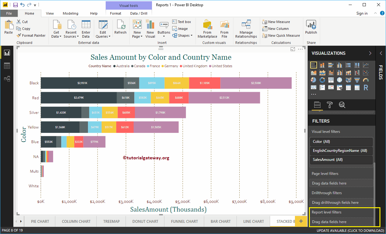
En la sección Filtros, puede ver la lista de filtros de nivel de informe disponibles en Power BI. Tienes que usar el Filtros de nivel de informe sección para crear un filtro a nivel de informe.
Permítanme arrastrar y soltar el nombre de la región del país inglés de la sección de campos a los filtros de nivel de informe.
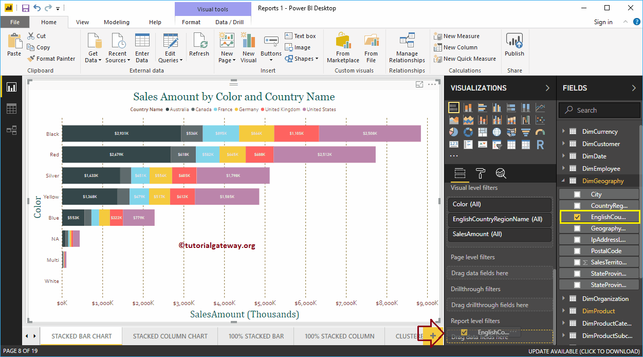
Expanda el nombre de la región del país en inglés para ver los tipos de filtro. De forma predeterminada, la opción Filtros básicos seleccionada como Tipo de filtro.
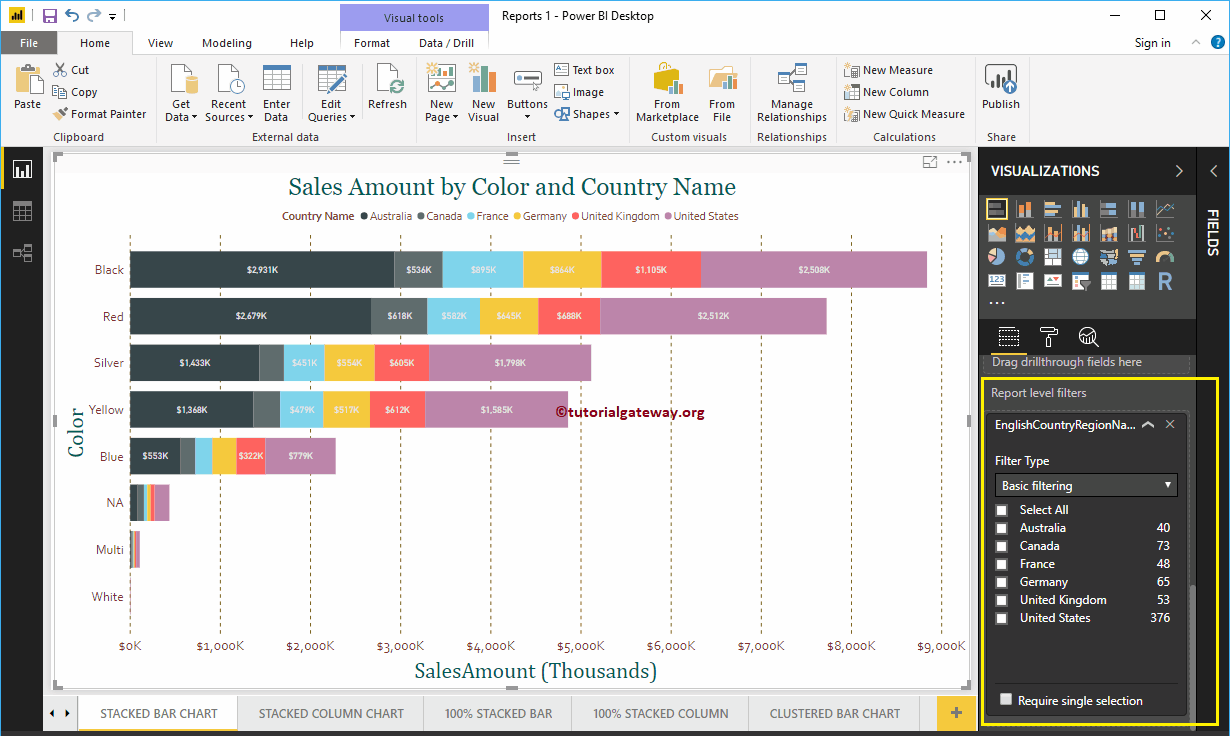
Para este propósito de demostración del filtro de nivel de informe de Power BI, seleccionamos Australia, Alemania, el Reino Unido y los Estados Unidos.
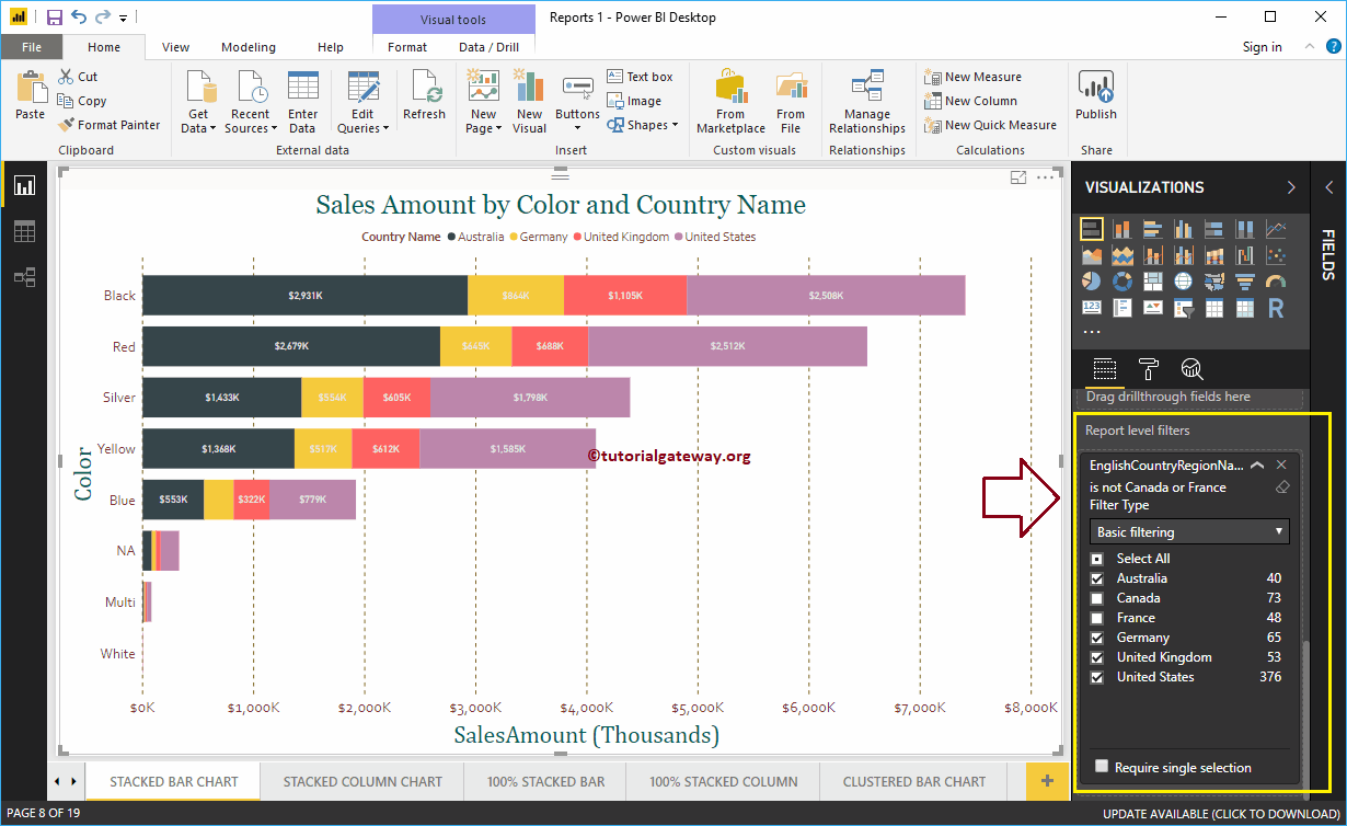
En la siguiente captura de pantalla, puede ver que el gráfico de barras apiladas muestra las ventas de los países seleccionados en una leyenda.
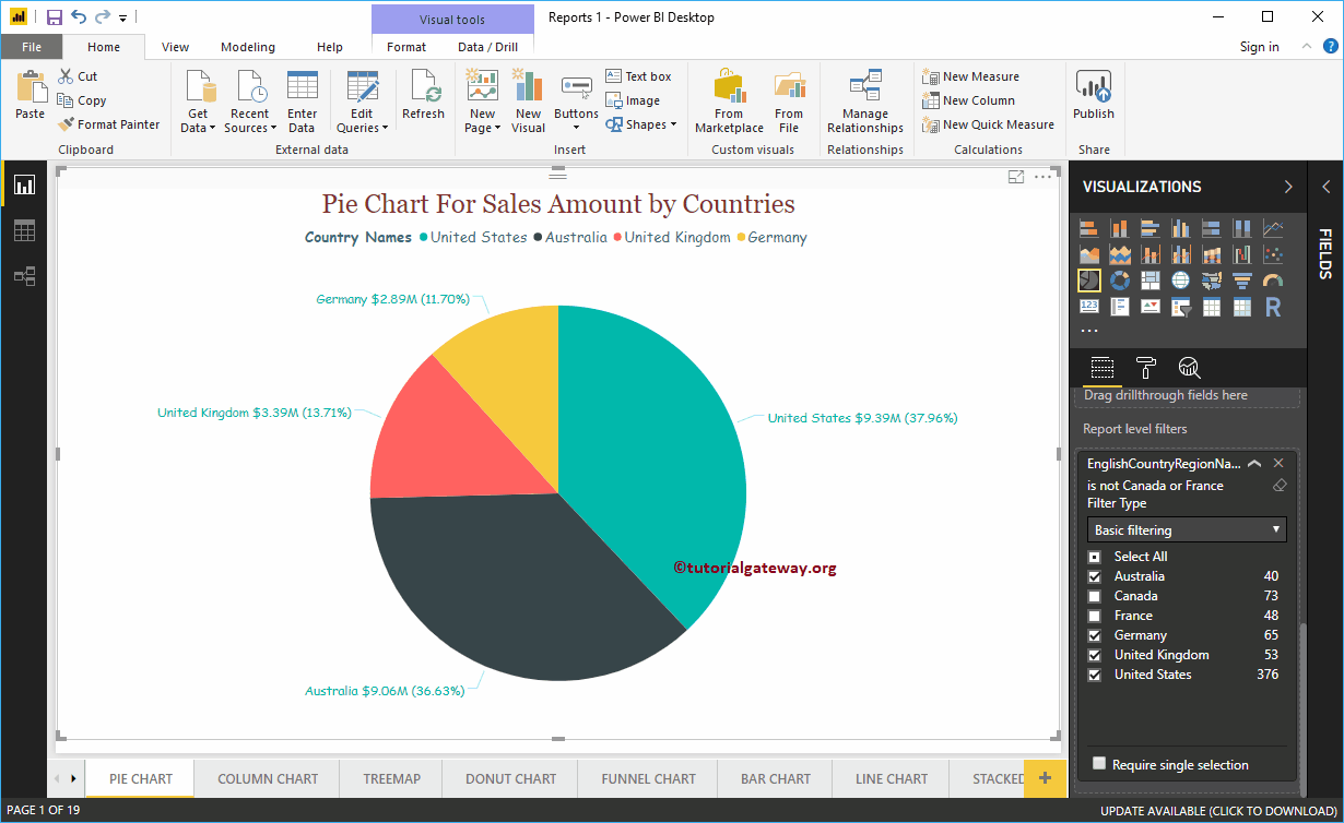
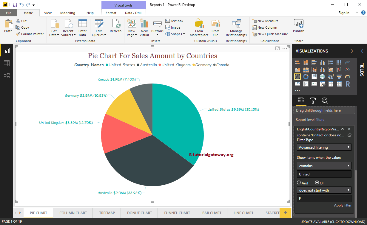
Permítanme navegar a la página 1 de 19. Como puede ver en la captura de pantalla siguiente, el gráfico circular también se filtra por el filtro de nivel de informe. Quiero decir, muestra las ventas de los países seleccionados.
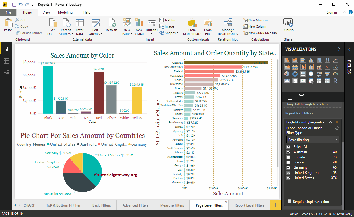
Permítanme navegar a la página 18 de 19. En la captura de pantalla siguiente, puede ver que los filtros de nivel de informe de Power BI están filtrando estos tres gráficos.
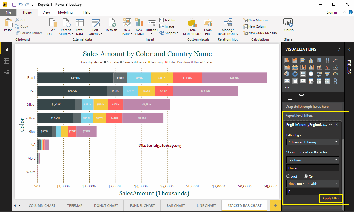
Utilice el menú desplegable para cambiar el tipo de filtrado de nivel de informe a Filtro avanzado.
Aquí, estamos aplicando varios filtros en la columna País. El primer filtro comprueba si el país contiene una palabra clave unificada o no. O bien, el segundo filtro comprueba los países que no comienzan con F.

El siguiente informe muestra las barras con países que contienen la palabra clave United, y los países no comenzaron con F.

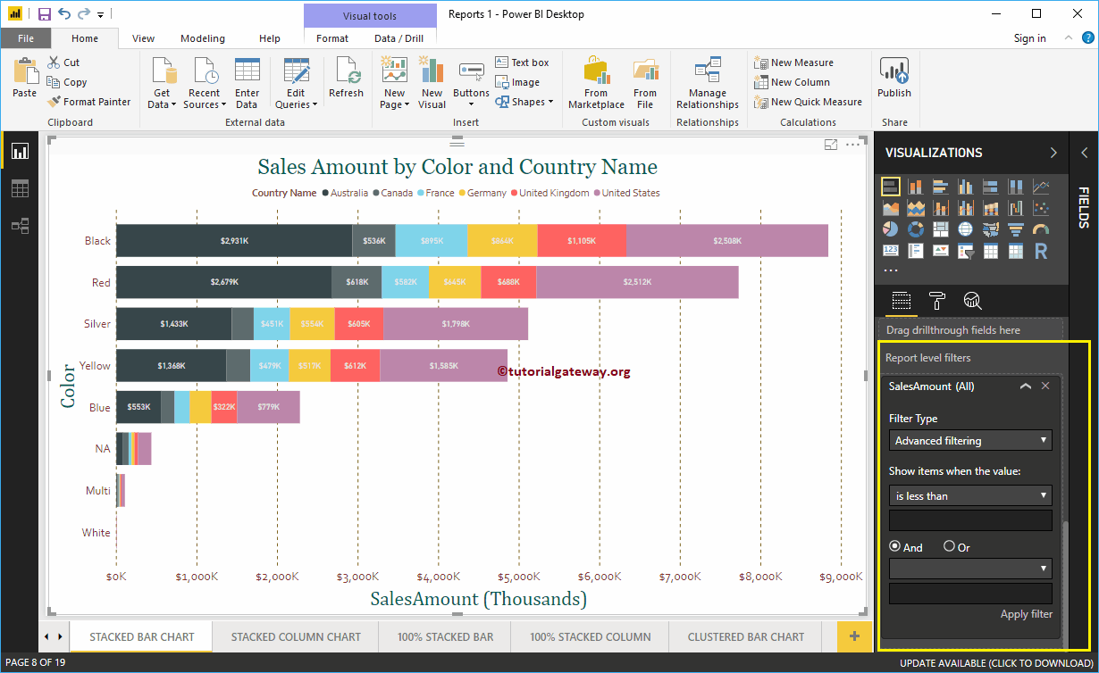
Permítanme navegar a la página 1 de 19. Como puede ver, el gráfico circular muestra las ventas de los países que contienen united o países que no comienzan con F
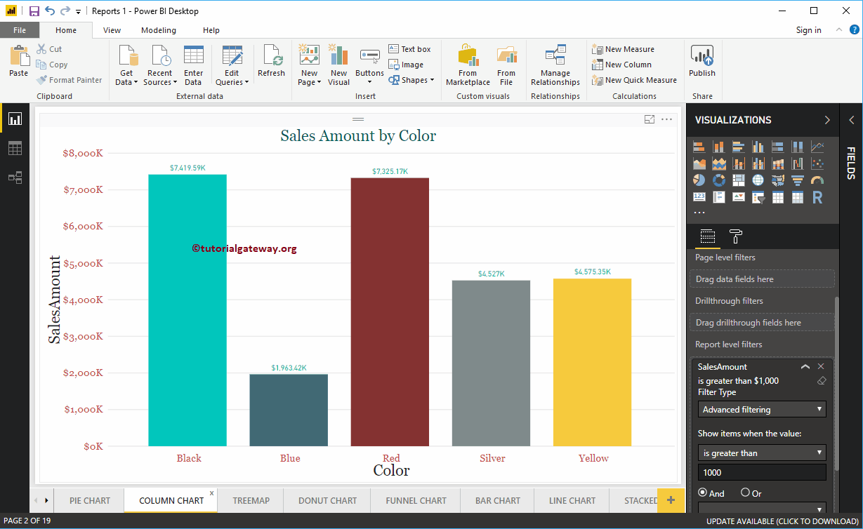
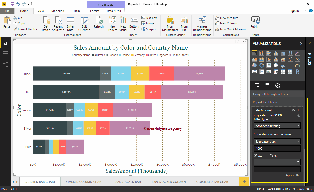
Permítanme eliminar los filtros de nivel de informe de Power BI existentes. A continuación, arrastre y suelte el Importe de ventas de la sección de campos al nivel de informe Filtros. Luego, expanda el Monto de ventas para ver las opciones de filtro. Consulte el artículo Filtros en medidas para comprender estas opciones.

Para el propósito de demostración, seleccionamos es mayor que como operador y 1000 como valor. En la captura de pantalla a continuación, puede ver que el gráfico de barras apiladas muestra las barras cuyo monto de ventas es superior a 1000.

Ahora, puede ver que el mismo filtro se aplicó al gráfico de columnas presente en la página 2 de 19