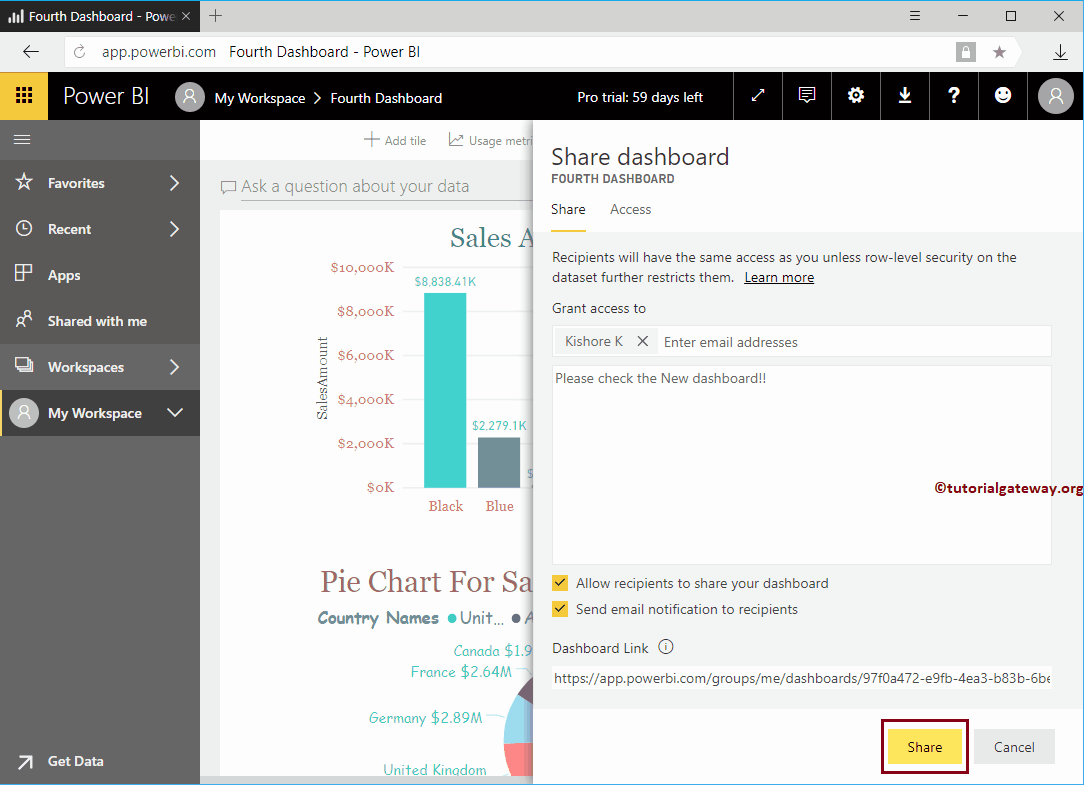
Let me show you the step-by-step approach to sharing the Power BI dashboard across your organization with a practical example. Before you start sharing your dashboard ...
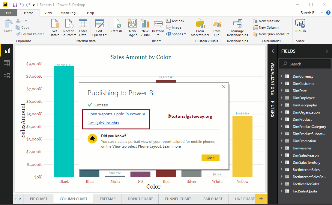
In this article, we show you the step-by-step approach to publishing Power BI desktop reports to the Power BI service with a practical example. Before starting…
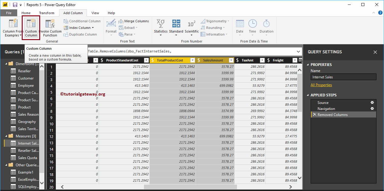
The Power BI custom column generates a new column based on the existing columns. For example, you can use this to calculate profit or loss, etc. Let's see how to create ...
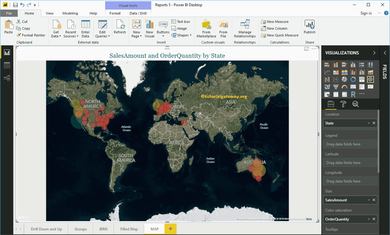
Power BI Maps helps you visualize geological data. Let's take a step-by-step approach to creating a map in Power BI with a practical example. For the demonstration ...
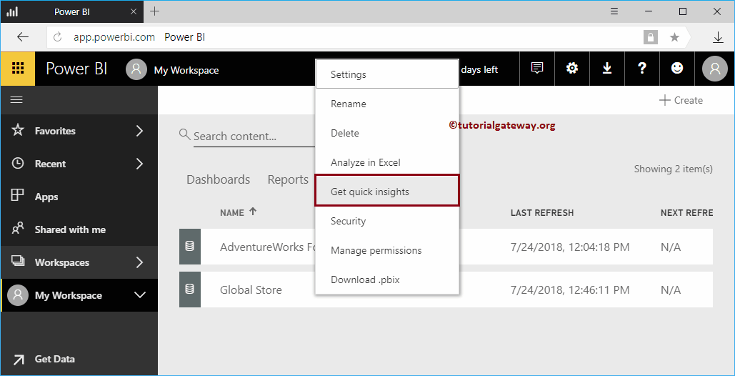
Let me show you how to get insight into the Power BI workspace with a practical example. Before we begin to search or obtain information about the data of ...
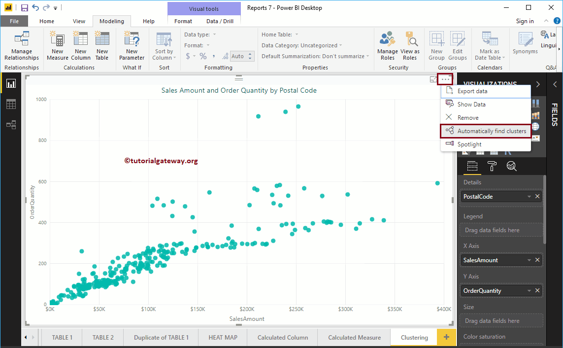
In this section, we show you how to create Power BI clusters with an example. To explain this concept of Clusters, we will use the scatter plot that we created earlier. For this…
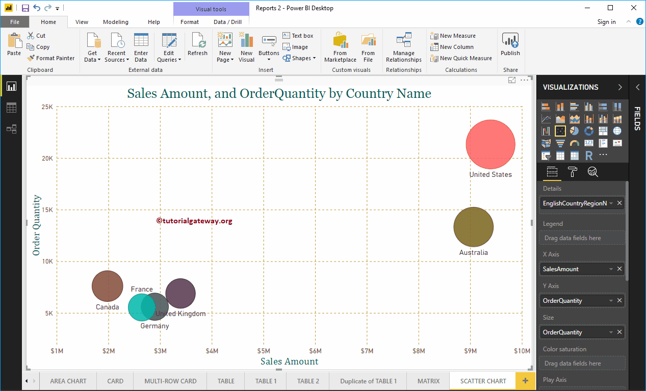
Power BI scatter chart or scatter chart is very useful for visualizing the relationship between two sets of data. Let me show you how to create a chart ...
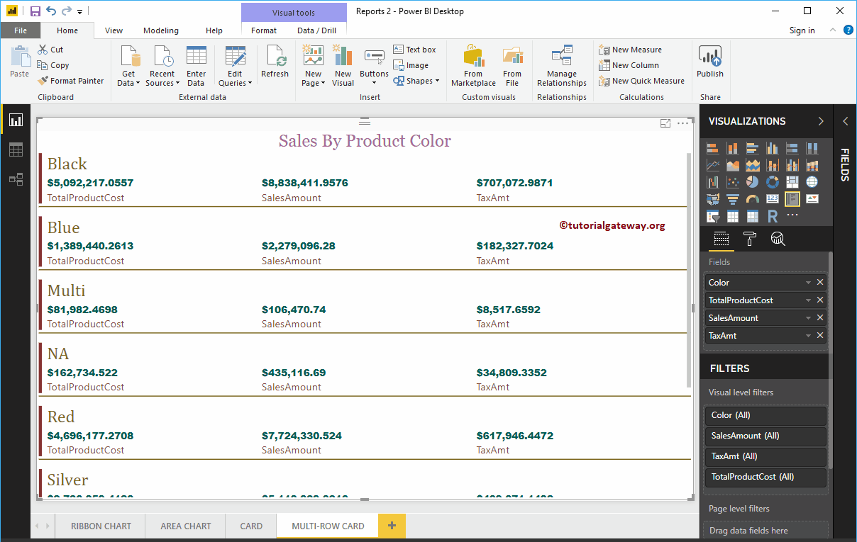
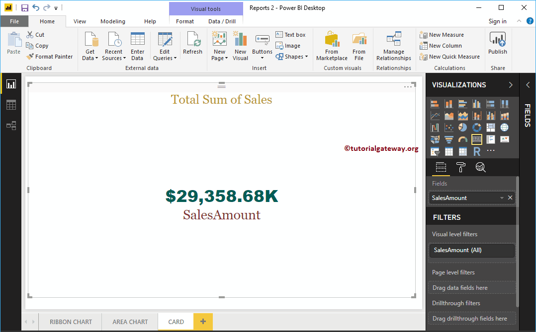
Let me show you how to create a card in Power BI with an example. The Power BI card is useful for displaying a single number (or metric value). For example, yes…
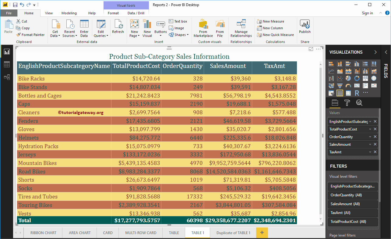
Let me show you how to add alternate row colors to Power BI table report with a practical example. For this demo of adding alternate row colors to the ...