El gráfico de barras de Power BI o el gráfico de barras horizontales son útiles para la comparación de datos. Por ejemplo, puede comparar ventas por color, región o grupo de productos, etc. Permítame mostrarle cómo crear un gráfico de barras en Power BI con un ejemplo.
Para esta demostración de gráfico de barras de Power BI, usamos la fuente de datos SQL que creamos en nuestro artículo anterior. Por lo tanto, consulte el artículo Conectar Power BI a SQL Server para comprender la fuente de datos de Power BI.
Cómo crear un gráfico de barras en Power BI
Para crear un gráfico de barras, primero arrastre y suelte el monto de ventas de la sección Campos a la región del lienzo. Crea automáticamente un gráfico de columnas.
A continuación, permítame agregar el nombre de la provincia estatal a la sección Eje para crear un gráfico de columnas que muestre el monto de ventas por provincia estatal.
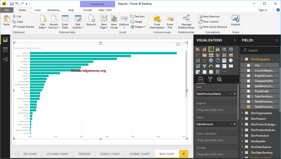
Al hacer clic en el gráfico de barras debajo del Visualización sección, convertirá el gráfico de columnas en gráfico de barras
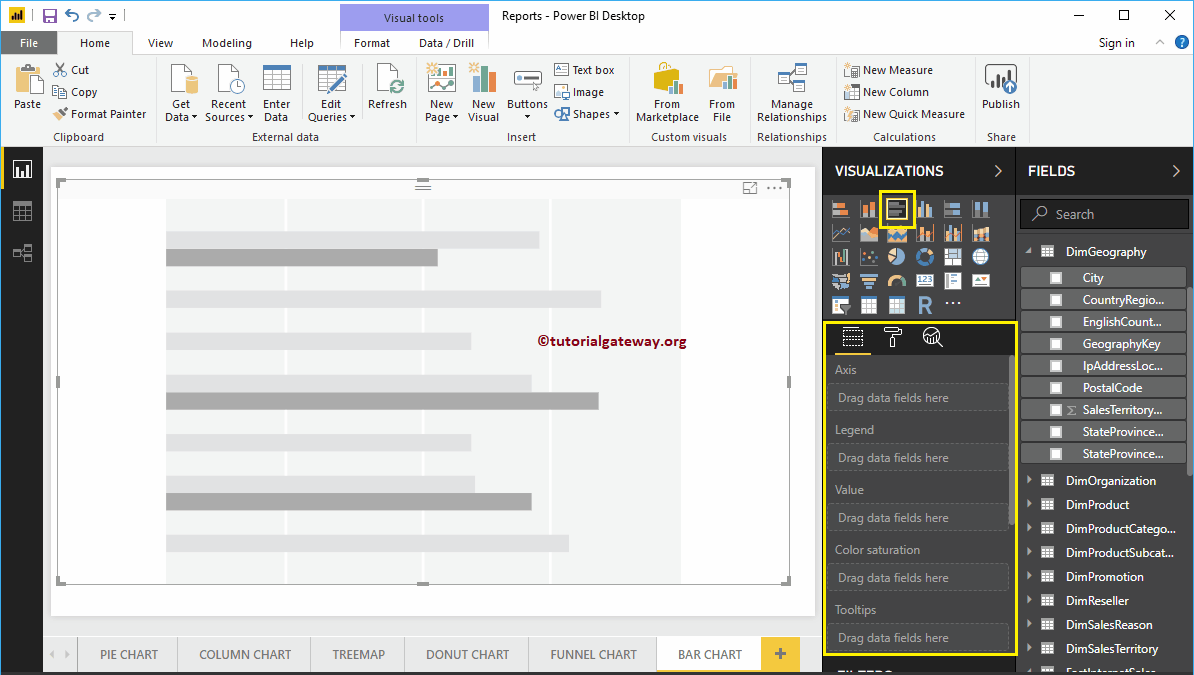
Crear un gráfico de barras en Power BI: enfoque 2
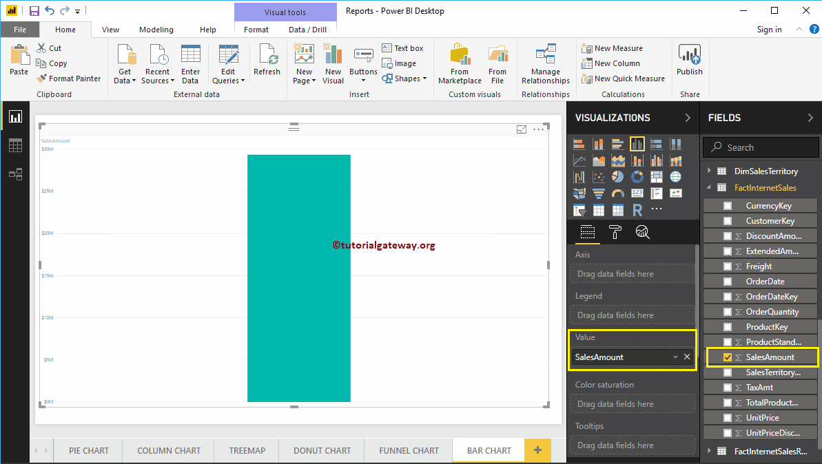
Primero, haga clic en el gráfico de barras agrupadas debajo del Visualización sección. Crea automáticamente un gráfico de barras con datos ficticios.
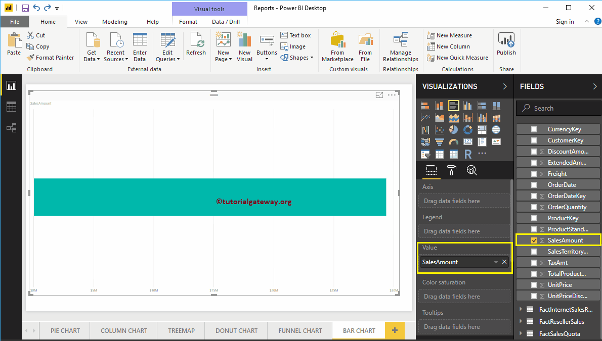
Para agregar datos al gráfico de barras de Power BI, tenemos que agregar los campos obligatorios:
- Eje: Especifique la columna que representa las barras horizontales.
- Valores: Cualquier valor numérico como el monto de las ventas, las ventas totales, etc.
Permítanme arrastrar el monto de ventas de la sección Campos al campo Valores.
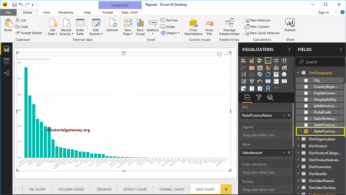
A continuación, agregue el nombre de la provincia del estado de la tabla DimGeography a la sección Eje. Puede hacer esto arrastrando State Province a la sección Axis, o simplemente marque la columna State Province
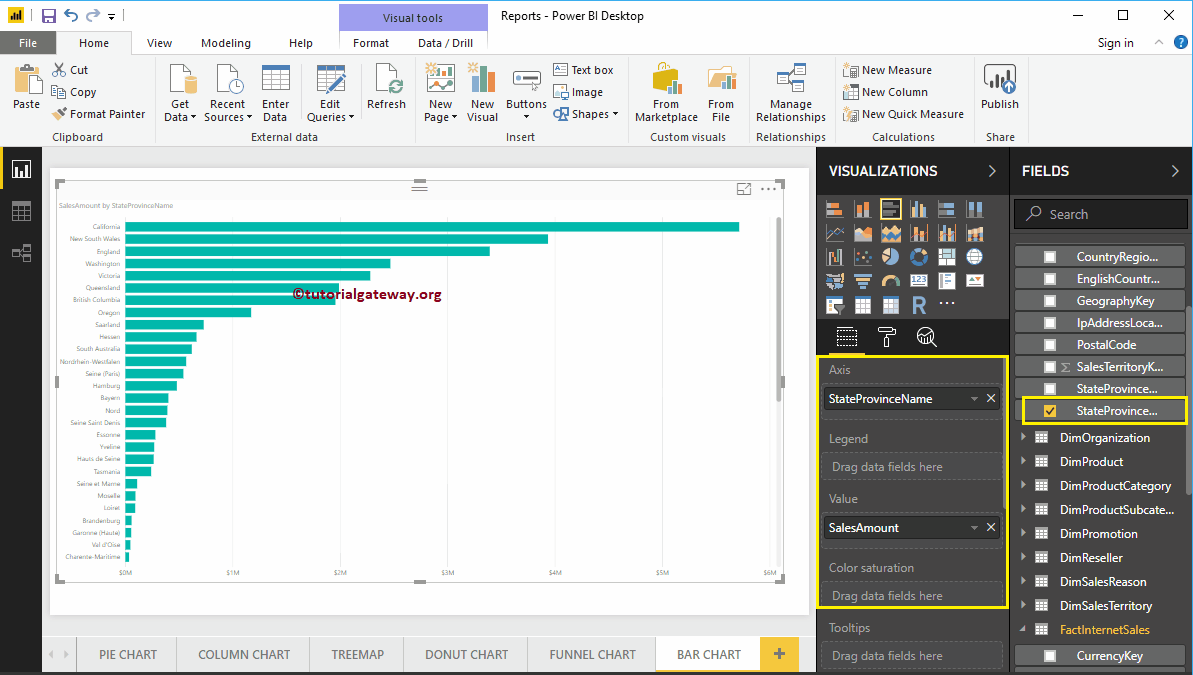
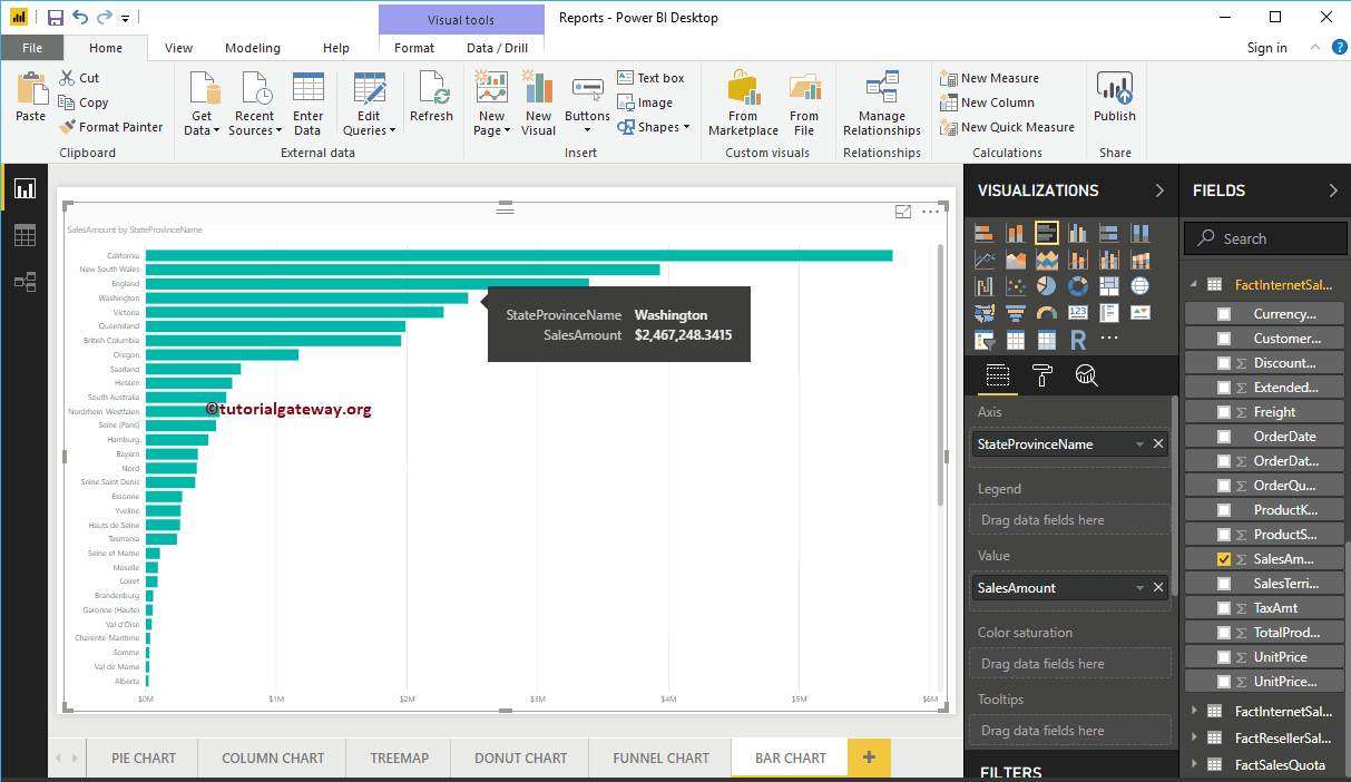
Ahora puede ver un gráfico de barras que representa las ventas por provincia estatal. Pase el mouse sobre cualquier barra para mostrar la información sobre herramientas del nombre de la provincia del estado y su monto de ventas
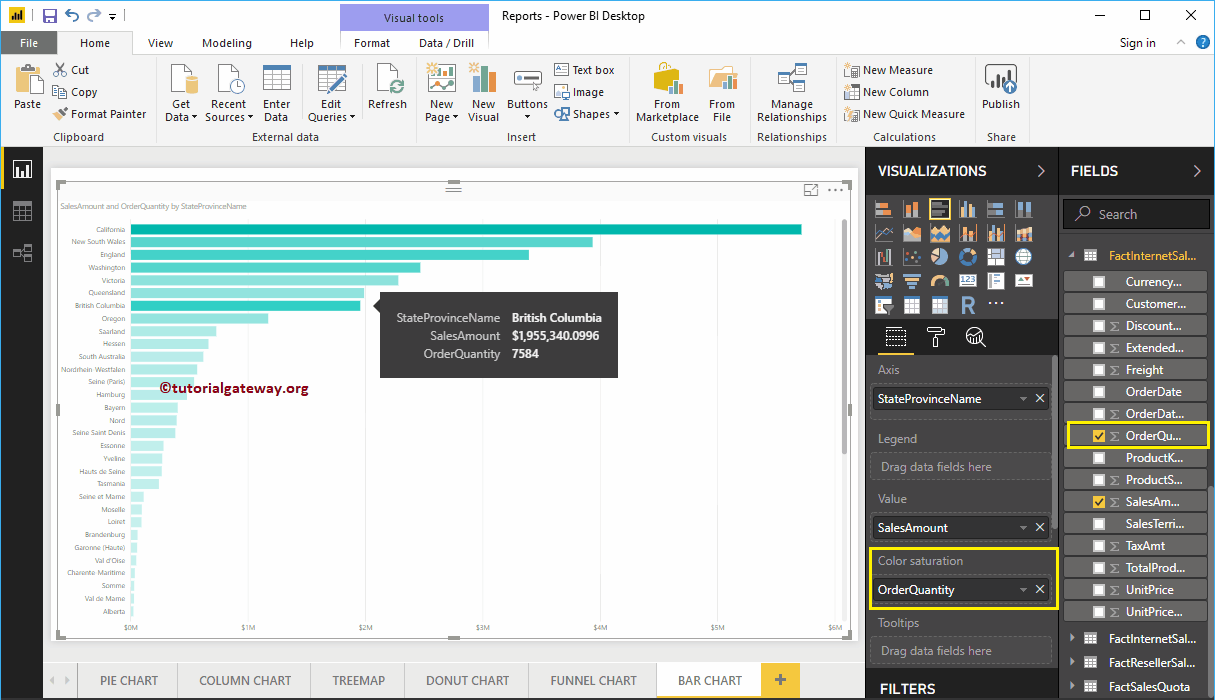
El gráfico de barras de Power BI tiene una propiedad más llamada Saturación de color. Agrega colores a las barras individuales según el valor del campo de saturación de color. Permítanme agregar la cantidad de pedido para saturar el color de claro a oscuro.
En la captura de pantalla a continuación, puede ver que los colores de las barras han cambiado según la cantidad de su pedido.

Permítanme aplicar un formato rápido a este gráfico de barras
NOTA: Le sugiero que consulte el artículo Dar formato al gráfico de barras para comprender los pasos necesarios para dar formato al título del gráfico de barras, los colores de las barras, el color de los datos, el color de fondo, las fuentes del eje y los colores.