The Power BI clustered bar chart is used to display horizontal bars from multiple data regions (measures) in a single metric. Let me show you how to create a clustered bar chart in Power BI with an example.
For this Power BI clustered bar chart demo, we used the SQL data source that we created in our previous article. So, check out the article Connect Power BI to SQL Server to understand the data source in Power BI.
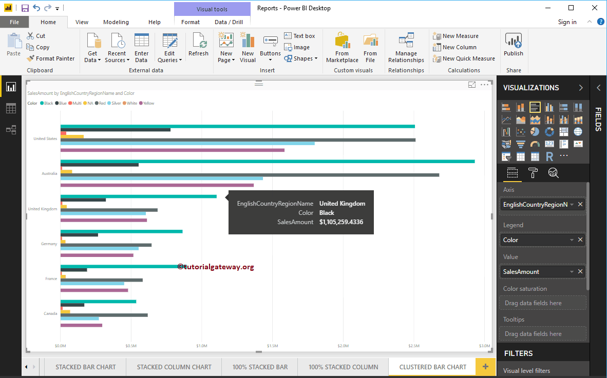
How to create a clustered bar chart in Power BI
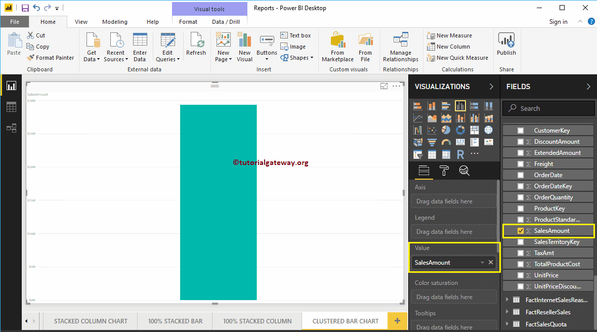
First, click on the clustered bar chart below the Display section. Automatically creates a clustered bar chart with dummy data.
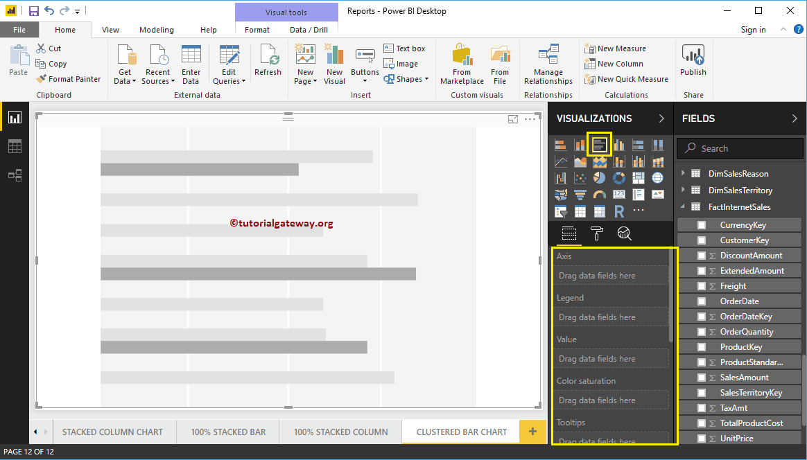
To add data to the clustered bar chart, we have to add the required fields:
- Axis: Specify the main column that represents the horizontal axis.
- Legend: Specify the second column that represents the horizontal bars.
- Values: Any numerical value such as sales amount, sales, orders, etc.
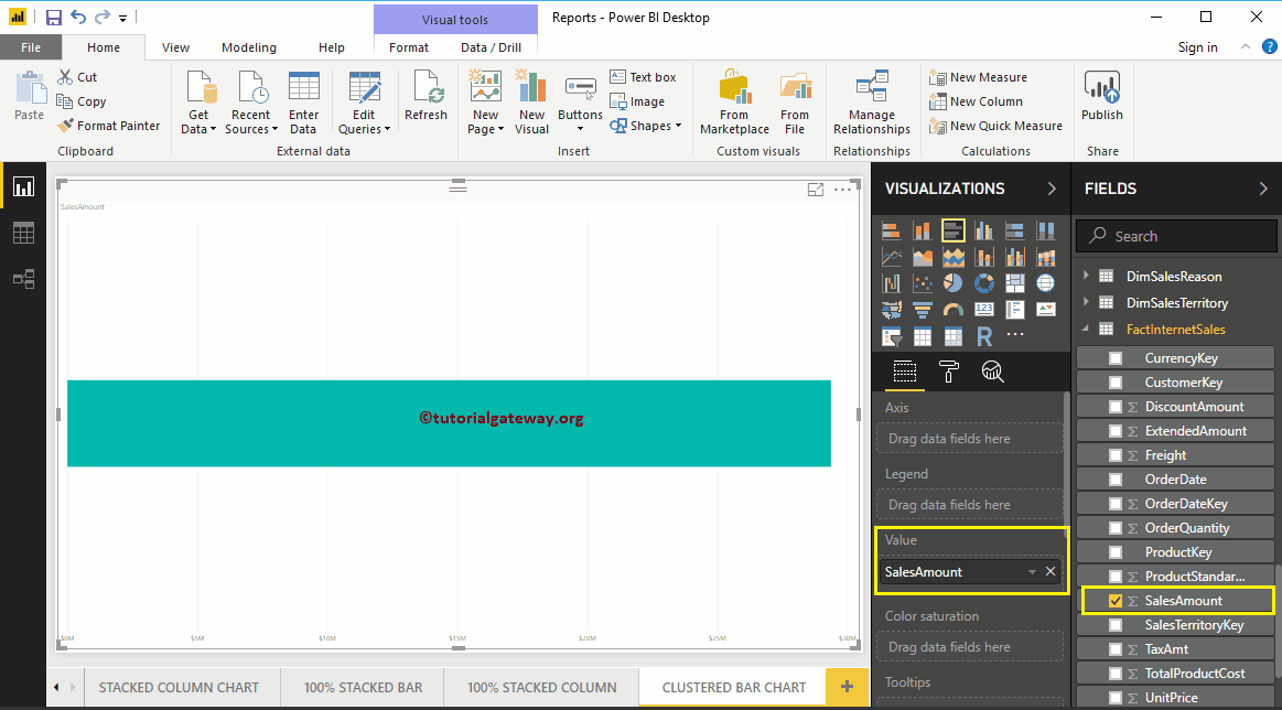
Let me drag the Sales Amount section from the fields to the Values field
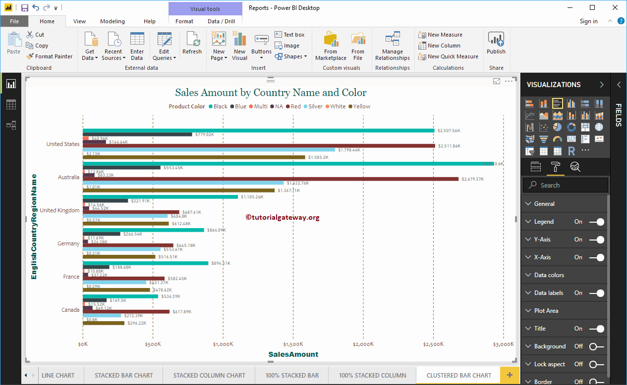
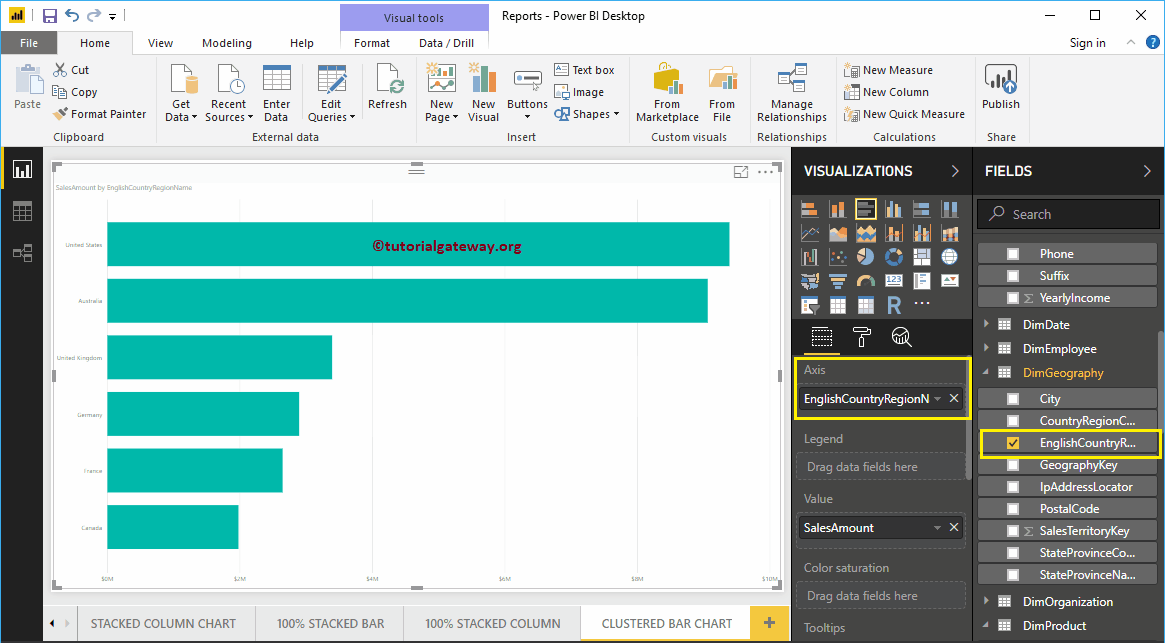
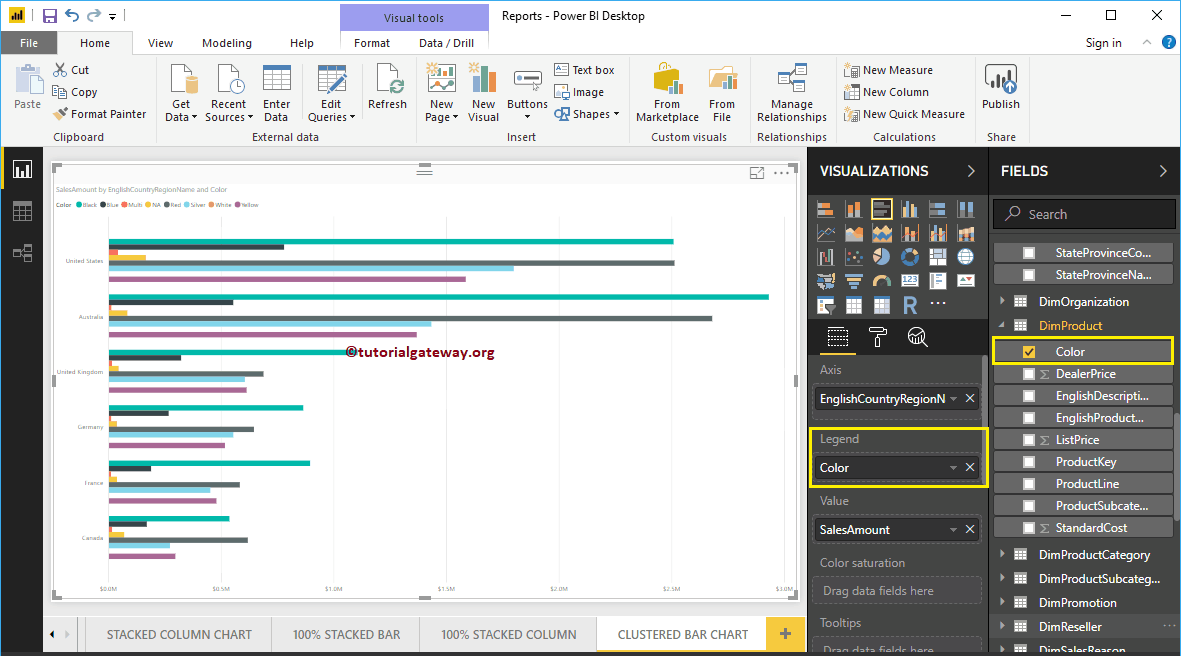
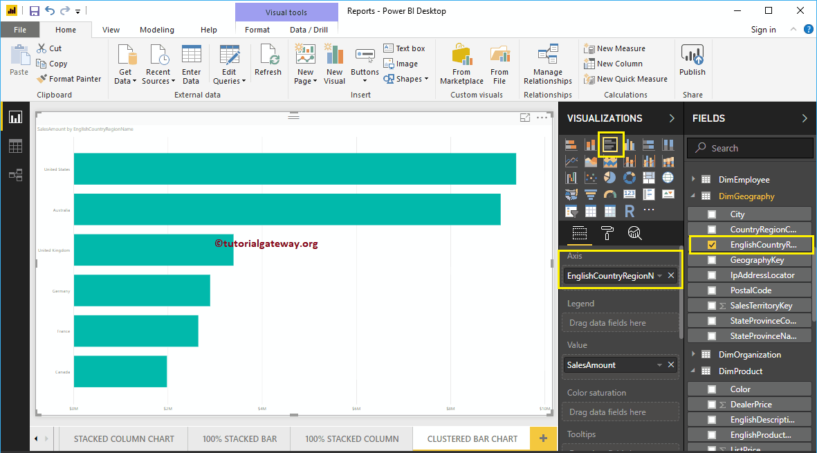
Next, let me add the name of the country region in English to the Axis section to create a bar chart. This chart shows the sales amount by country region name in English.
Then add Color from the DimProduct table to the Legend section.
Create a Clustered Bar Chart Approach 2
To create a clustered bar chart in Power BI, first drag and drop the Sales Amount section of the fields to the region of the canvas. Automatically create a column chart.
Next, let me add the name of the country region in English to the Axis section. Then click on the clustered bar chart below the Display section will convert column chart to clustered bar chart
Let me add the Color section to the legend to create a clustered bar chart showing the sales amount by country name and color.
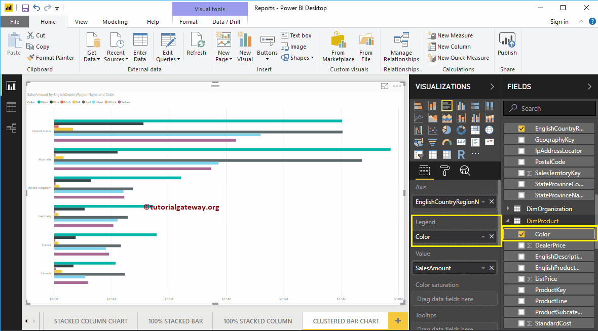
Hover over any horizontal bar to display the tooltip for country name, product color, and its sales amount
Let me apply a quick format to this clustered Power BI bar chart
NOTE: The formatting options for bar charts and clustered bar charts are the same. Therefore, I suggest that you refer to the article Formatting Bar Chart to understand the steps required to format clustered bars.