
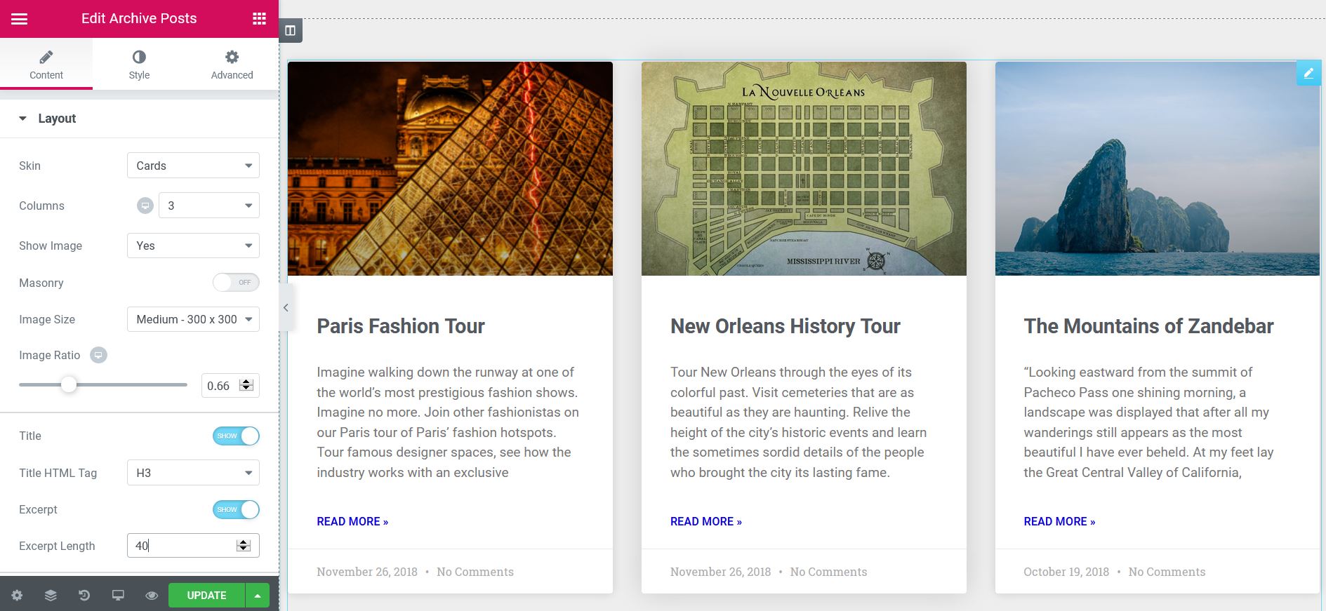
the Archive posts The widget displays a list of the posts within the archive templates, which are created in Templates> Theme Builder> File.
 es un protocolo que permite determinar una conexión segura entre el servidor y el cliente, que no puede ser interceptada por personas no autorizadas. En resumidas cuentas, es la versión segura de el http (Hyper Text Transfer Protocol) Cómo funciona Una conexión HTTP estándar en Internet puede ser fácilmente secuestrada por partes no autorizadas. El propósito de una conexión HTTPS es evitar esto: encriptar<span class="glossaryai-more-link"> <a href="https://rmarketingdigital.com/en/wiki/https/" data-wpel-link="internal">más</a></span></span></span></span></span>://rmarketingdigital.com/wp-content/uploads/2020/09/file-VDXQ3y683c-9544371.jpg)
Nota: El número de publicaciones por página se controla desde la configuración de lectura de WordPressWordPress es el software de blogs líder en el mundo, y es concretamente fácil de utilizar y adaptable. Con WordPress, es factible crear con éxito sitios web con la ayuda de funciones ya predefinidas, sin mucho esfuerzo, y para proporcionar contenido como texto, imagen y vídeo. No se requiere conocimiento de HTML. WordPress además facilita la gestión y el mantenimiento de contenidos extensos. Al mismo tiempo de su fácil manejo, plus (Panel de control> Settings> Reading)
ContentEl contenido puede ser muy difícil de definir con precisión. Es una definición que se refiere a las declaraciones contenidas en un documento o publicación de cualquier tipo y puede incluir las tecnologías de la información y la comunicación. Esto cubre todos los tipos de medios como imágenes y texto. A parte de esto, en el campo de la optimización de motores de búsqueda, los términos duplicar contenido, contenido único, plus
Design
- Skin: Select a predesigned skin, either Classic or Cards
- Columns: Sets how many columns will be displayed, from 1 to 6
- Image position: Sets the position of the image in relation to the content. Options include: Up / Left / Right / None
- Brickwork: Slide in or out
- Image size: Sets the image size, from thumbnail to full
- Image ratio: Sets the exact proportion of images
- image width: Sets the exact width of the images
- Title: Choose to show or hide the title
- Label HTMLHTML (Hypertext Markup Language) se usa para estructurar el contenido de texto de un documento web. No sólo se marca el contenido, sino además la meta-información que describe este contenido. Las páginas HTML se almacenan normalmente en el directorio raíz del servidor. Cómo se creó En la era digital, a los usuarios les resulta difícil hallar su camino en las webs y hacer un seguimiento de las estructuras de las plus de título: Seleccione la etiqueta HTML que se utilizará para el título, de H1Concepto de H1¿Qué es un H1?El H1 es un elemento primordial en cualquier página web y algo que nace del lenguaje HTML. Consiste en una etiqueta que suele utilizarse para indicar el fragmento más importante de una página, normalmente la cabecera que más ha de señalar en ella y captar la atención del lector.Su conocimiento y su utilización son algo primordial de cara al SEO e inclusive de cara a plus a H6, o div, span o p
- Abstract: Choose to show or hide the statement
- Excerpt length: Choose the length of the excerpt, setting the exact number of words displayed
- MetadataLos metadatos son datos estructurados que contienen información sobre una fuente como, por ejemplo, un libro o un documento web. Gracias a los metadatos resulta mucho más fácil hallar la fuente de información dado que contienen datos sobre el título, el autor, la fecha de publicación, la descripción, etc. Se utilizan en librerías pero además para la estadística y la ingeniería de software. Metadatos en WWW Los metadatos se utilizan plus: Select the metadata to be displayed in the widget. A click on the field opens the list of options. Options include author, date, time, and comments.
- read more: Show or hide the Read more button
- Read more text: Customize the text Read more
- Badge (Only available if card layout is selected) - Slide to YES to display the badge
- Taxonomy¿Qué es taxonomía?Conjunto organizado de palabras o frases que se usa para organizar información con el propósito de que pueda ser encontrada con mayor facilidad. En el campo específico de una web, es una lista estructurada y jerárquica de categorías o palabras clave bajo las que categorizar el contenido. La construcción de las taxonomías supone la realización de cuatro procesos: delimitación del área de conocimiento que representará la taxonomía, extracción del plus de insignias (Only available if the Cards mask is selected): Select the taxonomy to be used for the badge, choosing from Categories, Tags, etc.
- AvatarUn avatar es una imagen gráfica que representa a una persona real. Los avatares se usan como una imagen de alter ego o personaje en mundos virtuales, redes sociales, webs y comunidades. Estos pueden ser iconos personales (los llamados picons) en forma bidimensional o imágenes gráficas tridimensionales tales como figuras cómicas. Información general El término avatar fue acuñado por primera vez por Richard Garriot. Con la creación de "UltimaIV: Quest plus (Only available if the Cards mask is selected): show or hide the author's avatar
Note: When Elementor displays a post, if you don't have an excerpt, Elementor automatically generates an excerpt from the post content. the Excerpt length The option allows you to control the length of this automatically generated extract. However, the excerpt length only applies to posts where no manual excerpts have been entered. The length specified in the Elementor widget is ignored if there is a manually generated excerpt for a post.
Pagination
- Pagination: Choose how you want to paginate the results. Options include None, Numbers, Previous / Next, or Numbers + Previous / Next
- Page limit: Limit paging to the number you enter here.
- Shorten: If there are many pages of results, this adds an ellipsis (…) between the first pages and the last pages. that is, 1 2 3…. 8 9
- Previous label / Next label: Enter the text to be used for the Previous and Next labels. The option is only available if Previous / Next or Numbers + Previous / Next was chosen for pagination.
- Alignment: Aligns pagination to the left, right, or center
Advanced
- Nothing found message: Enter the text to display when there are no posts to display.
Style
Design
- Column spacing: Sets the exact space between the columns
- Row spacing: sets the exact space between the rows
- Alignment: Sets the alignment of the content in the widget as left, center or right
Card (only displayed if card layout chosen)
- Background color: Choose the background color of the card
- Border color: Choose the color of the card border
- Border width: Sets the thickness of the border around the card
- Edge radius: Sets the roundness of the card edge corners
- Horizontal padding: Sets the horizontal fill of the card content
- Vertical padding: Sets the vertical padding of the card content
- Shadow of the box: Choose Yes to apply a predefined box shadow to the card
- Scroll effect: Seleccione un efecto de desplazamiento, Ninguno o DegradedConcepto de Degradado¿Qué es un Degradado?El Degradado es una técnica que está fundamentalmente vinculado con el terreno del diseño gráfico y la maquetación, con todo lo que tiene que ver con la elaboración de imágenes o su modificación. Se trata de combinar dos colores de forma que uno va perdiendo intensidad a medida que el otro la va ganando, realizando una transición cromática suave que puede obtener resultados muy impactantes.Una plus
- Meta border color: Choose the border color over the metadata
Image
- Spacing: Sets the exact spacing between the image and the content
- FiltersConcepto de Filtros¿Qué son los Filtros?Los Filtros son unos mecanismos que, sea en el campo de la informática o en el de las páginas web, se usan para establecer qué tipo de contenidos se deben visualizar o mostrar por pantalla, o cuáles no deben aparecer. Es algo que se emplea en numerosos lugares con fines muy distintos, pero que siempre tiene como objetivo perfilar la búsqueda para acertar mejor con plus CSSConcepto de CSS¿Qué es el CSS?CSS es un lenguaje de programación que se usa para definir el estilo y el aspecto de un documento que se ha escrito mediante de un lenguaje de etiquetas, como HTML. Conocido además como hojas de estilo en cascada, es el que se emplea para dar colores, indicar tipos de letra o inclusive resaltar aspectos como el espacio entre items para dotar de estilo a plus: Adjusts the picture style by changing the CSS filter scales for Blur, Brightness, Contrast, Saturation, and Hue adjustments
Badge (Only available if Card skin is chosen)
- Badge position: Aligns the badge to the left or right of the card
- Background color: Choose the background color of the badge
- Text color: Choose the color of the logo text
- Edge radius: Sets the radius of the border to control the roundness of the corners
- Size: Sets the size of the badge
- Margin: Control the distance of the badge from the top and side of the card
- Typography: Sets the typography of the badge text
Avatar (Only available if Card skin is chosen)
- Size: Sets the size of the avatar.
Content
Title
- Colour: Sets the color of the titles
- Typography: Sets the font for the titles
- Spacing: Sets the space between the title and the content
Goal (Only available if Card skin is chosen)
- Colour: Sets the metadata color
- Separator color: Sets the color of the metadata separator
- Typography: Sets the font of the metadata
Abstract
- Colour: Sets the color of the abstract
- Typography: Sets the font of the extract
- Spacing: Set the space between the excerpt and the longest reading
read more
- Colour: Sets the color of the reading
- Typography: Set the font to read more text
- Spacing: Sets the space between the most read text and the bottom of the post box
Pagination
- Typography: Sets the font for the pagination text
- Colour: Choose the color of the pagination text for Normal, Hover and Active states
- Space between: Sets the space between pagination elements
Nothing found message
- Colour: Choose the message color
- Typography: Sets the font of the message