
Pop-ups are modal call-to-action windows that appear and overlap the page at a specific time or under specific conditions and triggers. Pop-up windows are designed to focus the user's attention once they have performed an action.
To get started, go to Templates> Popups. Controle el diseño, las condiciones, las reglas y los estilos de la ventana emergente y luego diseñe el contentsEl contenido puede ser muy difícil de definir con precisión. Es una definición que se refiere a las declaraciones contenidas en un documento o publicación de cualquier tipo y puede incluir las tecnologías de la información y la comunicación. Esto cubre todos los tipos de medios como imágenes y texto. A parte de esto, en el campo de la optimización de motores de búsqueda, los términos duplicar contenido, contenido único, plus de la ventana emergente.
Note: Click the cogwheel icon Settings Popup 
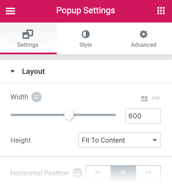
Pop-up design
Configurations
Design
- Width: Set the exact width of the popup window, using px or vh
- Height: Sets the exact height of the popup window, using px or vh. Use 100vh for width and height to create full screen popups
- Horizontal: Choose the horizontal position of the popup window, from Left, Center or Right
- Vertical: Choose the vertical position of the popup window, from Top, Center or Bottom
- Cover: Show or hide the background overlay
- Close button: Choose Show or Hide the Close button
- Show button after x seconds (if Show close button was chosen) - Select the number of seconds to wait before displaying the close button
- Entrance animation: Choose the pop-up input animation, such as fading and zooming, from the drop-down selections. Choose any animation effect to preview the effect.
- Exit animation: Choose the pop-up output animation, such as fade and zoom, from the drop-down selections. Choose any animation effect to preview the effect.
- Animation duration: Sets the duration of the animation, in milliseconds
General configuration
- Title: Enter the title of the pop-up window. This title will only be displayed on the backend, not for the user.
- Condition: Draft, Pending Review, Private, or Published
Preview settings
- Preview dynamic content as: Choose from Files, Pages, Posts, Media, or 404 pages.
Note: To view the content you have chosen, you must reload the page after selecting the dynamic content.
Style
 es un protocolo que permite determinar una conexión segura entre el servidor y el cliente, que no puede ser interceptada por personas no autorizadas. En resumidas cuentas, es la versión segura de el http (Hyper Text Transfer Protocol) Cómo funciona Una conexión HTTP estándar en Internet puede ser fácilmente secuestrada por partes no autorizadas. El propósito de una conexión HTTPS es evitar esto: encriptar<span class="glossaryai-more-link"> <a href="https://rmarketingdigital.com/en/wiki/https/" data-wpel-link="internal">más</a></span></span></span></span></span>://rmarketingdigital.com/wp-content/uploads/2020/09/file-LrUzHoOWu8-5345889.jpg)
Arise
- Fund type: Elija un color de fondo, una imagen o un degradedConcepto de Degradado¿Qué es un Degradado?El Degradado es una técnica que está fundamentalmente vinculado con el terreno del diseño gráfico y la maquetación, con todo lo que tiene que ver con la elaboración de imágenes o su modificación. Se trata de combinar dos colores de forma que uno va perdiendo intensidad a medida que el otro la va ganando, realizando una transición cromática suave que puede obtener resultados muy impactantes.Una plus
- Border type: Select the type of edge, choosing from none, solid, double, dotted, dashed or grooved
- Edge radius: Sets the border radius to control the roundness of the corners on each side of the popup
- Shadow of the box: Adjust box shadow options
Cover
- Fund type: Choose a background color, image, or gradient
Close button
- Position: Choose to display the Close button on the inside or outside of the pop-up window
- Vertical position: Use the slider to select the vertical position of the Close button
- Horizontal position: Use the slider to select the horizontal position of the Close button
Normal | Float up
- Colour: Select the color of the Close button for Normal and Hover states
- Background color: Choose the background color of the Close button for Normal and Hover states
- Size: Sets the size of the close button
Advanced
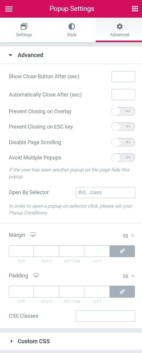
Advanced
- Show close button after (seconds): Enter a number of seconds. The close button will only appear after that time has passed.
- Automatically close after (ms): Enter the number of ms to wait before automatically closing the pop-up window. Leave blank to disable automatic shutdown.
- Avoid overlapping closure: Select Yes to prevent users from closing the popup by clicking the overlay.
- Avoid closing with the ESC key: Select Yes to prevent users from closing the popup by pressing the ESC key.
- Disable page scrolling: Select Yes to prevent users from scrolling through the page displayed behind the pop-up window
- Avoid multiple pop-ups: If the user has seen another popup on the page they visit, hide this popup by selecting Yes
- Open by selector: Ingrese una lista de selectores que activarán manualmente la ventana emergente (ID de CSSConcepto de CSS¿Qué es el CSS?CSS es un lenguaje de programación que se usa para definir el estilo y el aspecto de un documento que se ha escrito mediante de un lenguaje de etiquetas, como HTML. Conocido además como hojas de estilo en cascada, es el que se emplea para dar colores, indicar tipos de letra o inclusive resaltar aspectos como el espacio entre items para dotar de estilo a plus, clases o elementos de datos). Vea las instrucciones
- Margin: Adjust margins
- Filling: Adjusts the padding around the popup
- CSS classes: Add your custom class without the period (eg my class)
Custom css
Custom css: Enter your own CSS
<h1Concepto de H1¿Qué es un H1?El H1 es un elemento primordial en cualquier página web y algo que nace del lenguaje HTML. Consiste en una etiqueta que suele utilizarse para indicar el fragmento más importante de una página, normalmente la cabecera que más ha de señalar en ella y captar la atención del lector.Su conocimiento y su utilización son algo primordial de cara al SEO e inclusive de cara a plus>Control popup through publish settings
Set conditions
Terms allows you to set on which pages of your website the pop-up will appear.
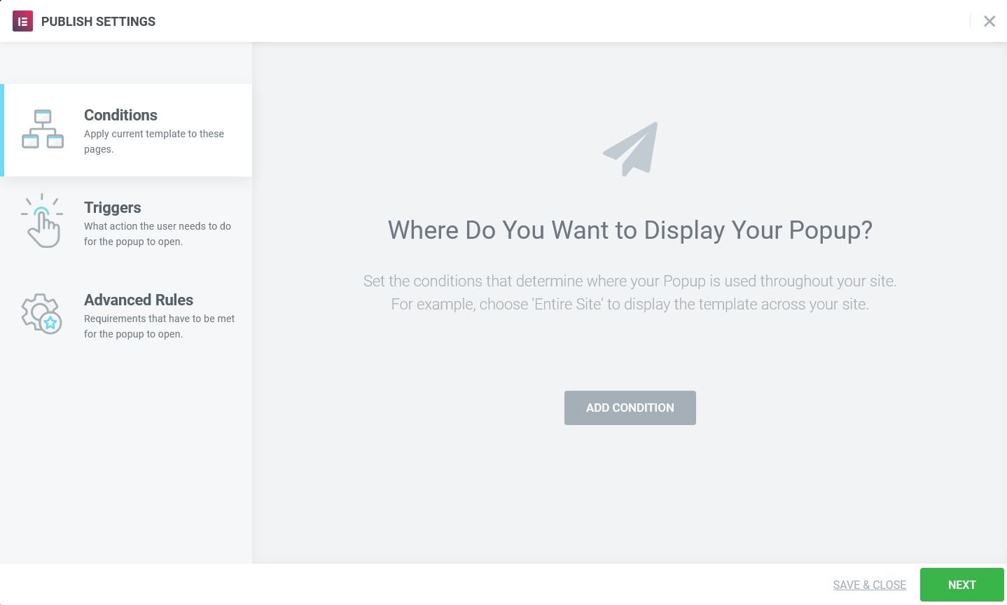
Set the conditions that determine where your popup is used (excluding manual activation). For example, add an Include condition and choose Singular> Cover to show only the pop-up window on the home page of the site. Learn more about the conditions.
Set triggers
Triggers it's the user actions that make your campaign appear. Select Yes or No for each option that will bring up the pop-up window.
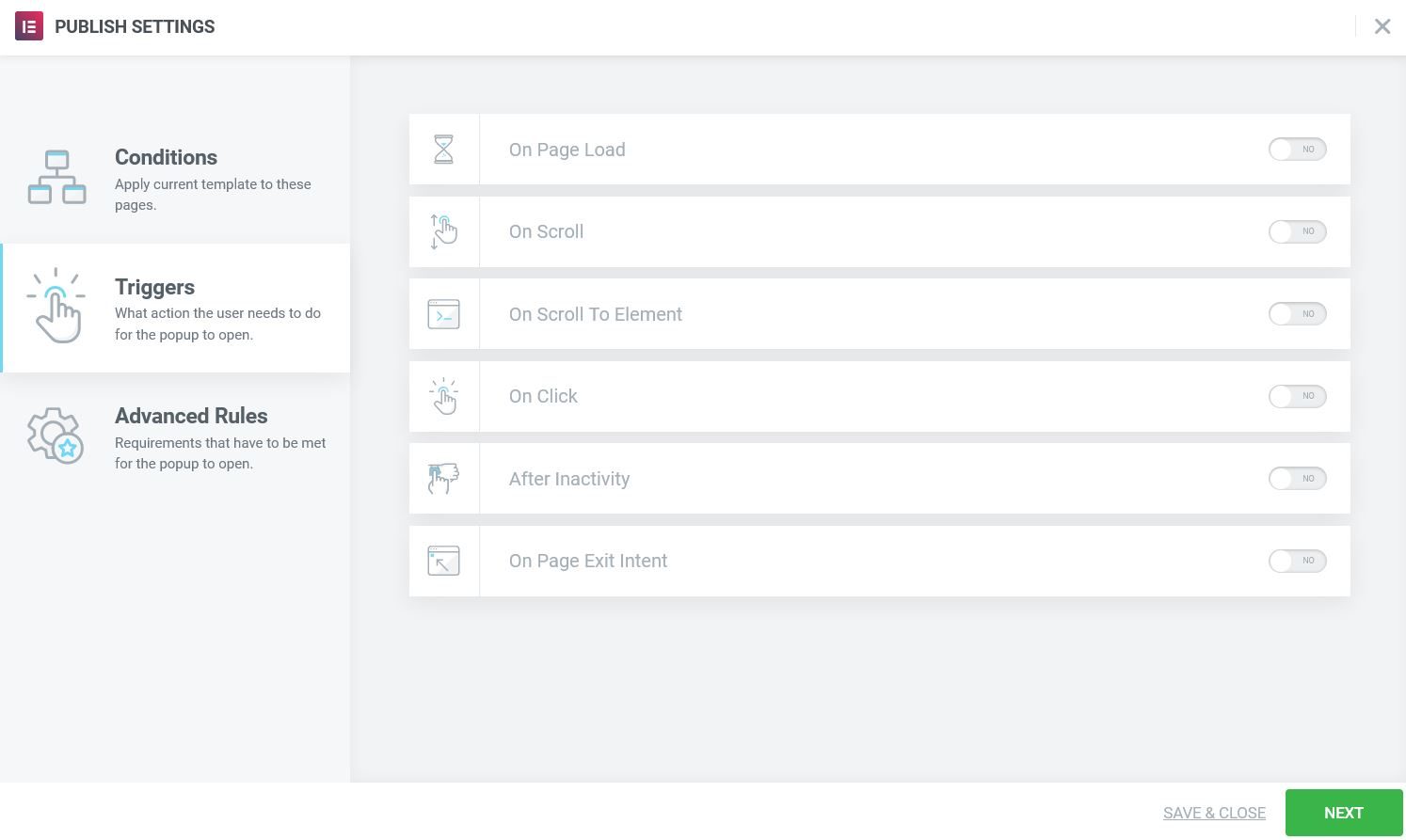
- Loading on the page: If set to Yes, set the number of seconds to wait, when loading the page, before the pop-up window is activated.
- In displacement: If set to Yes, select the direction (Up or Down) and the amount of scrolling before the popup is activated. Scroll down is based on percentage page scrolled down; Scroll up is based on number of pixels shifted up.
- When scrolling to item: If set to Yes, enter the name of the selector (CSS ID) that will trigger the popup when the user scrolls to it. You also need to add the CSS ID to the Advanced tab of the element.
- Clicking: If set to Yes, enter the number of clicks that will trigger the popup
- After inactivity: If set to Yes, enter the number of seconds of user inactivity that will trigger the pop-up window.
- Exit intent on page: Set Yes to trigger the pop-up window when user mouse activity indicates intention to exit the page
Advanced rules
Advanced rules specify other requirements that must be met to generate a pop-up window.
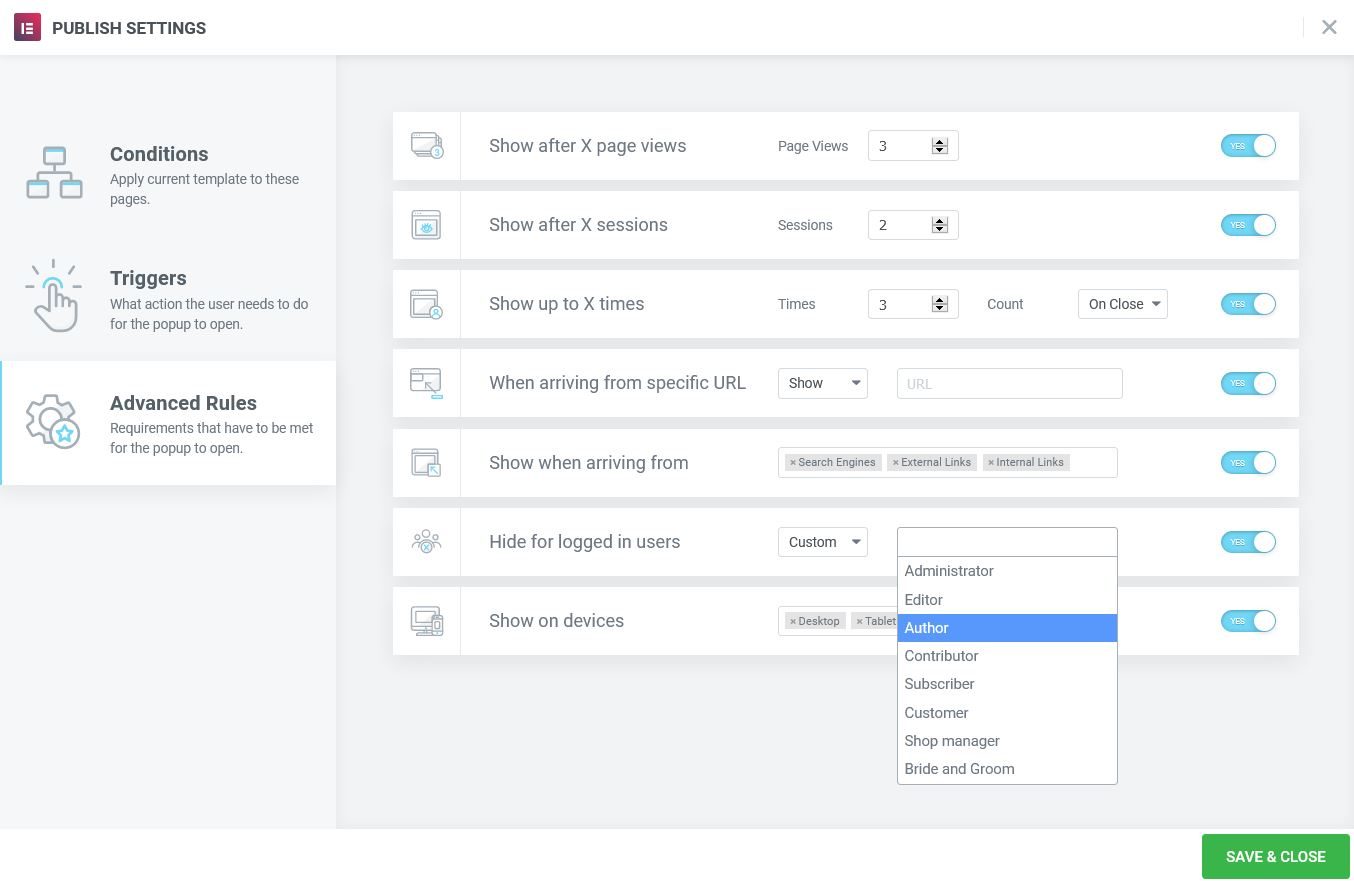
- Show after X page views: If set to Yes, set the number of page views before the popup is activated.
- Show after X sessions: Si se establece en Sí, establezca el número de sesiones de usuario antes de que se active la ventana emergente (una sesión comienza cuando el usuario visita el sitio web y finaliza cuando el usuario cierra el browserUn navegador (además: browser) es una herramienta informática que te permite ver documentos y datos y navegar por la red. Los navegadores pueden mostrar distintos tipos de recursos de información; principalmente documentos HTML, a pesar de todo, además son posibles otros tipos de archivos y contenido multimedia, como PDF, JPEG, MPEG, GIF o el lenguaje de meta marcado. A través el uso de complementos especiales y la configuración respectivo, los plus).
- Introduce yourself up to X times: Maximum times the pop-up window will be displayed. If Count is set to On Open, this will only allow the popup to open as many times as the configured number. If Count is set to On Close, the popup will only open until the user has closed it for the umpteenth time, after which it will not be reopened. This setting is set to local storage and will remain there until it is removed.
- Al llegar de una UrlEl URL (Localizador Uniforme de Recursos), es una dirección definida que apunta a la posición de un archivo en un servidor y lo recupera. Las URL se introducen en un navegador web para ingresar a documentos en la web o se incrustan como hipervínculos dentro de un documento. Se puede usar un Permalink para que una URL esté disponible de forma permanente. Componentes de una URL • prefijo de protocolo plus específica: Si se establece en Sí, muestra u oculta la ventana emergente si un usuario llega desde una URL específica (ingresa la URL específica). RegexLas abreviaturas regex y regexp denotan expresiones regulares que se usan en la informática teórica, programación, desarrollo de software, procesamiento de textos y optimización de motores de búsqueda. Las expresiones regulares se pueden usar para describir cadenas y números de cadenas en una forma lógica general con el fin de buscarlas, sustituirlas, manipularlas o procesarlas en documentos, código fuente o una base de datos. Ejemplo: En un editor de texto habilitado plus es una opción para que los usuarios avanzados establezcan reglas avanzadas para patrones de URL coincidentes.
- Show when arriving from: Si se establece en Sí, muestra si el usuario llega de los search enginesConcepto de Motores de Búsqueda¿Qué son los Motores de Búsqueda?Los Motores de búsqueda, o Search Engines, son lo que se conoce comúnmente como buscadores. Todos aquellos sistemas informáticos que trabajan buscando todos los archivos almacenados en internet por medio de de arañas o crawlers para elaborar páginas de resultados que sirvan para que los usuarios accedan a webs tras realizar una búsqueda. Son los responsables de que, al buscar cualquier plus, a linkConcepto de Dominio¿Qué es un Enlace?En Internet, un link, además conocido como enlace o hipervínculo, es cualquier texto o imagen que se encuentra en una página web y en la que el usuario puede pulsar o clicar para ser dirigido a otro contenido distinto. Es el principal medio de “desplazamiento” en la red, puesto que se encuentra presente en prácticamente cualquier portal que visites a día de hoy, inclusive en plus externo (ingrese la URL del enlace específico) y / o un enlace interno (ingrese la URL del enlace específico).
- Hide for registered users: Configúrelo en Sí para ocultar la ventana emergente para todos los usuarios que iniciaron sesión o para seleccionar roles personalizados. Para sitios web con cacheUn caché es un tipo de memoria auxiliar de la que se puede recuperar a alta velocidad con una capacidad de almacenamiento relativamente pequeña. Se encuentra entre la unidad central de procesamiento (CPU) y la memoria principal. Ayuda a evitar el acceso al disco duro o los recálculos complejos almacenando temporalmente ciertos datos y haciéndolos disponibles rápidamente cuando sea necesario. El caché almacena una copia de la petición actual y plus, es posible que esta función no funcione correctamente
- Show on devices: Select Yes to choose to display on desktop, tablet and / or mobile devices
Note: Pop-ups cannot be displayed more than once if the page is not reloaded or re-entered.
Control pop-up window by manual activation
Pop-ups can be activated manually. Dynamic links can use the popup action to open or close a popup. The form can use the Actions after submit option to open or close a pop-up window. Any item can use a single selector (class, ID, or data item) to manually trigger a popup when that item is clicked.
- From any link item, choose Dynamic> Actions> Popup Window. Click Arise to select either Open popup window or Close popup. If you choose Close popup window, the option «Not reappear'Will become an available option.
- From an Elementor form, choose Actions after sending> Add action> Open popup or Close popup
- Starting from a Custom selector: Any element can have a set of selectors that can be used as a manual pop-up trigger. Edit the item and go to Advanced> CSS Classes (or CSS ID) and give the element a class name (without the preceding dot) or an identifying name (without the preceding #). In pop-up windows Terms, choose the page that includes the item with the single selector (ex. Conditions> Include> Singular> Pages> Title of your page). When a user visits that page and clicks on the item, the pop-up is activated. This is useful for opening a popup from a theme's navigation menu item, content within a Text Editor widget, from a non-Elementor element or script, etc.
When activating a popup from a custom selector, note that the element does not have to be a "link". An item that is normally not clickable, such as plain text, can also be clicked to generate the pop-up window. Also note that the Triggers and Advanced rules will be ignored while using this option.