
Learn how to avoid sudden layout shifts to improve user-experience
Updated
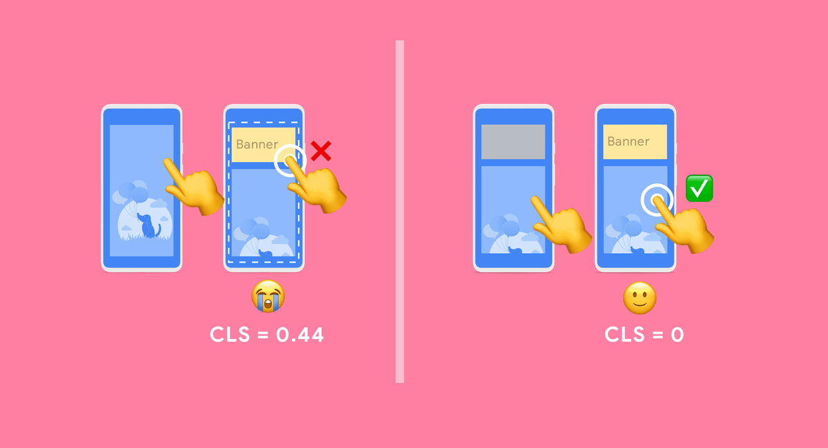
«I was about to click¿Qué es un click?Es la acción de pulsar un botón del ratón una vez colocado el puntero del mismo sobre un elemento determinado de la pantalla. El click determina la interacción del usuario con el sistema.Otras denominaciones: Clic plus that! Why did it move? 😭»
Layout shifts can be distracting to users. Imagine you've started reading an article when all of a sudden elements shift around the page, throwing you off and requiring you to find your place again. This is very common on the web, including when reading the news, or trying to click those 'Search' or 'Add to Cart' buttons. Such experiences are visually jarring and frustrating. They're often caused when visible elements are forced to move because another element was suddenly added to the page or resized.
Cumulative Layout Shift (CLS) - a Core Web Vitals metric, measures the instability of content by summing shift scores across layout shifts that don't occur within 500ms of user input. It looks at how much visible content shifted in the viewport as well as the distance the elements impacted were shifted.
In this guide, we'll cover optimizing common causes of layout shifts.

The most common causes of a poor CLS are:
- Images without dimensions
- Ads, embeds, and iframes without dimensions
- Dynamically injected content
- Web Fonts causing FOIT / FOUT
- Actions waiting for a network response before updating DOM
Images without dimensions 🌆
Summary: Always include width and height size attributes on your images and video elements. Alternatively, reserve the required space with CSS aspect ratio boxes. This approach ensures that the browser can allocate the correct amount of space in the document while the image is loading.

History
In the early days of the web, developers would add width and height attributes to their <img> tags to ensure sufficient space was allocated on the page before the browser started fetching images. This would minimize reflow and re-layout.
<img src="puppy.jpg" width="640" height="360" alt="Puppy with balloons">You may notice width and height above do not include units. These «pixel» dimensions would ensure a 640 × 360 area would be reserved. The image would stretch to fit this space, regardless of whether the true dimensions matched or not.
When Responsive Web Design was introduced, developers began to omit width and height and started using CSSConcepto de CSS¿Qué es el CSS?CSS es un lenguaje de programación que se usa para definir el estilo y el aspecto de un documento que se ha escrito mediante de un lenguaje de etiquetas, como HTML. Conocido además como hojas de estilo en cascada, es el que se emplea para dar colores, indicar tipos de letra o inclusive resaltar aspectos como el espacio entre items para dotar de estilo a plus to resize images instead:
img {
width: 100%;
height: car;
}
A downside to this approach is space could only be allocated for an image once it began to download and the browser could determine its dimensions. As images loaded in, the page would reflow as each image appeared on screen. It became common for text to suddenly pop down the screen. This wasn't a great user experience at all.
This is where aspect ratio comes in. The aspect ratio of an image is the ratio of its width to its height. It's common to see this expressed as two numbers separated by a colon (for example 16: 9 or 4: 3). For an x: y aspect ratio, the image is x units wide and units high.
This means if we know one of the dimensions, the other can be determined. For a 16: 9 aspect ratio:
- If puppy.jpg has a 360px height, width is 360 x (16/9) = 640px
- If puppy.jpg has a 640px width, height is 640 x (9/16) = 360px
Knowing the aspect ratio allows the browser to calculate and reserve sufficient space for the height and associated area.
Modern best practice
Modern browsers now set the default aspect ratio of images based on an image's width and height attributes so it's valuable to set them to prevent layout shifts. Thanks to the CSS Working Group, developers just need to set width and height as normal:
<img src="puppy.jpg" width="640" height="360" alt="Puppy with balloons">…and the UA stylesheets of all browsers add a default aspect ratio based on the element's existing width and height attributes:
img {
aspect-ratio: attr(width) / attr(height);
}
This calculates an aspect ratio based on the width and height attributes before the image has loaded. It provides this information at the very start of layout calculation. As soon as an image is told to be a certain width (for example width: 100%), the aspect ratio is used to calculate the height.
Tip: If you're having a hard time understanding aspect ratio, a handy calculator is available to help.
The above image aspect ratio changes have shipped in Firefox and Chromium, and are coming to WebKit (Safari).
For a fantastic deep-dive into aspect ratio with further thinking around responsive images, see jank-free page loading with media aspect ratios.
If your image is in a container, you can use CSS to resize the image to the width of this container. We set height: auto; to avoid the image height being a fixed value (for example 360px).
img {
height: car;
width: 100%;
}
What about responsive images?
When working with responsive images, srcset defines the images you allow the browser to select between and what size each image is. To ensure <img> width and height attributes can be set, each image should use the same aspect ratio.
<img width="1000" height="1000"
src="puppy-1000.jpg"
srcset="puppy-1000.jpg 1000w,
puppy-2000.jpg 2000w,
puppy-3000.jpg 3000w"
alt="Puppy with balloons"/>
What about art direction?
Pages may wish to include a cropped shot of an image on narrow viewports with the full image displayed on desktop.
<picture>
<source half="(max-width: 799px)" srcset="puppy-480w-cropped.jpg">
<source half="(min-width: 800px)" srcset="puppy-800w.jpg">
<img src="puppy-800w.jpg" alt="Puppy with balloons">
</picture>
It's very possible these images could have different aspect ratios and browsers are still evaluating what the most efficient solution here should be, including if dimensions should be specified on all sources. Until a solution is decided on, relayout is still possible here.
Ads, embeds and iframes without dimensions 📢😱
Advertisements
Ads are one of the largest contributors to layout shifts on the web. Ad networks and publishers often support dynamic ad sizes. Ad sizes increase performanceEn el caso de las webs, el término Performance o rendimiento, se refiere a la velocidad de carga o a la potencia de cálculo de un servidor, es decir, a la velocidad a la que se transmiten los datos del servidor al cliente. Razones para una buena performance Una web que se carga lentamente, puede animar a los clientes potenciales a abandonar la página. Para asegurar una interacción fluida, se tiene plus/revenue due to higher click rates and more ads competing in the auction. Unfortunately, this can lead¿Qué es un lead?Persona que muestra interés por un producto, servicio o marca facilitando sus datos, normalmente por medio de del formulario de contacto de una landing page. plus to a suboptimal user experience due to ads pushing visible content you’re viewing down the page.
During the ad lifecycle, many points can introduce layout shift:
- When a site inserts the ad container in the DOM
- When a site resizes the ad container with first-party code
- When the ad tag library loads (and resizes the ad container)
- When the ad fills a container (and resizes if the final ad has a different size)
The good news is that it's possible for sites to follow best practices to reduce ad shift. Sites can mitigate these layout shifts by:
- Statically reserve space for the ad slot.
- In other words, style the element before the ad tag library loads.
- If placing ads in the content flow, ensure shifts are eliminated by reserving the slot size. These ads shouldn't cause layout shifts if loaded off-screen.
- Take care when placing non-sticky ads near the top of the viewport.
- In the below example, it's recommended to move the ad to below the «world vision» logo and make sure to reserve enough space for the slot.
- Avoid collapsing the reserved space if there is no ad returned when the ad slot is visible by showing a placeholder.
- Eliminate shifts by reserving the largest possible size for the ad slot.
- This works, but it risks having a blank space if a smaller ad creative fills the slot.
- Choose the most likely size for the ad slot based on historical data.
Some sites may find collapsing the slot initially can reduce layout shifts if the ad slot is unlikely to fill. There isn't an easy way to choose the exact size each time, unless you control the ad serving yourself.

Statically reserve space for the ad slot
Statically style slot DOM elements with the same sizes passed to your tag library. This can help ensure the library doesn't introduce layout shifts when it loads. If you don't do this, the library may change the size of the slot element after page layout.
Also consider the sizes of smaller ad serves. If a smaller ad is served, a publisher can style the (larger) container to avoid layout shifts. The downside to this approach is that it will increase the amount of blank space, so keep in mind the trade-off here.
Avoid placing ads near the top of the viewport
Ads near the top of the viewport may cause a greater layout shift than those at the middle. This is because ads at the top generally have more content lower down, meaning more elements move when the ad causes a shift. Conversely, ads near the middle of the viewport may not shift as many elements as the content above it is less likely to move.
Embeds and iframes
Embeddable widgetsConcepto de Widgets¿Qué son los Widgets?Los Widgets son una serie de pequeños programas que se usan para añadir funciones, simplificar o automatizar aquellas acciones que se lleven a cabo a menudo dentro de una web. Son herramientas adicionales, añadidos que se elaboran con la finalidad de hacer más fácil las labores de mantenimiento o inclusive de generación de contenidos dentro de cualquier sitio de Internet y que no han hecho plus allow you to embed portable web content in your page (for example, videos from YoutubeConcepto de Youtube¿Qué es Youtube?Youtube es una de las plataformas más utilizadas e importantes de todo internet. Consiste en un rincón del océano digital dedicado única y exclusivamente al contenido en vídeo, permitiendo a los usuarios tanto publicar contenidos audiovisuales como consumirlos. Es el principal lugar al que acudir al momento de buscar algún documento en forma de vídeo o de ver cualquier tipo de publicación elaborada en este formato.Una plus, maps from Google mapsConcepto de Google Maps¿Qué es Google Maps?Google Maps es el nombre de una aplicación desarrollada por Google que se encarga de ofrecer a los usuarios toda la información que necesiten sobre su ubicación actual, como además la de cualquier dirección específica, así como el trazado de recorridos para llegar al lugar que estos deseen desde donde se encuentran.Una app que aprovecha la conexión GPS de los smartphones y tablets y plus, social media¿Qué es Social Media?Término en inglés que puede traducirse como medios sociales y que designa al conjunto de plataformas, herramientas, apps y medios de comunicación donde la información es creada y visualizada por los usuarios, que pueden compartir y transferir textos, fotografías, audio, vídeo… Dos ejemplos de social media son Facebook y Wikipedia.Otras denominaciones: Medios sociales plus posts, and so on). These embeds can take a number of forms:
- HTMLHTML (Hypertext Markup Language) se usa para estructurar el contenido de texto de un documento web. No sólo se marca el contenido, sino además la meta-información que describe este contenido. Las páginas HTML se almacenan normalmente en el directorio raíz del servidor. Cómo se creó En la era digital, a los usuarios les resulta difícil hallar su camino en las webs y hacer un seguimiento de las estructuras de las plus fallback and a JavaScriptJavaScript es un lenguaje de programación que funciona en el lado del cliente y con el que las webs pueden ser más funcionales. Incorporación en código HTML El código JavaScript puede ser incrustado en las páginas HTML, para que adquieran funcionalidad. Existen varias opciones. Puede estar entre las etiquetas <SCRIPT> y </SCRIPT>, puede estar contenido en un archivo externo, puede ser un parámetro de las etiquetas HTML, y puede estar plus tag transforming the fallback into a fancy embed
- Inline HTML snippetConcepto de Snippet¿Qué es un Snippet?El Snippet es el pequeño texto que los buscadores muestran al momento de lanzar resultados a los usuarios que hacen una búsqueda. Suele ser un párrafo que acompaña al título que se muestra en grande, con un resumen del contenido de su interior. Consiste en una definición que se usa mucho dentro del campo de la web y, especialmente, del posicionamiento SEO.Los snippets pueden ser plus
- iframeConcepto de Iframe¿Qué es un Iframe?Un Iframe es un documento de una web que se inserta en otra página web. Consiste en un elemento que puede albergar cualquier tipo de contenido en su interior y que ayuda, entre otras cosas, a ampliar el mensaje que se ofrece con fuentes externas o con material complementario que pueda resultar de interés para el usuario que entra.Este elemento web se usa especialmente al plus embed
These embeds often aren’t aware in advance just how large an embed will be (for example, in the case of a social media postConcepto de Post¿Qué es un Post?Un Post es todo aquel contenido, sea post, opinión, noticia u otro género, que un autor publica en un blog. Este puede ser de carácter corporativo o meramente ocioso; pero siempre tiene como meta arrojar información o reflejar una idea, al mismo tiempo de facilitar que los usuarios encuentren la web donde se recoge por medio de de buscadores y demás plataformas online.Generalmente, se han plus – does it have an embedded image? video? multiple rows of text?). As a result, platforms offering embeds do not always reserve enough space for their embeds and can cause layout shifts when they finally load.

To work around this, you can minimize CLS by precomputing sufficient space for embeds with a placeholder or fallback. One workflowConcepto de Workflow¿Qué es un Workflow?El Workflow o flujo de trabajo es un sistema con el que se busca automatizar determinado procesos dentro del ámbito laboral. Aplicado en el contexto del marketing, fundamentalmente el digital u online, reúne todas las acciones que se automatizan de forma que se ponen en marcha en función de los distintos tipos de usuario y su vinculación con la web de una marca. Un planteamiento plus you can use for embeds:
- Obtain the height of your final embed by inspecting it with your browser developer tools
- Once the embed loads, the contained iframe will resize to fit so that its contents will fit.
Take note of the dimensions and style a placeholder for the embed accordingly. You may need to account for subtle differences in ad / placeholder sizes between different form factors using media queries.
Dynamic content 📐
Summary: Avoid inserting new content above existing content, unless in response to a user interaction. This ensures any layout shifts that occur are expected.
You've probably experienced layout shifts due to UI that pops-in at the top or bottom of the viewport when you're trying to load a site. Similar to ads, this often this happens with banners and forms that shift the rest of the page's content:
- «Sign-up to our newsletter¿Qué es una newsletter?Publicación digital periódica, transmitida generalmente por medio de del email, con la que una marca de comunica con sus usuarios, que previamente se han suscrito a ella, autorizando el envío de información. Es una herramienta con la que se busca fidelizar a clientes y mantenerles actualizados con noticias de ofertas, promociones y nuevos productos.Otras denominaciones: Boletín informativo, NW plus!» (whoa, slow down! we just met!)
- "Related content"
- "Install our [iOS / Android] app"
- "We're still taking orders"
- «GDPREl Reglamento General de Protección de Datos (GDPR) es un reglamento de la UE diseñado para regular y armonizar el almacenamiento y tratamiento de datos personales. El Reglamento afecta a las empresas, a las autoridades públicas y a los operadores web de la Unión Europea. El GDPR entró en vigor en la UE el 25 de mayo de 2018. Antecedentes Los primeros esfuerzos para proteger los datos personales y la plus notice»
If you need to display these types of UI affordances, reserve sufficient space in the viewport for it in advance (for example, using a placeholder or skeleton UI) so that when it loads, it does not cause content in the page to surprisingly shift around .
Web fonts causing FOUT / FOIT 📝
Downloading and rendering web fonts can cause layout shifts in two ways:
- The fallback font is swapped with a new font (FOUT - flash of unstyled text)
- "Invisible" text is displayed until a new font is rendered (FOIT - flash of invisible text)
The following tools can help you minimize this:
font-displayallows you to modify the rendering behavior of custom fonts with values such ascar,swap,block,fallbackandoptional. Unfortunately, all of these values (except optional) can cause a re-layout in one of the above ways.- The Font Loading API can reduce the time it takes to get necessary fonts.
As of Chrome 83, I can recommend the following too:
- Using
on the key web fonts: a preloaded font will have a higher chance to meet the first paint, in which case there's no layout shifting. - Combining
andfont-display: optional
Read Prevent layout shifting and flashes of invisible text (FOIT) by preloading optional fonts for more details.
Animations 🏃♀️
Summary: Prefer transform animations to animations of properties that triggerConcepto de Trigger¿Qué es un Trigger?Un trigger además conocido como disparador, es una especie de script en lenguaje de programación SQL, MySQL o PostgreSQL para base de datos.Se trata de una serie de procedimientos que se ejecutan, según instrucciones definidas, cuando se lleven a cabo determinadas operaciones, sobre la información que contiene una base de datos.Generalmente, un trigger se acciona cuando se ejecutan acciones para insertar, quitar o modificar los plus layout changes.
Changes to CSS property values can require the browser to react to these changes. A number of values trigger re-layout, paint and composite such as box-shadow and box-sizing. A number of CSS properties can be changed in a less costly manner.
To learn more about what CSS properties trigger layout, see CSS Triggers and High-performance animations.
Developer Tools 🔧
I'm happy to share there are a number of tools available to measure and debug Cumulative Layout Shift (CLS).
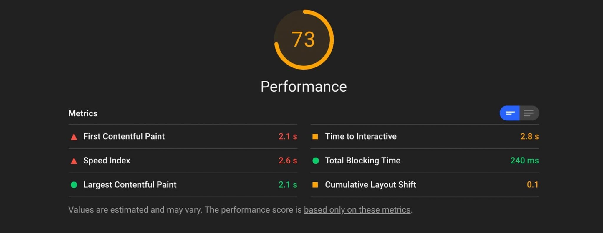
Lighthouse 6.0 and above include support for measuring CLS in a lab setting. This release will also highlight the nodes that cause the most layout shifting.
The Performance panel in DevTools highlights layout shifts in the Experience section as of Chrome 84. The Summary view for a Layout Shift record includes the cumulative layout shift score as well as a rectangle overlay showing the affected regions.
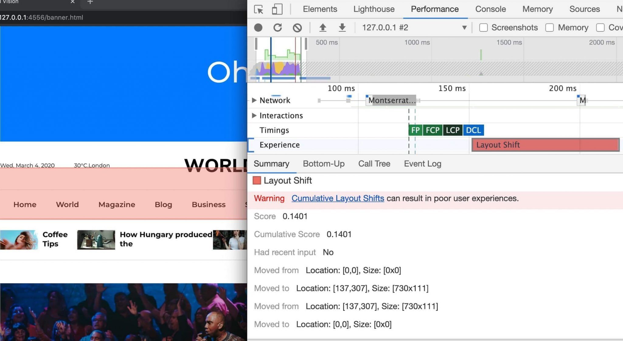
Layout Shift record. Clicking the record allows you to drill down into impacted elements (eg note the moved from / to entries).Measuring real-world CLS aggregated at an origin-level is also possible using the Chrome User Experience Report. CrUX CLS data is available via BigQuery and a sample query to look at CLS performance is available to use.
That's it for this guide. I hope it helps keep your pages just a little less shifty 🙂
With thanks to Philip Walton, Kenji Baheux, Warren Maresca, Annie Sullivan, Steve Kobes and Gilberto Cocchi for their helpful reviews.