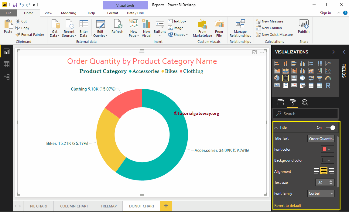
How to format donut chart in Power BI with an example? The donut chart format includes enabling the legend, positioning the legend, the position of the title, ...
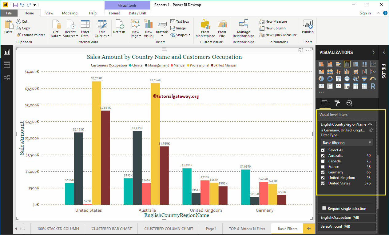
Power BI filters are useful for narrowing down your data based on requirements. For example, when using basic Power BI filters, we can exclude a product from the screen ...
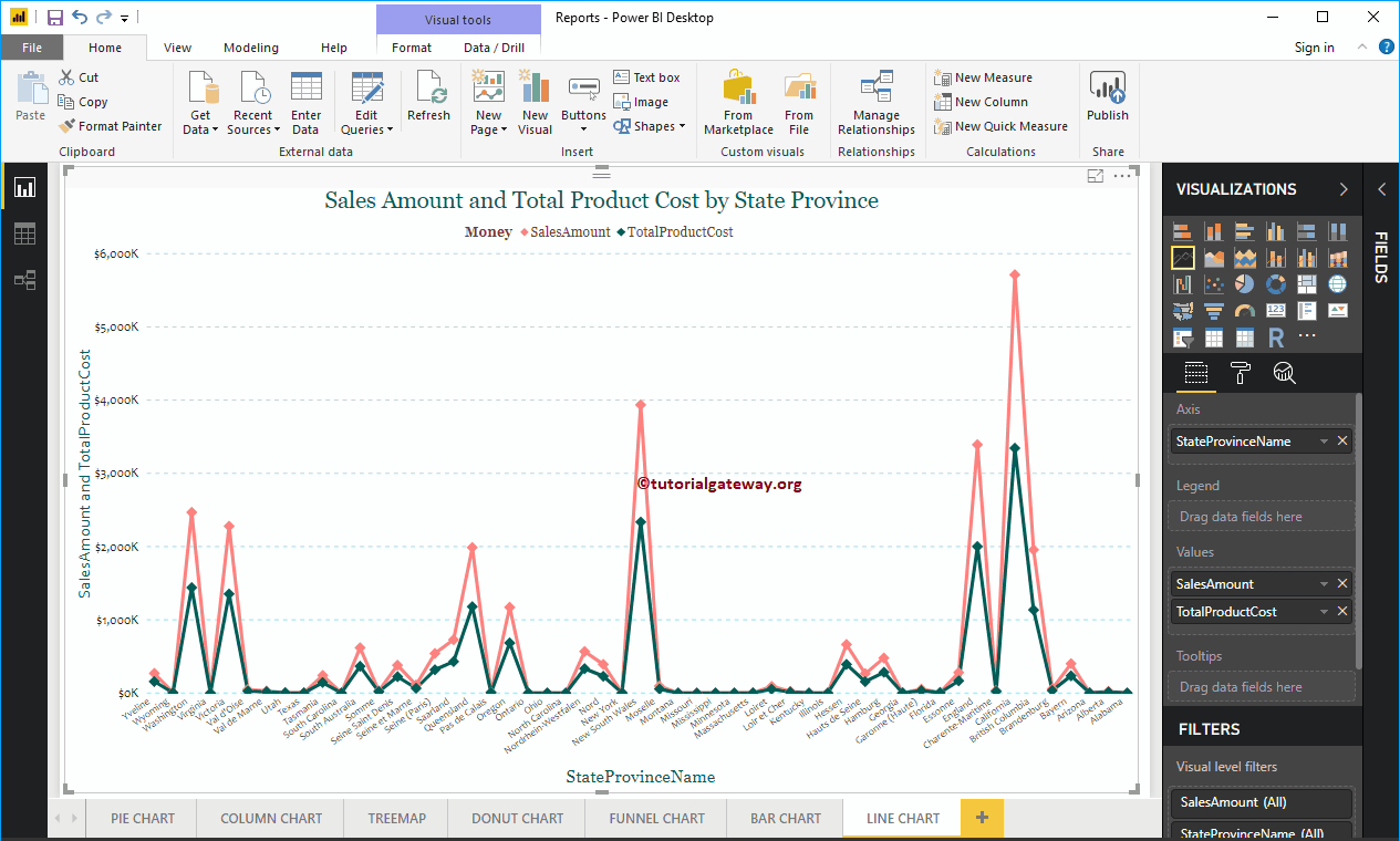
The Power BI line chart is useful for visualizing trends. For example, you can use this to create a sales trend, a temperate trend, etc. Let me show you ...
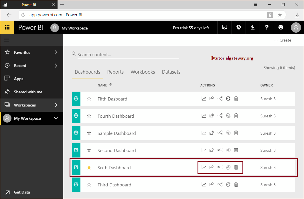
Let me show you the Power BI dashboard actions and their uses. Before you start exploring the list of dashboard actions in Power BI, let me show you the dashboards ...
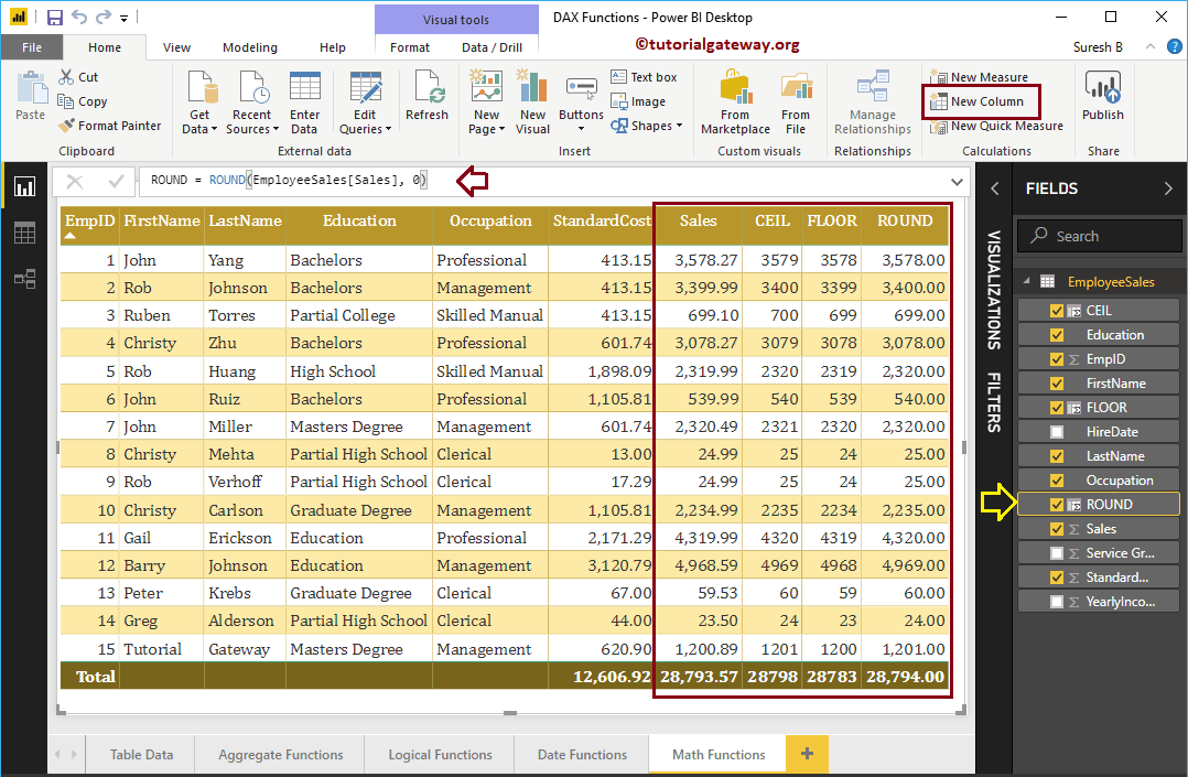
How to use Power BI DAX math functions with examples? Microsoft Power BI DAX provides various mathematical or mathematical functions such as ROOF, FLOOR, CURRENCY, INT, SQRT, POWER, MOD, DIVIDE, ...
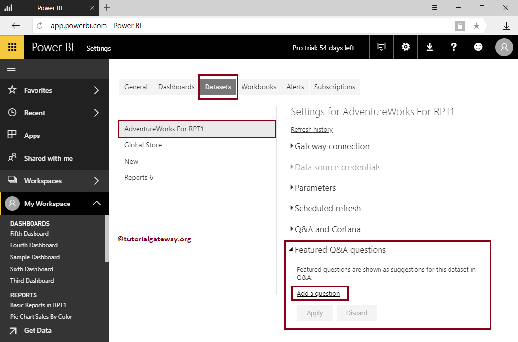
By default, Power BI Q&A suggests a few questions about your data. However, you can customize them according to your requirements. I mean, you can ask your own set of questions based on your ...
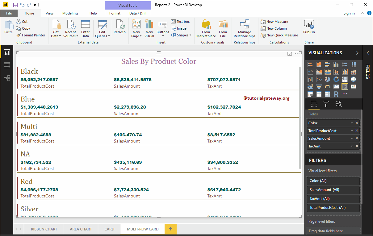
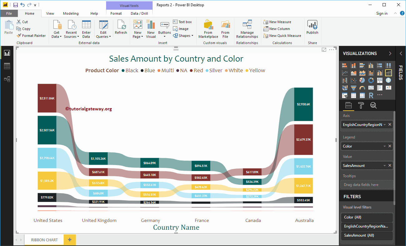
The Power BI ribbon chart is useful for quickly identifying which categorical data has the highest rank (large values). Let me show you how to create a tape chart ...
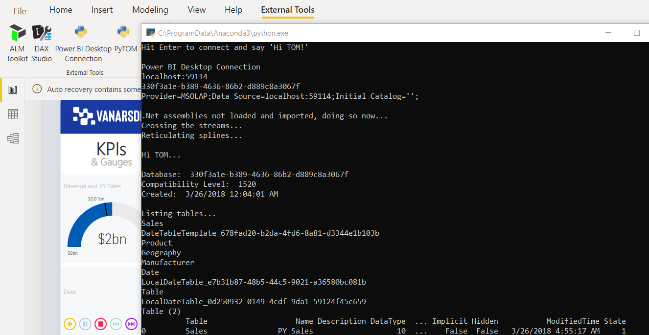
Time to read: 5 minutes The July 2020 release of Power BI Desktop includes a new preview feature that enables "external tools" To more easily connect to ...
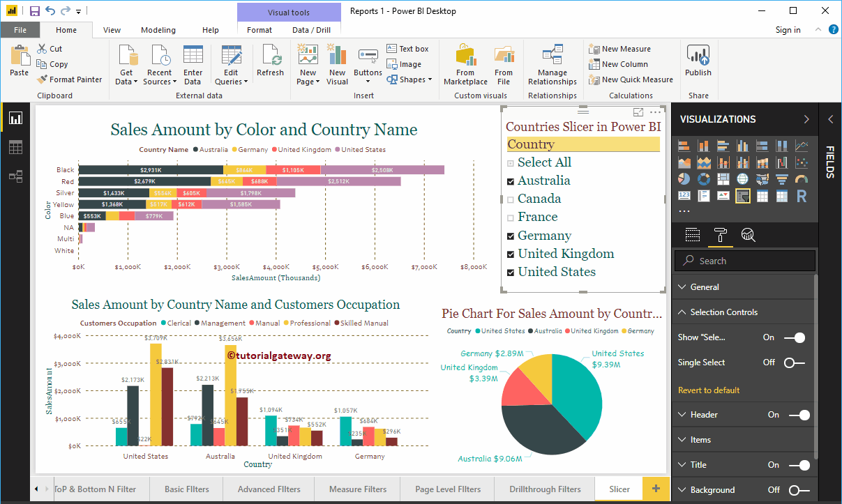
Power BI Slicer is commonly used to add filters to the canvas or to display filters on the report canvas. Let me show you how to create a Slicer in Power BI with ...