Power BI Slicer se usa comúnmente para agregar filters al lienzo o para mostrar filtros en el lienzo del informe. Permítame mostrarle cómo crear un Slicer en Power BI con un ejemplo.
For this Power BI Slicer demo, we will use the SQL data source that we created in our previous article. Therefore, see the article Connect Power BI to SQL Server to understand the Power BI data source.
Cómo crear una segmentation de Power BI
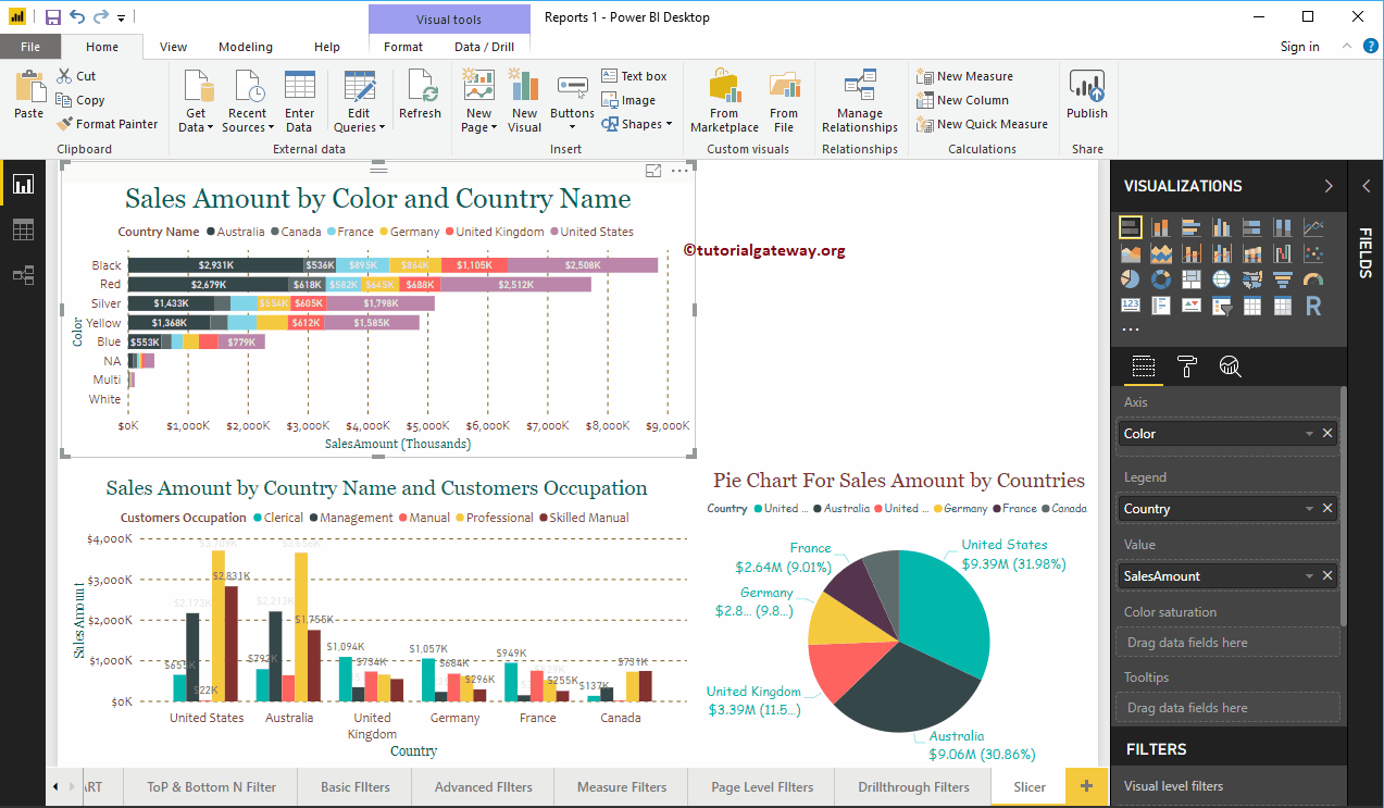
Usaremos esta página para demostrar los pasos involucrados en la creación de un Power BI Slicer. Esta página contiene gráfico de bars apiladas, gráfico de columnas agrupadas y gráfico circular.
 <>
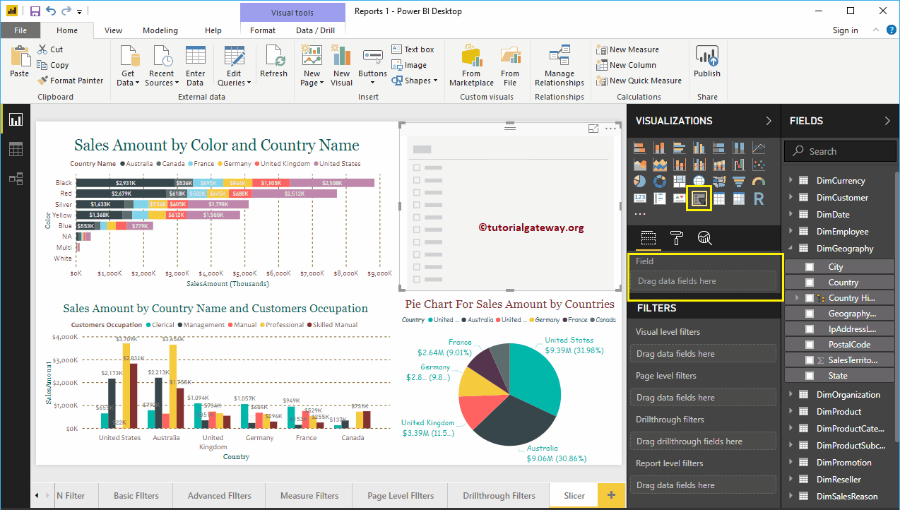
<>To create a Slicer in Power BI, first drag and drop the fields you want to use as a filter onto the region of the canvas.
In this example, we want to use Country as the filter for this report. So, let me drag the Country from the Geography table to the Canvas. It will automatically create a map for you.
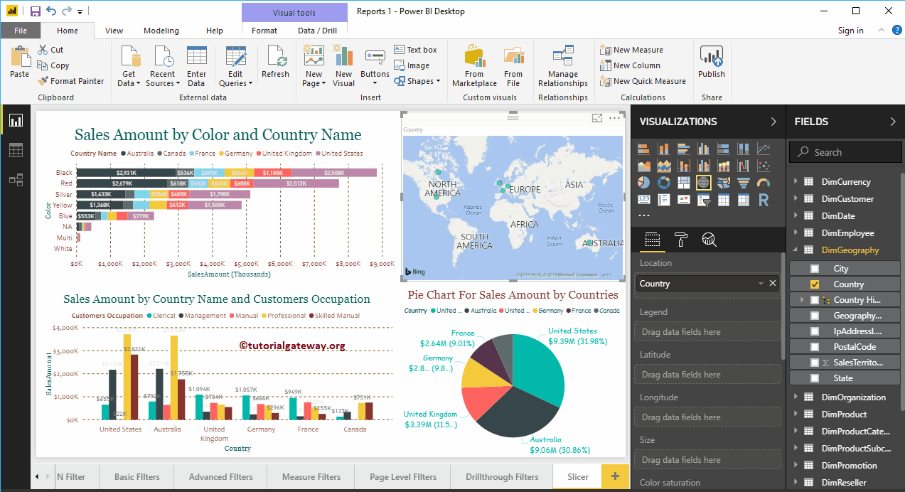
Click on the Slicer below the Display section. It will turn a map into a Slicer. In the screenshot below, you can see the list of countries.
Create a Power Bi Slicer 2 Approach
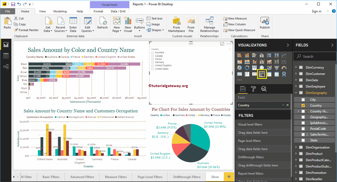
First, click on Slicer under the Display section. Automatically create a Slicer with dummy data, as shown below.
To add data to a Slicer, drag and drop the filter field into the Fields section. Let me add Country to Fields section.
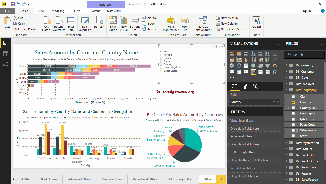
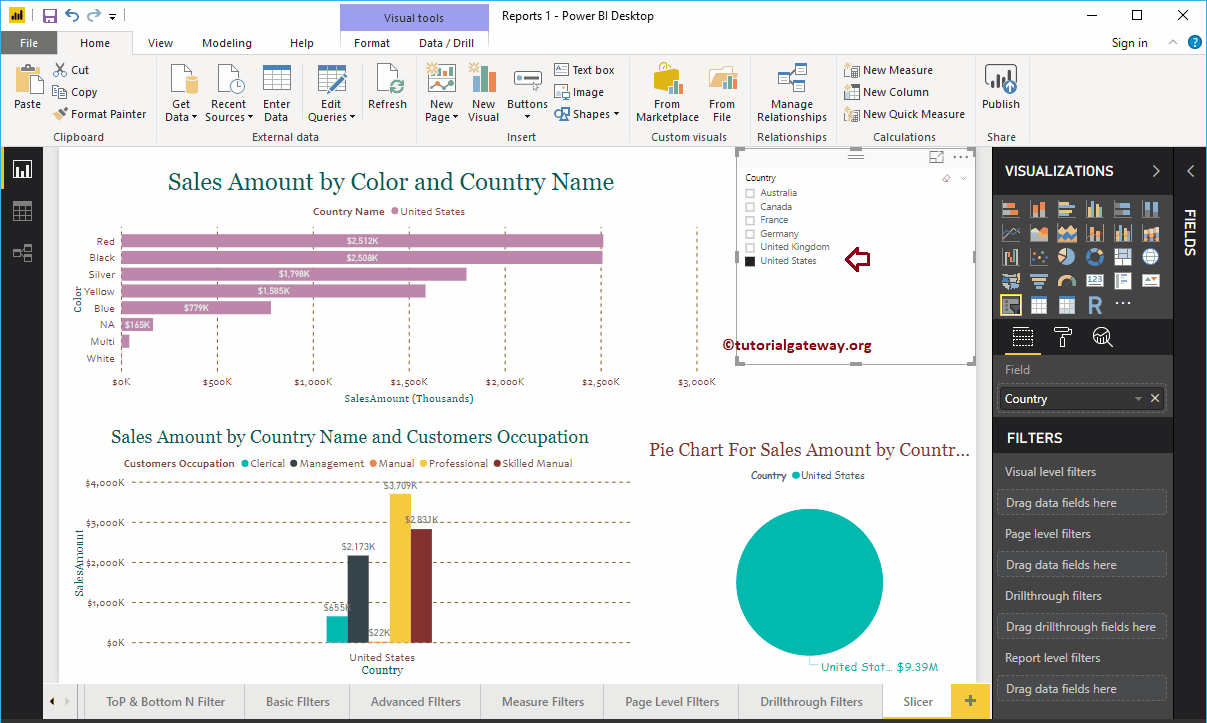
For the purpose of demonstration, let me select the United States. In the screenshot below, you can see that the stacked column chart, pie chart, and clustered column charts show US sales.
TIP: By default, you can only select one field (country) at a time. For multiple selection, you need to toggle the Single Selection option from On to Off in the format section.
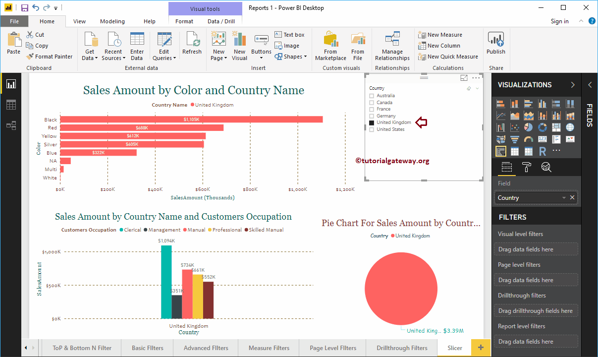
This time we select the UK. In the following screenshot, you can see that the filter was applied on all charts.
How to format Power BI Slicer
Click on the Format to see the list of formatting options that are available for this Power BI Slicer.
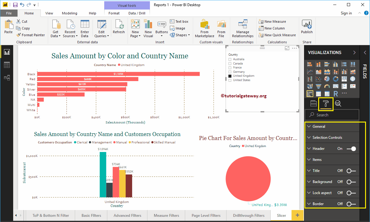
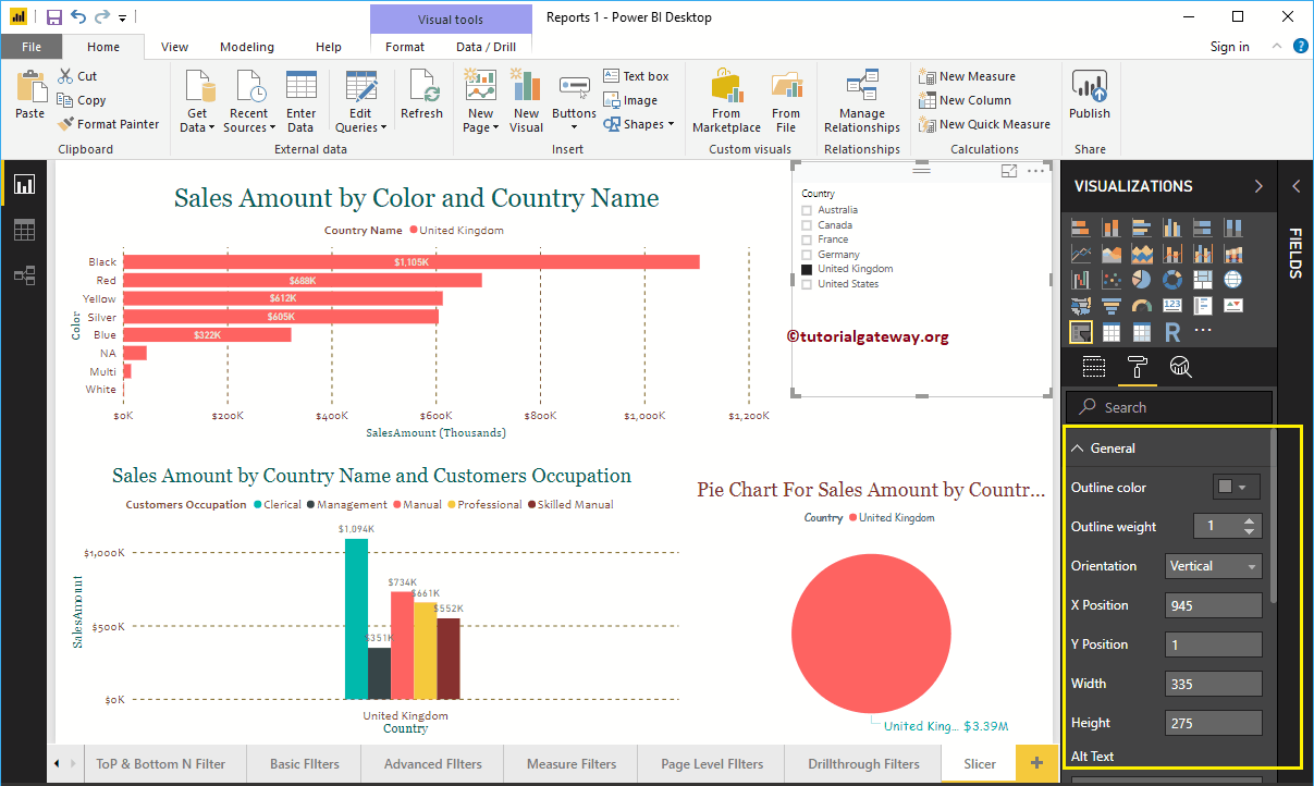
Format Power BI Slicer General Settings
Use this general section to change the outline thickness, outline color, X, Y position, width and height of a cutter
Format a slicer header in Power BI
As you can see in the screenshot below, we added Background Color, Outline at the bottom. Next, we change the text size to 20 and the font family to Georgia.

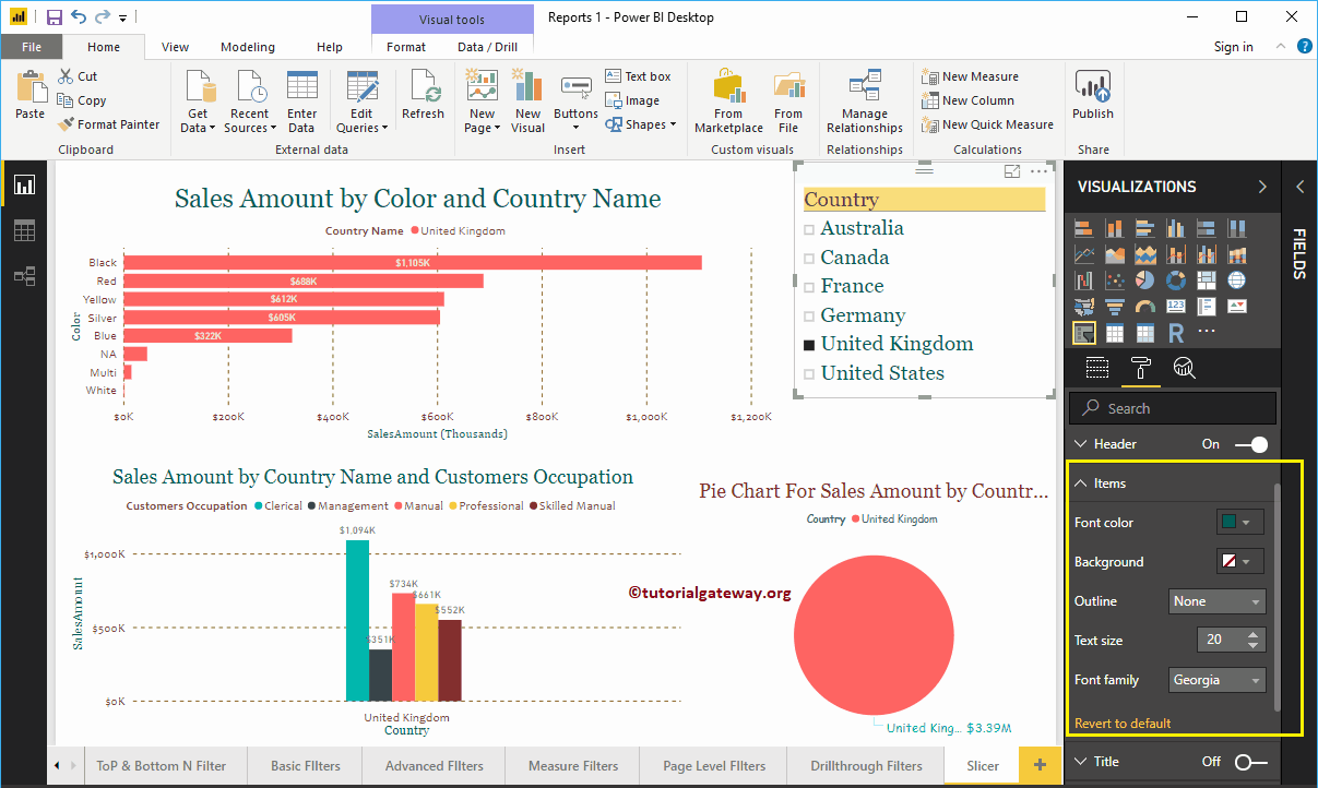
Format Power BI Slicer Items
We changed the font color of the elements (countries) to green, the text size to 20 and the font family to Georgia.
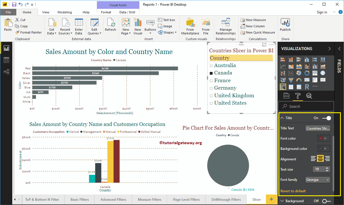
Format Cutter Title
By toggling the Title of Off to In, You can add a title to the Slicer.
In the screenshot below, you can see that we added the title text as a country cutter in Power BI. Then change the font color to red, the title alignment to center, the font family to Georgia, and the text size to 19.
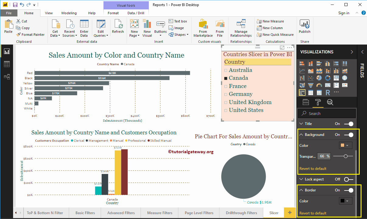
Format Power BI Slicer Borders and Background Color
You can add the background color to a cutter by alternating Background option a In. For demonstration purposes, we added a random color with a 66% of transparency.
Similarly, you can add Edges to a cutter by toggling the Border option of Off to In.
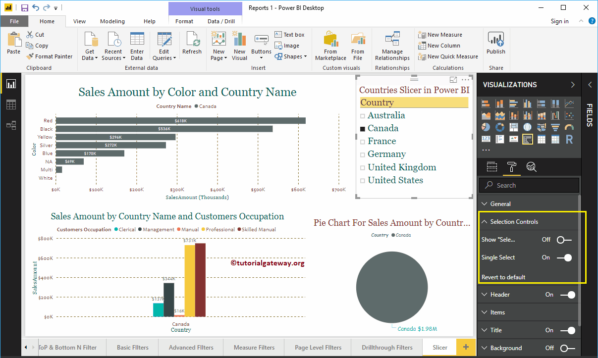
Format cutter selection control
The Selection Controls section helps you format the Power BI targeting selection control. This section has two properties:
- Show Select All: Adds Select All option to cutter.
- Unique selection: Restricts the cutter selection to one item at a time.
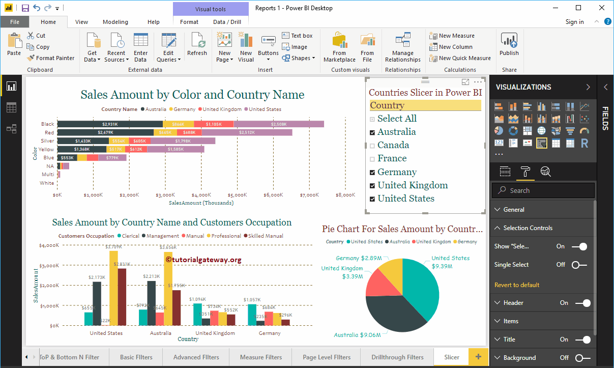
Let me toggle the Show Select All option from Off to On. Now, you can see Select All in the Country Slicer
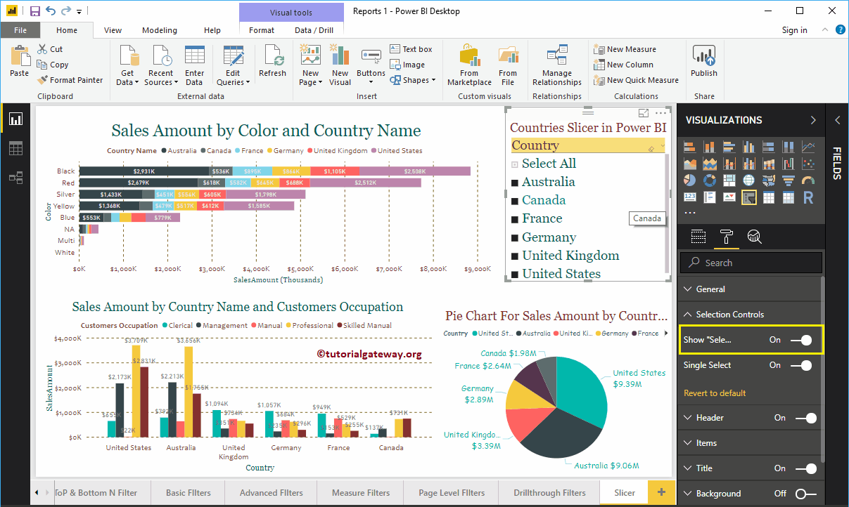
Toggling Unique selection option from Enabled to Disabled, you can enable segmentation to select multiple fields.
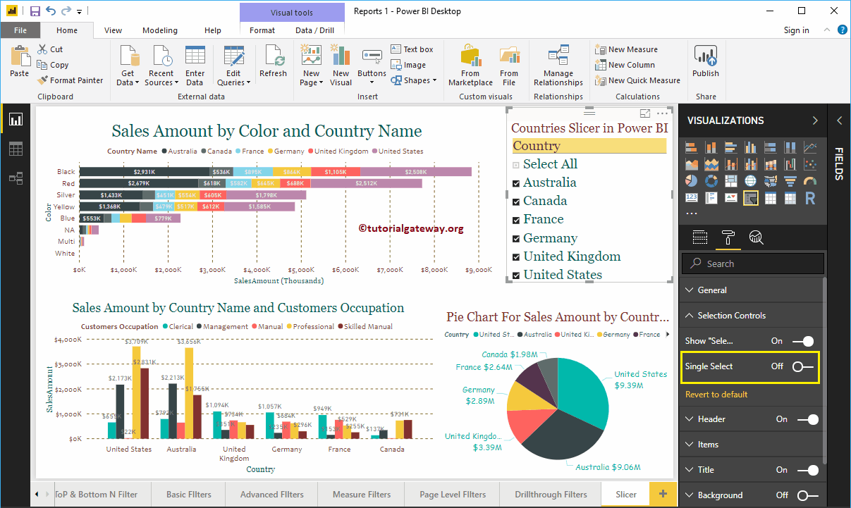
Let me select Australia, Germany, the United Kingdom, and the United States.