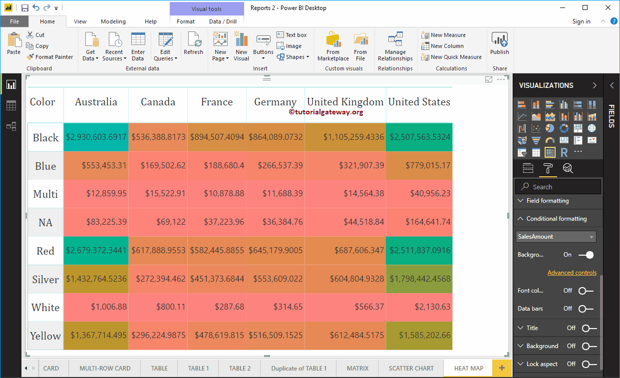
Power BI Heat Map is useful for displaying data along with colors. By seeing the color, one can easily understand the gains. Let me show you how to create a map ...
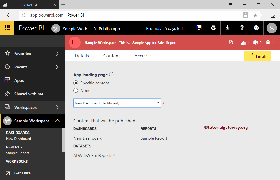
Let me show you the step-by-step approach to publishing apps in Power BI with a practical example. Before you start publishing the Power BI app, let me show you the dashboards ...
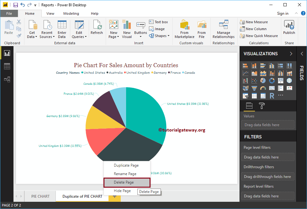
In this article, we show how to add new pages, rename pages, hide pages, duplicate pages, and delete pages in Power BI with an example. For the purpose ...
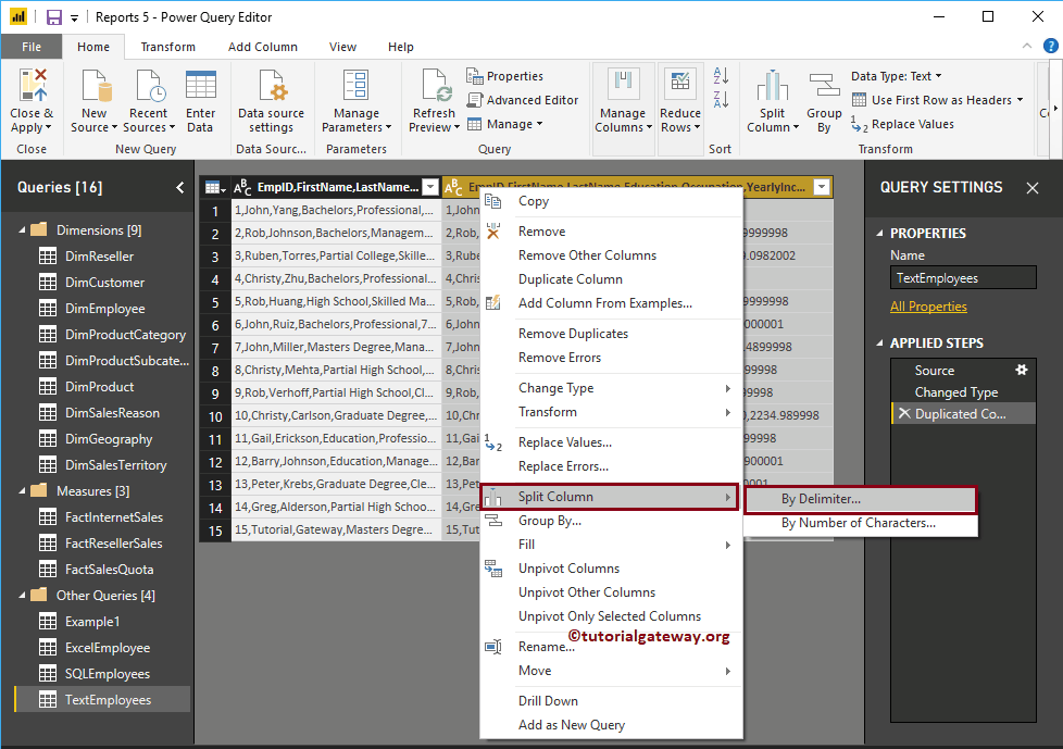
In real time, you might get the data that has merged columns (a column with too much information). In that situation, you can use Power BI's Split Columns ...
How to add reports to Power BI dashboard with a practical example? Before moving on to the actual example of Adding reports to the Power BI dashboard, let me show you the dashboards ...
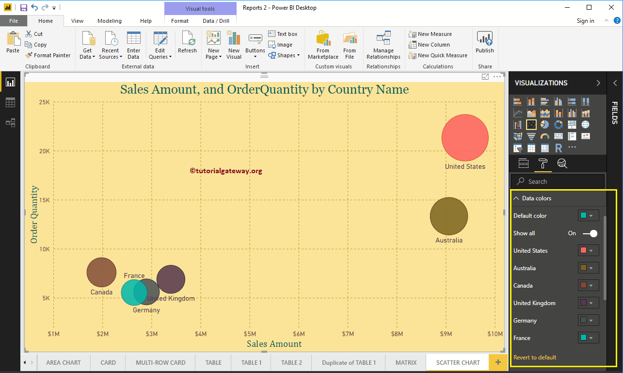
How to format Power BI scatter chart with an example? Formatting the scatter plot includes changing the scatters (circular shapes), colors, text of the ...
In this section, we show you how to connect Power BI Desktop with Power BI Service or Power BI Pro. It is very important to publish your reports. TIP: I suggest you check the…
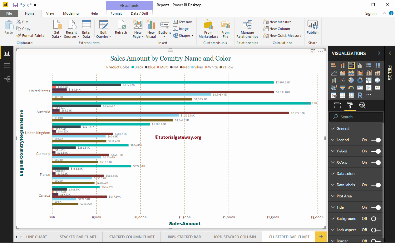
The Power BI clustered bar chart is used to display horizontal bars from multiple regions of data (measures) in a single metric. Let me show you how to create a ...