
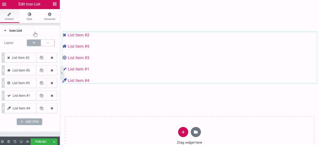
the Icon list widget creates an easy-to-manage list of items, with each item highlighted by its own icon.
Ficha Content
Design
Choose Default or Online. Default displays items in a vertical list, while Inline displays items horizontally.

Articles
- Text: Enter the text of the list item
- Icon: Select the item icon
- Link: Introduzca la Url del enlace del elemento. Haga clic en el engranaje Opciones de enlace
 para agregar rel = nofollow al enlace o para abrir el enlace en una nueva ventana.
Note: Both the text and the link of the items in the Icon List can be generated dynamically by clicking the Dynamic icon next to each one and choosing the source of the data.
Tip: Quickly duplicate or delete items by clicking an item's Duplicate or Delete icon 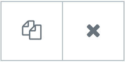
Style
List
- Space between: Controls the space between items in the list
- Alignment: Aligns the list to the left, right or center
- Divider: Enable or disable item dividing lines
If he Divider is enabled, the following style options are available:
- Style: Choose from solid, double, dotted, or discontinuous
- Weight: Sets the thickness of the divider
- Width: Controls the width of the divider in relation to the container
- Colour: Choose the color of the divider
Icon
- Colour: Choose the icon color
- Float up: Choose the color of the icon scrolling state
- Size: Sets the exact size of the icon
- Alignment: Aligns the icon to the left, right, or center
Text
- Text color: Choose the text color
- Float up: Choose the color of the text scrolling state
- Text script: Sets the distance between the icon and the text
- Typography: Sets the typography options for the text
Advanced
Set the advanced options that are applicable to this widget


