

Let's start with the basics.
In CSS, puede especificar tamaños o longitudes de elementos utilizando varias unidades de medida. Las unidades de medida que encontrará en algunas opciones de Elementor incluyen PX, EM, REM, %, VW and VH, although there are several more available in CSS. Not all Elementor items will offer all of these units. Elementor only presents the options that make the most sense for the given element.
The most important thing to learn about the different units is that some units, such as PX, are absolute units and others are relative units.
Absolute units
PX: Pixels (px) are considered absolute units, although they are relative to the DPI and resolution of the display device. But on the device itself, the PX drive is fixed and doesn't change based on anything else. Using PX can be problematic for responsive sites, but it's useful for keeping the size consistent for some elements. If you have elements that shouldn't be resized, then using PX is a good option.
Relative units
EM: Relative to the parent element
rapid eye movement: Relativo al elemento raíz (etiqueta HTML)
%: Relative to the parent element
Vw: Relative to the width of the viewport
VH: Relative to the height of the viewport
Unlike PX, relative drives like %, EM, and REM are better suited to responsive design and also help comply with accessibility standards. Relative units scale better on different devices because they can scale up and down according to the size of another element.
Let's look at a simple example.
En la mayoría de los browsers, el tamaño de fuente predeterminado es 16px. Las unidades relativas calculan el tamaño a partir de esta base. Si cambia esa base estableciendo un tamaño de base para la HTML tag a través de CSS, eso se convierte en la base para calcular las unidades relativas en el resto de la página. Del mismo modo, si un Username ajusta su tamaño de fuente, eso se convierte en la base para calcular las unidades relativas.
So what do these units mean when it comes to the default of 16px?
The number you specify will multiply that number by the default size.
1em = 16px (1 * 16)
2em = 32px (2 * 16)
.5em = 8px (.5 * 16)
1rem = 16 px
2rem = 32px
.5rem = 8px
100% = 16 px
200% = 32 px
50% = 8 px
Great, but what if you or the user changes the default size? Since these are relative units, the final size values will be based on the new base size. Although the default value is 16px, if you or the user were to change it to 14px, the calculated sizes would end up being:
1em = 14px (1 * 14)
2em = 28px (2 * 14)
.5em = 7px (.5 * 14)
1rem = 14px
2rem = 28px
.5rem = 7px
100% = 14 px
200% = 28 px
50% = 7px
Esto le da al usuario la libertad de ajustar el tamaño de fuente predeterminado de su browser, mientras mantiene la escala relativa de cada elemento que ha especificado.
What is the difference between EM and REM?
Looking at the graph above, it shows EM and REM looking exactly the same. So how are they different?
Simply put, they differ based on heredity. As mentioned, REM is based on the root element (HTML). Each child element using REM will use the size of the HTML root as the calculation point, regardless of whether or not a parent element has different sizes specified.
EM, on the other hand, is based on the font size of the parent element. If a parent element has a different size than the root element, the EM calculation will be based on the parent element and not the root element. This means that nested elements that use EM for sizing can sometimes end up having a size that you didn't anticipate. On the other hand, it gives you more granular control if you need to specify the size of a particular area of a page.
So what about %, VW and VH? What are they about?
While PX, EM, and REM are primarily used for font size, %, VW, and VH are primarily used for margins, padding, spacing, and widths / heights.
To reiterate, VH stands for "viewport height", which is the height of the visible screen. 100VH would represent the 100% of the viewport height or the total height of the screen. And of course VW stands for "viewport width", which is the width of the visible screen. 100VW would represent the 100% of the viewport width, or full width from the screen. % reflects a percentage of the parent element's size, regardless of viewport size.
Let's look at some examples of where Elementor offers %, VW and VH options.
Column widthsNote: If you edit the layout of an Elementor column, you will notice that there is only one width size unit available: %. Column widths only work well and responsively when using percentages, so no other options are offered.
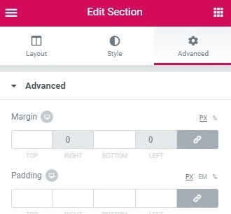
Margins: Los márgenes de una sección se pueden especificar en PX o%. Por lo general, es preferible usar% para garantizar que los márgenes no sean más grandes que el contents al reducir la escala para un dispositivo móvil, por ejemplo. Al usar un porcentaje del ancho del dispositivo, sus márgenes se mantendrán en relación con el tamaño del contenido, lo que casi siempre es preferible.
Filling: The padding of a section can be specified in PX, EM, or %. As with margins, it is often preferable to use EM o% so that the padding remains relative as the page size increases.
Font size: If you edit the font of an element, such as a heading, you will see four options: PX, EM, REM and VH

have you ever created a header big and admired how great it looked on desktop, only to realize it was too big on mobile? (Admission of guilt: I have, more than once).
La clave para resolver esto de manera elegante es usar EM, REM o VW en lugar de PX. Lo que elija depende de su situación particular. Por lo general, elijo EM porque quiero que el tamaño be relativo al padre del encabezado. Pero si prefiere que el tamaño sea relativo al tamaño de la raíz (HTML), elija REM en su lugar. O bien, puede configurarlo para que sea relativo al ancho de la ventana gráfica (VW) si eso funciona mejor para su caso.
Tenga en cuenta que también puede establecer valores PX de tamaño de fuente específicos por dispositivo utilizando los iconos de dispositivo para especificar un tamaño para computadora de escritorio, tableta y dispositivo móvil. Pero eso todavía impone límites a la capacidad de respuesta y la accessibility, así que téngalo en cuenta si elige PX.
More about VW and VH
Viewport units represent a percentage of the current browser window (current browser size). While similar to percentage units, there is a difference. Viewport units are calculated as a percentage of the current size of the browser viewport. On the other hand, percentage units are calculated as a percentage of the parent element, which can be different from the size of the viewport.
Let's consider an example of a 480 px x 800 px moving screen viewport.
1 VW = 1% of the viewport width (or 4.8 px)
50 VW = 50% of the viewport width (or 240 px)
1 VH = 1% of the viewport height (or 8px)
50 VH = 50% of the viewport height (or 400 px)
If the size of the viewport changes, the size of the element changes respectively.
When should you use one unit over another?
Ultimately, there is no perfect answer to this question. In general, it is often better to choose one of the relative units instead of PX so that your page website has the best opportunity to represent a design beautifully responsive. Choose PX however, if you need to ensure that an element never changes size at any breakpoint and stays the same regardless of whether a user has chosen a different default size. PX units guarantee consistent results even if that's not ideal.
EM it is relative to the font size of the parent element, so if you want to scale the size of the element based on the size of its parent, use EM.
rapid eye movement it is relative to the font size of the root (HTML), so if you want to scale the element size based on the size of the root, no matter what the parent size is, use REM. If you have used EM and are running into size issues due to many nested elements, REM is probably the best choice.
Vw It is useful to create elements of full width (100%) that fill the entire width of the viewport. You can of course use any percentage of the viewport width to achieve other goals, like 50% for half the width, etc.
VH is useful for creating full-height elements (100%) that fill the entire height of the viewport. You can of course use any percentage of the viewport height to achieve other goals, like the 50% for half the height, etc.
% it is similar to VW and VH, but it is not a length relative to the width or height of the viewport. Instead, it is a percentage of the width or height of the parent element. Percentage units are often useful for setting the width of margins, for example.
Elementor makes it easy to choose the option that best suits your design. Ultimately, it is your choice.


