
Use cross-platform browser features to build sign-in forms that are secure, accessible and easy to use.
Updated
If users ever need to log in to your site, then good sign-in form design is
critical. This is especially true for people on poor connections, on mobile, in
a hurry, or under stress. Poorly designed sign-in forms get high bounce rates.
Each bounce could mean a lost and disgruntled user—not just a missed sign-in
opportunity.
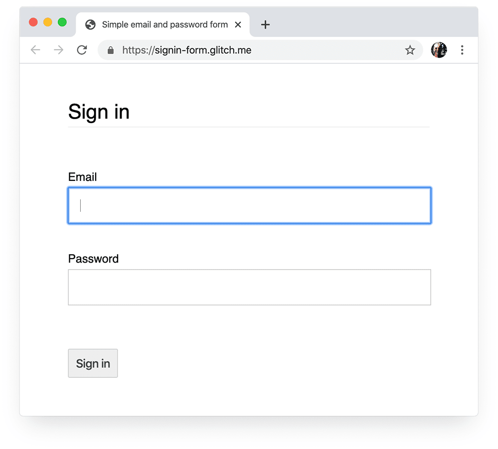
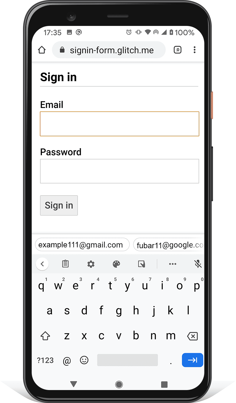
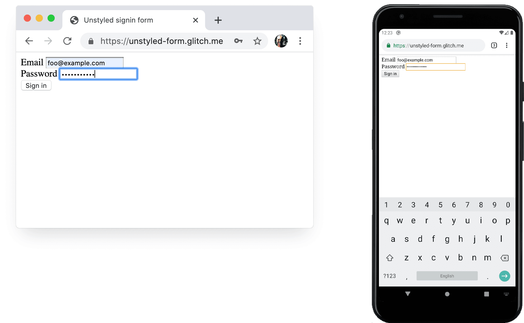
Here is an example of a simple sign-in form that demonstrates all of the best practices:
Checklist
- Use meaningful HTML elements:
<form>,<input>,
<label>, and<button>. - Label each input with a
<label>. - Use element attributes to access built-in browser
features:type,name,autocomplete,required,
autofocus. - Give input
nameandidattributes stable values that don’t change
between page loads or website deployments. - Put sign-in in its own <form> element.
- Ensure successful form submission.
- Use
autocomplete="new-password"for the password input
in a sign-up form, and for the new password in a reset-password form. - Use
autocomplete="current-password"for a sign-in
password input. - Provide Show password functionality.
- Use
aria-labelandaria-describedbyfor
password inputs. - Don’t double-up inputs.
- Design forms so the mobile keyboard doesn’t obscure inputs or
buttons. - Ensure forms are usable on mobile: use legible text,
and make sure inputs and buttons are large enough to work as touch targets. - Maintain branding and style on your sign-up and sign-in pages.
- Test in the field as well as the lab: build page analytics,
interaction analytics, and user-centric performance measurement into your
sign-up and sign-in flow. - Test across browsers and devices: form behaviour varies
significantly across platforms.
This article is about frontend best practices. It does not explain how to build
backend services to authenticate users, store their credentials, or manage their
accounts. 12 best practices for user account, authorization and password
management
outlines core principles for running your own backend. If you have users in
different parts of the world, you need to consider localizing your site’s use of
third-party identity services as well as its content.
There are also two relatively new APIs not covered in this article which can
help you build a better sign-in experience:
- Web OTP: to deliver one-time passcodes or
PIN numbers via SMS to mobile phones. This can allow users to select a phone
number as an identifier (no need to enter an correo electrónico address!) and also enables
two-step verification for sign-in and one-time codes for payment confirmation. - Credential Management: to enable developers to store and retrieve password credentials and federated credentials programmatically.
Use meaningful HTML
Use elements built for the job: <form>, <label> and <button>. These enable
built-in browser functionality, improve accessibility, and add meaning to your
markup.
Use <form>
You might be tempted to wrap inputs in a <div> and handle input data
submission purely with JavaScript. It’s generally better to use a plain old
<form>
element. This makes your site accessible to screenreaders and other assistive
devices, enables a range of built-in browser features, makes it simpler to build
basic functional sign-in for older browsers, and can still work even if
JavaScript fails.
A common mistake is to wrap a whole web page in a single form, but this is liable
to cause problems for browser password managers and autofill. Use a different
<form> for each UI component that needs a form. For example, if you have
sign-in and search on the same page, you should use two form elements.
Use <label>
To label an input, use a <label>!
<label for="correo electrónico">Correo electrónico</label>
<input id="correo electrónico" …>
Two reasons:
- A tap or click on a label moves focus to its input. Associate a label with an
input by using the label’sforattribute with the input’snameorid. - Screenreaders announce label text when the label or the label’s input gets
focus.
Don’t use placeholders as input labels. People are liable to forget what the
input was for once they’ve started entering text, especially if they get
distracted («Was I entering an correo electrónico address, a phone number, or an account
ID?»). There are lots of other potential problems with placeholders: see Don’t
Use The Placeholder
Attribute and
Placeholders in Form Fields Are
Harmful if you’re
unconvinced.
It’s probably best to put your labels above your inputs. This enables consistent
design across mobile and desktop and, according to Google AI
research,
enables quicker scanning by users. You get full width labels and inputs, and you
don’t need to adjust label and input width to fit the label text.
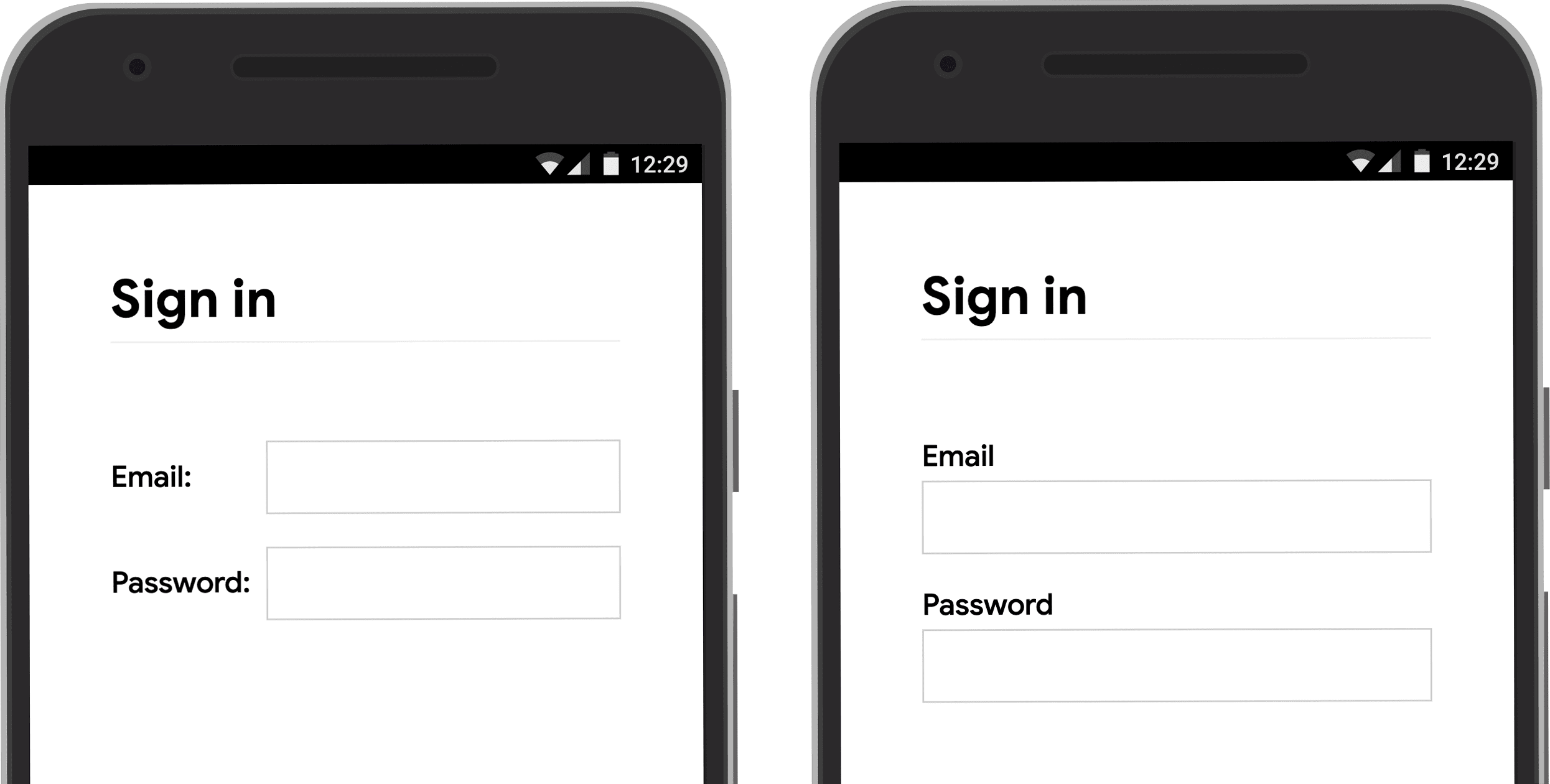
Open the label-position Glitch on a
mobile device to see for yourself.
Use <button>
Use <button>
for buttons! Button elements provide accessible behaviour and built-in form
submission functionality, and they can easily be styled. There’s no point in
using a <div> or some other element pretending to be a button.
Ensure that the submit button says what it does. Examples include Create account or
Sign in, not Submit or Start.
Ensure successful form submission
Help password managers understand that a form has been submitted. There are two
ways to do that:
- Navigate to a different page.
- Emulate navigation with
History.pushState()orHistory.replaceState(),
and remove the password form.
With an XMLHttpRequest or fetch request, make sure that sign-in success is
reported in the response and handled by taking the form out of the DOM as well
as indicating success to the user.
Consider disabling the Sign in button once the user has tapped or clicked
it. Many users click buttons multiple times
even on sites that are fast and responsive. That slows down interactions and
adds to server load.
Conversely, don’t disable form submission awaiting user input. For example,
don’t disable the Sign in button if users haven’t entered their customer
PIN. Users may miss out something in the form, then try repeatedly tapping the
(disabled) Sign in button and think it’s not working. At the very least, if
you must disable form submission, explain to the user what’s missing when they
click on the disabled button.
Caution:
The default type for a button in a form is submit. If you want to add another
button in a form (for Show password, for example) add type="button".
Otherwise clicking or tapping on it will submit the form.
Don’t double up inputs
Some sites force users to enter emails or passwords twice. That might reduce
errors for a few users, but causes extra work for all users, and increases
abandonment
rates.
Asking twice also makes no sense where browsers autofill correo electrónico addresses or
suggest strong passwords. It’s better to enable users to confirm their correo electrónico
address (you’ll need to do that anyway) and make it easy for them to reset their
password if necessary.
Make the most of element attributes
This is where the magic really happens!
Browsers have multiple helpful built-in features that use input element attributes.
Help users start faster
Add an autofocus attribute to the first input in your sign-in form. That makes
it clear where to start and, on desktop at least, means users don’t have to
select the input to start typing.
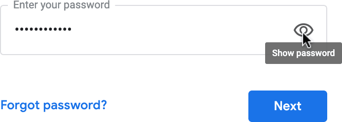
Keep passwords private—but enable users to see them if they want
Passwords inputs should have type="password" to hide password text and help the
browser understand that the input is for passwords. (Note that browsers use
a variety of techniques to understand input roles and decide
whether or not to offer to save passwords.)
You should add a Show password icon or button to enable users to check the
text they’ve entered—and don’t forget to add a Forgot password enlace. See
Enable password display.
Give mobile users the right keyboard
Use <input type="correo electrónico"> to give mobile users an appropriate keyboard and
enable basic built-in correo electrónico address validation by the browser… no JavaScript
required!
If you need to use a telephone number instead of an correo electrónico address, <input type="tel"> enables a telephone keypad on mobile. You can also use the
inputmode attribute where necessary: inputmode="numeric" is ideal for PIN
numbers. Everything You Ever Wanted to Know About
inputmode
has more detail.
Caution:
type="number" adds an up/down arrow to increment numbers, so don’t use it for
numbers that aren’t meant to be incremented, such as IDs and account numbers.
Prevent mobile keyboard from obstructing the Sign in button
Unfortunately, if you’re not careful, mobile keyboards may cover your form or,
worse, partially obstruct the Sign in button. Users may give up before
realizing what has happened.
Where possible, avoid this by displaying only the correo electrónico/phone and password inputs and Sign in button at the top of your sign-in page. Put other content below.
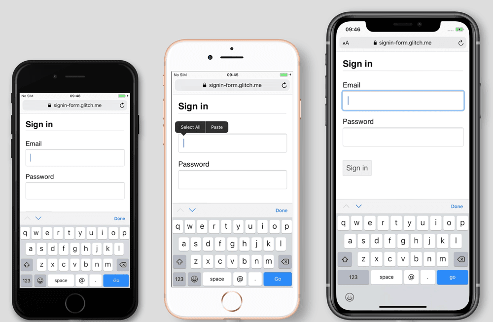
Test on a range of devices
You’ll need to test on a range of devices for your target audience, and adjust
accordingly. BrowserStack enables free testing for de código abierto
projects on a range of real devices
and browsers.
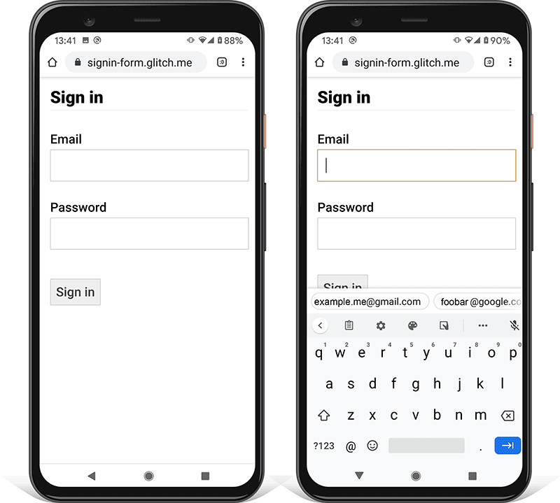
Consider using two pages
Some sites (including Amazon and eBay) avoid the problem by asking for
correo electrónico/phone and password on two pages. This approach also simplifies the
experience: the user is only tasked with one thing at a time.
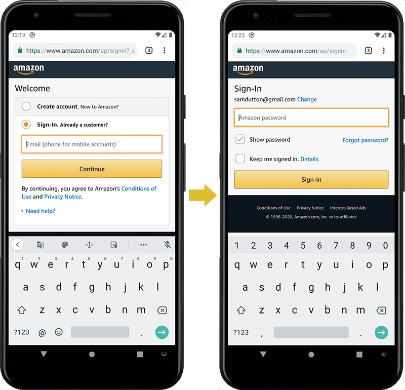
Ideally, this should be implemented with a single <form>. Use JavaScript
to initially display only the correo electrónico input, then hide it and show the password input.
If you must force the user to navigate to a new page between entering their correo electrónico and
password, the form on the second page should have a hidden input element with the
correo electrónico value, to help enable password managers to store the correct value. Password
Form Styles that Chromium Understands
provides a code example.
Help users to avoid re-entering data
You can help browsers store data correctly and autofill inputs, so users don’t
have to remember to enter correo electrónico and password values. This is particularly important
on mobile, and crucial for correo electrónico inputs, which get high abandonment rates.
There are two parts to this:
-
The
autocomplete,name,id, andtypeattributes help browsers understand
the role of inputs in order to store data that can later be used for autofill.
To allow data to be stored for autofill, modern browsers also require inputs to
have a stablenameoridvalue (not randomly generated on each page load or
site deployment), and to be in a <form> with asubmitbutton. -
The
autocompleteattribute helps browsers correctly autofill inputs using
stored data.
For correo electrónico inputs use autocomplete="username", since username is recognized
by password managers in modern browsers—even though you should use type="correo electrónico"
and you may want to use id="correo electrónico" and name="correo electrónico".
For password inputs, use the appropriate autocomplete value to help browsers
differentiate between new and current passwords.
Use autocomplete="new-password" for a new password
- Use
autocomplete="new-password"for the password input in a sign-up form, or the new
password in a change-password form.
Use autocomplete="current-password" for an existing password
- Use
autocomplete="current-password"for the password input in a sign-in form, or the
input for the user’s old password in a change-password form. This tells the
browser that you want it to use the current password that it has stored for
the site.
For a sign-up form:
<input type="password" autocomplete="new-password" …>For sign-in:
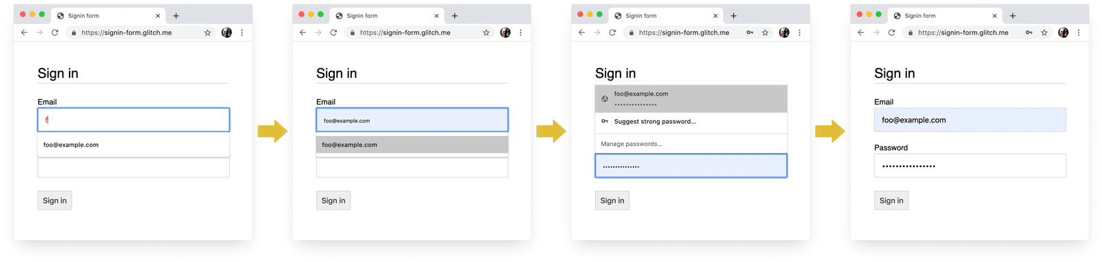
<input type="password" autocomplete="current-password" …>Support password managers
Different browsers handle correo electrónico autofill and password suggestion somewhat
differently, but the effects are much the same. On Safari 11 and above on desktop,
for example, the password manager is displayed, and then biometric
authentication (fingerprint or facial recognition) is used if available.
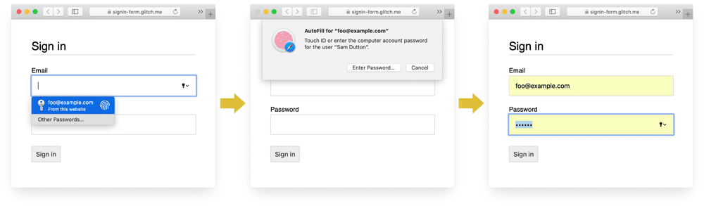
Chrome on desktop displays correo electrónico suggestions, shows the password manager, and autofills the password.
Caution:
Browser password and autofill systems are not simple. The algorithms for
guessing, storing and displaying values are not standardized, and vary from
platform to platform. For example, as pointed out by Hidde de
Vries:
«Firefox’s password manager complements its
heuristics
with a recipe system.»
Autofill: What web devs should know, but
don’t
has a lot more information about using name and autocomplete. The HTML
spec
lists all 59 possible values.
Enable the browser to suggest a strong password
Modern browsers use heuristics to decide when to show the password manager UI and
suggest a strong password.
Here’s how Safari does it on desktop.
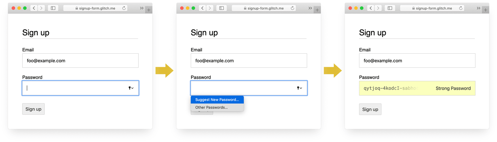
(Strong unique password suggestion has been available in Safari since version 12.0.)
Built-in browser password generators mean users and developers don’t need
to work out what a «strong password» is. Since browsers can securely store
passwords and autofill them as necessary, there’s no need for users to remember
or enter passwords. Encouraging users to take advantage of built-in browser
password generators also means they’re more likely to use a unique, strong
password on your site, and less likely to reuse a password that could be
compromised elsewhere.
The downside with this approach is that there’s no way to share passwords across
platforms. For example, a user may use Safari on their iPhone and Chrome on
their Windows laptop.
Help save users from accidentally missing inputs
Add the required attribute to both correo electrónico and password fields.
Modern browsers automatically prompt and set focus for missing data.
No JavaScript required!
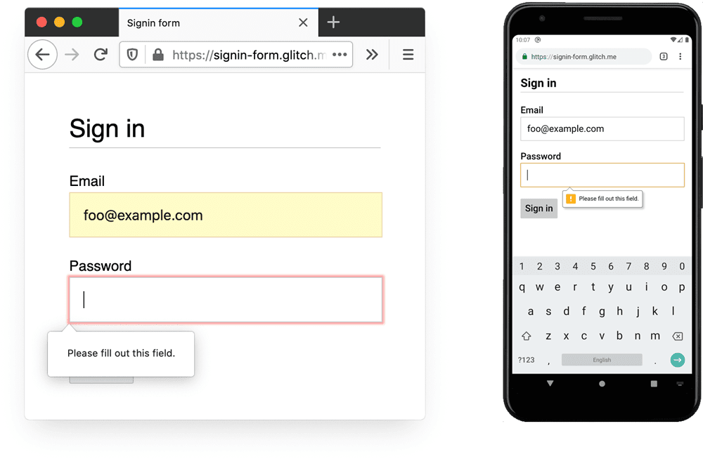
and Chrome for Android (version 83).
Design for fingers and thumbs
The default browser size for just about everything relating to input elements
and buttons is too small, especially on mobile. This may seem obvious, but it’s
a common problem with sign-in forms on many sites.
Make sure inputs and buttons are large enough
The default size and padding for inputs and buttons is too small on desktop and
even worse on mobile.
According to Android accessibility
guidance
the recommended target size for touchscreen objects is 7–10 mm. Apple interface
guidelines suggest 48×48 px, and the W3C suggest at least 44×44 CSS
pixels. On that
basis, add (at least) about 15 px of padding to input elements and buttons for
mobile, and around 10 px on desktop. Try this out with a real mobile device and
a real finger or thumb. You should comfortably be able to tap each of your
inputs and buttons.
The Tap targets are not sized appropriately
Lighthouse audit can help you automate the process of detecting input elements
that are too small.
Design for thumbs
Search for touch target and
you’ll see lots of pictures of forefingers. However, in the real world, many
people use their thumbs to interact with phones. Thumbs are bigger than
forefingers, and control is less precise. All the more reason for adequately
sized touch targets.
Make text big enough
As with size and padding, the default browser font size for input elements and
buttons is too small, particularly on mobile.
Browsers on different platforms size fonts differently, so it’s difficult to
specify a particular font size that works well everywhere. A quick survey of
popular websites shows sizes of 13–16 pixels on desktop: matching that physical size
is a good minimum for text on mobile.
This means you need to use a larger pixel size on mobile: 16px on Chrome for
desktop is quite legible, but even with good vision it’s difficult to read 16px
text on Chrome for Android. You can set different font pixel sizes for different
viewport sizes using media
queries.
20px is about right on mobile—but you should test this out with friends or
colleagues who have low vision.
The Document doesn’t use legible font sizes
Lighthouse audit can help you automate the process of detecting text that’s too
small.
Provide enough space between inputs
Add enough margin to make inputs work well as touch targets. In other words, aim
for about a finger width of margin.
Make sure your inputs are clearly visible
The default border styling for inputs makes them hard to see. They’re almost
invisible on some platforms such as Chrome for Android.
As well as padding, add a border: on a white background, a good general rule is
to use #ccc or darker.
Use built-in browser features to warn of invalid input values
Browsers have built-in features to do basic form validation for inputs with a
type attribute. Browsers warn when you submit a form with an invalid value,
and set focus on the problematic input.
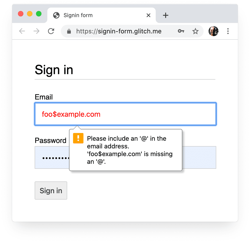
You can use the :invalid CSS selector to highlight invalid data. Use
:not(:placeholder-shown) to avoid selecting inputs with no content.
input[type=email]:not(:placeholder-shown):invalid {
color: red;
outline-color: red;
}
Try out different ways of highlighting inputs with invalid values.
Use JavaScript where necessary
Toggle password display
You should add a Show password icon or button to enable users to check the
text they’ve entered. Usability
suffers when users
can’t see the text they’ve entered. Currently there’s no built-in way to do
this, though there are plans for
implementation. You’ll
need to use JavaScript instead.
The following code uses a text button to add Show password functionality.
HTML:
<section>
  <label for="password">Password</label>
  <button id="toggle-password" type="button" aria-label="Show password as plain text. Warning: this will display your password on the screen.">Show password</button>
  <input id="password" name="password" type="password" autocomplete="current-password" required>
</section>
Here’s the CSS to make the button look like plain text:
button#toggle-password {
background: none;
border: none;
cursor: pointer;
font-size: var(--mobile-font-size);
font-weight: 300;
padding: 0;
position: absolute;
top: 0;
right: 0;
}
And the JavaScript for showing the password:
const passwordInput = document.getElementById('password');
const togglePasswordButton = document.getElementById('toggle-password');togglePasswordButton.addEventListener('click', togglePassword);
function togglePassword() {
if (passwordInput.type === 'password') {
passwordInput.type = 'text';
togglePasswordButton.textContent = 'Hide password';
togglePasswordButton.setAttribute('aria-label',
'Hide password.');
} else {
passwordInput.type = 'password';
togglePasswordButton.textContent = 'Show password';
togglePasswordButton.setAttribute('aria-label',
'Show password as plain text. ' +
'Warning: this will display your password on the screen.');
}
}
Here’s the end result:
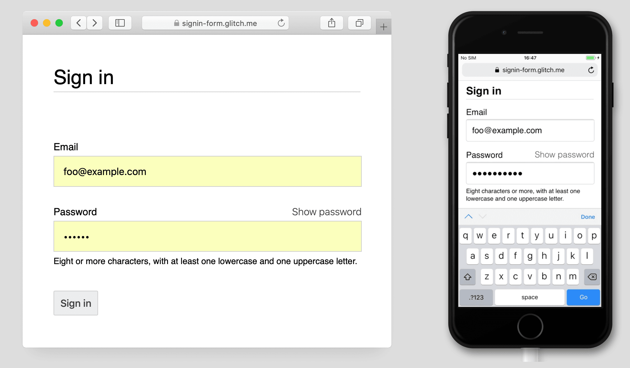
Make password inputs accessible
Use aria-describedby to outline password rules by giving it the ID of the
element that describes the constraints. Screenreaders provide the label text, the
input type (password), and then the description.
<input type="password" aria-describedby="password-constraints" …>
<div id="password-constraints">Eight or more characters with a mix of letters, numbers and symbols.</div>
When you add Show password functionality, make sure to include
an aria-label to warn that the password will be displayed. Otherwise users may
inadvertently reveal passwords.
<button id="toggle-password"
aria-label="Show password as plain text.
Warning: this will display your password on the screen.">
  Show password
</button>
You can see both ARIA features in action in the following Glitch:
Creating Accessible Forms has more tips to help make forms accessible.
Validate in realtime and before submission
HTML form elements and attributes have built-in features for basic validation,
but you should also use JavaScript to do more robust validation while users are
entering data and when they attempt to submit the form.
Warning:
Client-side validation helps users enter data and can avoid unnecessary server
load, but you must always validate and sanitize data on your backend.
Step 5 of the sign-in form
codelab uses the Constraint Validation
API (which is
widely supported) to add
custom validation using built-in browser UI to set focus and display prompts.
Find out more: Use JavaScript for more complex real-time
validation.
Analytics and RUM
«What you cannot measure, you cannot improve» is particularly true for sign-up
and sign-in forms. You need to set goals, measure success, improve your site—and
repeat.
Discount usability
testing can be
helpful for trying out changes, but you’ll need real-world data to really
understand how your users experience your sign-up and sign-in forms:
- Page analytics: sign-up and sign-in page views, bounce rates,
and exits. - Interaction analytics: goal
funnels (where do
users abandon your sign-in or sign-in flow?) and
events
(what actions do users take when interacting with your forms?) - Website performance: user-centric
metrics (are your sign-up and sign-in
forms slow for some reason and, if so, what is the cause?).
You may also want to consider implementing A/B testing in order to try out
different approaches to sign-up and sign-in, and staged rollouts to validate the
changes on a subset of users before releasing changes to all users.
General guidelines
Well designed UI and UX can reduce sign-in form abandonment:
- Don’t make users hunt for sign-in! Put a enlace to the sign-in form at the top
of the page, using well-understood wording such as Sign In, Create Account
or Register. - Keep it focused! Sign-up forms are not the place to distract people with
offers and other site features. - Minimize sign-up complexity. Collect other user data (such as addresses or
credit card details) only when users see a clear benefit from providing that
data. - Before users start on your sign-up form, make it clear what the value
proposition is. How do they benefit from signing in? Give users concrete
incentives to complete sign-up. - If possible allow users to identify themselves with a mobile phone number
instead of an correo electrónico address, since some users may not use correo electrónico. - Make it easy for users to reset their password, and make the Forgot your
password? enlace obvious. - Enlace to your terms of service and privacy policy documents: make it clear to
users from the start how you safeguard their data. - Include the logo and name of your company or organization on your signup and
sign-in pages, and make sure that language, fonts and styles match the rest of
your site. Some forms don’t feel like they belong to the same site as other
content, especially if they have a significantly different URL.
Keep learning
Photo by Meghan Schiereck on Unsplash.