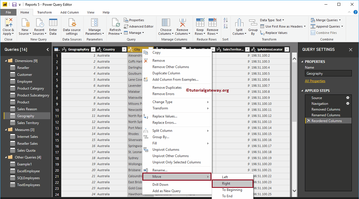
Generally, the data we get from the source may have few columns that may not be necessary for the purpose of the analysis. Let me show you the steps to remove or ...
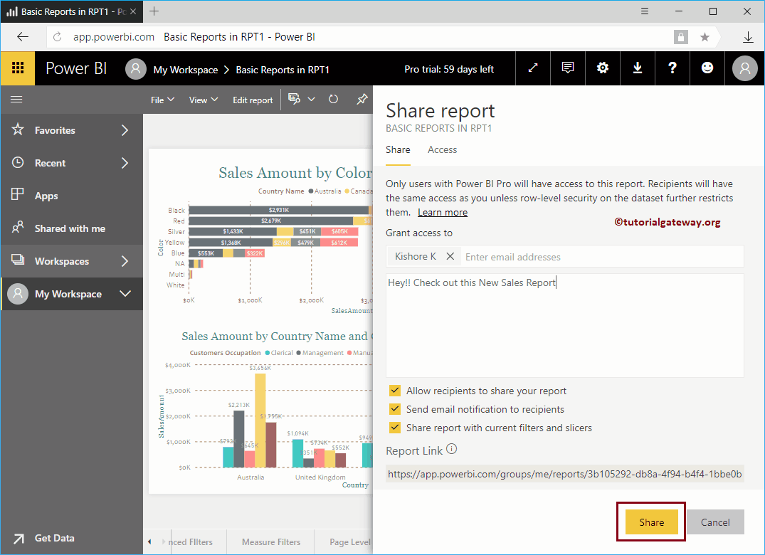
In this article, we show you the step-by-step approach to share a report in Power BI across your organization with a practical example. Before starting to share ...
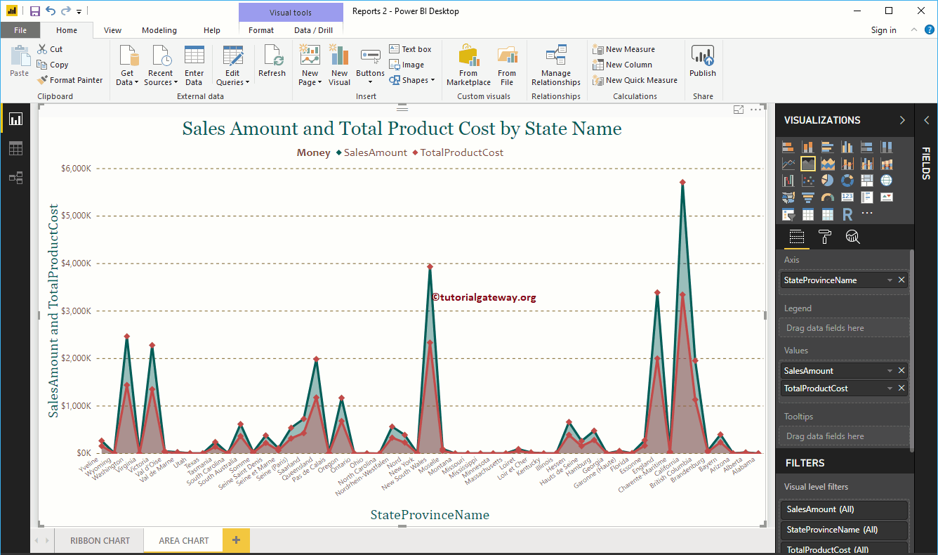
The clustered column and line chart in Power BI is useful for visualizing multiple dimensions and measures. Let me show you how to create a clustered column chart and of ...
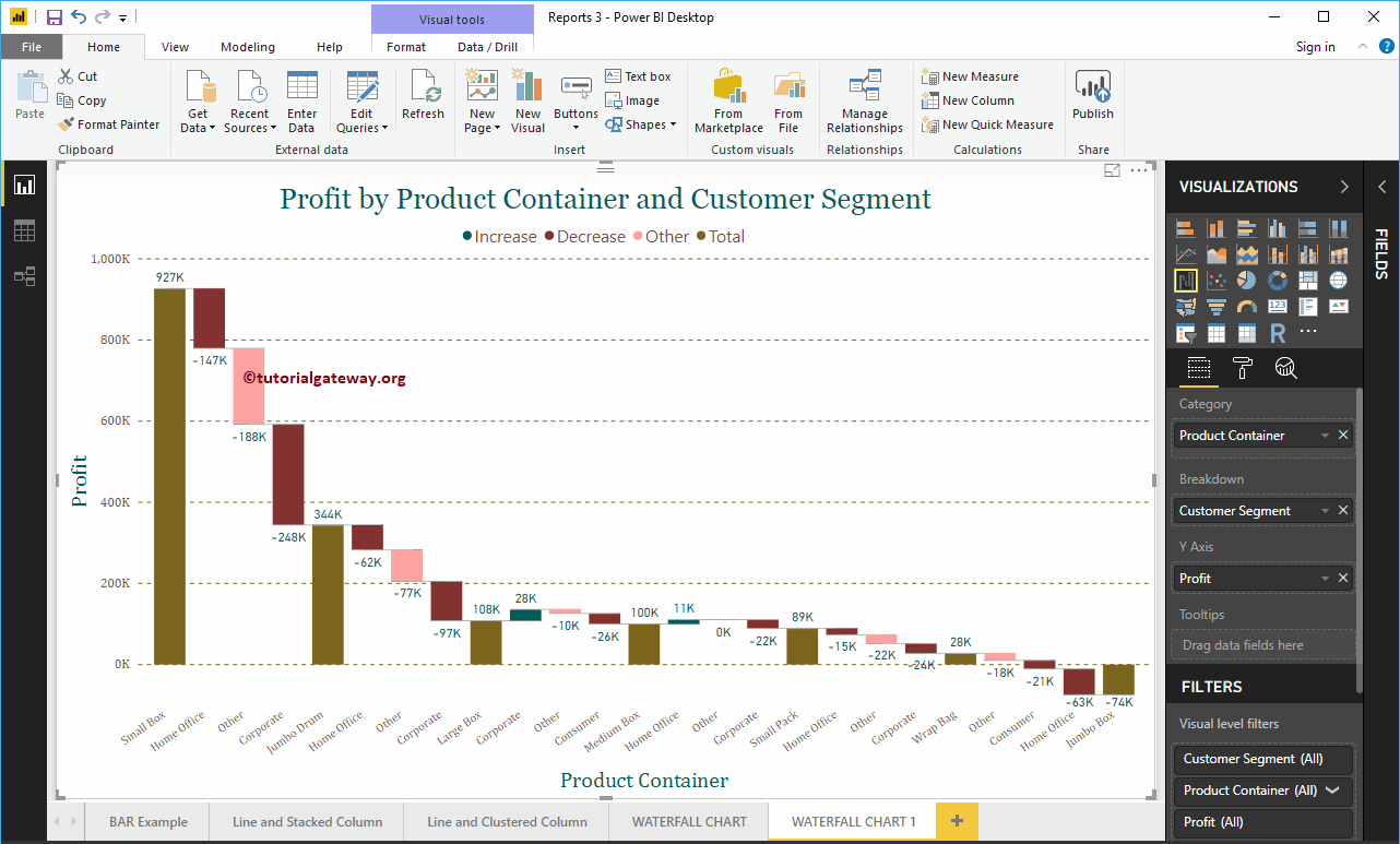
Power BI Waterfall Chart is very useful to visualize sales or profits for some time. Let me show you how to create a waterfall chart in Power BI with a ...
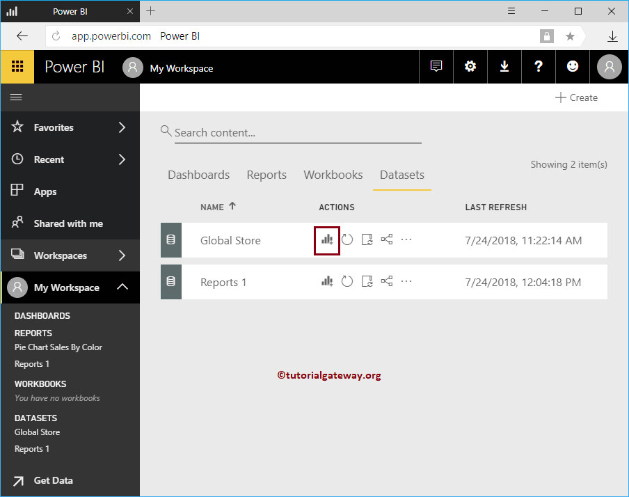
How to create a report using Excel data in Power BI Workspace with a practical example? It is the Excel workbook that we imported in our previous article. Before starting…
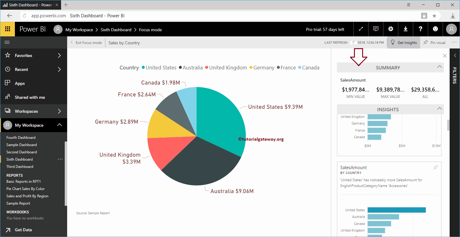
In this session, we show you how to get quick insights into Power BI with a practical example. Generally, there are two types of information in Power BI. One that runs on ...
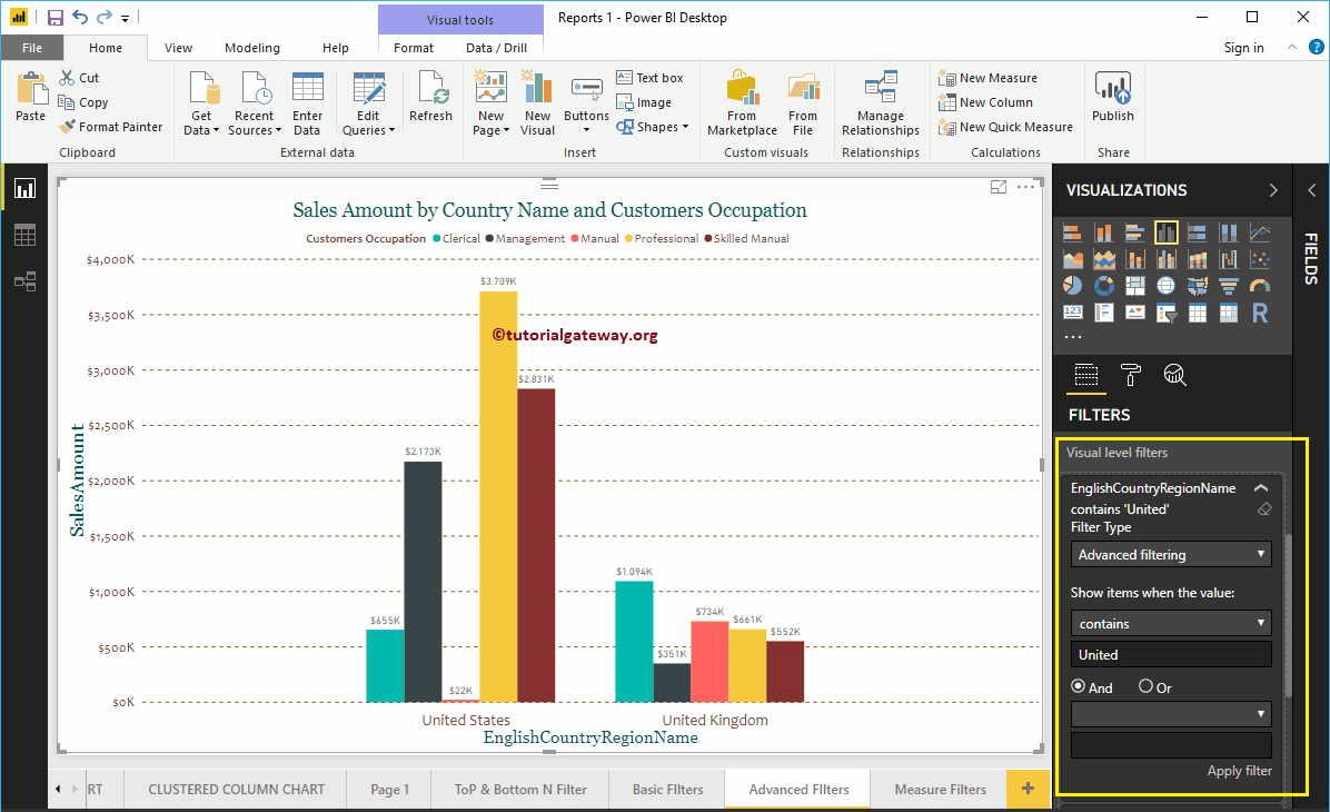
How to create advanced Power BI filters with an example ?. Power BI advanced filters use wildcards to narrow the report data based on requirements. For example,…
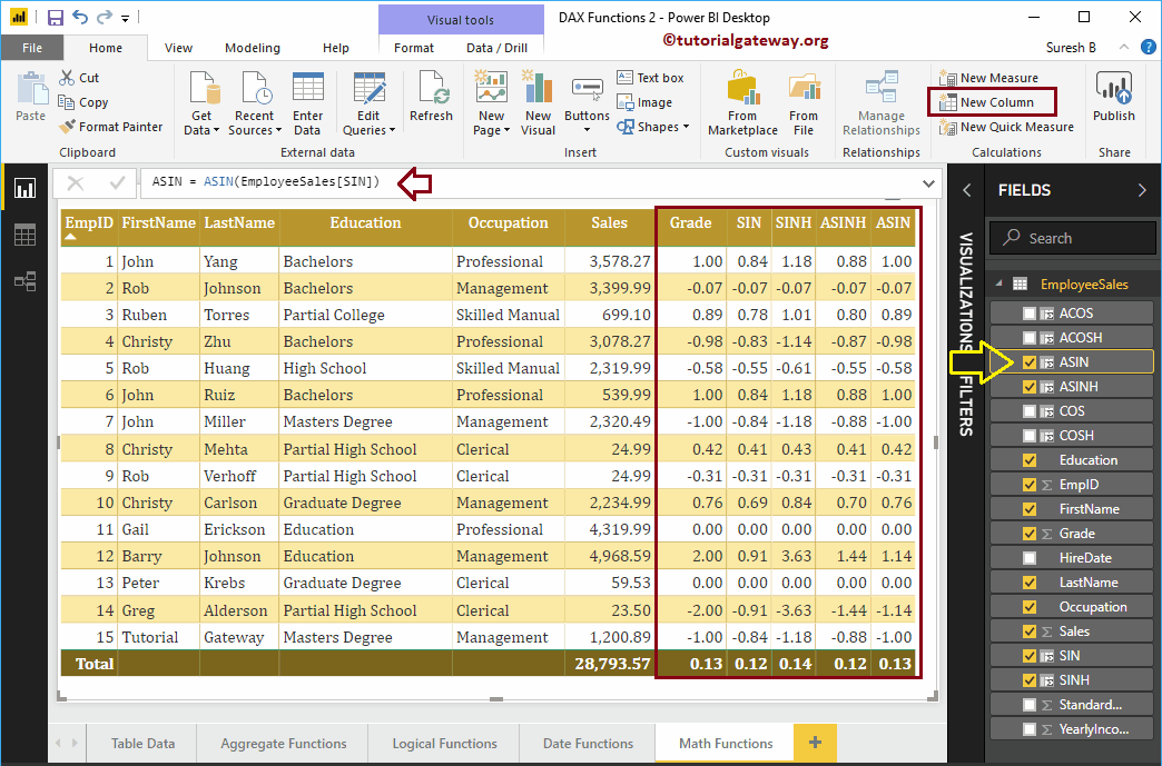
How to use Power BI DAX trigonometric functions with examples? Microsoft Power BI DAX provides several trigonometric functions such as EXP, COS, SIN, TAN, COSH, ACOS, ACOSH, ASIN, SINH, ASINH, ...