
the Toggle widget le permite crear cuadros de texto que están contraídos, de modo que el visitante solo vea los títulos de cada elemento del cuadro de texto. Esto le permite mostrar su contents en forma condensada, por lo que los visitantes no tienen que desplazarse por una página larga y pueden examinar los títulos fácilmente.
A similar widget is the Accordion widget, but there are two main differences between the Toggle widget and the Accordion widget.
- When a page loads, all Lever the widget elements are collapsed. With the Accordion widget, however, the first item is expanded, while all other items remain collapsed.
- With the Lever widget, you can expand as many elements as you want at the same time. With the Accordion widget, however, only one item can be expanded at a time. As you expand another accordion item, the previously opened item automatically collapses, looking similar to an accordion
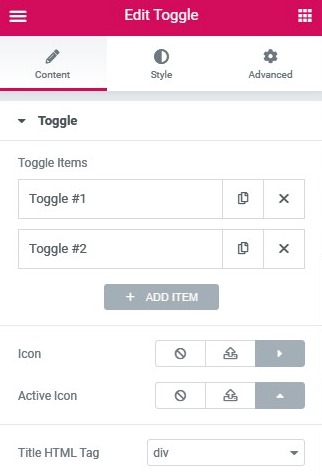
Content
Lever
- Toggle ItemsTitle & Content: Enter the title and description of each item
- Icon: Select the icon to represent the action of expanding an item. Choose None, Upload SVG, or select an icon from the Icon Library. If the Icon Library is chosen, a Recommended tab is displayed in the Library that shows the recommended icons to represent the expanding concept.
- Active icon: Select the icon to represent the action of collapsing the active item. Choose None, Upload SVG, or select an icon from the Icon Library. If the Icon Library is chosen, a Recommended tab is displayed in the Library that shows the recommended icons to represent the concept of collapse.
- Label HTML de título: Set the HTML tag used for the title to H1-H6 or DIV
- Add item: Use the 'Add Item' button to add more toggle items to the list.

Style
Lever
- Border width: Sets the thickness of the border around the toggle widget and between each element
- Border color: Choose the border color around the toggle widget and between each item
- Space between: Sets the amount of space between each item
- Shadow of the box: Sets the box shadow around the toggle widget or around each item if there is space between each. You can adjust the color, horizontal position, vertical position, blur, and extent of the box shadow, as well as the position of the shadow, which can be box or outline.
Title
- Background: Choose the color of the title background
- Colour: Choose the text color of the non-active titles
- Active color: Choose the text color of the active title
- Typography: Sets the font options for titles
- Filling: Sets padding for titles
Icon
- Alignment: Aligns the icon to the left or right of the title
- Colour: Choose the color of the icons
- Active color: Choose the color of the active icon
- Spacing: Controls the space between the icon and the title
Content
- Background: Choose the background color of the content
- Colour: Choose the text color of the content
- Typography: Sets the font options for the content
- Filling: Sets padding for content
Advanced
Set the advanced options that are applicable to this widget


