
Power BI Scatter Chart or Scatter Chart is very useful for visualizing the relationship between two sets of data. Let me show you how to create a scatter chart in Power BI with an example.
For this demo of the Power BI scatter chart, we will use the SQL data source that we created in our previous article. Therefore, see the article Connect Power BI to SQL Server to understand the Power BI data source.
How to create a scatter chart in Power BI
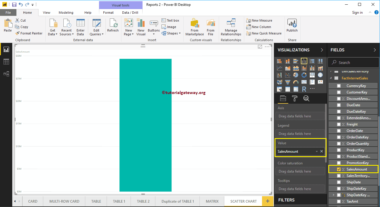
To create a scatter chart in Power BI, first drag and drop the Sales Amount section of the fields onto the region of the canvas. Automatically create a column chart, as shown below.
 <>
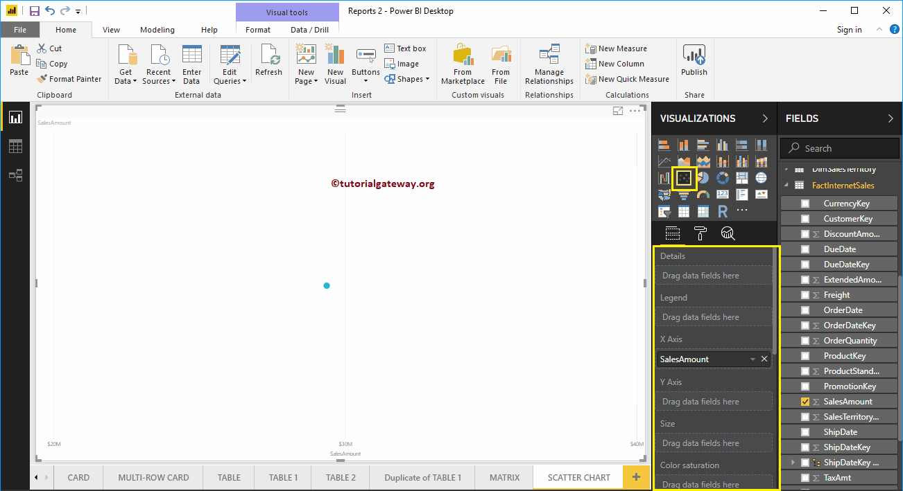
<>Click on the scatter plot below the Display section. Automatically converts a column chart to a scatter chart.
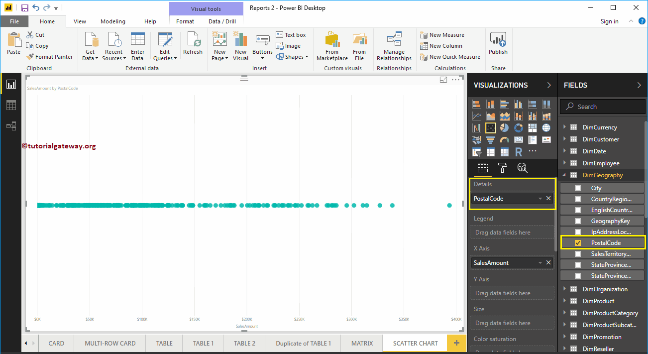
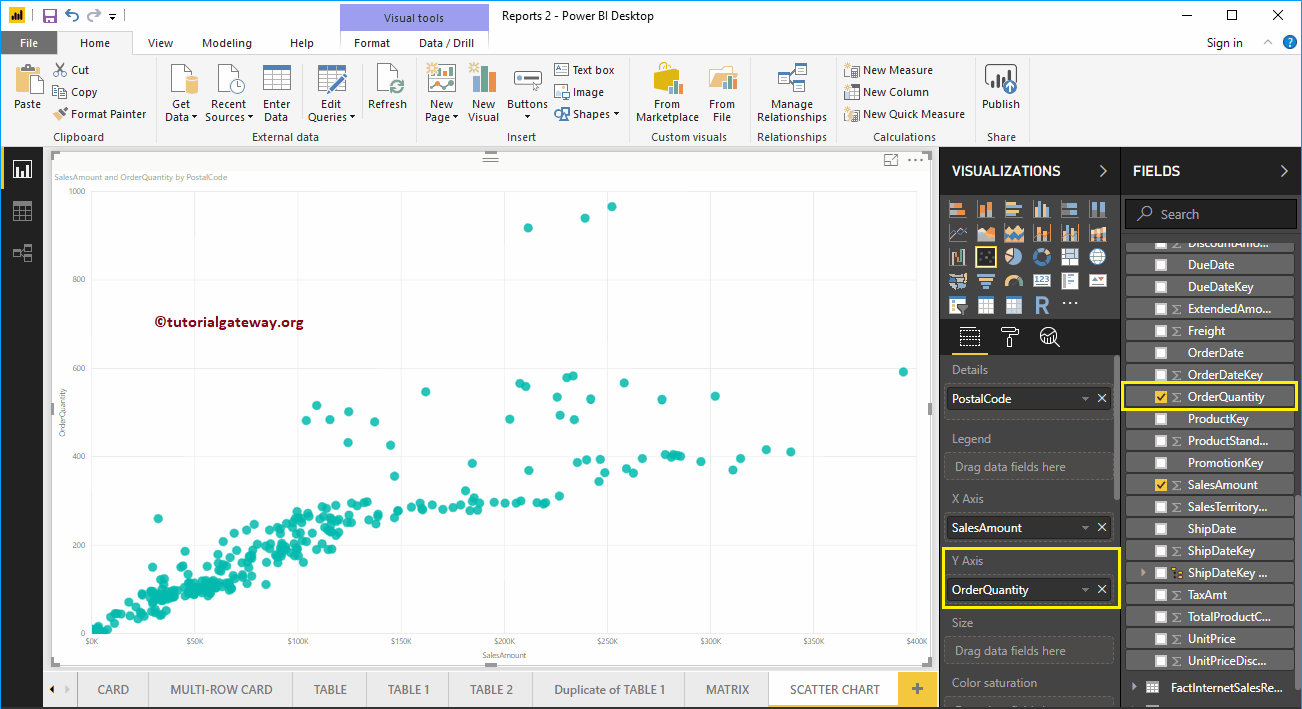
Let me add the zip code to the Details section.
Next, we add the Order Quantity as the Y-axis. Now you can see the proper scatter plot.
Let me apply a quick format to this Power BI scatter chart
Create a scatter chart in Power BI approach 2
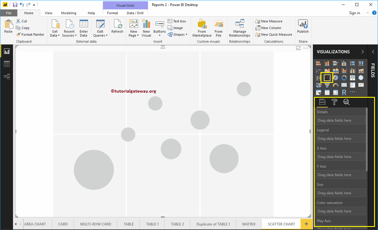
First, click on the scatter plot below the Display section. Automatically creates a scatter plot with fictitious data, as shown in the following screenshot.
To add data to the Power BI scatter chart, we have to add the required fields:
- Details: Specify the column that represents the bubbles.
- Legend: Specify the column that subdivides the details data.
- X axis: Specify the column that represents the horizontal axis.
- Axis y: Column representing the Vertical Axis.
- Size: Specify the column that represents the size of the bubbles.
- Color saturation: Any numerical value that decides the color of the bubbles.
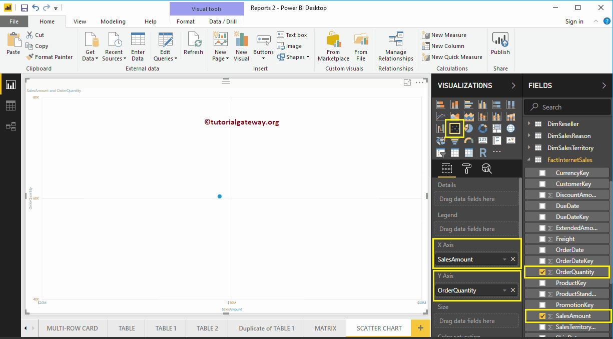
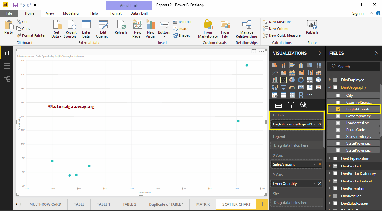
Let me drag the sales amount from the Fields section to the X-axis section and the order quantity to the Y-axis section.
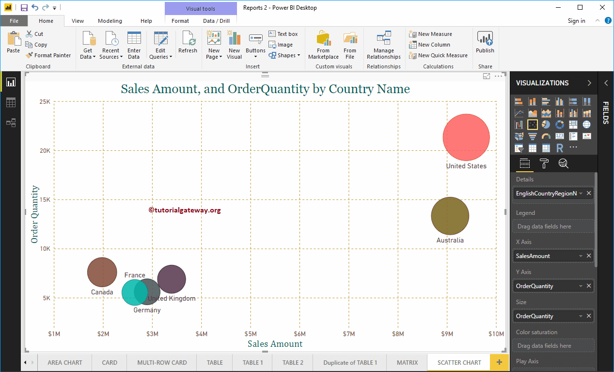
Next, let me add the name of the country region in English to the Details section. You can do this by dragging Country to the Details section, or just check the Country Region Name column in English.
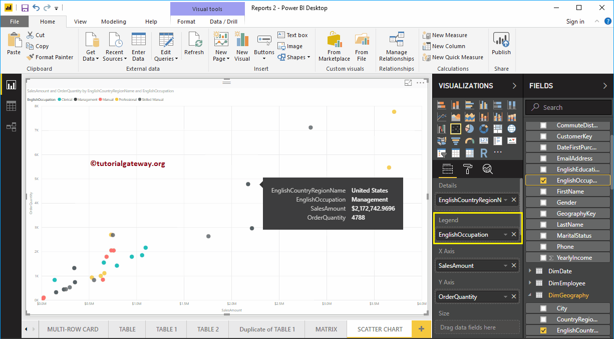
Permítanme agregar Ocupación de inglés del client a la sección Leyenda. Pase el cursor sobre cualquier círculo para mostrar la información sobre el país, la ocupación, el monto de las ventas y el costo total del producto.
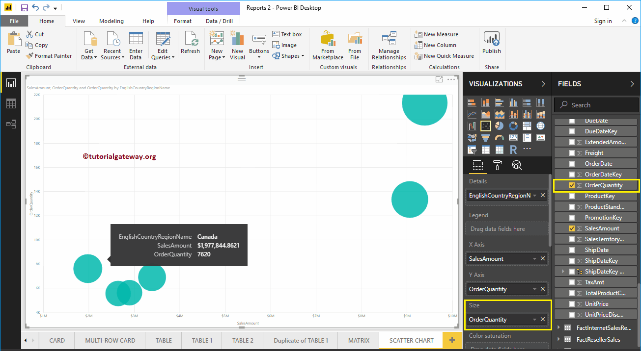
To demonstrate the Size section of a Power BI scatter chart, we removed English Occupation from the Legend section. We add the Order Quantity to the Size section.
As you can see from the screenshot below, the circle size has changed based on the Order Quantity (number of orders)
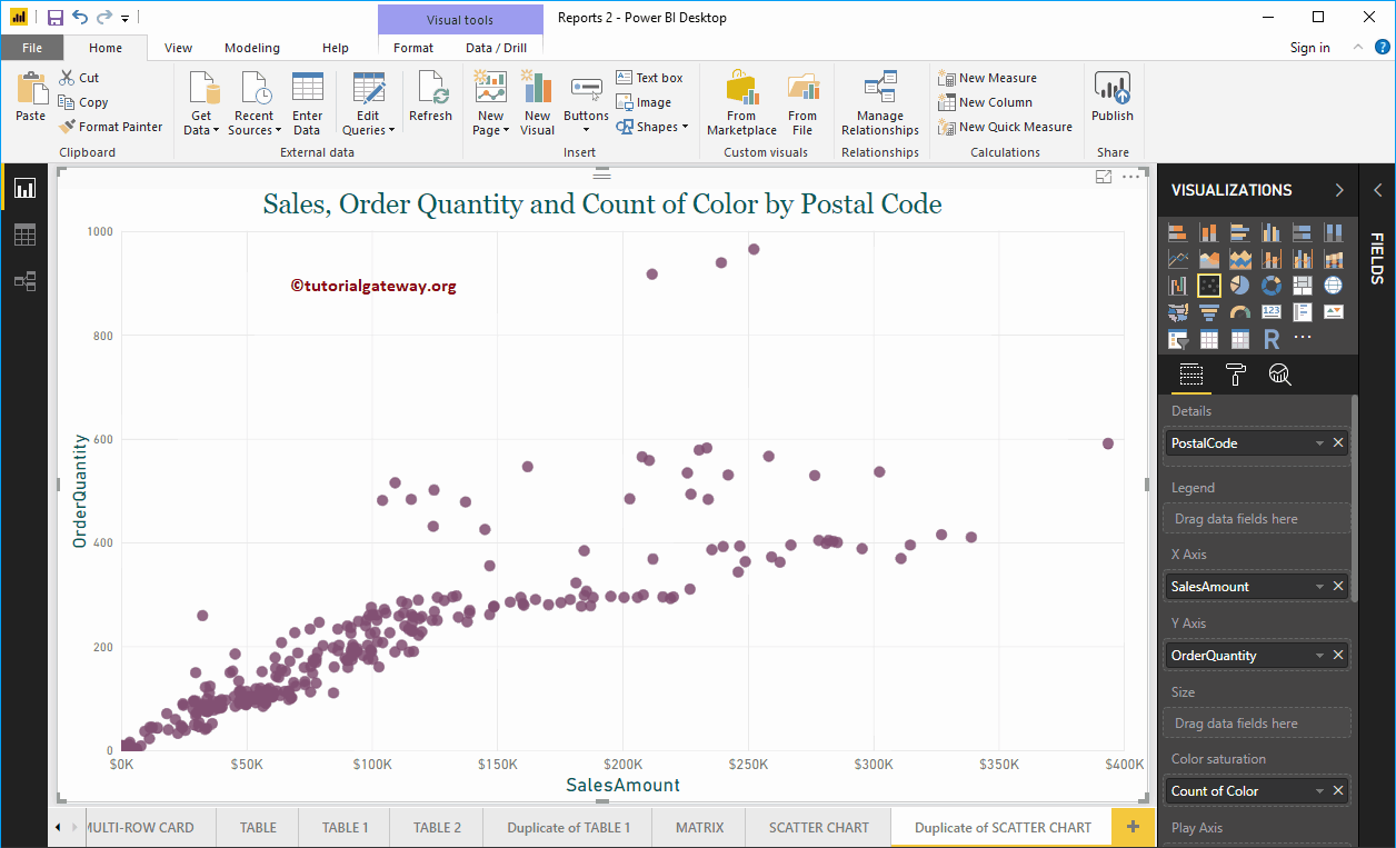
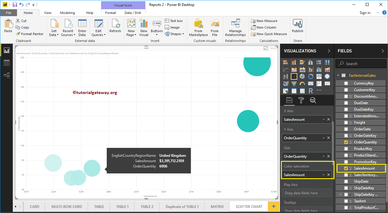
To demonstrate the Color saturation section, we add the Sales Amount to the Color Saturation section. As you can see in the following screenshot, the color of each circle has changed based on the Sales Amount
Let me quick format this Power BI scatterplot
NOTE: I suggest you refer to the Scatter Chart Format article to understand the formatting options.


