How to format Power BI line and clustered column chart with an example? Formatting the Power BI line and clustered column chart includes changing clustered column colors, line strokes, title position, axis details, and more.
To demonstrate the clustered column and line chart formatting options, we'll use the clustered column and line chart that we created earlier. See the article Clustered column and line chart in Power BI in Power BI to understand the steps required to create it.
How to format the Power BI line and clustered column chart
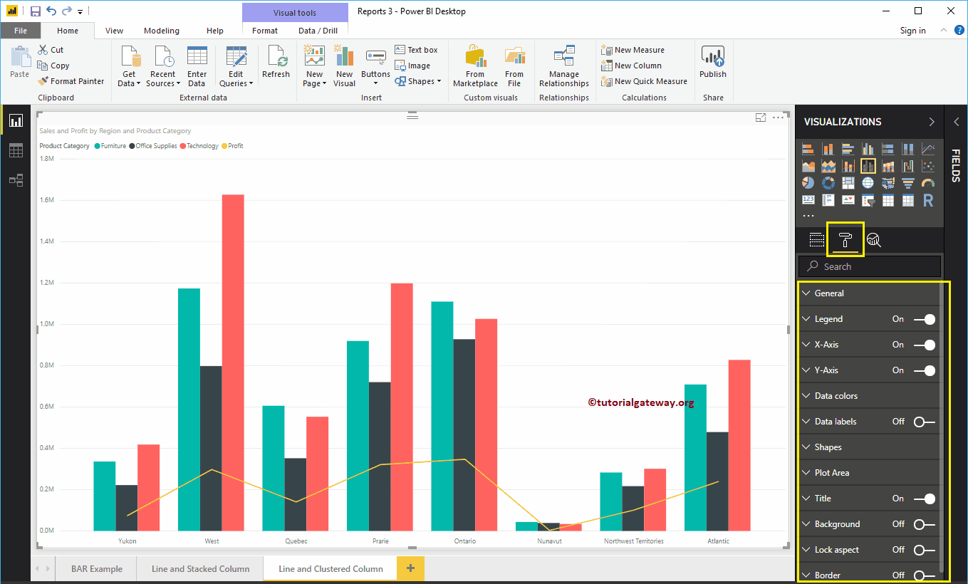
Click on the Format to see the list of formatting options available in the grouped column and line chart.
 <>
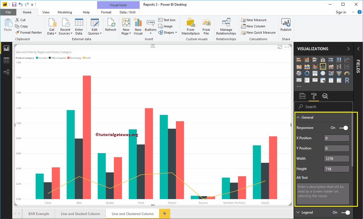
<>Grouped column chart and format line chart general settings
Use this general section to change the X, Y position, width, and height of a clustered column and line chart
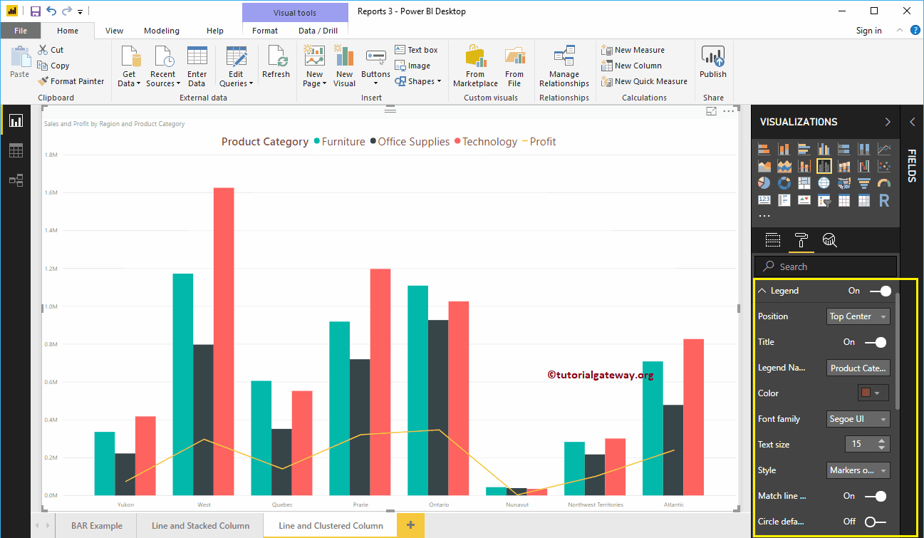
Format the legend for a clustered column and line chart in Power BI
First, we use the Position drop-down menu to change the position of the legend to Top Center. Next, we change the Color to Brown and the text size to 15.
Format the X axis of a Clustered column and line chart in Power BI
The following is the list of options that are available to format the X axis. Here, we change the color to brown and the text size to 14.
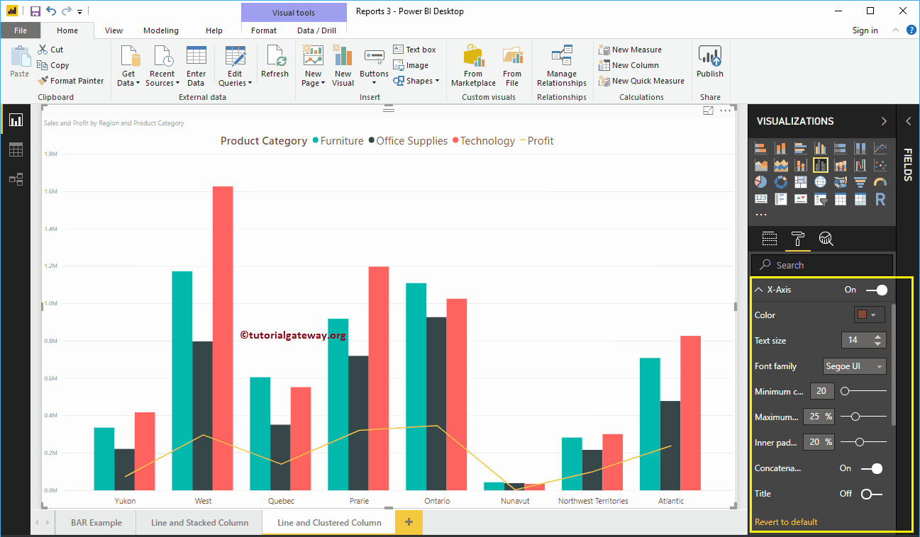
As you can see in the screenshot above, by default the X-axis title is off for the clustered column and line chart. But you can enable it by toggling Title to In. Let me change the title color to green, the font style to Cambria, and the font size to 25.
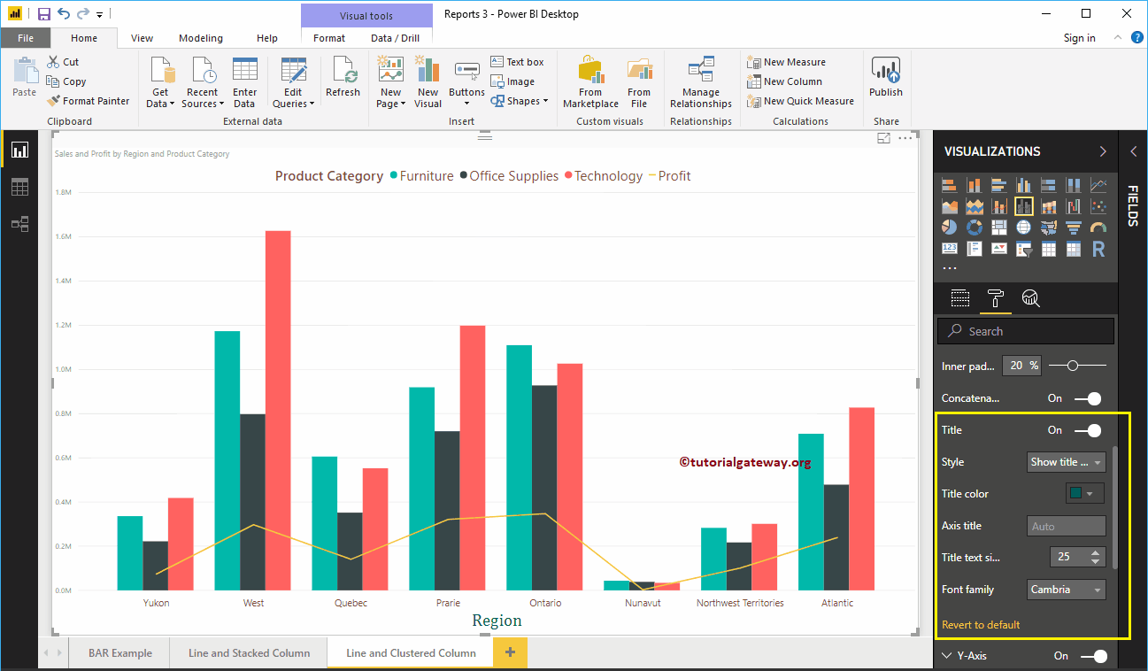
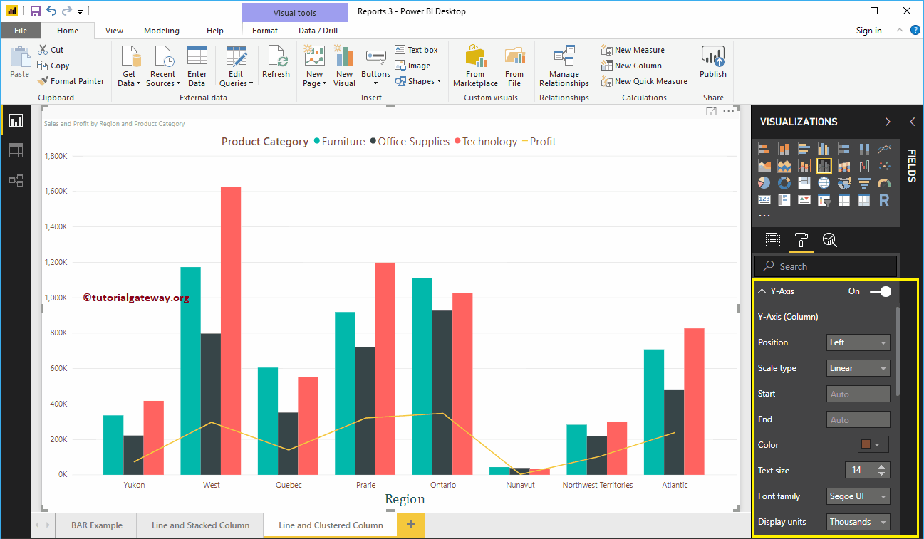
Format the Y-axis of a line and a clustered column chart
As you can see, we changed the Y-axis label color to brown, the text size to 14, and the display units to thousands.
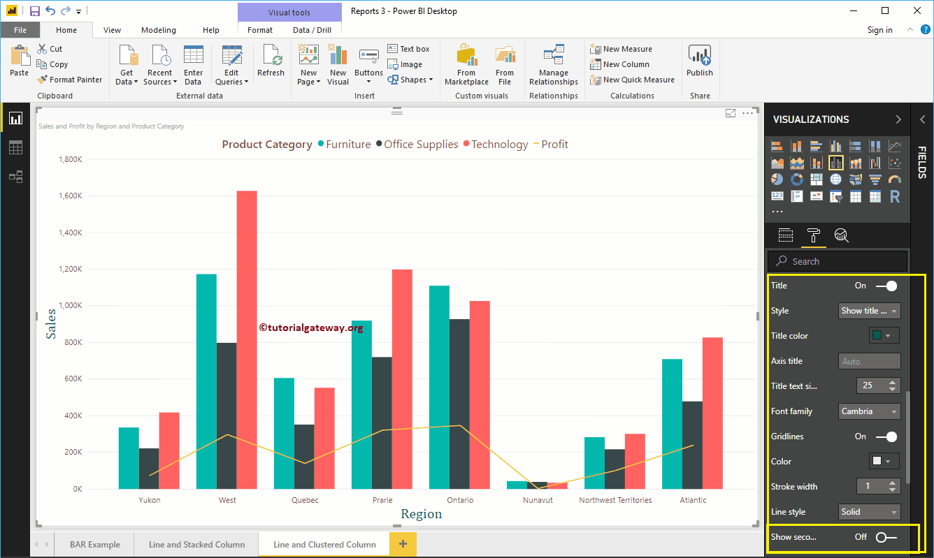
By default, the Y-axis title of the Clustered Column and Line chart is disabled, but you can change the title to In. Let me change the title color to green, the text size to 25, and the Cambria font family.
By toggling the line and clustered chart Grid lines option from On to Off, you can disable the grid lines.
- Colour: You can change the color of the grid.
- Stroke width: Use this to change the width of the grid.
- Line Style: Choose the line style as Solid, Dotted, and Dashed.

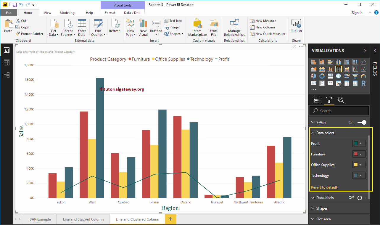
Format the colors of Power BI line and clustered column chart data
By default, the clustered column and line chart will use the default colors to fill the clustered columns and lines. Let me change them for demonstration purposes.

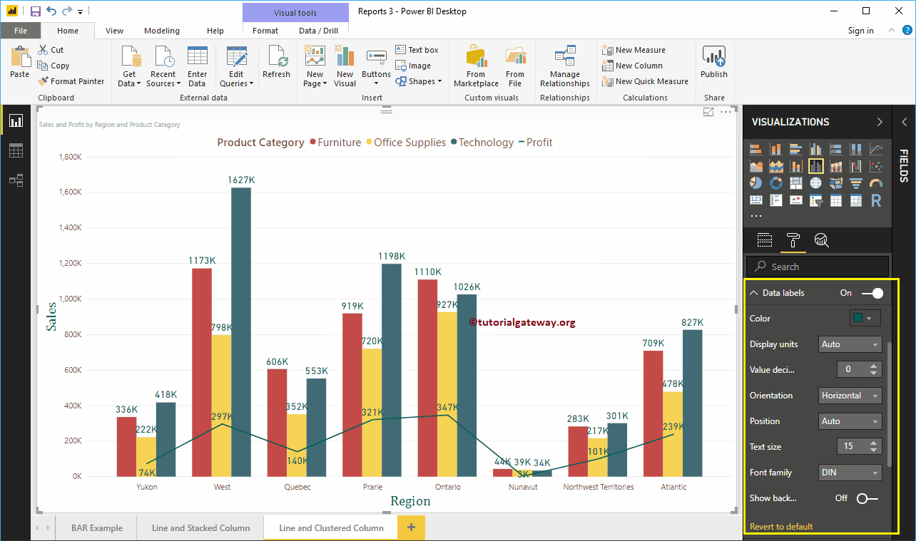
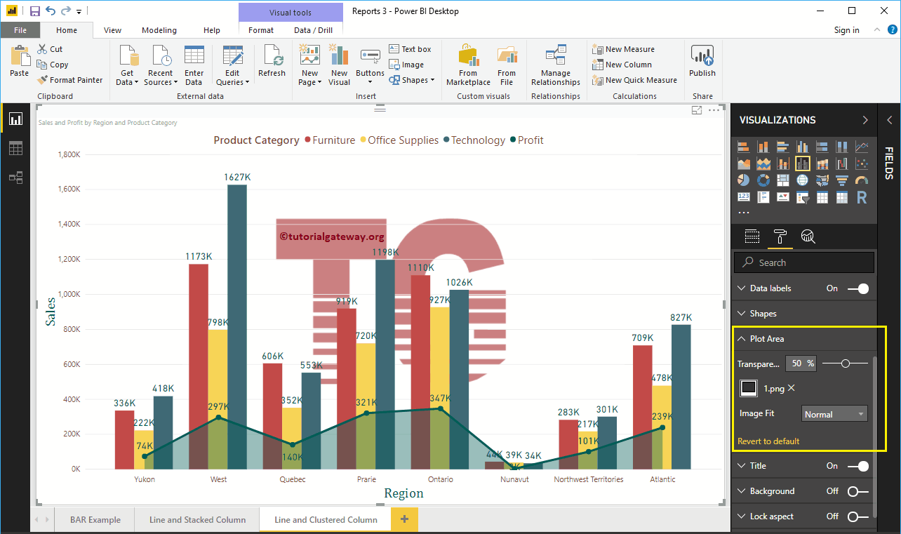
Format Power BI Line and Clustered Column Chart Data Labels
The data labels show the metric values (sales and profit at each point). As you can see in the following screenshot, we enabled data labels and changed the color to green and the text size to 15.

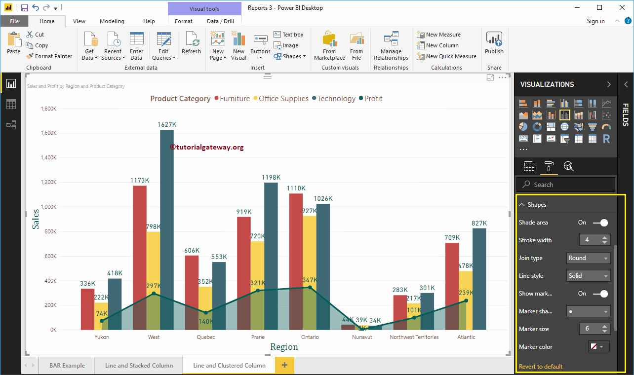
Format clustered column and line chart in Power BI shapes
You can use this section to change line strokes or mark shapes. By enabling the Shadow Area property, you can share the area between the x-axis and the line. Next, we change the stroke width (line width) to 4, the join type to rounded, and the line style to solid.
By enabling the Show Markers property, you can display the markers at each point. Here, we change the size of the marker to 6.

Format the plot area of the grouped column and line chart
With this plot area property, you can add custom images as the background of the grouped column chart and line. For demonstration purposes, we added an image as the background of the plot area.
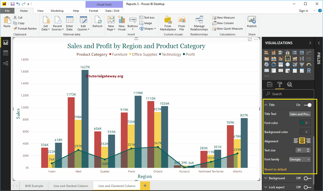
Format clustered column and line chart title
As you can see, we changed the font color to green, the font family to Georgia, the text size to 25, and the heading to center alignment. If you want, you can also add the background color to the title.
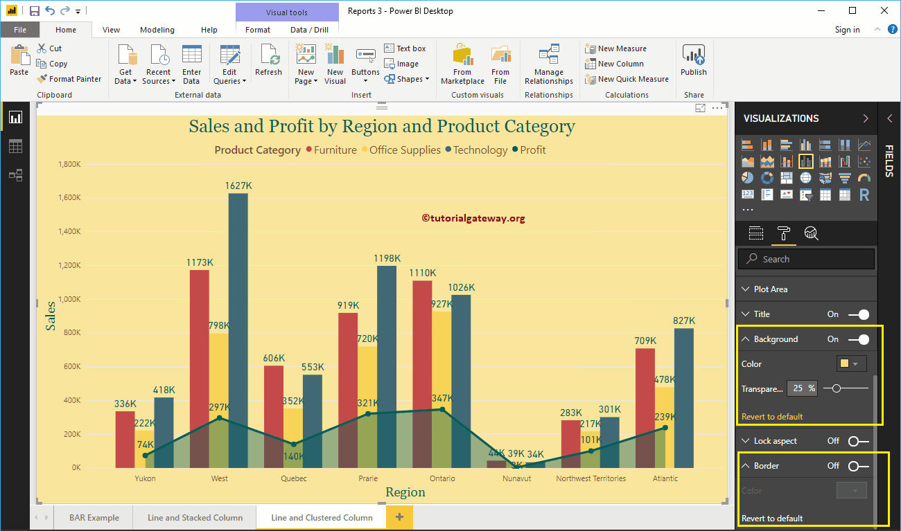
Format the background color and borders of the Power BI line and clustered column chart
You can add the background color to a clustered line and column chart by alternating Background option a In. For demonstration purposes, we added pale yellow with a 25% of transparency.
Similarly, you can add borders to a clustered column and line chart by toggling the Border option of Off to In.