
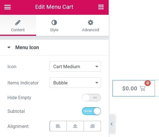
the Menu cart El widget le permite colocar un icono de carrito de WooCommerceConcepto de WooCommerce¿Qué es WooCommerce?Woocommerce es el nombre de un plugin sin costes pensado para integrarse en webs donde se utilice WordPress. Se caracteriza por facilitar la elaboración de una tienda online con la que el responsable de la web puede poner en venta prácticamente cualquier tipo de producto y por permitir que tanto el webmaster como los desarrolladores puedan llevar un exhaustivo control de la tienda sin miedo a plus en su menú o en cualquier lugar de su página.

Content
Menu icon
- Icon: Select the icon to display, choosing between Cart, Basket or Bag, in Light, Medium or Solid designs.
- Item Indicator: Select the type of indicator to be used for the number of items in the cart, choosing from None, Bubble or Single
- Hide empty: Slide to YES to hide the items indicator if the cart is empty
- Subtotal: Show or hide the current cart subtotal
- Alignment: Align the menu cart to the left, right or center
Style
Menu icon
Normal | Float up
- Text color: Choose the subtotal text color
- Icon color: Choose the color of the cart icon
- Background color: Elija el color de fondo del contenedor de widgetsConcepto de Widgets¿Qué son los Widgets?Los Widgets son una serie de pequeños programas que se usan para añadir funciones, simplificar o automatizar aquellas acciones que se lleven a cabo a menudo dentro de una web. Son herramientas adicionales, añadidos que se elaboran con la finalidad de hacer más fácil las labores de mantenimiento o inclusive de generación de contenidos dentro de cualquier sitio de Internet y que no han hecho plus
- Border color: Choose the border color of the widget container
- Border width: Controls the thickness of the border around the widget container
- Edge radius: Sets the radius of the border to control the roundness of the corners
- Typography: Change the typography options for subtotal text
Icon
- Size: Adjust the size of the cart icon
- Spacing: Adjusts the amount of space between the cart icon and the subtotal text
- Filling: Change widget container padding settings
Item Indicator
- Text color: Choose the color of the number of elements in the element indicator
- Background color: Choose the background color of the item indicator
- Distance: Sets the distance between the icon indicator and the subtotal text
Note: When the menu cart is clicked, a cart overlay opens. The following options control the design aspects of the carriage overlay.

Car
- Divider: Show or hide the dividing line after each item in the cart overlay
- Delete item icon: Show or hide the icon that allows users to remove an item from the cart
Subtotal
- Colour: Choose the subtotal text color in the cart overlay
- Typography: Change the typography options for the subtotal text in the cart overlay
products
Product title
- Colour: Choose the color of the product title in the cart overlay
- Typography: Change the typography options for the product title in the cart overlay
Price of the product
- Colour: Choose the color of the product price in the cart overlay
- Typography: Change the typography options for the product price in the cart overlay
Divider
- Style: Select the style of the divider above and below the subtotal in the cart overlay, choosing from none, solid, double, dotted, dashed, or slotted
- Colour: Choose the color of the subtotal divider in the cart overlay
- Weight: Sets the thickness of the subtotal divisor
- Spacing: Sets the space between the subtotal dividers and the subtotal text
Buttons
- Design: Choose the layout of the buttons on the cart overlay, either in-line or stacked.
- Space between: Sets the amount of space between the cart overlay buttons
See small car
- Text color: Choose the text color of the Show Cart button in the cart overlay
- Background color: Choose the background color of the Show Cart button in the Cart Overlay
- Border color: Choose the border color of the Show Cart button on the Cart Overlay
- Border width: Controls the thickness of the border around the Show Cart button in the cart overlay.
Check out
- Text color: Choose the text color of the checkout button in the cart overlay
- Background color: Choose the background color of the Checkout button in the cart overlay
- Border color: Choose the border color of the Checkout button in the cart overlay
- Border width: Controls the thickness of the border around the checkout button text in the cart overlay
- Typography: Change the font options for both buttons in the cart overlay
- Edge radius: Sets the border radius for both buttons in the cart overlay
Mini cart
To avoid conflicts with WooCommerce plugins or themes that may use their own Mini Cart templates, Elementor offers you the option to enable or disable the Elementor version of the Mini Cart template. If WooCommerce is on, follow these steps to enable or disable the Elementor Mini Cart template.
- Go Elementor> Settings> Integrations> WooCommerce
- Choose Enable for this option to replace the default WooCommerce mini cart template or your theme's mini cart template with the Elementor template. Unless manually set to Disable, this setting is automatically enabled once the menu cart widget is used anywhere on your site.
- Choose Disable to opt out of using Elementor's Mini Cart template.
 es un protocolo que permite determinar una conexión segura entre el servidor y el cliente, que no puede ser interceptada por personas no autorizadas. En resumidas cuentas, es la versión segura de el http (Hyper Text Transfer Protocol) Cómo funciona Una conexión HTTP estándar en Internet puede ser fácilmente secuestrada por partes no autorizadas. El propósito de una conexión HTTPS es evitar esto: encriptar<span class="glossaryai-more-link"> <a href="https://rmarketingdigital.com/en/wiki/https/" data-wpel-link="internal">más</a></span></span></span></span></span>://rmarketingdigital.com/wp-content/uploads/2020/09/file-xzu8Qsb2XY-6986810.jpg)