

Theme style Settings are global settings that allow you to set default style options for various items, such as Background, Headers, Buttons, Imagesand Form fields. This setting overrides the theme's style setting and takes its place, allowing you to use Elementor to set styles for elements not created by Elementor. By default this will apply styles only to non-Elementor elements, por ejemplo, campos de pago de WooCommerce, etiquetas del Formulario de contacto 7, títulos de terceros y mucho más. If you prefer, you can force these Theme Style settings to apply to elements built by Elementor as well.
Note: Los usuarios de Elementor Pro también pueden configurar CSS personalizado global que le permite aplicar reglas CSS personalizadas a todo su sitio.
To apply theme styles to Elementor elements:
To Theme style configuración para aplicar también a la mayoría de los elementos y widgets de Elementor, deberá deshabilitar los colores y fuentes predeterminados de Elementor.
- Disable the default colors and default fonts by going to Elementor> Settings and placing a check in the boxes next to Disable default colors and Disable default fonts.

How to set theme styles
Click on the Hamburger menu 

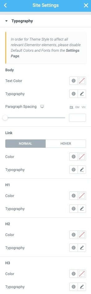
Typography
Text color: Choose the default text color
Typography: Change the font options for the default text
Paragraph spacing: Sets the default amount of space after a paragraph (bottom margin)
Normal | Float up
Colour: Choose the default color of the links for the normal and floating states
Typography: Changes the default font of links for normal and floating states
H1-H6
Colour: Elija el color predeterminado para cada título (H1, H2, H3, H4, H5 y H6)
Typography: Set the default font options for each title (H1, H2, H3, H4, H5, and H6)
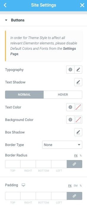
Buttons
Typography: Changes the default font for buttons
Text shadow: Sets the default text shadow for buttons
Normal | Float up
Text color: Choose the default color for the button text
Background color: Choose the default background color of the buttons
Border type: Sets the default border type for buttons (none, solid, double, dotted, dashed, groove)
Shadow of the box: Sets the default box shadow options for buttons
Edge radius: Sets the default border radius to control the roundness of button corners
Filling: Changes the default button padding settings
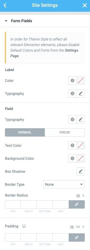
Form fields
Label
Colour: Choose the default text color for field labels
Typography: Sets the default typography options for field labels
Field
Typography: Sets the default typography options for the input field text
Normal | Attention
Text color: Choose the default text color for the input field text
Background color: Choose the default background color for input fields
Border type: Set the default border type for input fields (none, solid, double, dotted, dashed, groove)
Edge radius: Sets the default border radius to control the corner roundness of input fields
Shadow of the box: Sets the default box shadow options for input fields
Transition duration (ms) (focus only): Set the default amount of time, in milliseconds, for the focus transition to take place.
Filling: Sets the default fill options for input fields
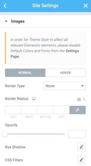
Images
Normal | Float up
Border type: Set the default border type for images (none, solid, double, dotted, dashed, groove) in Normal and Hover modes
Edge radius: Sets the default border radius to control image corner roundness in Normal and Hover modes
Opacity: Sets the default opacity level for images in Normal and Float modes
Shadow of the box: Set the default box shadow options for images in Normal and Hover modes
Filters CSS: Sets the default CSS filters: Blur, Brightness, Contrast and Saturation for images in Normal and Hover modes
Transition duration (ms) (offset only): Set the default amount of time, in milliseconds, for the shift transition to take place.
Undo / Redo and Draft / Publish
Like any other Elementor edit you can do, Theme style woks with him Reviews and History controls, so you can undo / redo any changes, and you can always revert to a previous version of your Theme style design.
Theme style also works with Drought and To post modes, so you can test your changes and save them in draft, without affecting your live site. Your live site will only get the changes applied when you click on the theme style To post button.
Elements HTML afectados
Note: Some elements will not be affected because Elementor does not allow editing (eg fieldset, input [type = ”reset”] and more)
Background color:
Buttons:
- button
- input [type = »button»]
- input [type = »submit»]
- .elementor-button
- Paragraph spacing:
Links:
Headers:
To form:
- label
- input: no ([type = »button»]): no ([type = »submit»])
- textarea
- textual-field-element
Images:
Why did all the styles in my theme disappear?
This happens when the Default kit is deleted. If you go to Templates> Saved Templatesand then select to view All templates, you will see a new template in the list, called Default kit. Los estilos de tema se almacenan en esta plantilla guardada. La plantilla del kit predeterminado, si se elimina, se volverá a crear automáticamente, pero eliminarla eliminará todas las configuraciones almacenadas en los estilos de tema, por lo que solo elimine esta plantilla si su target es restablecer completamente sus estilos de tema.


