Power BI Waterfall Chart is very useful to visualize sales or profits for some time. Let me show you how to create a waterfall chart in Power BI with an example.
For this Power BI Waterfall Chart demo, we will use the Excel data source that we created in our previous article. So, check out the article Connect Power BI to Excel with multiple Excel sheets to understand the Power BI data source.
How to create a waterfall chart in Power BI
To create a waterfall chart in Power BI, first drag and drop the Profit section of the fields onto the canvas region. Automatically create a column chart, as shown below.
 <>
<>Let me add the product subcategory to the Hub section.
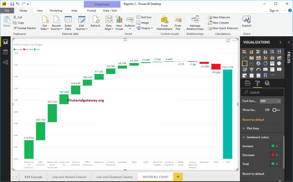
Click on the waterfall chart below the Display section. Automatically converts a column chart to a waterfall chart.
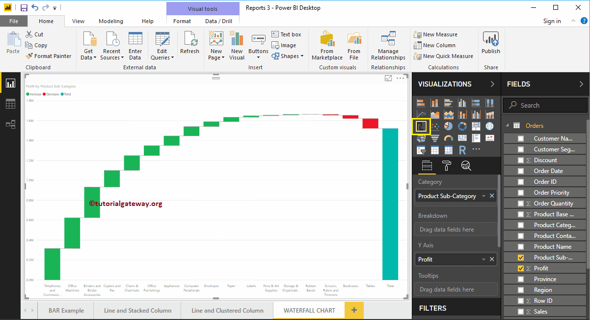
Next, we add the data labels so you can see the amount of profit increased or decreased. Below the sentiment colors, you can also change these bar colors.
Create a waterfall chart in Power BI approach 2
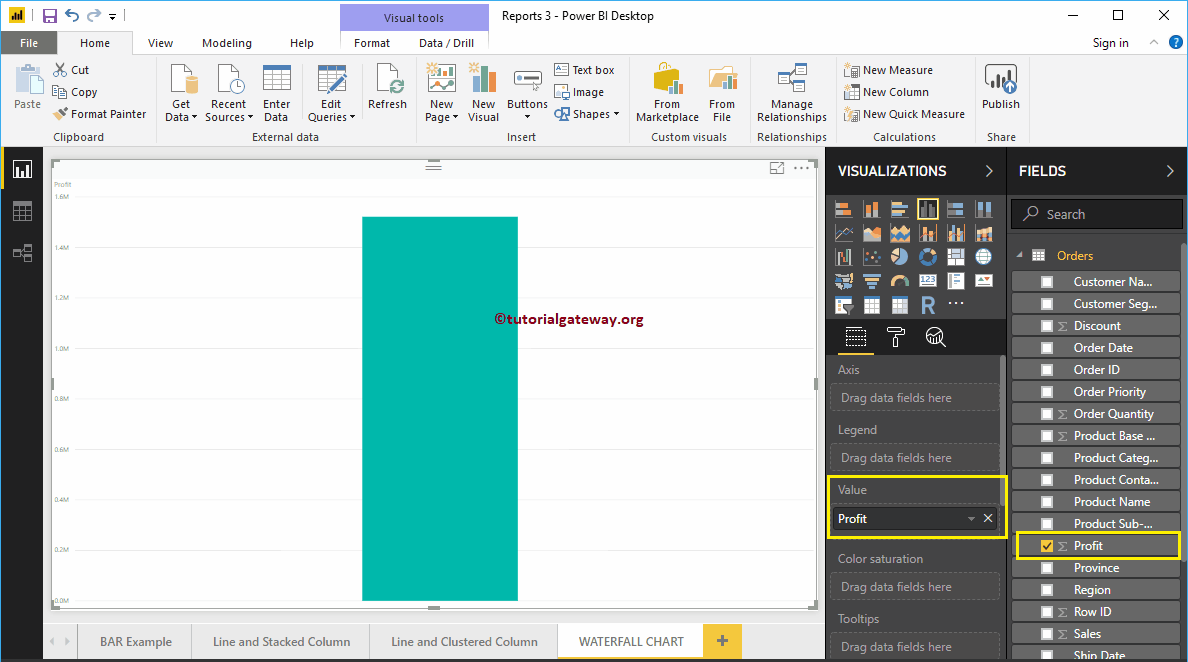
First, click on the Waterfall Box below the Display section. Automatically create a waterfall chart with fictitious data, as shown in the screenshot below.
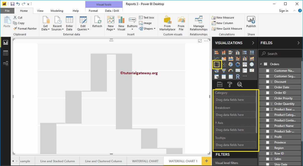
To add data to the Power BI waterfall chart, we have to add the required fields:
- Category: Specify the column that divides the chart (horizontal axis column).
- Decomposition: Specify the column that subdivides the details data.
- Axis y: Specify the metric column that represents the vertical axis.
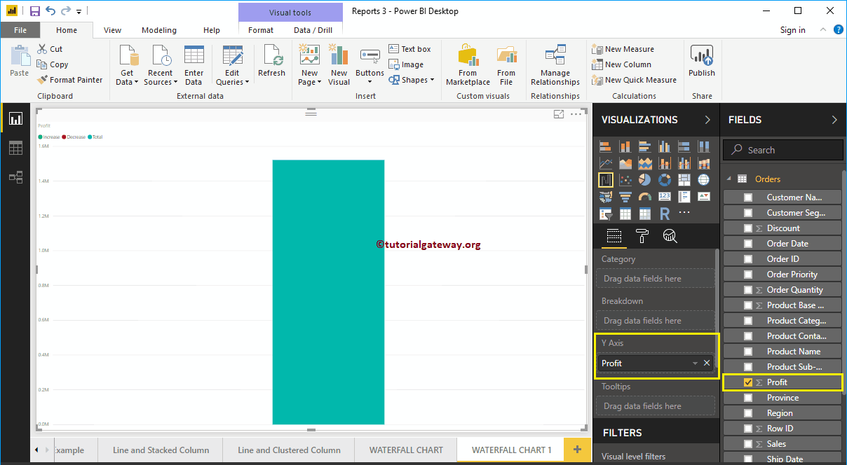
Let me drag the Benefit section of the fields to the Y Axis section.
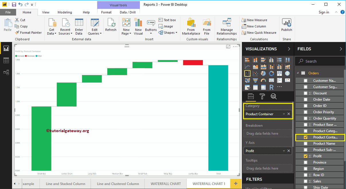
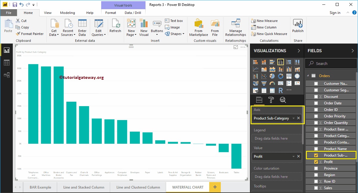
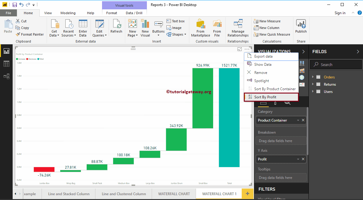
Next, let me add the products container to the Category section. You can do this by dragging the Product Container to the Category section, or simply check the Product Container column.

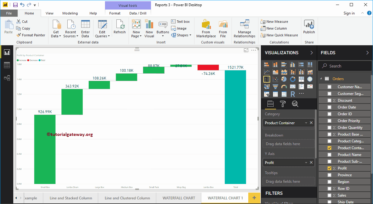
Next, we add the data labels so you can see the profit increase.

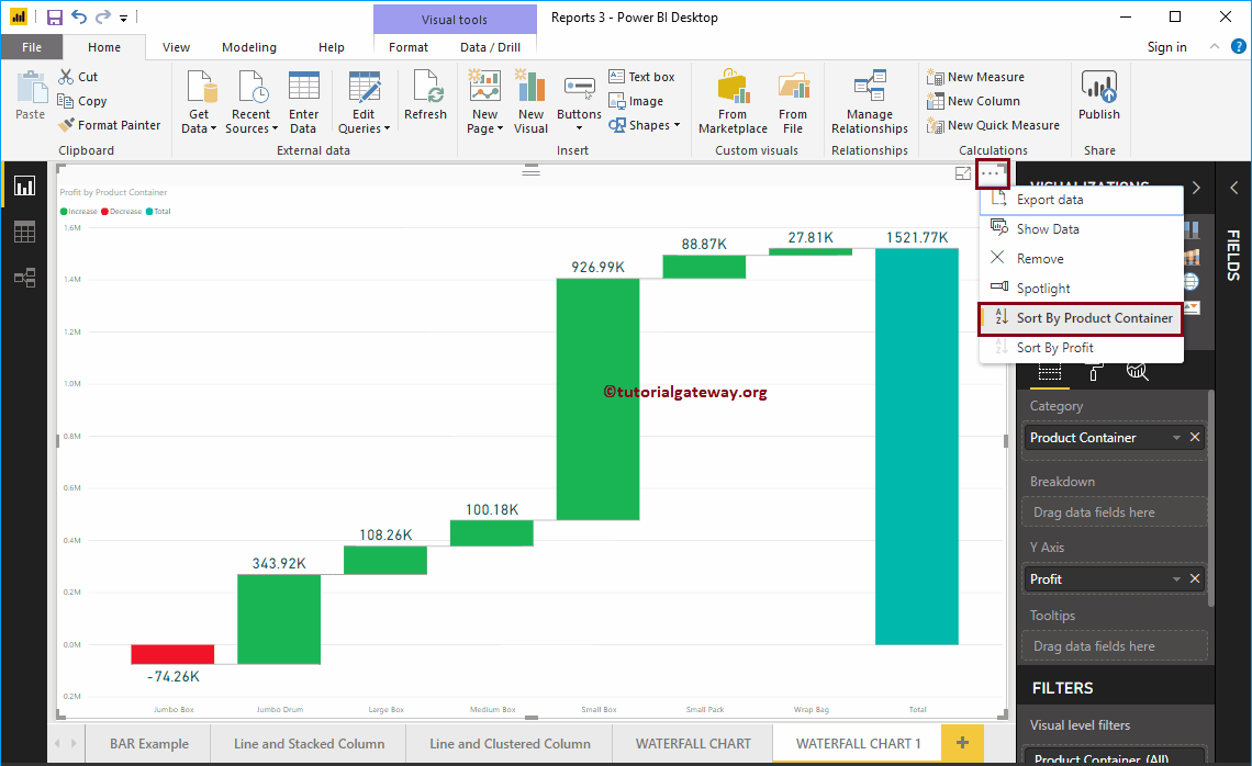
In the screenshot above, you can see that the waterfall chart is sorted by Profit in descending order. So let me sort the chart by Profit in ascending order. To do this, click on the … (3 dots) in the upper right corner and select the left corner of the Sort by benefit option, as shown below.
This time we sort the data by product container in descending order.
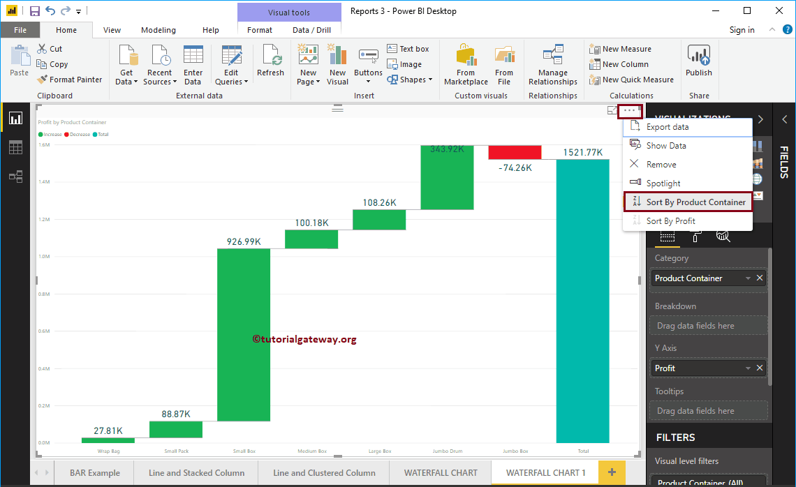
This time we sort the data by product container in ascending order.

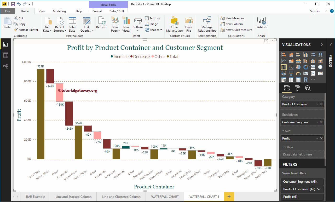
Power BI Waterfall Chart Breakdown
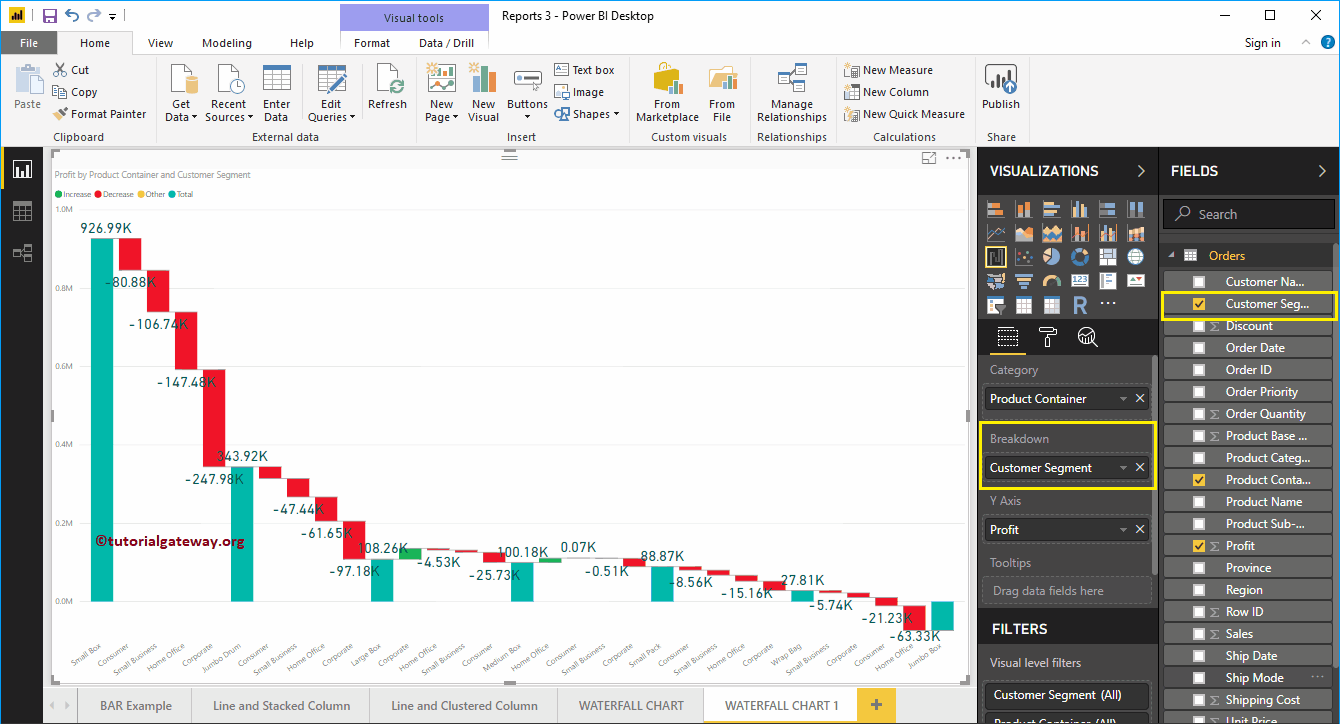
Let me add Customer Segment to the Breakdown section. And as you can see in the screenshot below, the waterfall chart has been further divided based on customer segment.

Let me apply a quick format to this waterfall chart
NOTE: I suggest you refer to the Waterfall Chart Format article to understand the formatting options.