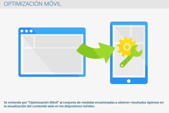
It is understood by smartphone optimization the measures aimed at achieving optimal results in the display of web content on mobile devices. To improve the usability of mobile devices such as smartphones or tablets, Google has created, among many other factors, a ranking.
General information
The use of the internet and E-Commerce on mobile devices is constantly increasing. That is why webmasters and online store owners try to improve and take full advantage of the quality of their websites on mobile devices to boost the experience that their users have when browsing them. Specifically in commerce through mobile devices, the usability of the web portal is a very important factor. At the same time, it is not only necessary to take full advantage of the usability on mobile devices, but it is also very important to take full advantage of the payment platforms on these devices.
Characteristics of internet use on mobile devices
There are many differences between the use of the internet on mobile devices and its use on computers or notebooks. Examples:
- The user does not navigate with the mouse, but through the touch screen
- Design is significantly smaller
- Mobile devices don't use Flash or Java
- The browsing speed is usually slower
Smartphone optimization of a web portal
Those who want to make the most of their web portal for mobile devices have two ways to achieve it:
1. Responsive Design
Its web portal and all its functions are adapted to a Responsive design: content such as texts, images, etc. is adapted to the dimensions of the smartphone device. In this case, it does not matter what are the dimensions of the device that the user decides to use (Eg a 10-inch or 4-inch tablet) since it will adapt correspondingly to its characteristics. The downside to this layout is that not all content may fit properly.
2. Mobile URL
The second version is designed primarily for mobile devices: all content is transferred to a smartphone URL. This option is more complicated since the content of the computer version must be transferred in its entirety to a Smartphone URL.
These are the two cases that are normally found:
- Computer version
http://www.estesitio.es
- Smartphone version
http://smartphone.estesitio.es or http://m.estesitio.es
There is another variant that is a mix between the smartphone version and the computer version in which the smartphone version consists of a simplified version of the original. But in this circumstance, the user of the smartphone version will have a worse usability.
The optimization of mobile devices is essential for companies that want to follow the concept of "Mobile First" , smartphone first, for your web portal.
Errors in Smartphone Optimization
When this optimization is carried out, several errors can be made:
- Videos in the smartphone version do not open: when you want to take full advantage of the video content of the smartphone version, you have to take into account the preconditions that the software and licenses set. For example, choose the video format with which to view the content. It is also recommended to use the HTML 5 Standard or create videos with the Transcript for videos so they can be viewed better.
- Interstitials, which encourage the download of the App- If not installed correctly, they will not be accessible from search engines. As an option it is recommended to use the banner.
- Errors with redirects: When you have two different URLs, one for mobile devices and a conventional one, the redirects must be integrated correctly to prevent them from leading to other websites.
- Mobile devices are not recognized: for the smartphone version of the web portal to load correctly, you must consult the browser user agent, User Agent in English. Most mobile device browsers transfer them to browser questions.
- File size is too large for upload: in smartphone optimization, data size plays a very important role. When browsing through mobile devices there is not always enough bandwidth, it is essential that on the websites of the mobile versions it is lighter by means of, for example, compressed images.
Tips for Smartphone Optimization
As we have mentioned previously, there are many errors when completing the smartphone version optimization of a web portal. Later we name some tips that help to avoid them:
- Increase the loading speed through CSS or JavaScript.
- Make the most of and compress your images - SEO For Images.
- Adapt the -Head-Bereich- to smaller monitors.
- Adjust the font size so that the texts can be displayed correctly on small monitors.
- Reduce multimedia content, as animations and audio content require additional time.
- Give up floating boxes in navigation.
Subsequently adapting the web portal to the smartphone version, a simulation must be carried out to review its functionality. For this, there are different tools such as, for example, the simulator Startmobile.de, one of several Google initiatives.
Relevance for SEO
The mobile device optimization is a very important part of the SEO since the use of mobile devices is always on the rise. Apart from this, Google promotes the optimization of smartphone content by offering assistance through the Google Webmaster Tools tool, since as of April 25, 2015, the smartphone version of a web portal will count as an influencing factor for positioning in the SERPs.
Web links
- Mobile guide developers.google.com
- How to Get the Most Out of Mobile Sites support.google.com


