Power BI Heat Map It is useful to display the data along with colors. By seeing the color, one can easily understand the gains. Let me show you how to create a heatmap in Power BI with an example.
For this Power BI Heatmap demo, we will use the SQL data source that we created in our previous article. Therefore, see the article Connect Power BI to SQL Server to understand the Power BI data source.
How to create a heatmap in Power BI
To create a Power BI heatmap, first, click on the Matrix below the Display section. Automatically creates an array with dummy data.
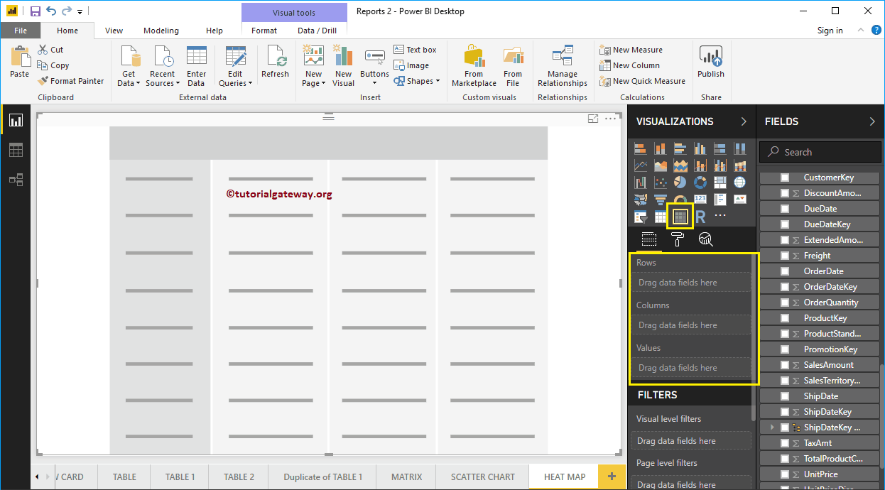 <>
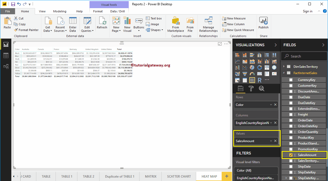
<>Then drag and drop the English country region name into the column group and the product color into the row group. Now, you can see an array with no values.
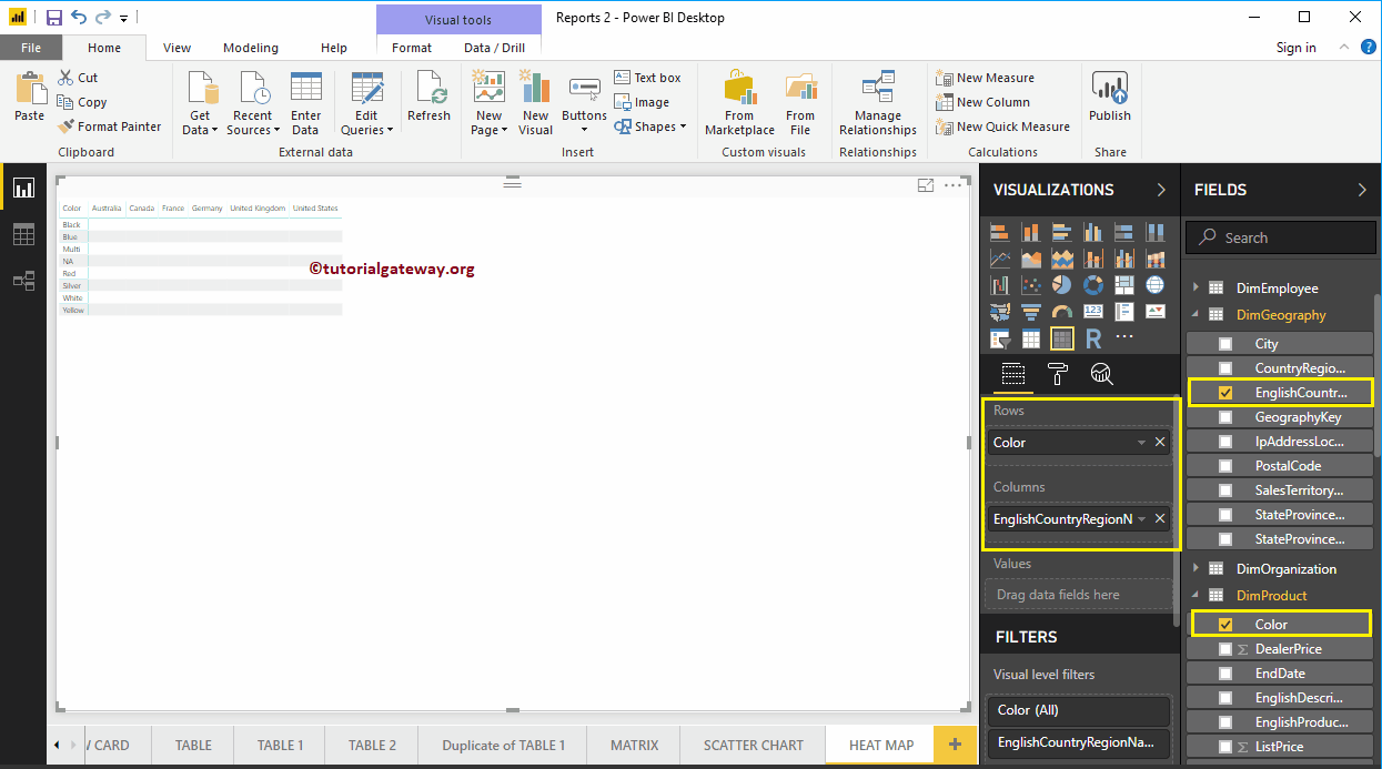
Next, let me drag the Sales Amount to the Values section. Automatically enable row totals and grand totals
Click on the Format to convert this matrix to a heat map in Power BI. I suggest you refer to the Formatting an array article to understand the formatting options.
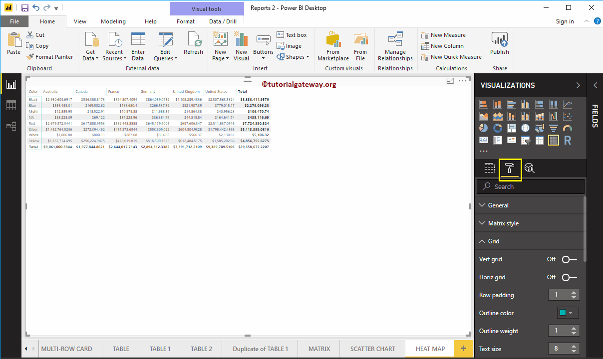
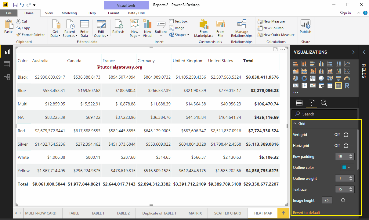
First, go to Grid Section. As you can see in the screenshot below, we changed the row padding to 18 and the text size to 15
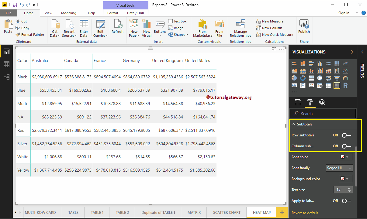
By toggling the row subtotals, the column subtotals below the Subtotals in Off, you can remove Totals entirely. So let me remove them
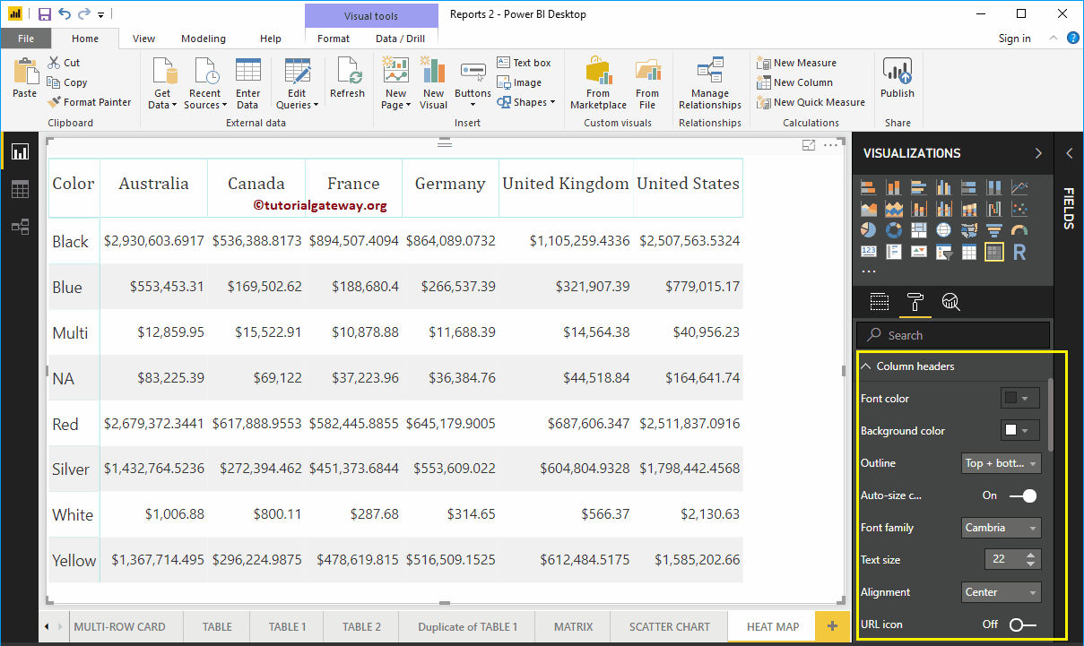
The Power BI Heatmap column header section helps us to modify the headersAs you can see in the screenshot below, we changed the font family to Cambria. Next, we set the outline to Top + Bottom (outline is added to the top and bottom of a heading), the text size to 22, and the heading text alignment to Center.
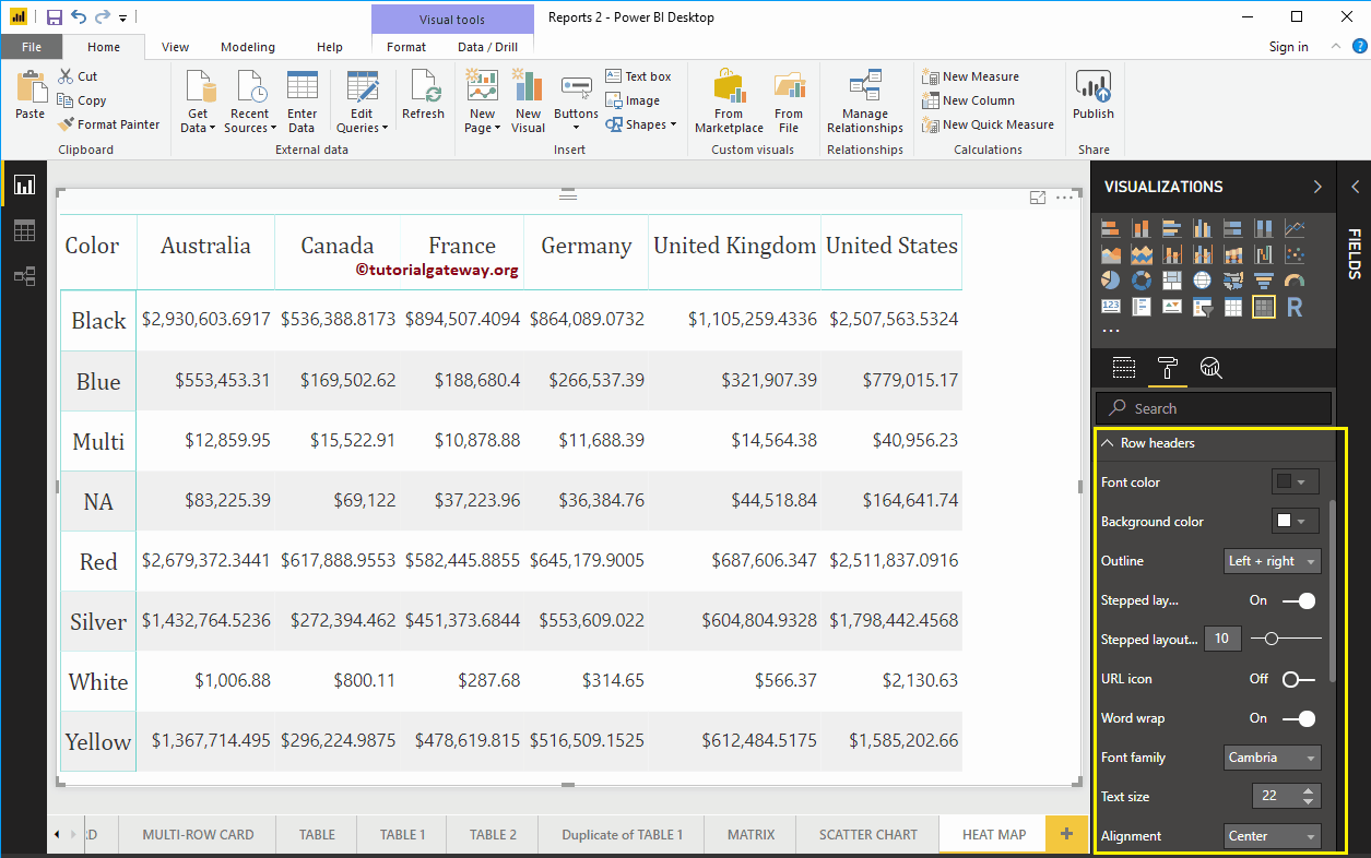
The Power BI Heatmap row header section helps us to format the row headers section. Here, we change the scheme to left + right (scheme added to the left and right of the header column, that is, color). Next, Font Family to Cambria, Text Size to 22, and text center alignment.
Power BI heatmap example
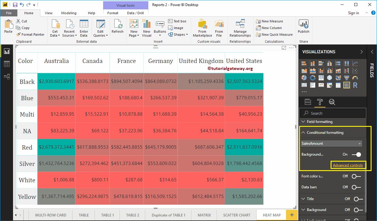
To connect that matrix to the Power BI heat map, go to Conditional format section to add colors to the Matrix Numeric column.
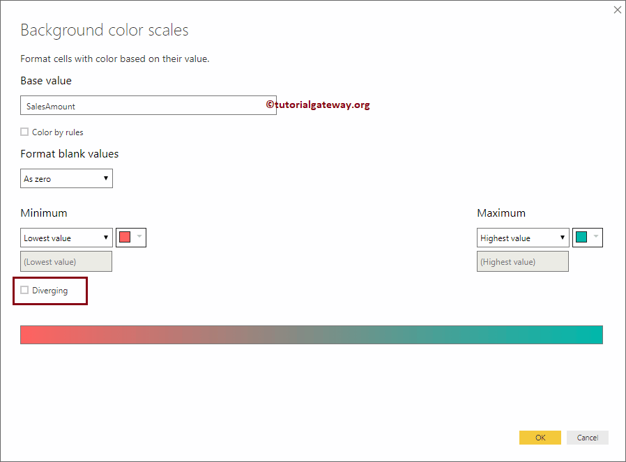
As you can see from the screenshot below, we select the Sales Amount as the field and change the background color scale property to On. Add a default color to the array. I mean, default color for Power BI Heatmap.

Change the color of the Power BI heatmap
To change the color of the Power BI heatmap, click the Advanced option. The following window will open. If you are interested in two colors, please select the minimum color and the maximum color.
We mark the Divergent option. Next, we select some random colors as the minimum, center and maximum values.
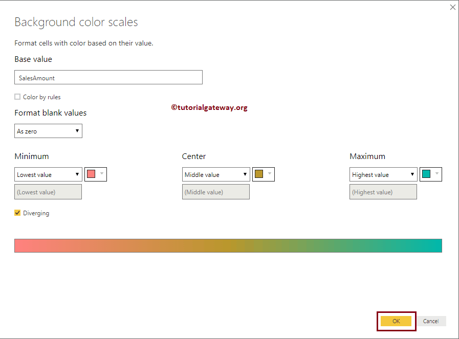
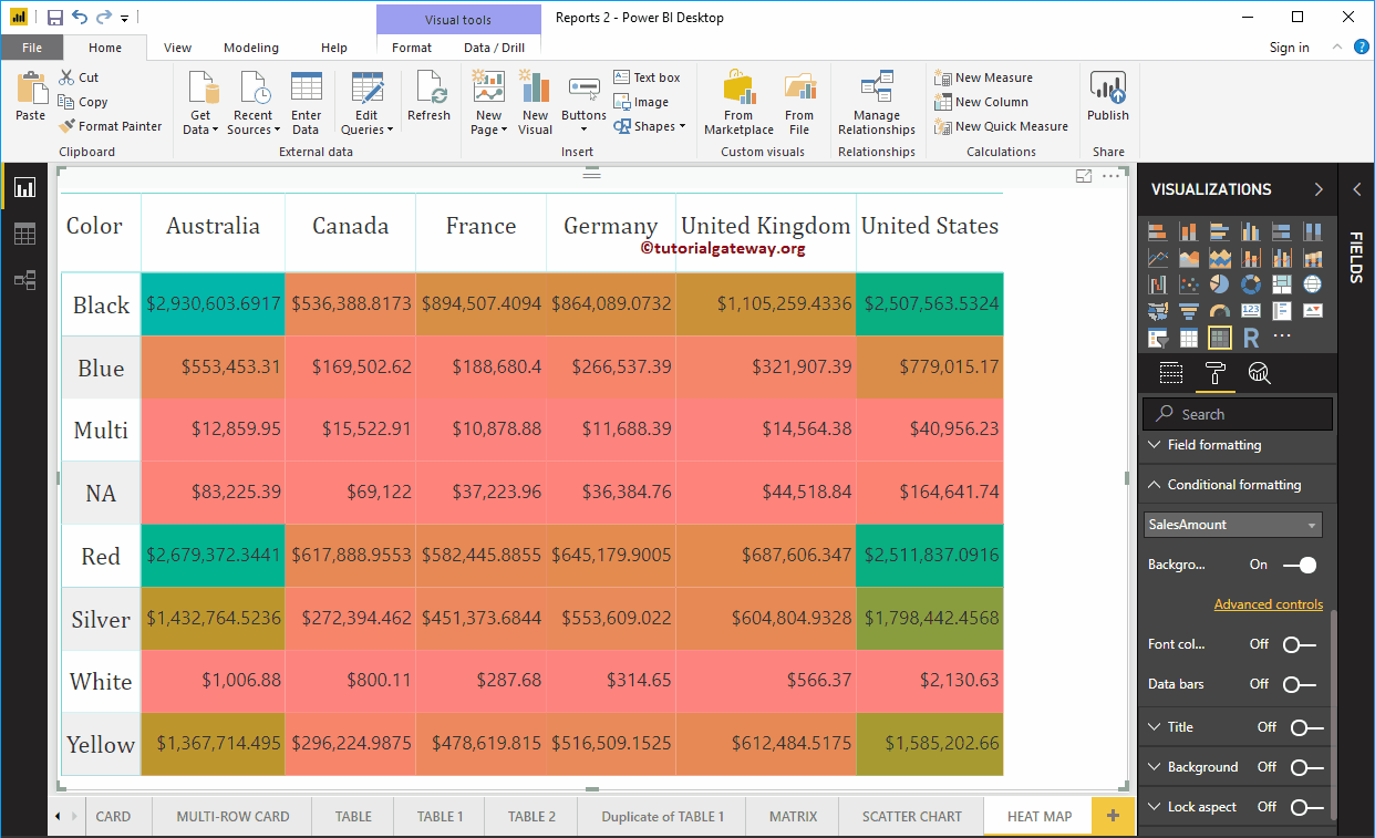
You will now see the Power BI heatmap with the selected colors.