How to format the Power BI area chart with an example? Formatting the Power BI area chart includes changing the area colors, chart title text, title position, X-axis details, Y-axis details, data labels, and background images, etc.
To demonstrate these Power BI area chart formatting options, we'll use the area chart we created earlier. See the article Area chart in Power BI.
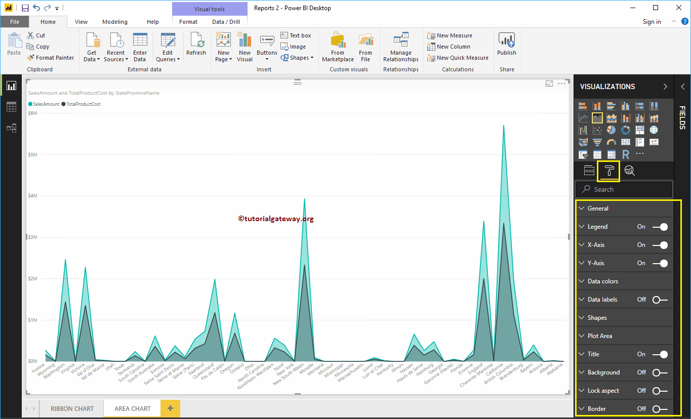
How to format the Power BI area chart
Click on the Format to see the list of formatting options that are available for this area chart.
 <>
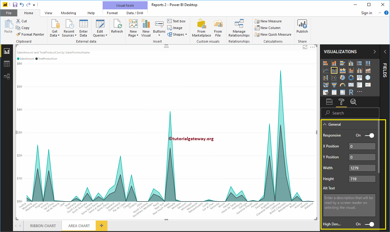
<>Format Area Chart General Settings
Use this general section to change the X, Y position, width and height of an area chart
Format an area chart legend in Power BI
Select the Power BI Legend region and change the option to Off to In to enable Legend.
As you can see in the screenshot below, we used the Position drop-down box to change the legend position to Top Center. And we also added the caption title as money, color to brick red, font family to Candara, and text size to 15.

Format the X-axis of an area chart in Power BI
The following is the list of options that are available for you to format the horizontal axis or the X axis of the area chart. Here, we change the Color to Brown and the Text Size to 12.
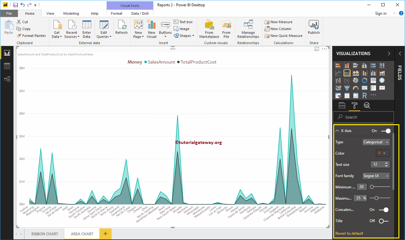
By default, the X-axis title is disabled for the area chart, but you can enable it by changing Title to In. Let me change the title color to green, the font style to Cambria, and the font size to 25.
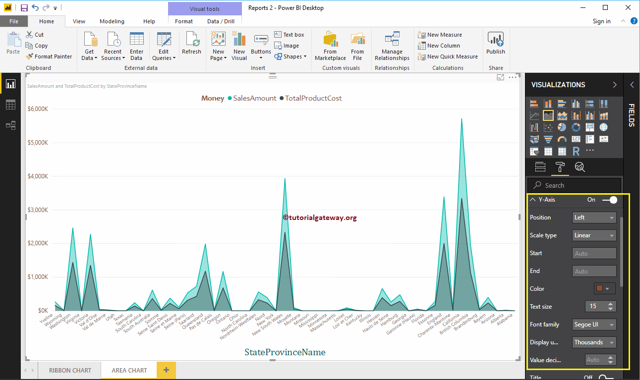
Format the Y-axis of a Power BI area chart
As you can see, we changed the Y-axis label color to brown, the text size to 15, and the display units to thousands.
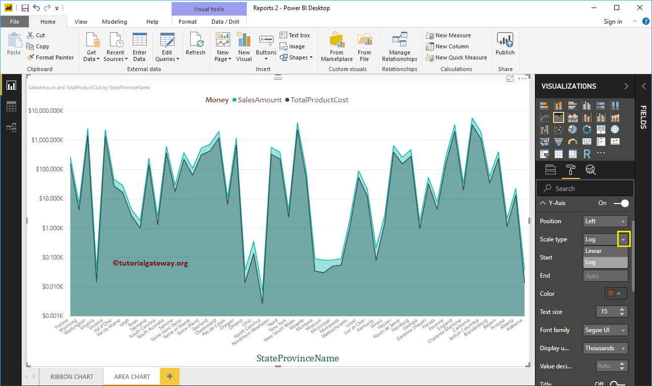
Let me change the scale type to Log. In the following screenshot, you can see that it shows the Log scale.
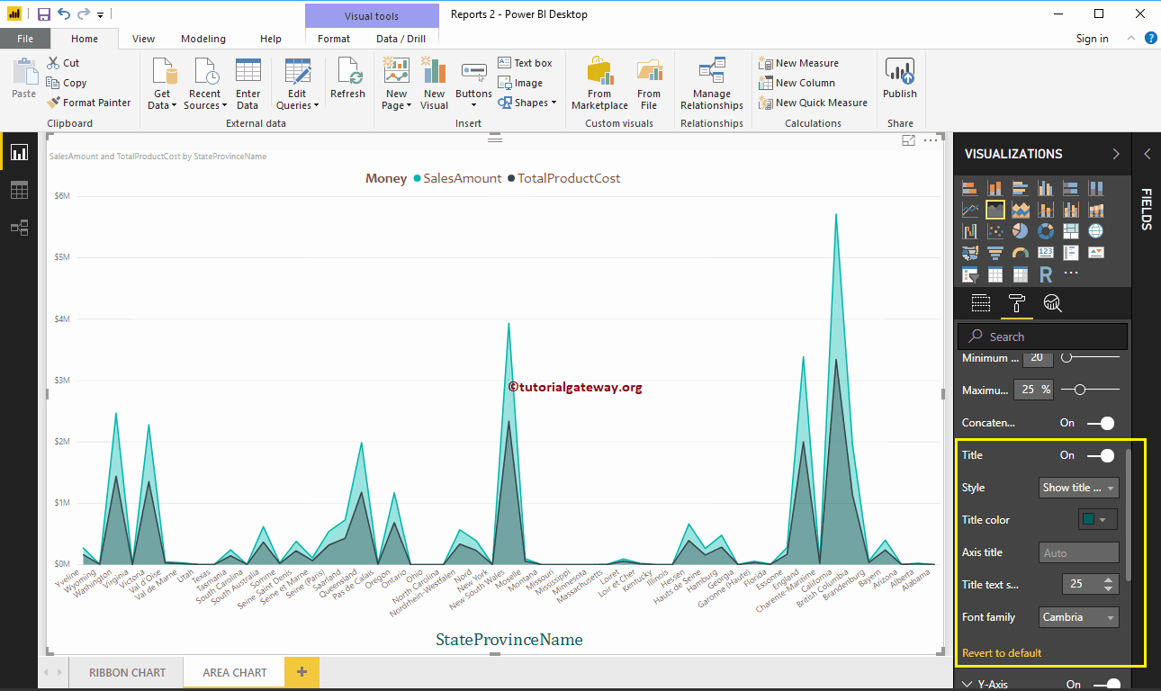
By default, the Y-axis title of the area chart is disabled. But you can enable it by toggling Title in Y Axis section to In. Let me change the title color to green, the text size to 25, and the Cambria font family.
By toggling the area chart Grid lines option from On to Off, you can disable the grid lines.
- Colour: You can change the color of the grid.
- Stroke width: Use this to change the width of the grid.
- Line Style: Choose the line style as Solid, Dotted, and Dashed.

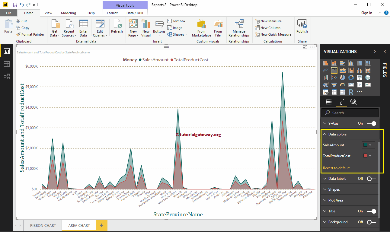
Format Power BI area chart data colors
By default, the area chart fills the space between the axis and the line with the default colors. Let me change the color of the sales amount line to green and the color of the total product cost to red.
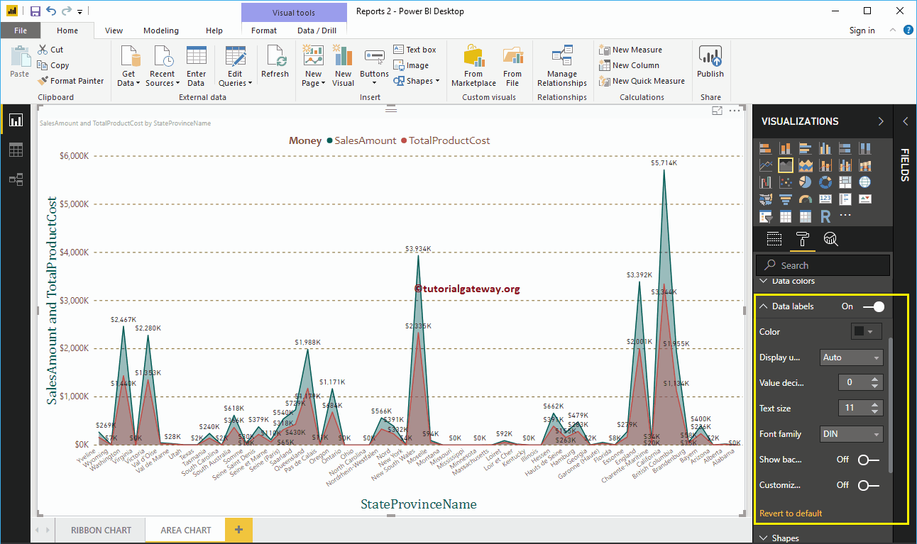
Format data labels in an area chart
The data labels show the values (sales amount and total product cost at each point). As you can see in the following screenshot, we enabled data labels and changed the color to black.

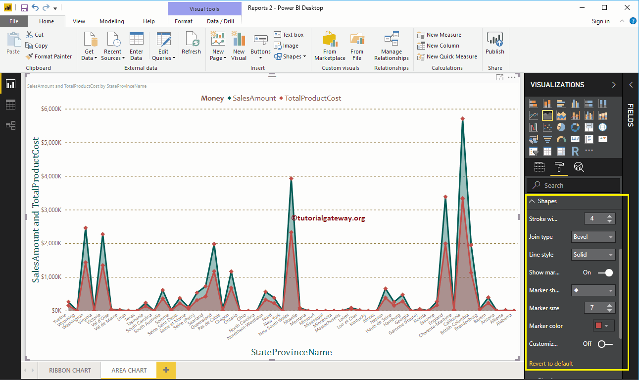
Format the area chart in Power BI shapes
Use this section to change line strokes or mark shapes.
As you can see in the following screenshot, we change the stroke width (line width) to 4, the marker shape (join point shape) to diamond, the marker size to 7, and the marker color to red. Cherry.
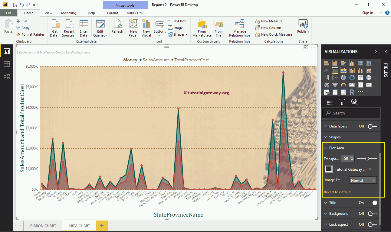
Format area Chart plot area
With this plot area property, you can add custom images as the area chart background. For demonstration purposes, we added an image as the background of the plot area.

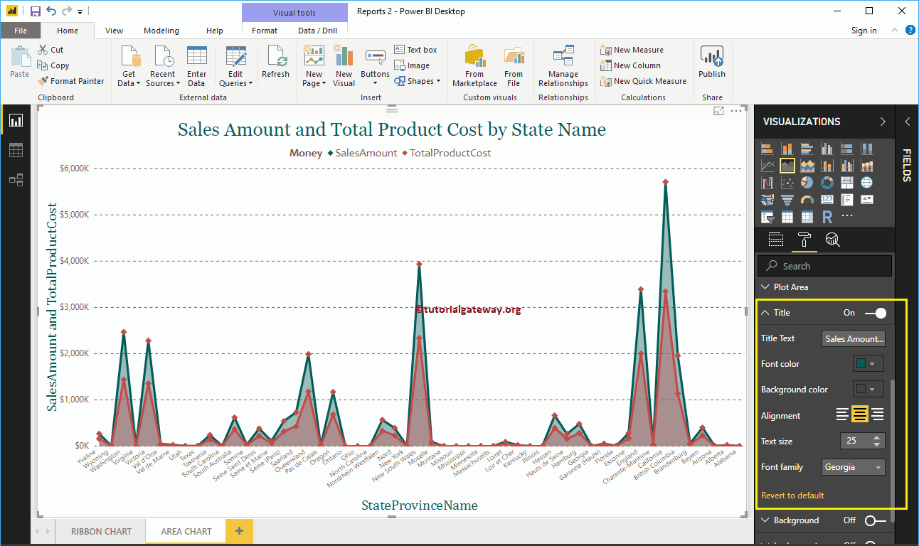
Format the Power BI area chart title
By toggling the Title of In to Off, you can turn off the Area Chart title.
In the below screenshot you can see that we changed the title text to Sales Amount and Total Product Cost by Status Name. We also changed the font color to green, the font family to Georgia, the text size to 25, and the title to center alignment. If you want, you can also add the background color to the title.

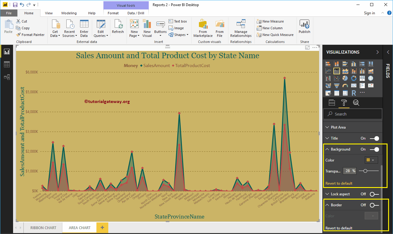
Format the background color and borders of the Power BI area chart
You can add the background color to an area chart by toggling Background option a In. For the purpose of demonstration, we added yellow color with 28% of transparency.
Similarly, you can add borders to an area chart by toggling the Border option of Off to In.