One way to dramatically improve the design and professionalism of your website is to use excellent fonts.
Most people never think twice about the font they use on their website. Regardless, if you are developing your own theme or editing a theme that you have installed at the moment, a good selection of fonts should be a big part of the process.
Selecting a font or combination of fonts for your website used to be a simple and frankly quite boring task. There were very few web-safe fonts available for use, but now with the large number of web-optimized fonts being continually created, it can be difficult to determine which ones to use.
With the creation of Google Fonts And with the more than 900 font families now available to you, the process of choosing a good font is even more complex. Regardless, in recent years, the development around Google Fonts has made implementing whatever choice you make much easier than ever.
Why should you use Google Fonts?
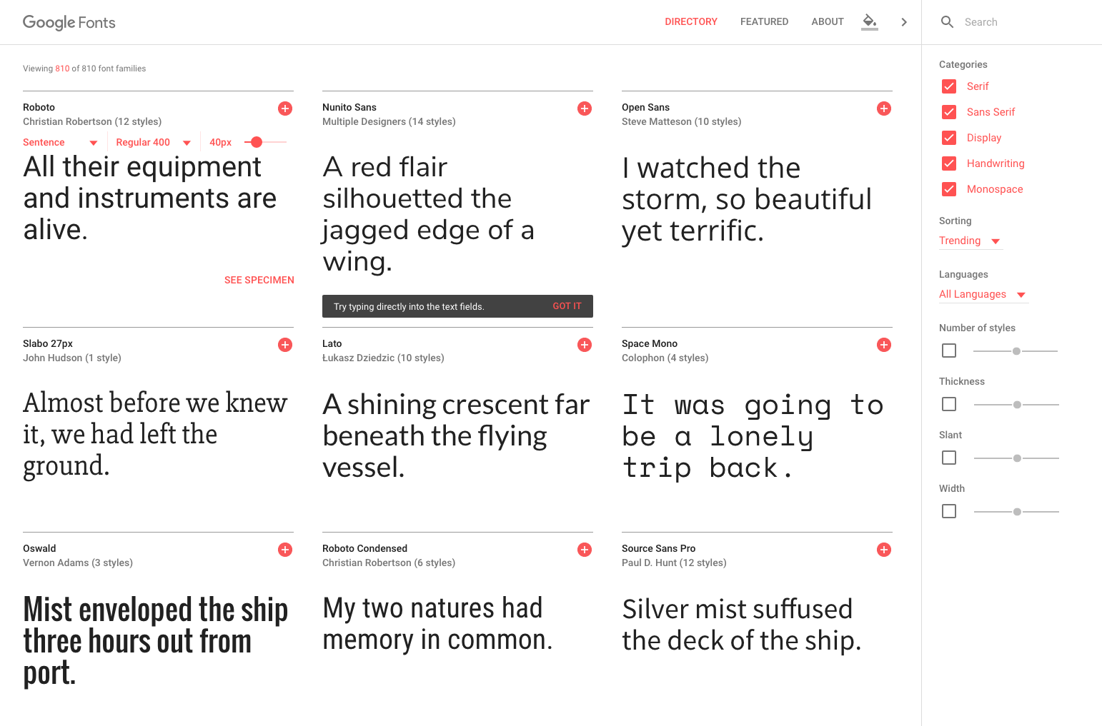
Google Fonts has become one of the best font resources available on the web today.
Not only are there more than 900 font families to use, they are all open source fonts that anyone can create and improve.
Designers who create fonts must go through a consideration process for their font to be listed in the Google directory. That means that, while having access to thousands of designers worldwide, fonts cannot be added to the directory without first ensuring that they are complete and optimized for the web.
Using different fonts in the past meant that people had to have the font installed on their own computer to allow the browser to display them correctly. With Google Fonts, all fonts are directly accessed from the Google directory, ensuring they will work on virtually any machine with any browser. This opens up an unprecedented amount of design freedom for website development.
How do I use Google Fonts on my website?
Some WordPress themes like the Total WordPress Theme include options built into the theme to easily modify your Google fonts. Just navigate to Customizer and click the Typography tab to edit the main fonts, font size, font weight and even line spacing of theme items.

Regardless, if you are using a different theme, you can add Google Fonts manually or use a plugin.
WordPress plugins to add Google fonts
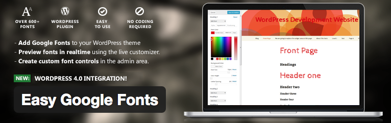
One of the best free plugins to add Google Fonts to your site is through the free Easy Google Fonts plugin that you can download from the WordPress repository. Despite everything, the easiest to download is directly from your WordPress dashboard. Just log into your WordPress site and go to Plugins> Add New. Then search for "Easy Google Fonts" for a quick and easy installation.
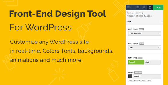
Another great plugin for customizing your fonts on the site is the Yellow Pencil Live CSS editor plugin (which is included for free in our New York WordPress theme). The advantage of this plugin is that it not only allows you to modify the fonts of your website by means of a simple click and edit method. At the same time you can customize all the colors, font sizes, font weights, padding, margins, etc. of your WordPress theme.
What fonts should I use?
The greatest strength of the Google Fonts Directory at the same time can complicate your life. There are so many fonts available to use that finding and choosing a decent font mix can be a challenge.
The fonts you choose will depend entirely on what you are trying to convey with your design. Fonts are used to capture the interest of the site's readers. They are used to draw attention to various aspects of the website, and a great designer can work wonders with very subtle differences in the fonts he uses.
One thing you need to understand is the difference between a font and a typeface. These two terms are often used interchangeably and incorrectly. A font is the entire collection of letters, numbers, symbols, etc. When referring to the design of that collection, I would call it typography.
Font classifications
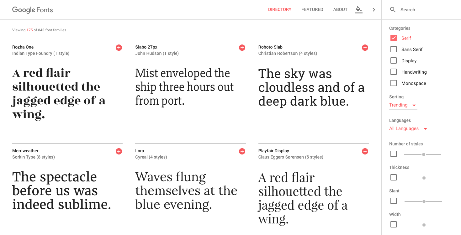
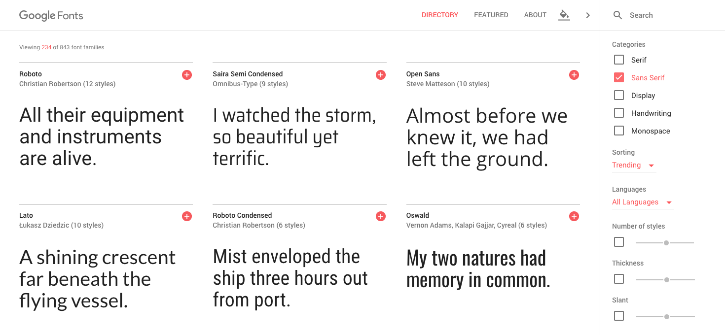
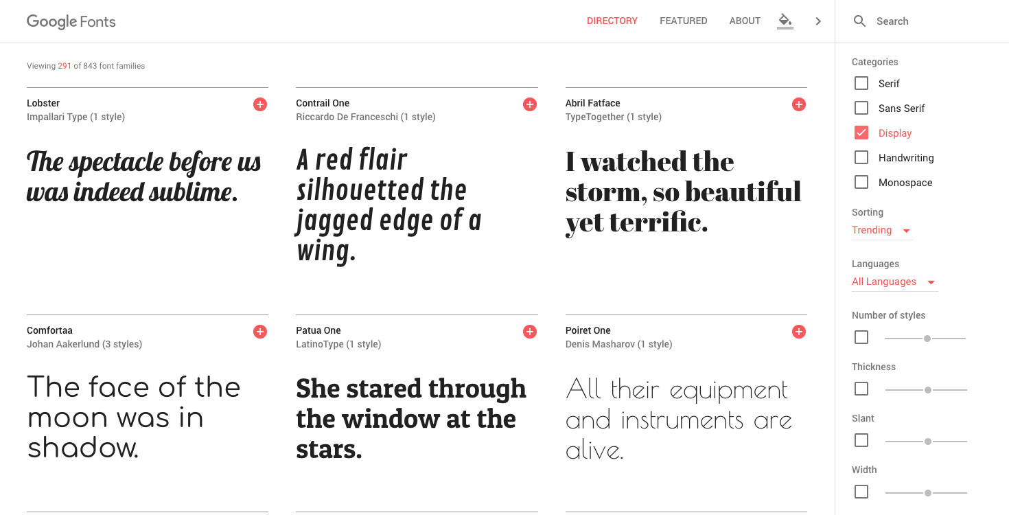
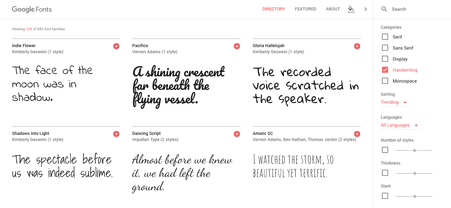
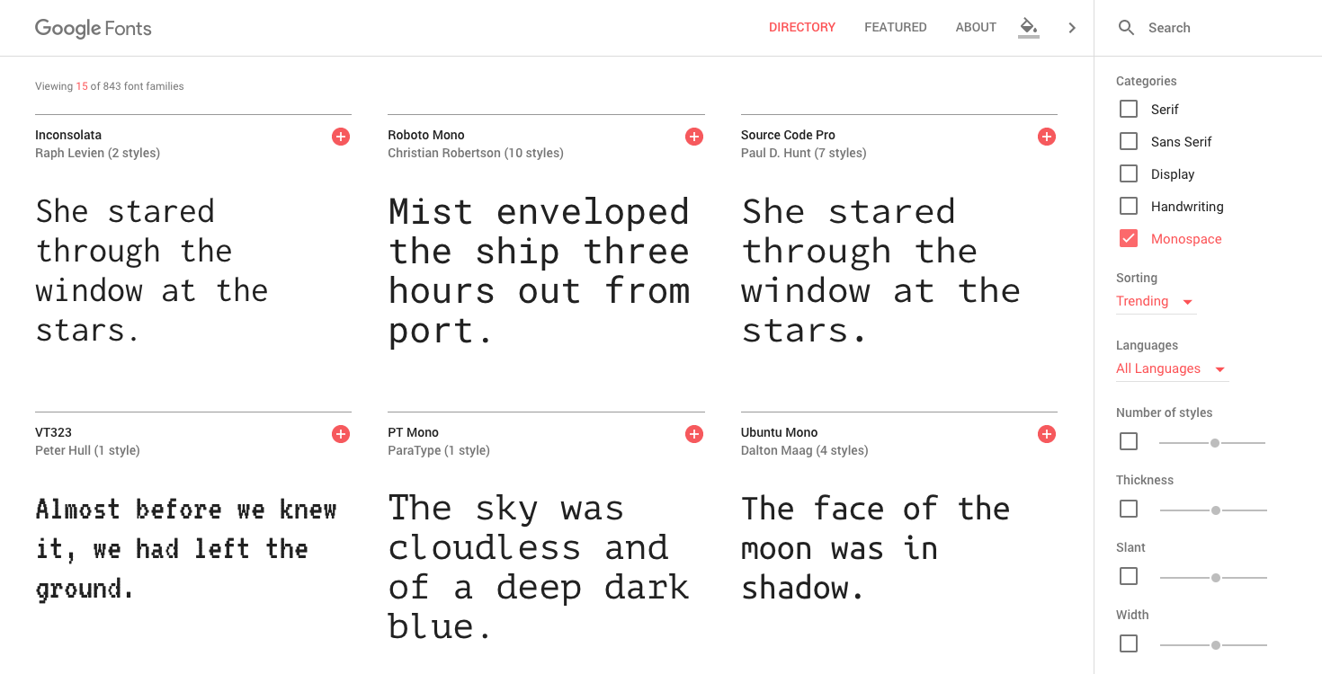
There are several classifications that can be applied to typefaces. They are: Serif, Sans Serif, Display, Handwriting (or Script) and Monospace. There are others that are used in print, although we won't have to worry about them at this time.
So what are the differences between them?
Serif typefaces have a tail that hangs from the edge of each character.
Sans serif fonts do not have a tail.
Monitor fonts are unusual and decorative.
Writing typefaces appear to be handwritten in italics or blocks.
By last, monospace fonts are made up of characters that take up exactly the same amount of space.
Font best practices for web design
There are some best practice guidelines to follow when choosing which fonts to use.
It is a good idea avoid using more than two different fonts in the design of your site. It can be difficult to balance more than two sources. And mixing more than two typefaces on one site can cause serious visual problems.
If you are using two different fonts, as an example, one for the headings and one for the content, make sure you don't choose them from the same type classification. Their better combine fonts. In other words, avoid using two different Serif fonts or two different Sans Serif fonts.
There are fonts that work great for headlines, but are not ideal for body content, and vice versa. There are sites that use fonts for their content that can be difficult to read. The content sources should be clean and easy to read. While title fonts should be used for maximum impact and draw attention to specific areas of your site.
Summarizing Google Fonts for WordPress
As you may begin to appreciate, selecting fonts for your website design can be a complicated and complicated process. The decision involves much more than simply choosing two sources.
There are several things that you should strive to ensure in your choices. Make sure your heading class hierarchy is balanced and your heading tags are reduced in relative size.
Half the battle of good site design and typography is being consistent with your font choices. That includes font sizes, weights, and spacing. Using Google Fonts and the Google Typography Plugin makes this whole operation much easier than it has ever been. Even with these resources, having a professional and balanced typeface is still a challenge.
If you are still unsure of the decisions you are making and get lost trying to figure out the differences between all of your options. It might be time for a professional designer to take a look at your site.
Have you implemented Google Fonts on your website? Have you created a theme from scratch that includes Google Fonts? We'd love to hear your thoughts on typography and your favorite fonts in the comments below.